
I started to feel bored with my home screen and app drawer because they had become monotonous and distracting. I even tried a utility-focused launcher to enhance my productivity, but this time I was looking for something fresh.
That’s why I resorted to Niagara Launcher. It’s specifically designed for modern, large-screen phones, aimed at those who want a fresh, simple, efficient, and distraction-free way to access apps and information.
![]()
OS
Android
Developer
Peter Huber
Niagara Launcher is a minimalist, ergonomic Android homescreen designed for one-handed use. It features a streamlined list layout, adaptive notifications, and a focus on efficiency to reduce distractions and declutter your phone.
How to get started with Niagara Launcher
I made Niagara mine with little effort
Customizing Niagara Launcher is easy; the process is as minimal as the launcher itself. Just download Niagara Launcher and follow these steps to make it truly yours from the get-go:
Launch Niagara and follow the pop-ups to allow needed permissions. You will need to enable notifications and accessibility permissions to get the full experience.
Customize your favorite apps, adding up to eight.
Scroll to the bottom of the drawer, go to Niagara settings, and enable the automatic music app appearance.
In its settings, you can change your themes and appearance.
These minimal customizations are what Niagara Launcher is all about. Compared to other Android launchers, it might look like there’s next to nothing when it comes to customization. But with these minimal customizations, Niagara strikes the perfect balance of distraction-free and minimal setup.
Related
These 4 Android launchers fill the gap Nova is leaving behind
A new era of home screen customization dawns with these launchers as Nova Launcher bids farewell.
Niagara is made for one-handed use
You no longer have to stress your fingers
Traditional Android launchers are essentially all the same: a grid spread across the home screen(s). It’s a design created for much older, smaller smartphones, which aren’t what we use today. This grid layout, while we are used to it, is awkward since we have to stretch our hand all the way to the corner to open certain apps.
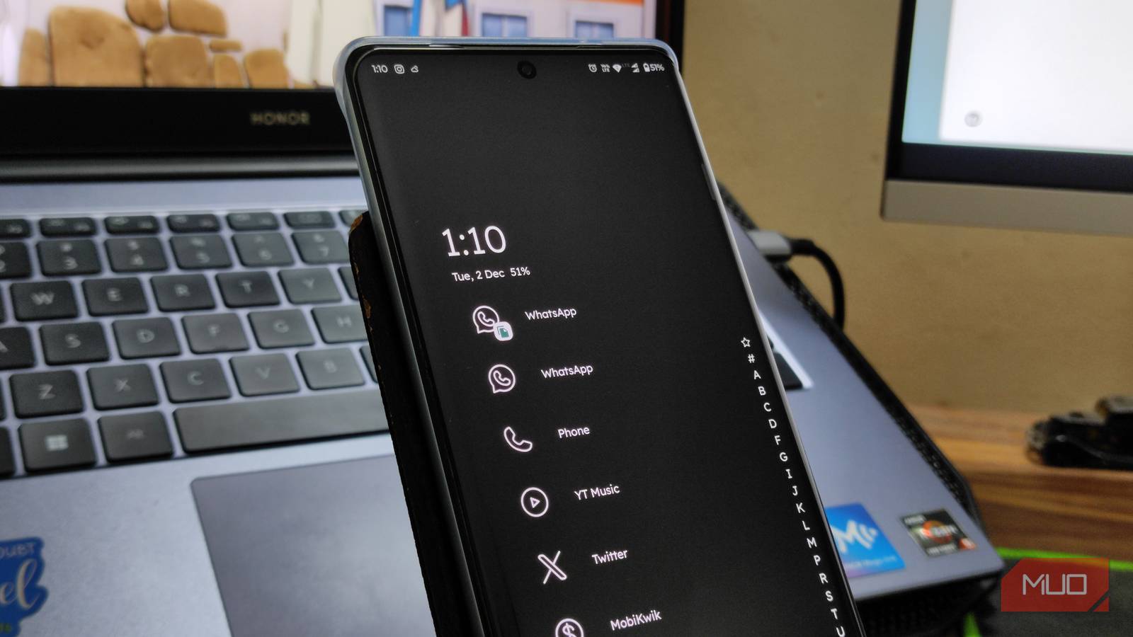
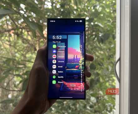
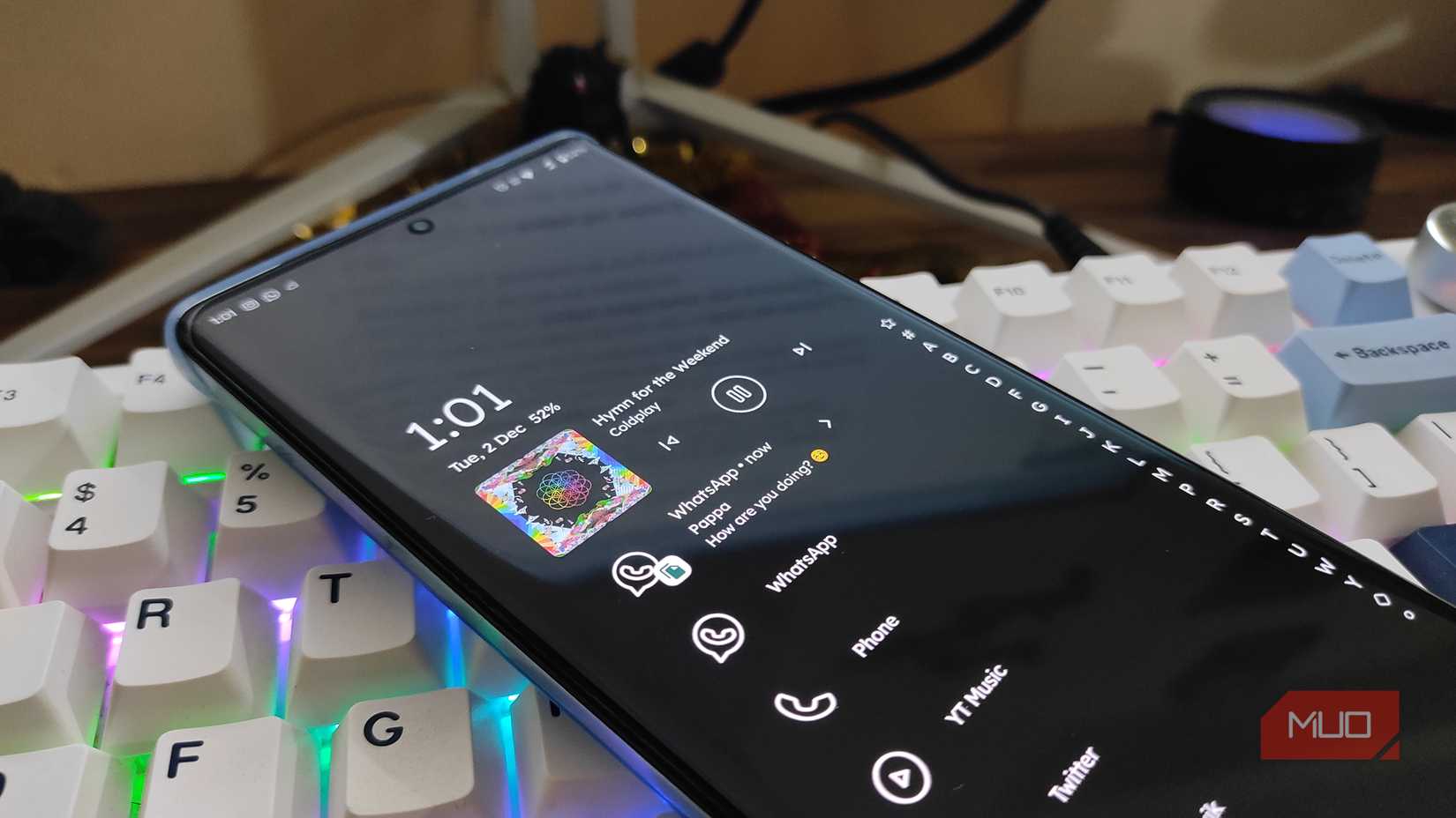
Niagara, at the other end of the spectrum, ships with a vertical scrolling list of apps accessible with just one thumb. Instead of flipping through endless pages, you can find the essentials right on the home page and the rest with just one swipe.
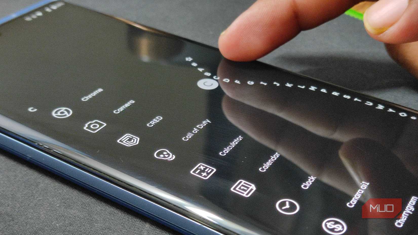
The launcher’s alphabetical wave scrollbar on the side lets you quickly jump to any letter section in your app list, allowing you to glide to any app without searching for it. This design makes it easier to navigate through a growing list of apps while putting less strain on your fingers.
Intelligent and contextual features
It’s smart and helps you get work done
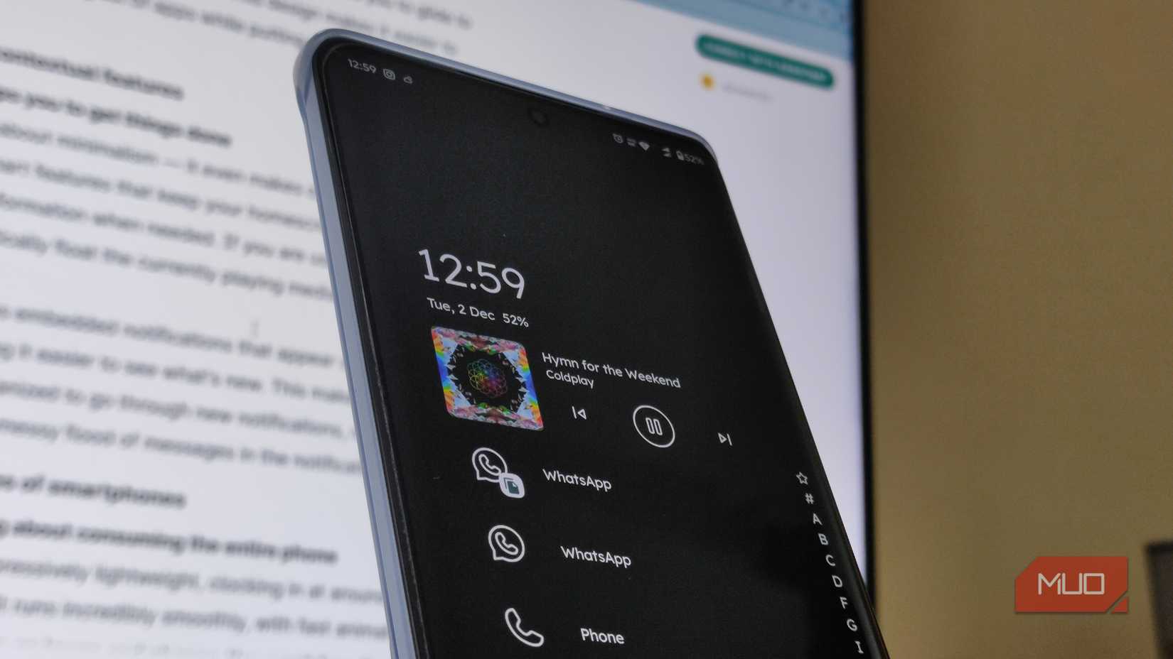
Niagara is not just about minimalism—it even makes our phones a tad more useful. It adds smart features that keep your home screen tidy while still showing relevant information when needed. When you’re using media apps, the currently playing media will automatically float to the top.
Niagara even features embedded notifications that appear cleanly within the drawer list, making it easier to see what’s new. I find it cleaner and more organized to go through new notifications, rather than a small dot and a messy flood of messages in the notification panel.
Light on resources
Run it without worrying about consuming your entire phone
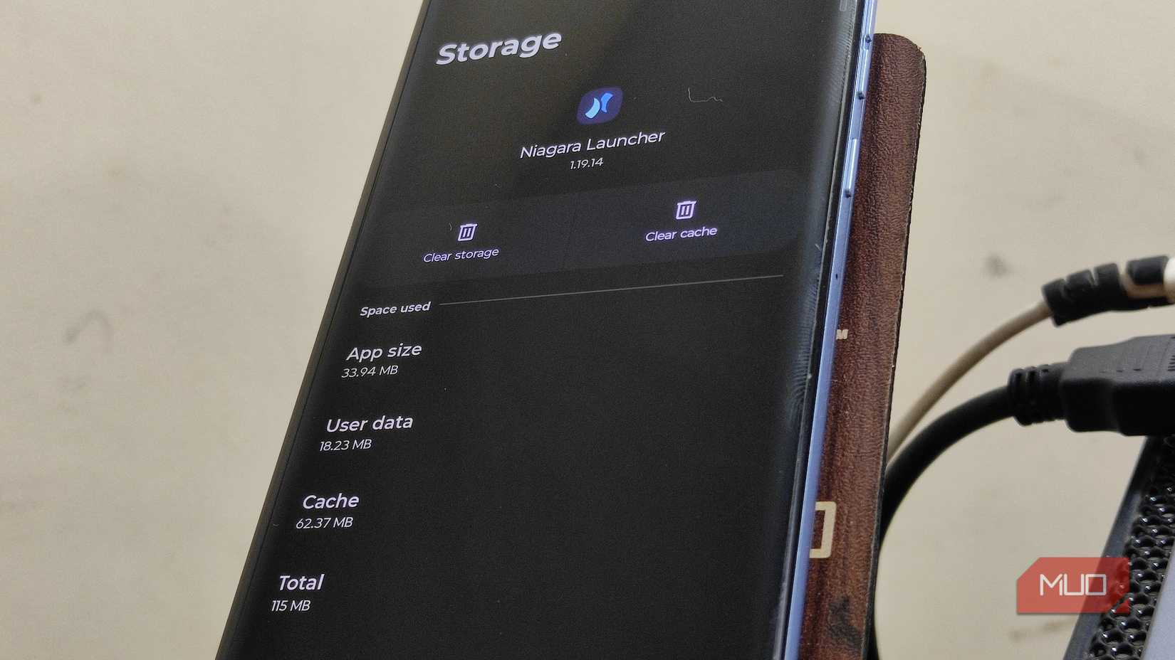
Niagara Launcher is impressively light on resources; it only consumes around 115MB of my phone’s storage. This small size ensures it runs smoothly, with fast animations and a fluid interface, even on lower-end phones. You won’t face the lag or stuttering that often happens with heavily loaded launchers.
The launcher supports Android 15 features such as App Archiving and Private Space integration, showing how it has stayed up to date with the latest OS improvements. For convenience, you can double-tap the alphabet scrollbar to turn off the screen without using the power button.
Niagara Launcher changes the way you use your phone
It helped me work smarter while also being useful
One of the reasons why I like Niagara Launcher is how it changes my phone usage. WIth it minimizing clutter and focusing on essential apps and timely information, I feel less distracted. The minimalist design minimizes the urge to constantly open multiple apps or get lost in social media.
Inline message previews and a contextual app appearance reduce unnecessary app switching, making interactions with my phone more intentional. I also like the one-handed convenience, which reduces awkward finger stretches and improves accessibility.
There is a slight initial adjustment—some people find the lack of traditional home screen widgets and grids unfamiliar at first. But after a few days, I bet you’ll find it a refreshing, more efficient way to navigate your device.
Here’s the difference you’ve been looking for
Shifting to Niagara launcher was the refresh I didn’t know I needed. It effectively solved my boredom with standard grid-style layout by replacing it with an ergonomic, one-handed experience that made sense for my 6.9-inch smartphone.
It’s not just about aesthetic minimalism; Niagara, with its contextual features such as embedded notifications and automatic media controls, means your phone feels faster and smarter without piling on clutter.
Niagara even made a noticeable change in my daily usage by stripping away the visual noise and letting me focus on essentials, making interactions more intentional and less distracting. It doesn’t escape the problems inherent to all Android launchers, but it’s certainly more interesting to use.