After introducing little bits and pieces last year, Telegram’s new update on Android is going all-in on Liquid Glass with new design elements throughout the UI in what is a pretty major redesign.
Available in Telegram for Android v12.4.0, rolling out now widely via the Play Store, the messaging app has picked up a fresh coat of paint, sporting a whole lot more Liquid Glass-esque design elements. This builds on the October/November 2025 update, which redesigned certain elements of the app.
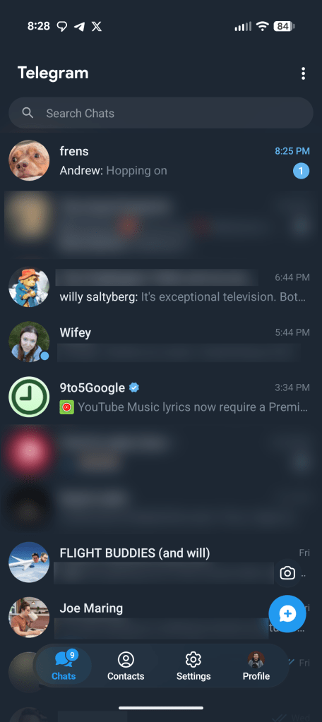
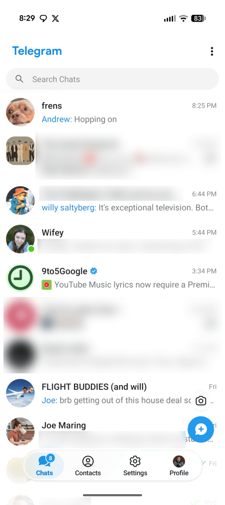
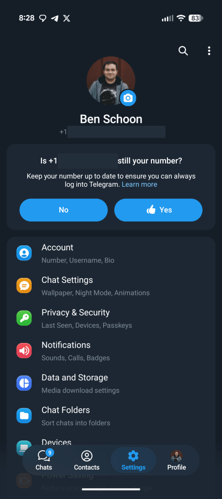
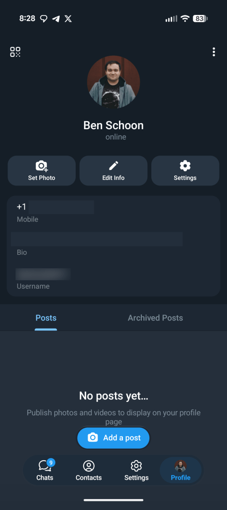
In the latest update, Telegram embraces this new look with a four-tab bottom bar that feels ripped straight out of iOS, as well as new transparent elements that are especially visible in the app’s light mode. It’s not quite the same as you see on iOS, but it’s very clearly inspired by Apple’s new design language (which, after all, is more than just transparency). The four tabs are for Chats, Contacts, Settings, and Profile, and the bottom bar stays open on all of them even as you scroll.
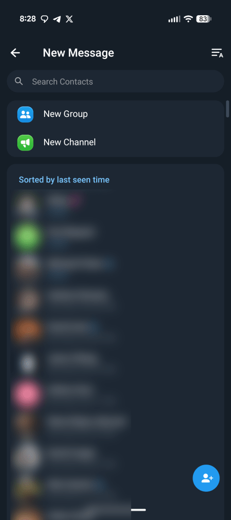
The hamburger side menu has also been entirely removed at this point, with “New Group” and other remaining features from that menu now found in a three-dot overflow menu at the top right of the chats screen.
Advertisement – scroll for more content
Telegram first rolled out full support for Liquid Glass on iOS in early January, with this Android redesign following in its footsteps. Users reactions have not exactly been positive.
What do you think of the change?
More on Android:
Follow Ben: Twitter/X, Threads, Bluesky, and Instagram
![]()
![]()
FTC: We use income earning auto affiliate links. More.