
The colours of national flags carry a lot of power, as we’re sure to see with World cup 2026 coming up. One creative agency has shown how that can be use to communicate more than just national pride.
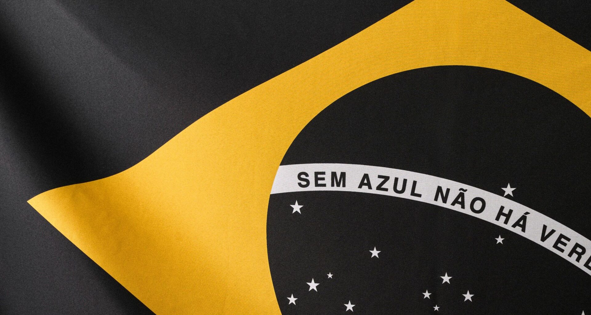
While the green and yellow of the Brazilian flag were originally taken from the royal houses of Hapsburg and Braganza, they were later re-interpreted to represent the country’s Amazon and Atlantic forests and gold reserves, with the blue circle representing the night sky over Rio. But what if the colours disappeared?
That’s the question Droga5 São Paulo asked a few months ago with its Lifeless Flag campaign during the COP30 meeting in Belém. Now it’s bringing the colour back to complete the message.
You may like
Droga5 São Paulo‘s Lifeless Flag campaign was created for SOS Oceano, a coalition of NGOs advocating for the expansion of marine protected areas. The first phase saw the blue and green removed from the Brazilian flag to stress that one can’t exist without the other. We need blue to create the colour green, and we also need to blue of the oceans for there to be green life on land.
This concept has now been expanded in a second phase through a series of six unique screen-printed artworks produced using natural mineral pigments. Developed in collaboration with Black Madre Studio and Joules & Joules Laboratory, it offers a more hopeful but not less urgent twist to the campaign.
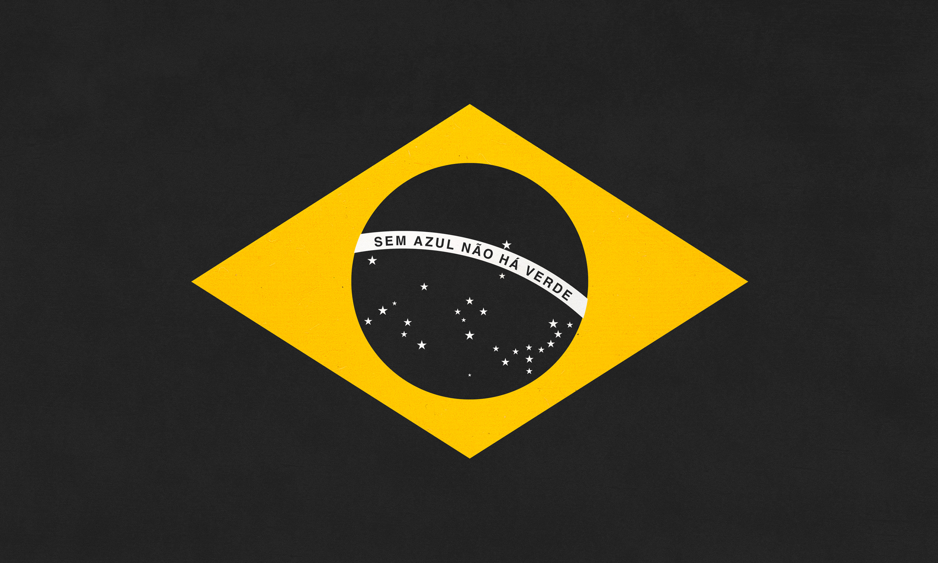
The Lifeless flag took the blue and green out of the Brazilian flag (Image credit: Droga5 São Paulo)
The prints draw on the tradition of Brazilian naturalist iconography, pairing marine and land flora and fauna, from the Amazon Rainforest to the Humpback Whale. The aim is to again stress the interconnectedness of ecosystems and the sometimes overlooked importance of ocean conservation. The yellow diamond of the Brazilian flag provides an immediately recognisable focal point, highlighting the fusion of the colors removed in the first phase of the campaign.
“The beginning of this project showed that design can condense a complex environmental truth into a single, felt symbol,” says Diego Limberti, Chief Design Officer at Droga5 São Paulo. “In this phase, the elements of the flag remain part of the campaign’s visual process, but they are now reinterpreted to emphasize the animals that live in marine parks and their relationship with the forest. One biome depends on the other, and this is highlighted by the colors of Brazil’s greatest symbol.”
Image 1 of 7
 (Image credit: Droga5 São Paulo)
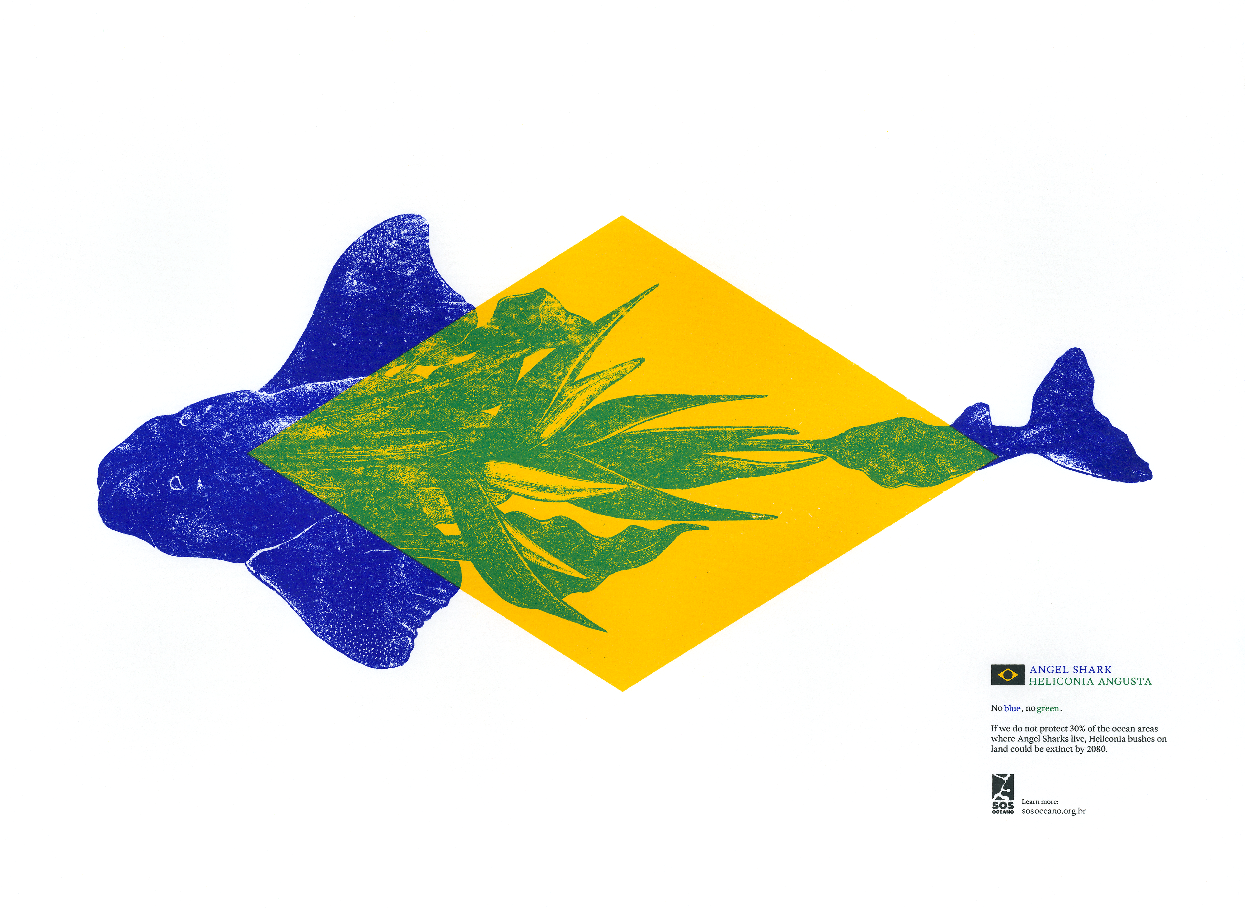 (Image credit: Droga5 São Paulo)
 (Image credit: Droga5 São Paulo)
 (Image credit: Droga5 São Paulo)
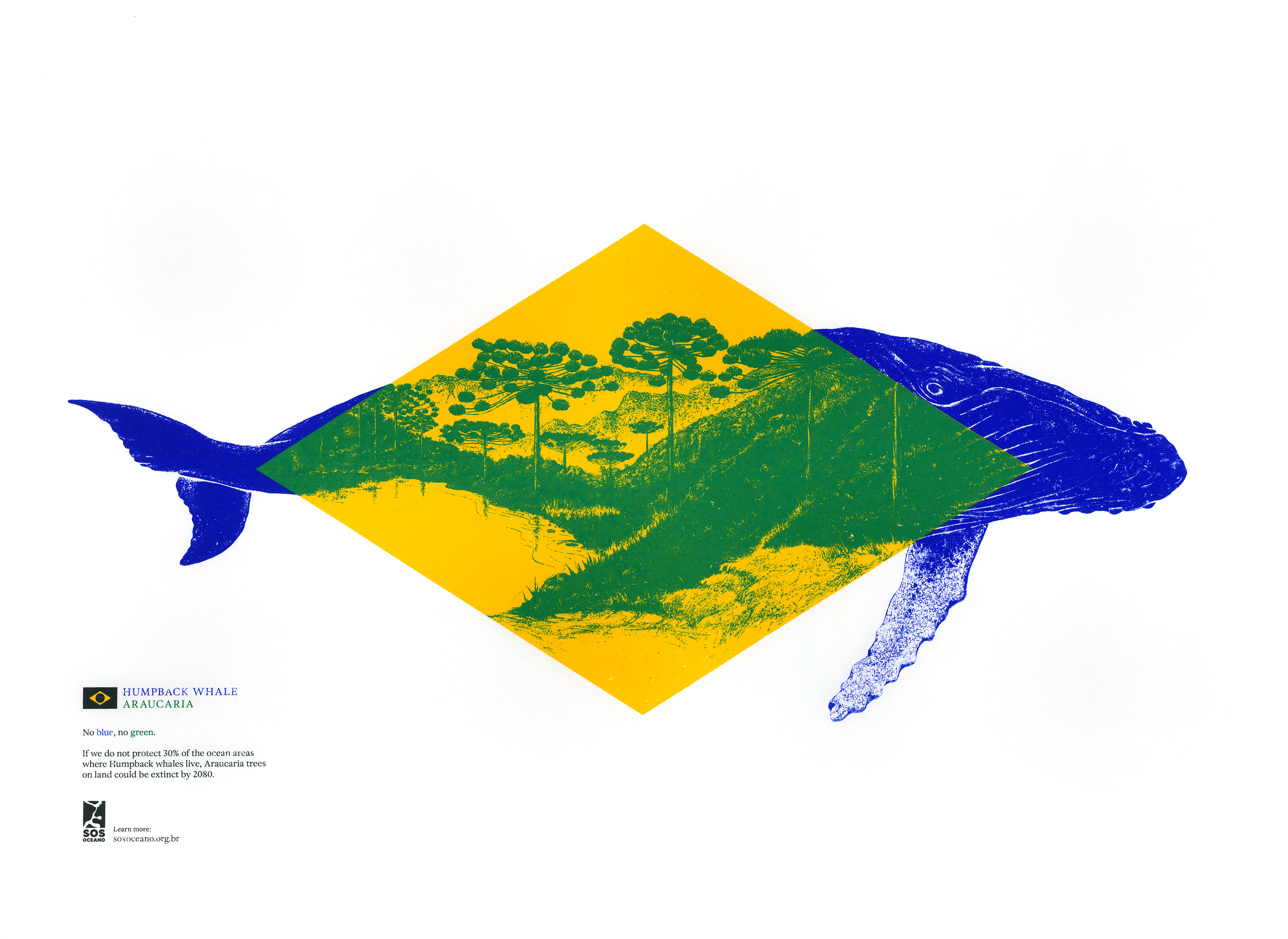 (Image credit: Droga5 São Paulo)
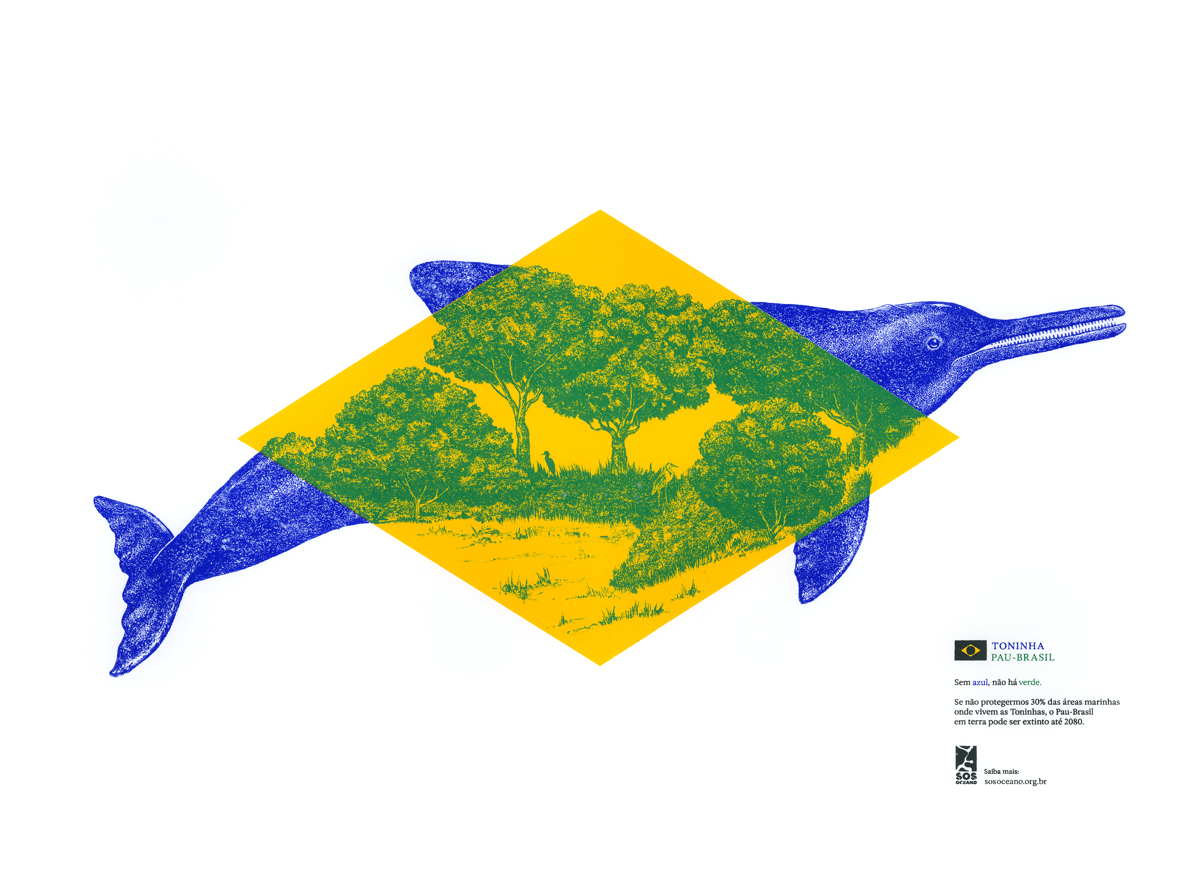 (Image credit: Droga5 São Paulo)
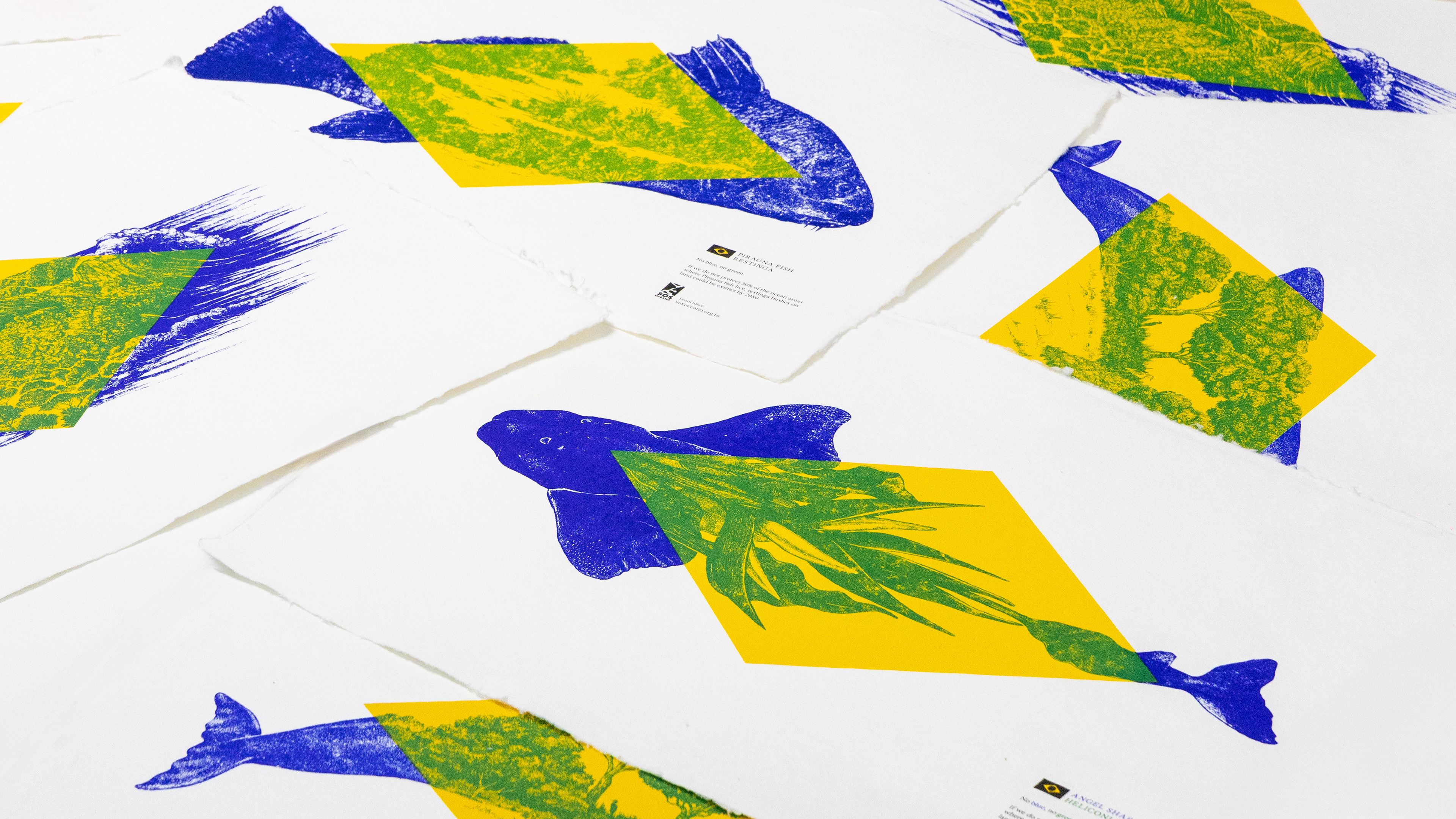 (Image credit: Droga5 São Paulo)
The campaign was built alongside WALK, Droga5’s impact innovation hub. Screen printing was chosen as the ideal medium to ensure chromatic rigour and layered ink application and for its deep history in graphic arts and artisan production, reinforcing the narrative behind the project.
The choice of natural pigments was also deliberate, making the prints consistent with the environmental message as with their visual one. Research was carried out with Joules & Joules to achieve the correct hues, tones, and transparency without synthetic solvents.
“The project is rooted in color theory. When we say ‘without blue there is no green,’ we’re working with the fundamental logic of primary and secondary colors: blue and yellow create green”, points out André Maciel, Creative Director at Black Madre Studio.