
The RealChart2Code benchmark puts 14 leading AI models to the test on complex visualizations built from real-world datasets. Even the top proprietary models lose nearly half their performance compared to simpler tests.
AI models can recreate simple charts from images without much trouble. But when the task involves complex, multi-part visualizations based on real data, even the most capable models hit a wall. That’s the takeaway from RealChart2Code, a new benchmark from a team of researchers at several Chinese universities.
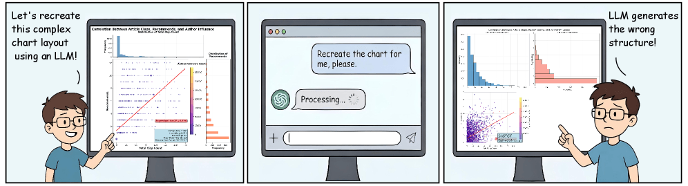 An AI model is asked to recreate a complex chart but produces the wrong structure. | Image: Zhang et al.
The benchmark includes more than 2,800 test cases built from real Kaggle datasets. Earlier benchmarks like Plot2Code and ChartMimic mostly leaned on synthetic data and simple single charts. RealChart2Code goes further, throwing complex composite layouts, 50 different chart types, and large raw files at the models. The researchers pulled from 1,036 curated datasets totaling roughly 860 million rows of data.
Three tasks, three different skills
RealChart2Code tests models on three tasks. In “Chart Replication,” the model has to generate visualization code from an image alone. “Chart Reproduction” adds the raw data into the mix, checking whether the model can produce the right code from real data sources. The third task, “Chart Refinement,” simulates an actual development workflow: the model gets broken code and has to fix it through a back-and-forth dialog with the user.
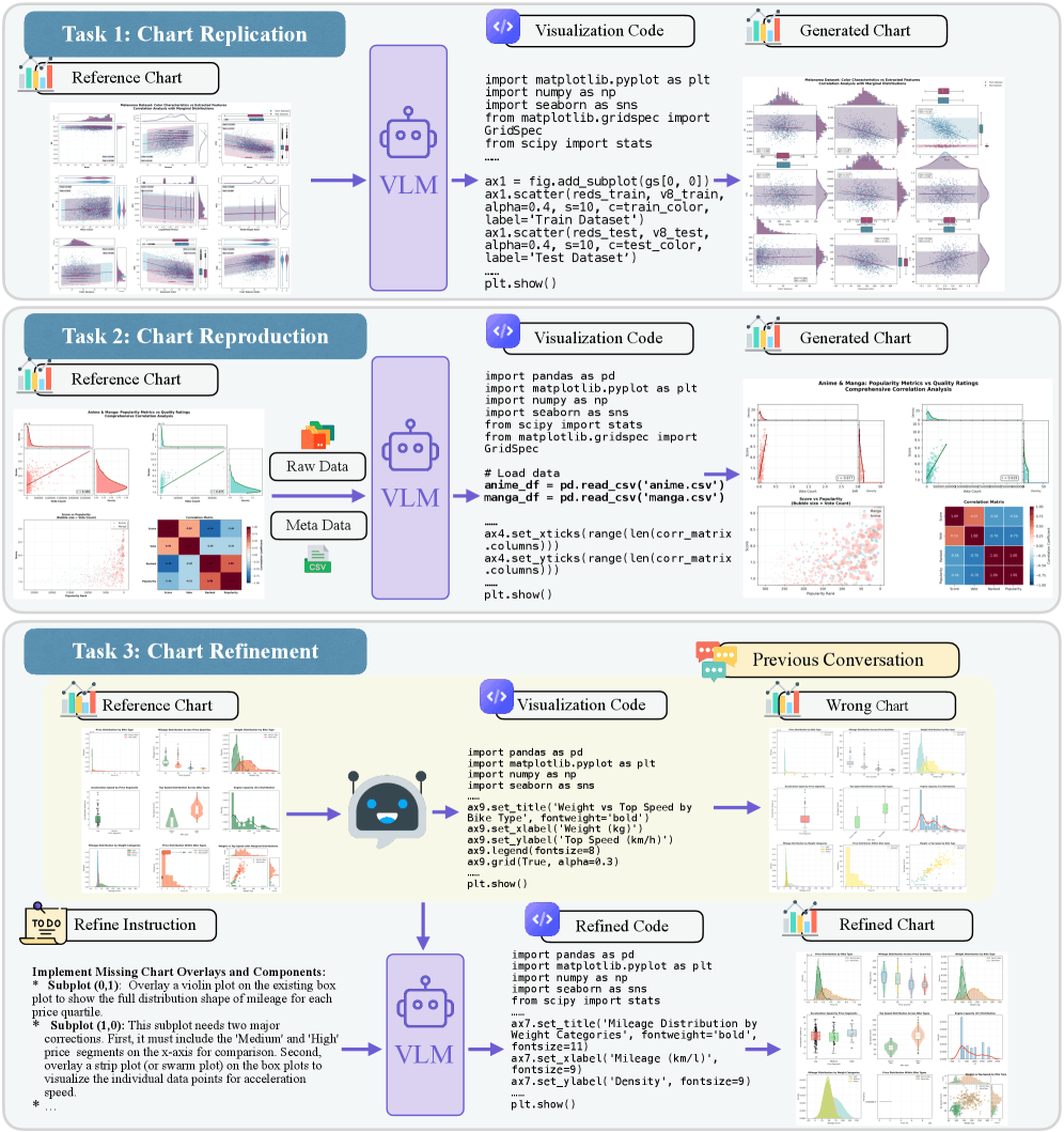 RealChart2Code tests AI models on three tasks: recreating a chart from an image (Replication), building one from an image plus raw data (Reproduction), and fixing broken code through dialog (Refinement). | Image: Zhang et al.
According to the paper, RealChart2Code is the first benchmark to systematically evaluate code generation from large raw datasets and iterative refinement in a conversational format.
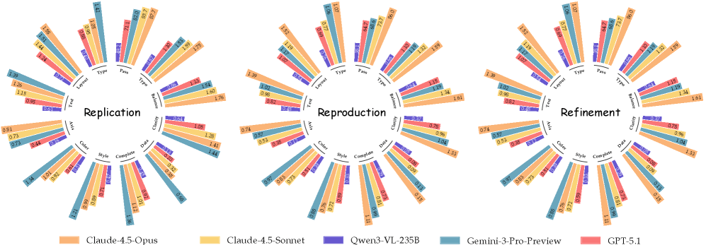 The radar charts show how the top models score across eight accuracy criteria. Claude 4.5 Opus and Gemini 3 Pro Preview dominate, while open-weight models trail in nearly every category. | Image: Zhang et al.
Proprietary models lead, but still fall well short
The team tested 14 models in all: five proprietary and nine open-weight. Among the proprietary group, Anthropic’s Claude 4.5 Opus posted the top average score of 8.2 (on a scale covering eight visual accuracy criteria). Google’s Gemini 3 Pro Preview came in right behind at 8.1 and took the top spot on basic chart replication with a score of 9.0. OpenAI’s GPT-5.1 lagged well behind at 5.4.
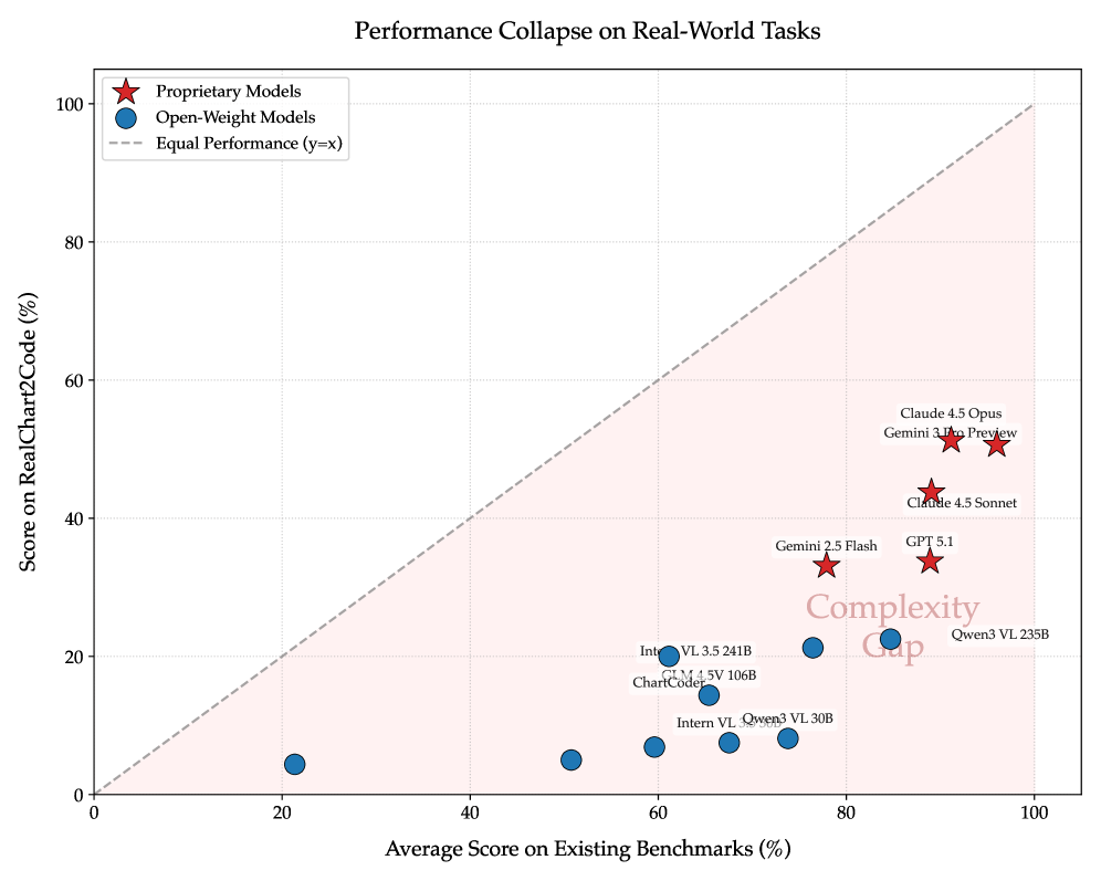 Every model tested falls far below the diagonal marking equal performance on simple and complex benchmarks. Open-weight models drop especially hard on RealChart2Code. | Image: Zhang et al.
Open-weight models did much worse. The best performers, Qwen3-VL-235B and Intern-VL-3.5-241B, scored just 3.6 and 3.4, less than half of what the leading proprietary models put up. One of the smallest models tested, DeepSeek-VL-7B, hit a pass rate of just 9.7 percent on chart replication, meaning the generated code failed to even run in more than 90 percent of cases.
The paper’s central finding is what the researchers call the “complexity gap”: models that ace simpler benchmarks fall apart on RealChart2Code. Gemini 3 Pro Preview, for example, scores over 96 percent (normalized) on ChartMimic but drops to around 50 percent on RealChart2Code. The collapse is even steeper for open-weight models. Qwen3-VL-235B pulls in about 85 percent on ChartMimic but under 25 percent on the new benchmark.
Open-weight models hallucinate libraries, proprietary models mix up data
The error analysis turns up two very different failure patterns. Open-weight models like Qwen3-VL and InternVL often break down at the code execution stage. They invent libraries that don’t exist or call invalid functions.
Qwen3-VL-235B, for instance, spits out invalid API calls, like a nonexistent Matplotlib style parameter, in roughly 20 percent of cases. When the code does run, layout problems often crop up, like overlapping subplots or broken grid structures.
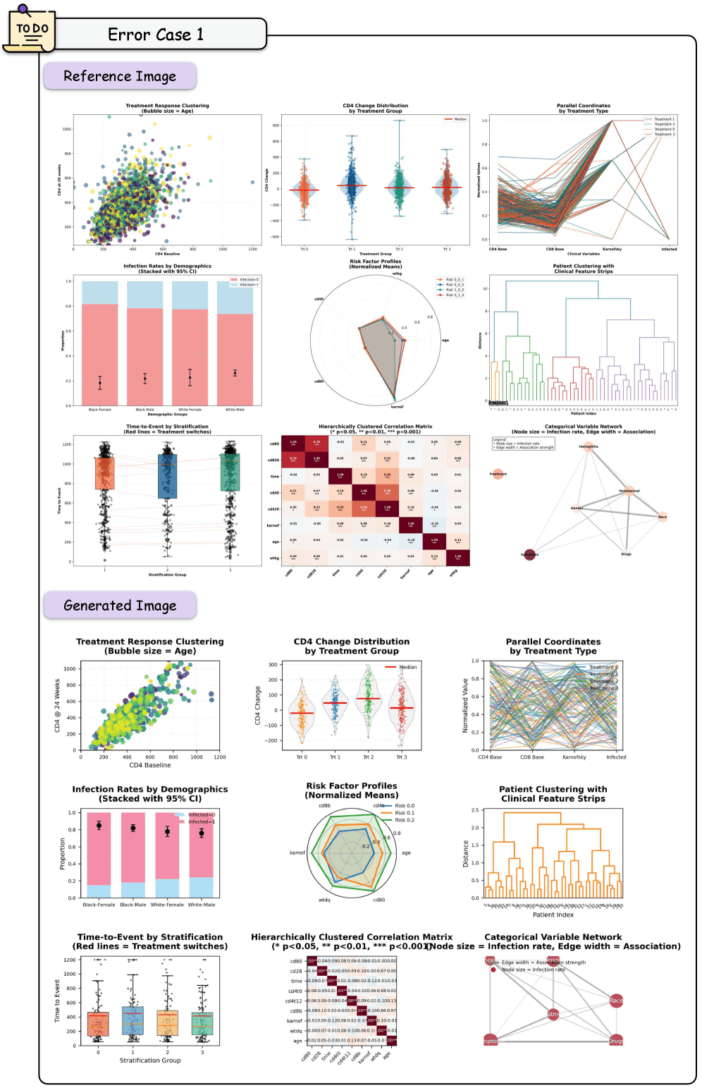 Reference chart on top, AI-generated version below. The model reproduces the individual subplots correctly but fails at spatial arrangement, with text and elements overlapping. | Image: Zhang et al.
Proprietary models like Claude 4.5 and GPT-5.1 rarely produce syntax errors. Their weak spot is data assignment: the visual structure looks right, but individual data series end up on the wrong axes, or visual attributes don’t match what was specified.
Iterative refinement is another sticking point. The researchers describe a pattern they call “regressive editing”: when models are asked to fix one error, they frequently break previously correct parts of the code in the process. Even the best models struggle to balance local edits against the overall consistency of the code, the paper notes.
Automated evaluation lines up with human judgment
For scoring, the team uses a multi-agent system that rates generated visualizations on a three-level scale across eight criteria, including chart type, spatial layout, text elements, axis configuration, and color scheme.
The automated evaluations match human expert judgments with a Cohen’s Kappa of 0.83, indicating strong correlation. Agreement among the agents themselves reached a Fleiss’ Kappa of 0.82.
The researchers acknowledge the benchmark is currently limited to Matplotlib as a visualization library, and automated scoring may miss subtle visual artifacts like minor element overlap or precise color nuances. The benchmark and its code are available on GitHub and Hugging Face.
Google’s PaperBanana research project showed earlier just how tough sophisticated visualizations are for AI image generators. Five specialized AI agents work together to generate scientific charts from text descriptions. Visualization fidelity lands at 45.8 percent, below the human reference, but human reviewers still preferred the results over plain image generation in nearly 73 percent of cases. For statistical plots, PaperBanana also falls back on Matplotlib code generation to boost numerical accuracy.