
Japanese overdesign is alternately hilarious and inspiring. ID students should be forced to study it. Because Japanese overdesign is about seeking out even the slightest inconvenience experienced while using an everyday object, then designing a solution for it.
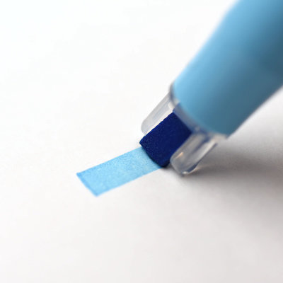
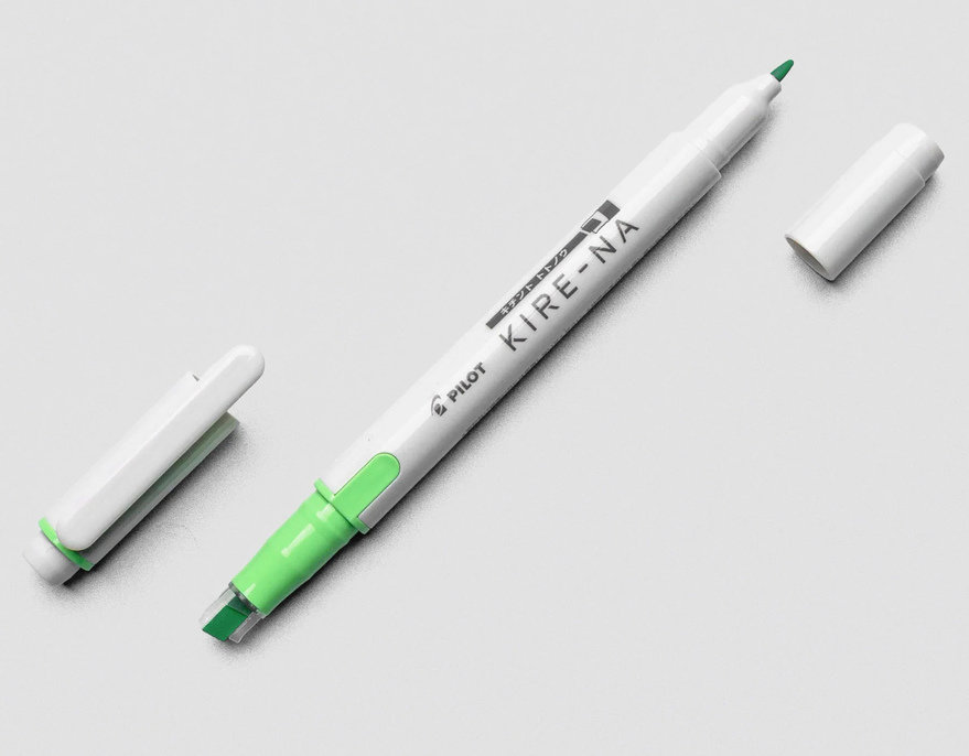
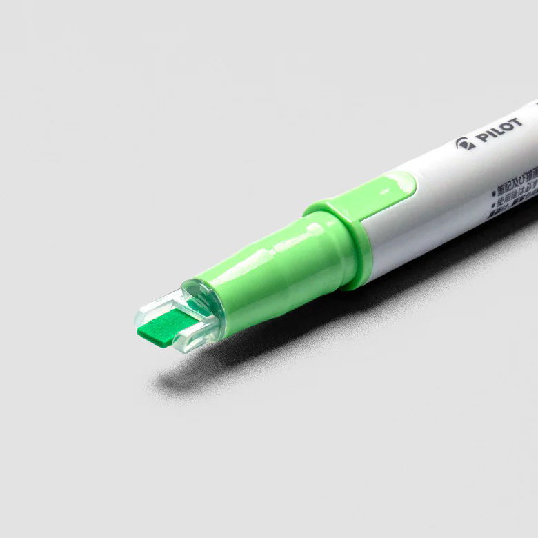
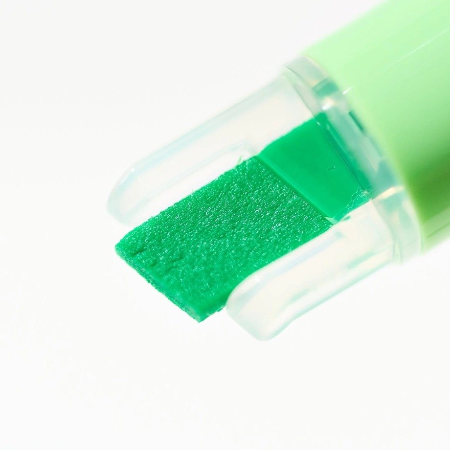
Pilot’s Kire-Na highlighter is a great example. Apparently the UX issue with existing highlighters, Pilot’s designers found, is that users cannot consistently modulate pressure. This leads to blotchy, inconsistent highlighting or bleed-through, both of which have been deemed intolerable. They thus added two protrusions on either side of the chisel nib which act as pressure guides:
Here’s the development story, according to Japanese stationary retailer Bungu:
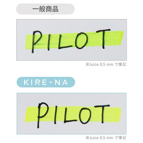
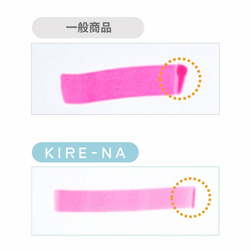
Lines never go straight. The ink smudges. It bleeds through the page. The tip gets dirty. Everyone just accepted that’s how highlighters work. Pilot didn’t.
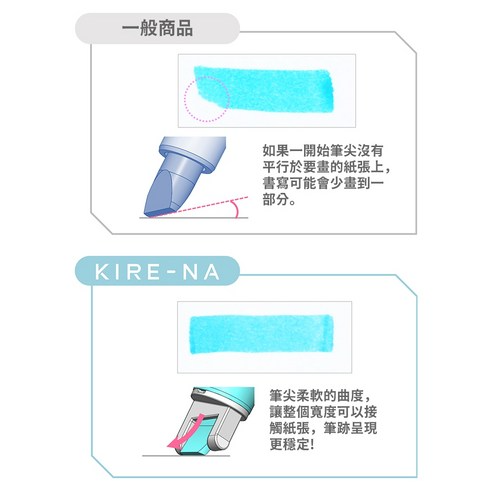
Six years of development. The project got shut down and restarted from scratch. They came back with a new soft nylon tip with plastic guides that control angle and pressure for you. Straight lines no matter how you hold it. A new ink that dries in one second. No smudging, no bleeding, no dirty tip.
They called it KIRE-NA, meaning “clean” in Japanese. Over ten million shipped in year one.

Six years? And ten million units? The Japanese market is fascinating.