
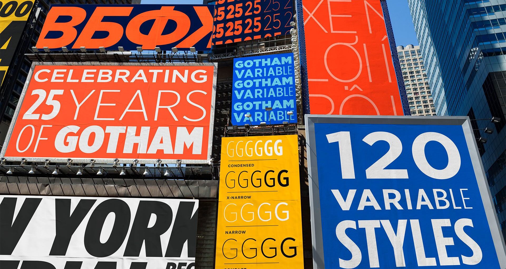
One of the most popular typefaces in the world, Gotham, has been upgraded by Monotype. Say hello to Gotham Variable, a major evolution of the iconic typeface, which introduces continuous control across weight and width in a single, performance-optimised file.
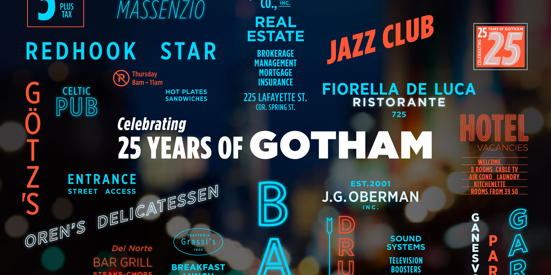
Gotham, designed by Jonathan Hoefler and Tobias Frere-Jones and published by Hoefler & Co., has been involved in various elements of global communication since it launched publicly on the January 2001 cover of GQ. It has been used by brands the world over, including Netflix and Coca-Cola, the United States Postal Service and Saturday Night Live. Twenty five years later, it enters a new era that enables a new level of creative control and adaptability.
Gotham Variable consolidates multiple static files into a single streamlined file, which improves performances, reduces load times and simplifies implementation across platforms. It’s also highly adaptable, working seamlessly across screens, systems and contexts while maintaining Gotham’s iconic qualities. There are also 54 new intermediate styles, including subtle new shades of weight and a new Compact width.
Latest Videos From

You may like
Why has it been upgraded now? “We’re at a point with variable fonts that they are more what we have come to expect from a workhorse family, rather than an experiment, an add-on, or a nice-to-have,” explains says Sara Soskolne, previously senior designer at Hoefler & Co., now executive creative director at Monotype and lead designer for Gotham Variable.
“Reverse engineering variability into an existing and very widely used family is a trickier task than creating a new family that’s conceived as variable from the start. Since Gotham was not designed with variable functionality in mind, I think it made sense to wait a little to make sure variable fonts had reached a critical mass of adoption and expectation before embarking on creating a variable version of a family like Gotham.”

(Image credit: Monotype)
Gotham was also an obvious choice for an upgrade. “Gotham has spent 25 years earning an extraordinary kind of trust, from political campaigns to billboards, and across some of the world’s most iconic brand identities,” explains Sara.
“With Gotham Variable, we tried to imagine what this typeface could become without losing sight of its powerful legacy. Many of the styles in Gotham Variable have never existed before. Making them feel like they always belonged was the hardest part, and the most essential.”

(Image credit: Monotype)
As well as its technical improvements, Gotham Variable features expanded language support, including Vietnamese, supporting complex diacritics, stacked accents and tone marks. It also includes enhanced Cyrillic and Bulgarian.
“Adding language support to an existing typeface family is no quick and easy task. Getting the proportion and style right for these new glyphs was essential to stay true to Gotham’s DNA. Particularly for the hook and horn, matching Gotham’s expressiveness was key,” says Jordan Bell, senior type designer at Monotype.
For Sara, the connection to Gotham was personal: “My relationship with Gotham stretches back nearly 20 years, which is when I first started collaborating on expansions to what was then still quite a small family. This progressed from smaller initial forays, like adding extended numeric sets and expanded Latin language support, to filling in the width range between Gotham’s original and Condensed extremes to create what became its full 66 styles that were released in 2009; and then to expanding that entire family to cover the Greek and Cyrillic scripts for its 2015 release.
“More recently, I worked with Manual Creative on several bespoke decorated styles of Gotham Condensed for the Obama Foundation, which was a lovely way to reconnect to the family and sort of test the limits of how far it can be pushed while still feeling like Gotham before leading this new Variable expansion.
“And, living in NYC this whole time, on a personal level I’ve had the good fortune of living with some of Gotham’s vernacular sources in signage around the city, to the extent these still exist.”
What to read next
(Image credit: Monotype)
In terms of challenges on this project, there were a few key issues: “To my mind, the main challenges came from the fact of grafting things like variability and Vietnamese language support onto an existing family,” says Sara.
“In adding variable functionality, suddenly all the spaces in between Gotham’s static styles – which were where we hid the sleight of hand involved in making them look the way they do – are now visible and completely accessible to users. So we had to be very intentional and critical about how that was handled.
“In adding Vietnamese support, because it’s a language that includes stacked accents (which often require more vertical space to incorporate), but we couldn’t go changing the line height of Gotham, we needed to include these across the whole design space without them feeling cramped or crowded.
“Underlying all of this is the temptation, once you’re opening up the hood, to turn this into a Gotham 2.0 and revisit some of those very early decisions that are causing some trouble later on. But we agreed very early on to keep this new expansion fully backwards compatible and only expand what’s available to users, not to change anything that existed previously, which I think was absolutely the right call.”
I asked Sara which element on Gotham Variable she was most proud of: “I’m probably most proud of how this all came together to create a variable version of such a beloved family that still feels utterly like Gotham at every moment.
“Since I wasn’t one of the original designers of Gotham, but have increasingly become its custodian over the years, I have a deep sense of responsibility to the intent behind it and the DNA that was created by those original designers. That can make some decisions (such as adding new styles) feel more challenging, but it also means it feels more rewarding when I get it right.
“So, I’m particularly excited about the new Compact width we’ve added in between the original and Narrow widths, which is meant to visually look just like the original width but set more efficiently in text.
“And even after staring at it for months, I never get tired of playing with the variable width slider and watching those stroke endings change their orientation in between the Extra Narrow and Condensed. There’s still plenty sleight of hand in this version, we just had to find different places to hide it!”
Gotham Variable is available on Monotype Fonts, Monotype Connect and MyFonts. Find out more about Gotham Variable.
Creative Bloq is now easier to access than ever before with our on-the-go app, which brings you all the content you know and love from our website, but in a super-streamlined design.