
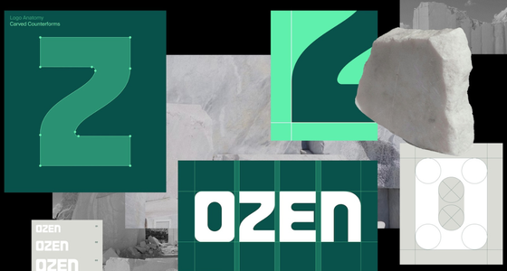
Colour plays a strategic role throughout the identity. A deep green gives the brand a more premium presence and stronger shelf stand-out, while a brighter green retains the freshness cues consumers expect from oral care. This balance allows the brand to feel familiar enough to inspire confidence, yet distinctive enough to avoid becoming another anonymous toothpaste pack.
Typography follows a similar principle. A bold, sculptural logotype is paired with clean, highly legible geometric sans-serif typefaces, balancing authority with accessibility and ensuring the brand remains easy to navigate and understand.
The overall system is deliberately restrained. Rather than relying on the claims-heavy visual language common across the category, the identity uses clarity and simplicity to create confidence, reflecting the reassurance sensitivity sufferers are seeking when choosing products.
Harry Zalk, Co-Founder & CEO, OZEN, said: “We weren’t interested in launching another toothpaste brand that looked and behaved like everything else in the category. OZEN is built on genuinely new science, and we wanted an identity that reflected that.
“Mother Design have created a brand that captures both the rigour behind our technology and the curiosity that led to its discovery. They’ve helped us turn a scientific breakthrough into a distinctive brand experience, giving us the presence and confidence to challenge some of the biggest names in oral care.”
Jo Tulej, Creative Director, Mother Design, said: “Oral care is one of those sectors where playing it safe has become the riskiest move of all. At one end of the market you have trusted clinical brands, and at the other a new generation of challengers that look different but don’t always offer something genuinely new.
“OZEN had a real point of difference, so our challenge was to create a brand that reflected that while still feeling credible and trustworthy. We wanted to keep the cues that help people navigate the category, but move away from the conventions that have made so many brands feel interchangeable. That’s where the real design work happens.”
Cecilia Serafini, Design Director, Mother Design, added: “What made OZEN so compelling was the story behind the science. The technology itself emerged from the intersection of art and experimentation, so we wanted the identity to reflect that tension.
“Every design decision was carefully calibrated. The sculptural logo, the use of green, the structural graphic language and the restrained typography all work together to create something that feels both clinically credible and unexpectedly human. In a category full of visual noise and familiar conventions, we wanted OZEN to feel confident, clear and genuinely new.”
Andy Medd, Co-Founder of Mother and Broody, said “Working with the OZEN team has been the perfect Broody partnership, where our role is to bring Broody’s commercial and marketing expertise together with Mother’s creativity in design and communication. We are very excited for the future of OZEN.”
The work spans brand strategy, positioning, visual identity, packaging, digital experience and communications, creating a distinctive new brand world that is now rolling out across packaging, digital channels and customer touchpoints as OZEN launches nationwide in Boots.