

Comment: There seems to be renewed attention on the continued flat-lining of NZ house prices. As but one example, “house price” was mentioned 35 times in the August Reserve Bank (RBNZ) Statement. The previous (May) Statement issued only five such mentions.
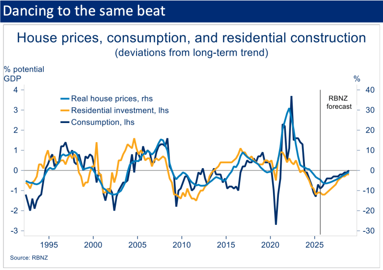
Some of this was about attributing part of the soggy economy to undershooting house price inflation. But the RBNZ also fleshed out the strong tie-up in its forecasting framework between the house price cycle and expected recoveries in residential construction and household consumption (chart below). In short, and for better or worse, a fair bit rides on what happens to house prices from here.
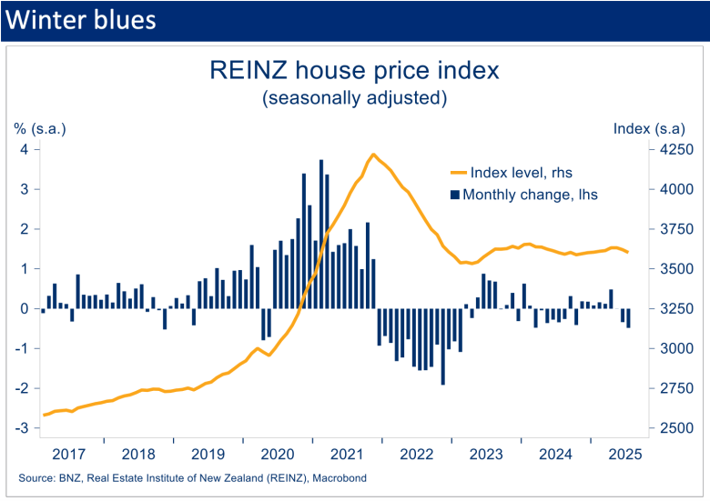
Like the RBNZ, we doubt we’ll see much lift this year. Already, recent REINZ data show the prior tentative recovery in the House Price Index petering out. After seven consecutive (seasonally adjusted) monthly increases, small falls in the index were recorded in June and July.
It’s possible this was part of the broader mid-year economic wobble. That appears to be steadying and house prices may do likewise. The RBNZ’s new-found intent to cut interest rates further could also inject a little more pep into the market over the remainder of the year.
However, this needs to be balanced against still heightened supply. A strong month for new listings in August pushed available housing inventory back up to near 10-year highs (s.a.). That’s just as the previous four months of data were hinting at the beginnings of an inventory run-down.
The upshot is that even if housing demand continues to find its feet, there remains plenty of supply to absorb it. This, alongside continued weakness in the labour market, means we’ve nudged our annual house price inflation forecast down to 1% for this calendar year.
If that proves close to the truth, prices will end the year back around early 2021 levels, or 2020 levels in CPI-inflation-adjusted terms.
Flattish house prices may not have done much for the so-called wealth effect and hence the broader economic recovery, but the flipside has been a noticeable improvement in housing affordability metrics.

Start your day informed. Make room for newsroom’s top stories. Direct to your inbox daily.
That’s not just because house prices have stopped rising. Some of the other drivers of affordability have been moving in a helpful direction as well. To get a sense of the overall impact of these developments, we’ve refined and updated our housing affordability index.
The crux of the index is that, of the many factors affecting housing affordability, there are three core components: the size of the required deposit, the cash required to service a mortgage, and the household incomes used to pay these bills.
It’s just one of many ways you can skin the affordability cat so our affordability measure should be interpreted as a general steer only. The index gets at ‘the average’ and the reality is that any particular situation will be different.
You can interpret the index as the average cost of a deposit and first year of debt servicing payments, expressed as a multiple of the average household disposable income (the box below has the full description).
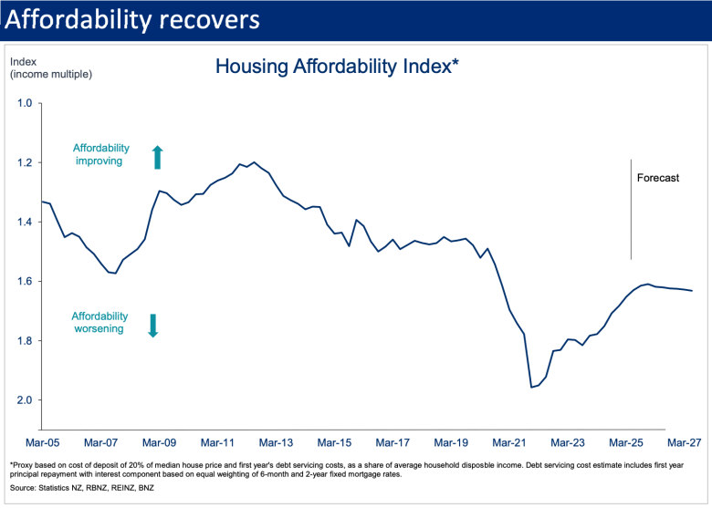
From a starting position of severe unaffordability, the past few years have seen house prices (in most regions) decline, mortgage rates cut, and wage growth – while having slowed – continue to chug away in the background.
According to our index, the combination of these factors puts housing affordability at the least bad level since December 2020. Relative to the index low point in December 2021, the median house is about 17% more affordable, but that’s still 7% less affordable than March 2020.
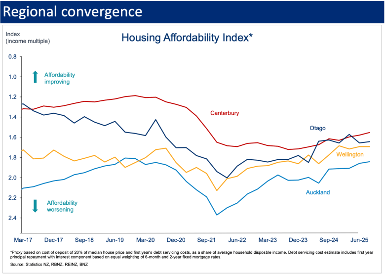
Over the past 12 months Auckland and Wellington have seen the largest affordability improvements, although they remain the most unaffordable regions outright. In contrast, such has been the outperformance of the Otago housing market, there’s been no obvious change in the index there despite falls in debt servicing costs and solid income growth. More generally, the degree of regional convergence over the past few years stands out.
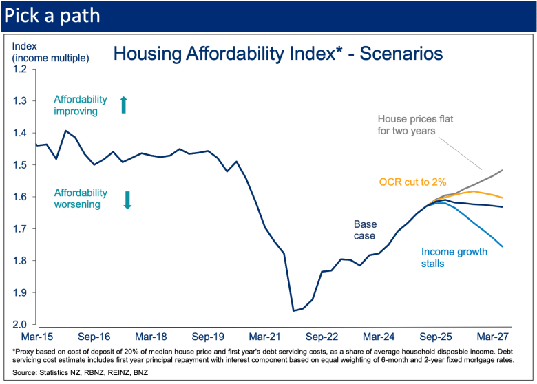
Looking forward, plugging in our forecasts for house prices, income growth, and mortgage rates sees the nationwide index basically hold its ground from here. In behind this flattish forecast is the affordability impost of small forecast lifts in house prices, and eventual mortgage rate increases, offset roughly evenly by growth in household incomes.
It’s still an improved outlook compared to our last look at the index two years ago. The difference being our softer outlook for both house prices and mortgage rates.
We’re quick to add that a forecast based on three forecasts leaves a huge amount of room for error! For this reason, we think there’s more value in using the index to examine a few scenarios. We do so below by changing one of the three variables and leaving the others constant (in reality there would be a degree of interdependence: e.g. stalled income growth would change interest rates).
These are illustrated below. A scenario in which the OCR is cut another 100bps pulls mortgage rates lower and delivers a modest affordability lift. Or a hypothetical stalling in income growth from here would, in isolation, erode about half of the post-COVID affordability improvement.
Of perhaps most interest, holding house prices flat for two years – a far from inconceivable scenario – would see the affordability index regain levels prevailing in March 2020. But only just, and with seven years having elapsed. It highlights how difficult it is to claw back affordability in the wake of a house price boom.
For the record, none of the above has much of a bearing on our house price view. It might be tempting to view the affordability improvement as allowing additional ‘room’ for house prices to rise. However, houses are far from affordable in absolute terms and other macro factors – the labour market, housing supply dynamics, interest rates, and population growth – tend to carry the day for the immediate house price cycle. As noted earlier, our best guess is that the net of these is pointing broadly sideways.
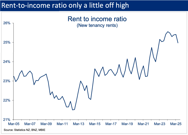
Finally, while we’ve focused on housing affordability here, it would be remiss not to point out that rental affordability metrics have not improved to the same extent. The median (new tenancy) rent still accounts for about 25% of average household incomes, down only a little from its highs.
Affordability index details
We assume a deposit of 20% of the median national house price. To this we add debt servicing costs in the first year (principal and interest), based on an 80% LVR and a 50/50 mix of 6-month and 2-year fixed mortgage rates. Those costs are then expressed as a multiple of the average household disposable income. In theory, the discounted value of future debt servicing costs should be included, but we’ve simplified for ease of interpretation.
Disclaimer: This publication has been produced by Bank of New Zealand (BNZ). This publication accurately reflects the personal views of the author about the subject matters discussed, and is based upon sources reasonably believed to be reliable and accurate. The views of the author do not necessarily reflect the views of BNZ. No part of the compensation of the author was, is, or will be, directly or indirectly, related to any specific recommendations or views expressed. The information in this publication is solely for information purposes and is not intended to be financial advice. If you need help, please contact BNZ or your financial adviser. Any statements as to past performance do not represent future performance, and no statements as to future matters are guaranteed to be accurate or reliable. To the maximum extent permissible by law, neither BNZ nor any person involved in this publication accepts any liability for any loss or damage whatsoever which may directly or indirectly result from any, opinion, information, representation or omission, whether negligent or otherwise, contained in this publication.