
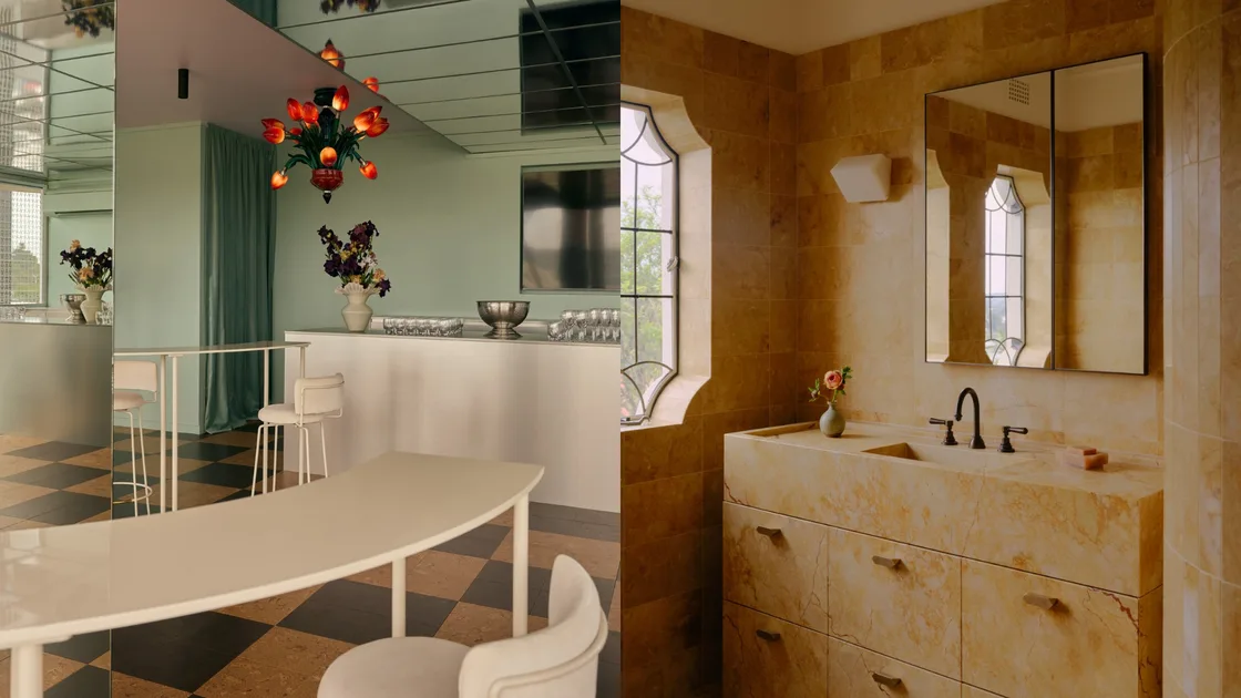
Colour, that most mercurial design feature, can set a mood, steal a scene or pull a room together. Across the projects shortlisted for the Belle Fanuli Interior Design Awards 2026, a compelling palette emerges, for the burnished glamour of gold and the expressive charge of sanguine red. Each hues brings its own particular temperament proving that colour is far more than a finishing touch.
Golden light
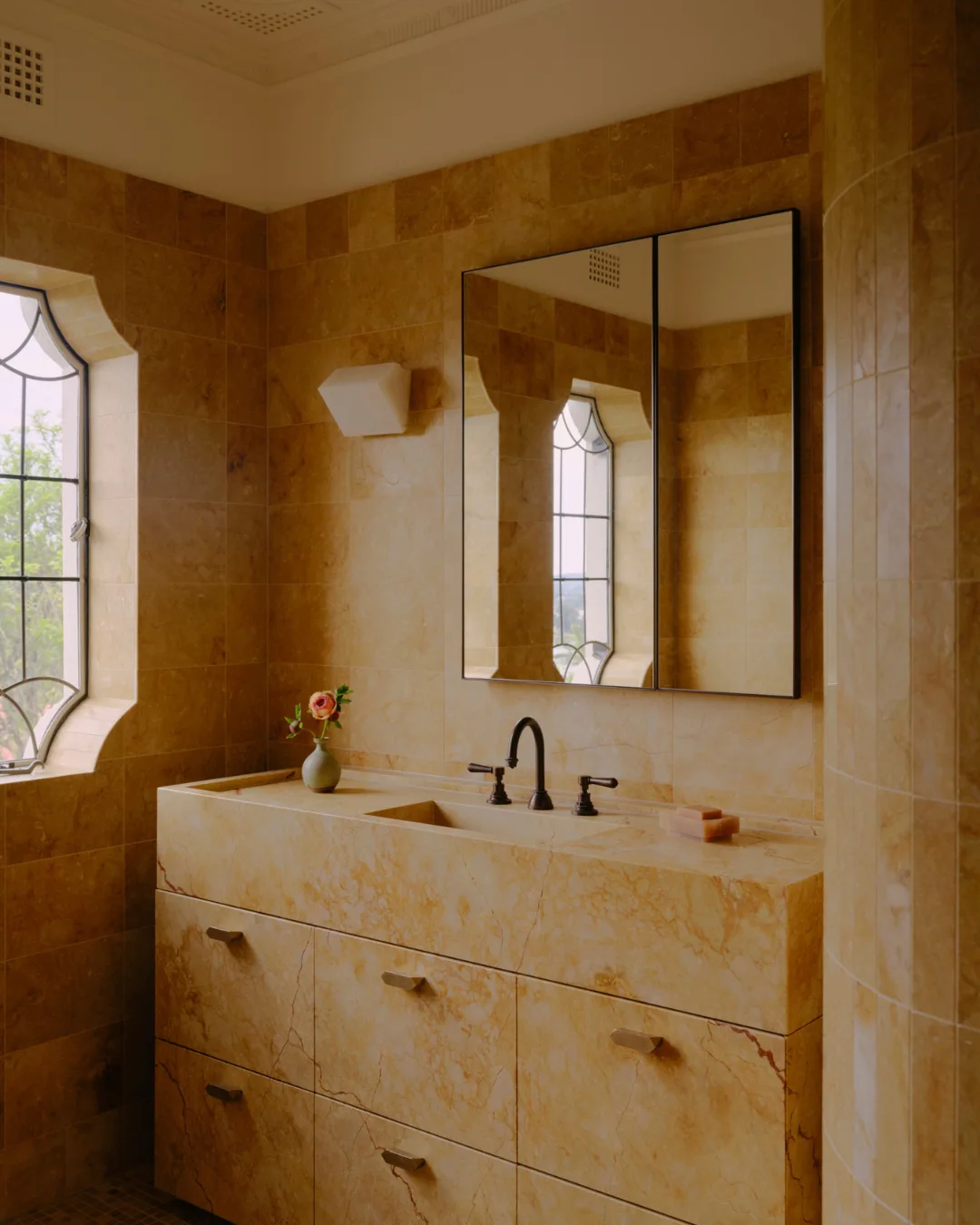
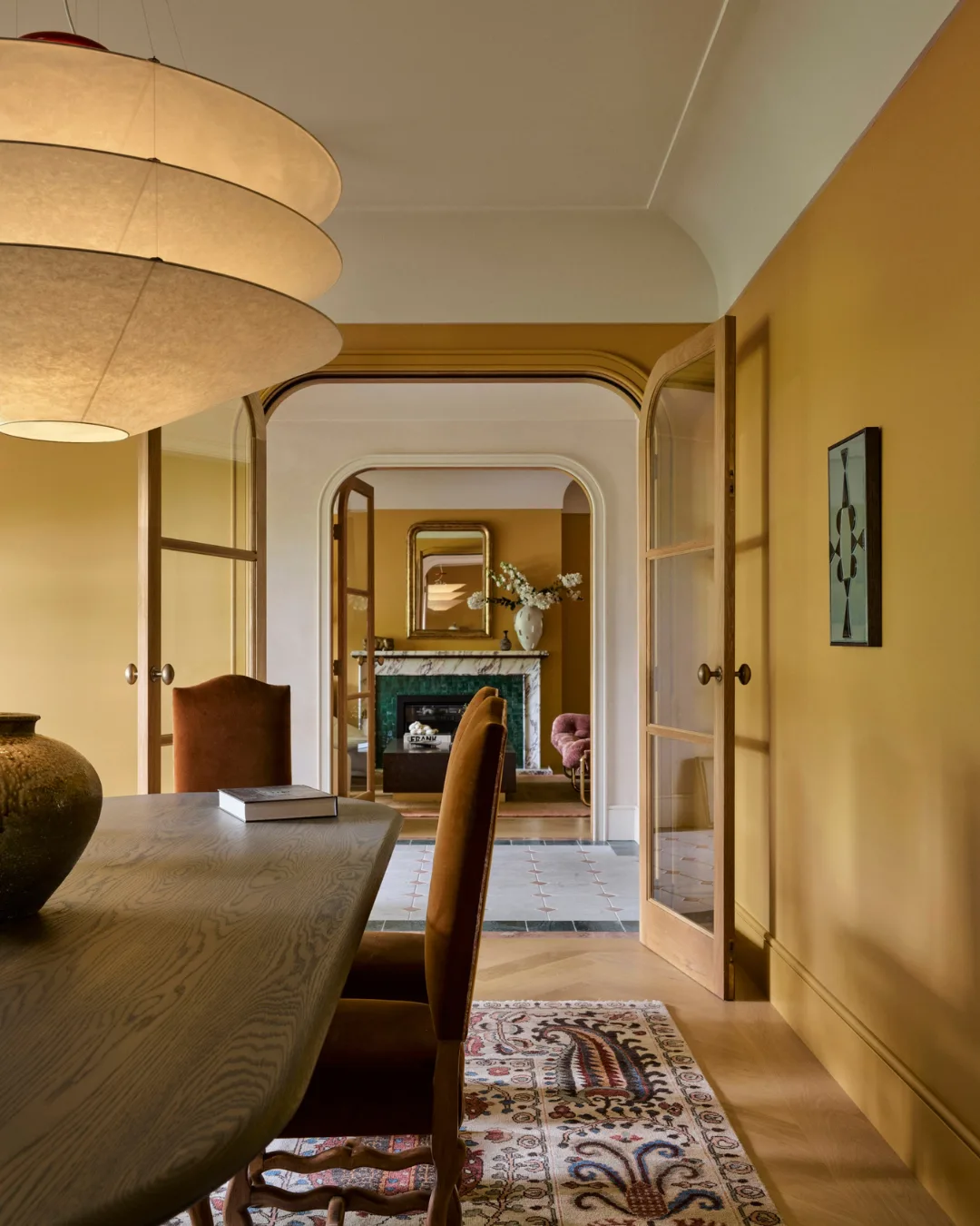
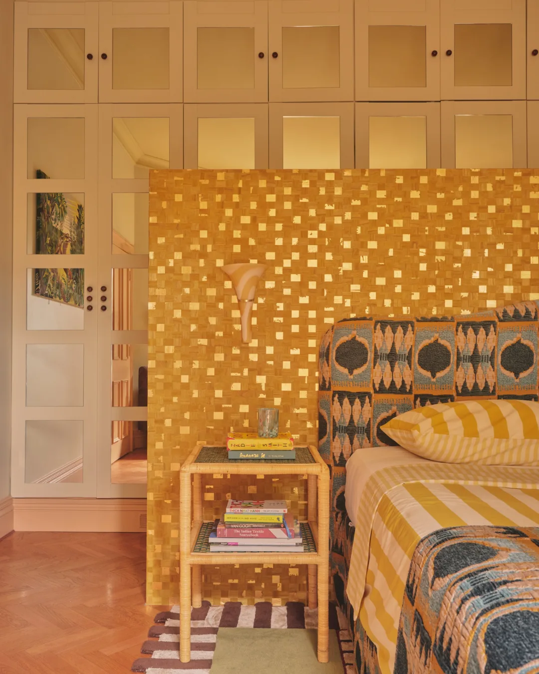
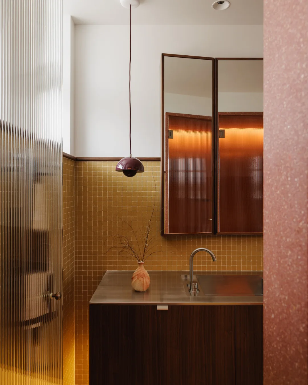
Curtain tones help amplify natural light infiltration, and golden hues do just that, imbuing interiors with a luminous quality. Yet the colour cannot be confined to a singular aesthetic, traversing a range of interior styles. In the residential bathroom of The Lookout by Lawless and Meyerson, golden hues enrobe the Art Deco-style bathroom, while similar tones feature in the main bedroom of Mix & Match by Britt Ross, a maximalist project in the illustrious city of London.
Green with envy
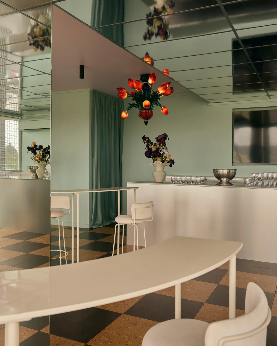
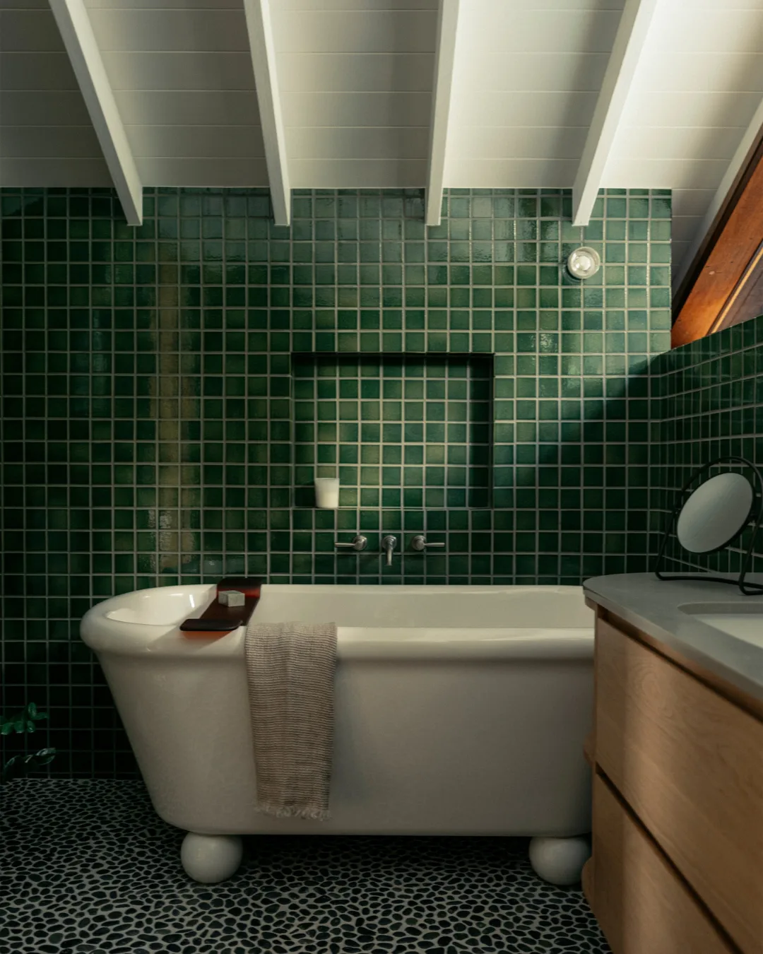
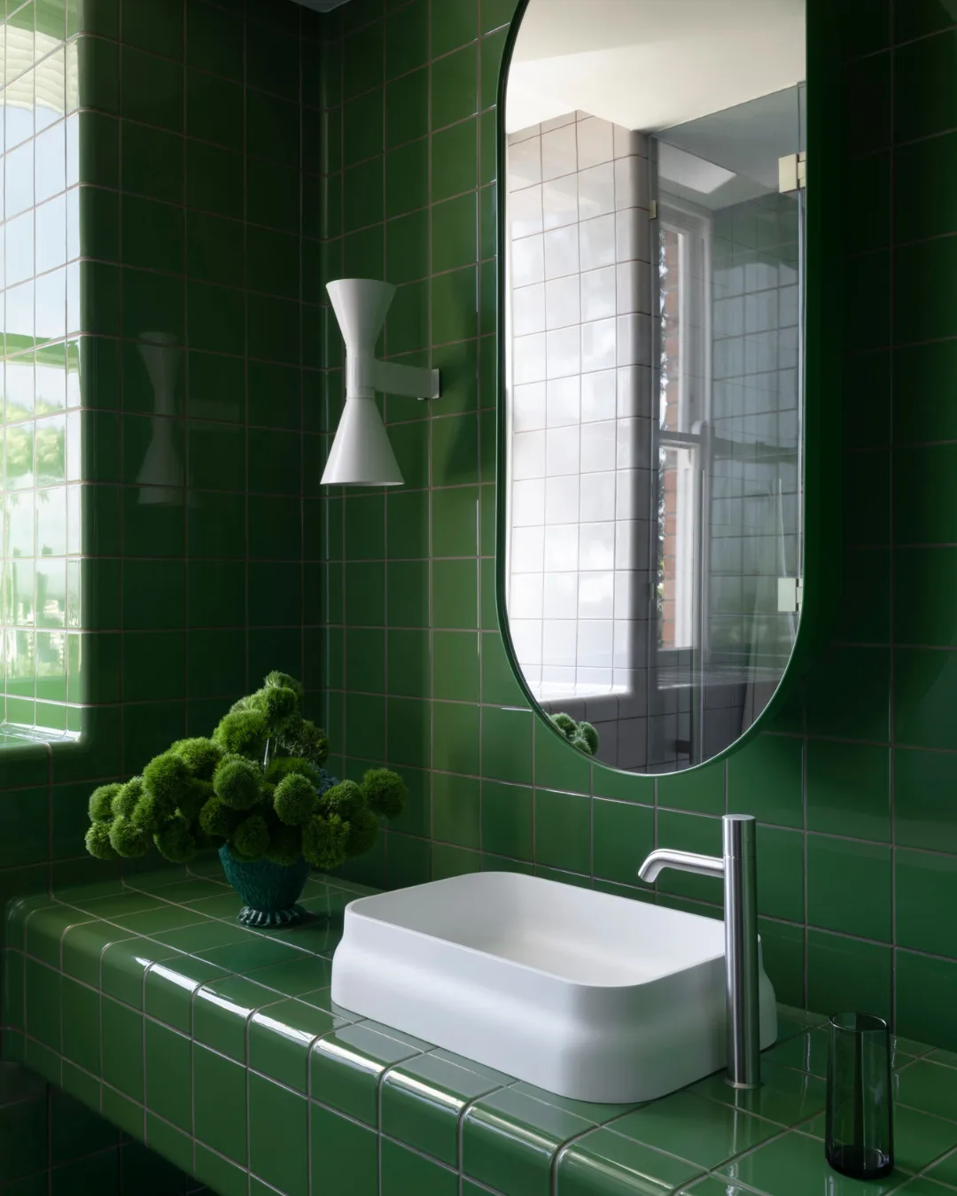
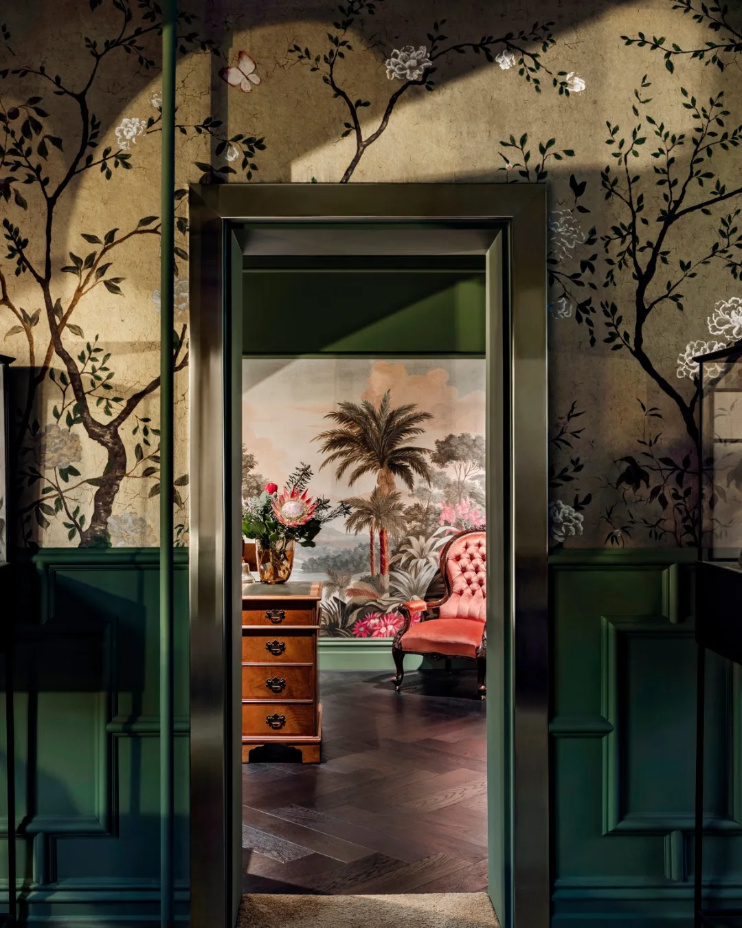
Green is used across a spectrum of interior styles, ranging from landscape-inspired schemes to more opulent applications of saturated colour. At Coalcliff House by Richards Stanisich, the tone of the interiors emulates the surrounding context, such as the bathroom enveloped in emerald-green tiles. Meanwhile, The Stylesmiths’ approach to The Wilde Rose by Trewarne Diamonds adopts a jewel-box like feel, where the forest green wainscoting is complemented by the green hues of the motif in the wallpaper.
A case of the blues
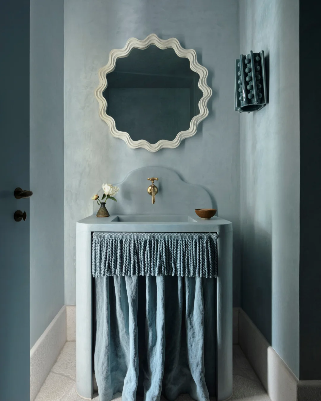
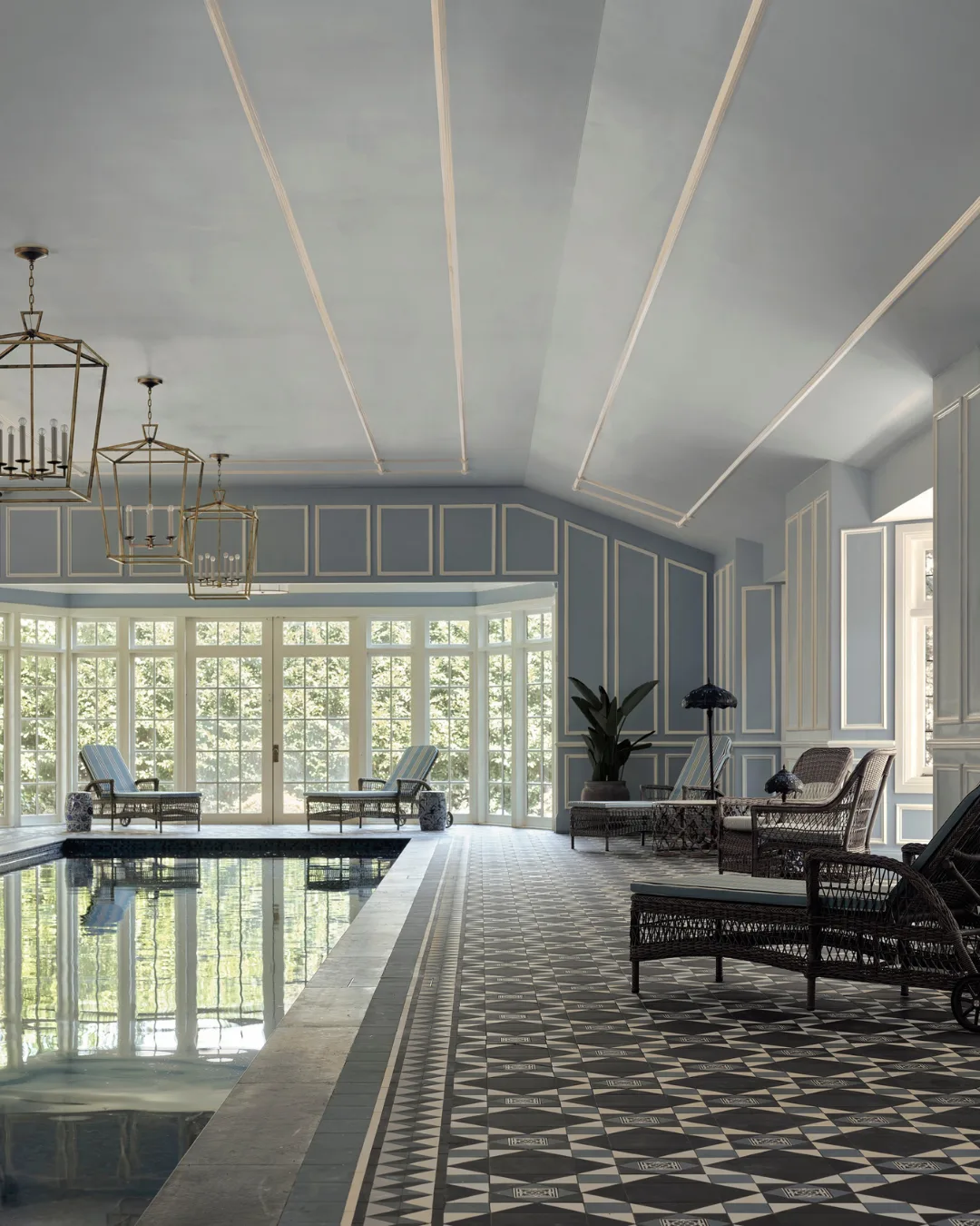
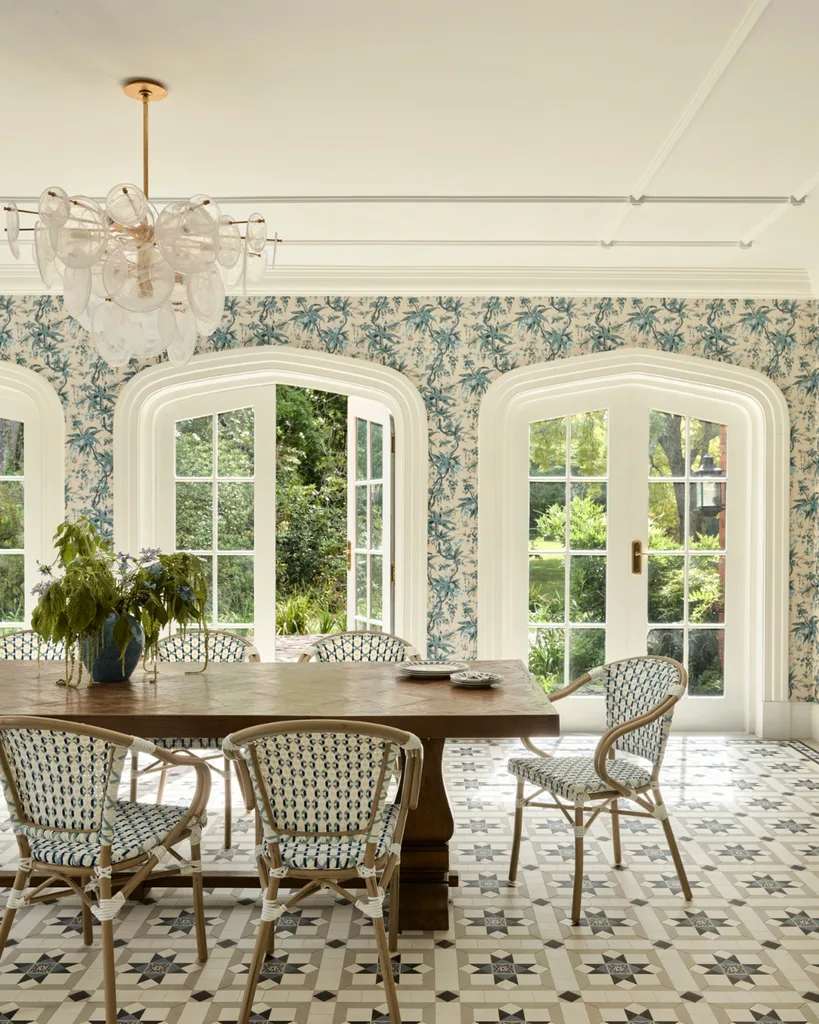
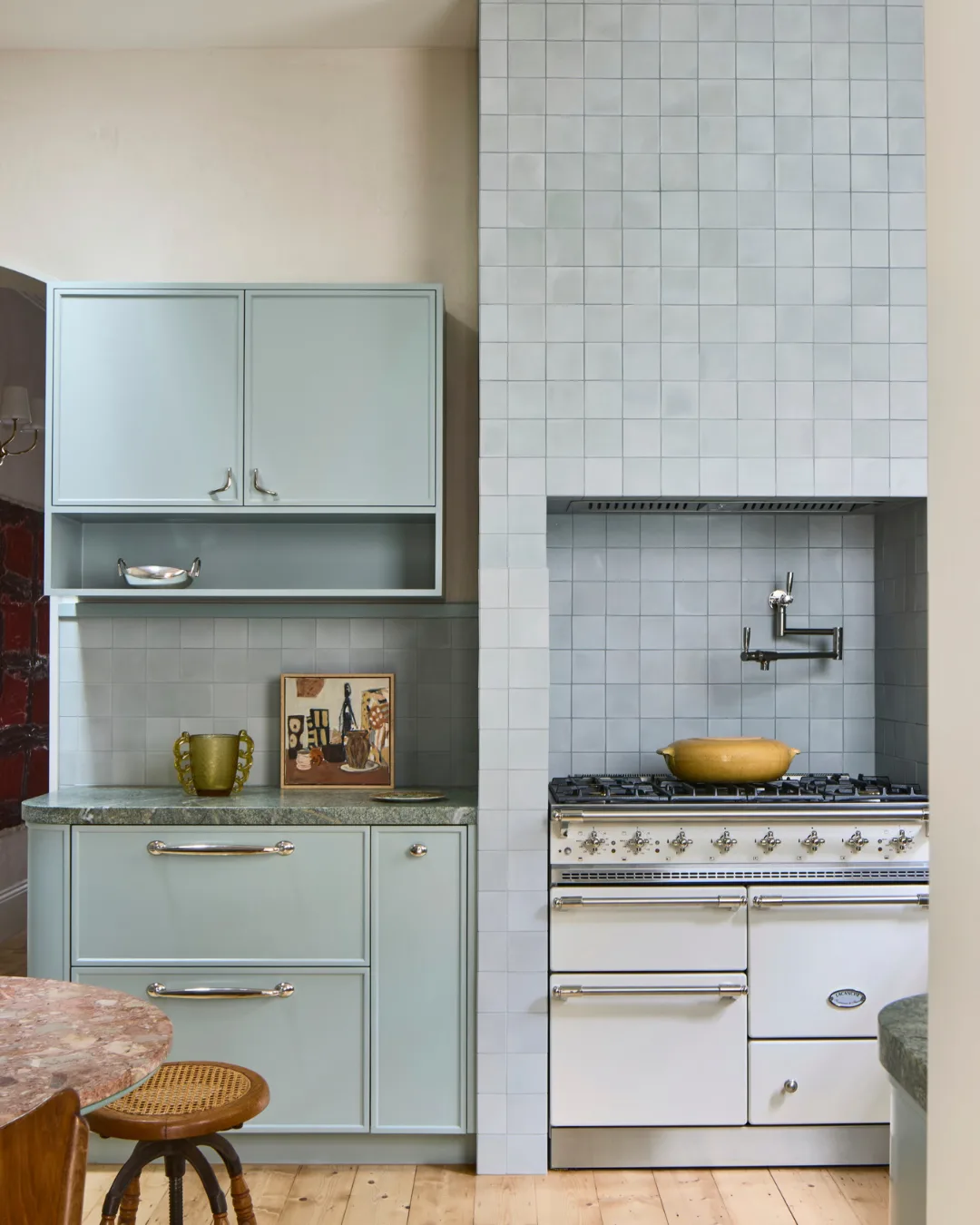
An alternative to white and ecru, the use of blue introduces colour to interiors while retaining a sense of calm, making it a versatile choice. Throughout Bondi Beach Villa by Handelsmann + Khaw, the family home makes a case for coastal living without the usual shorthand of whitewashed walls and sandy neutrals. Instead, varying shades of blue wash across the interiors, from the rooftop bar to the powder room, where baby-blue rendered walls are complemented by French-blue joinery and a linen sink skirt. Meanwhile, cool tones feature heavily within Exeter House by Greg Natale, from navy in the formal lounge to toile-motif wallpaper in the sunroom and icy hues on the pool room walls and ceilings.
Seeing red
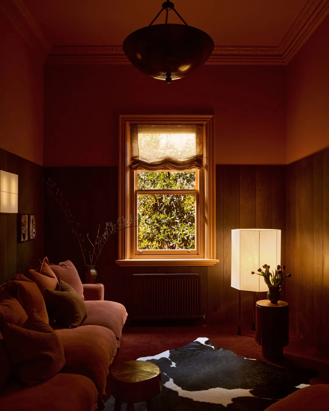
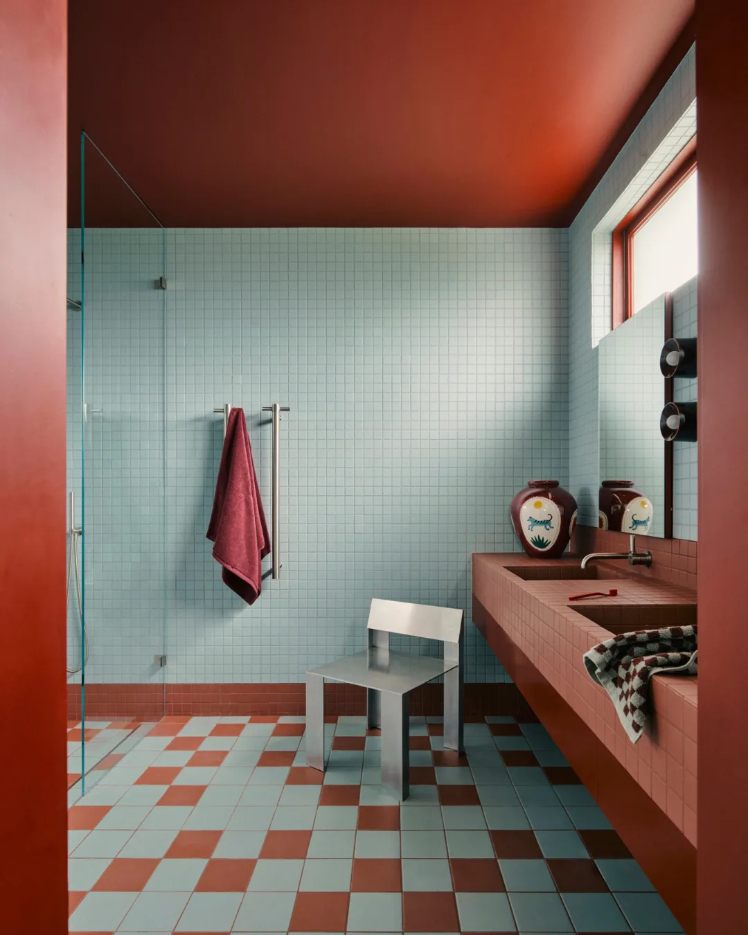
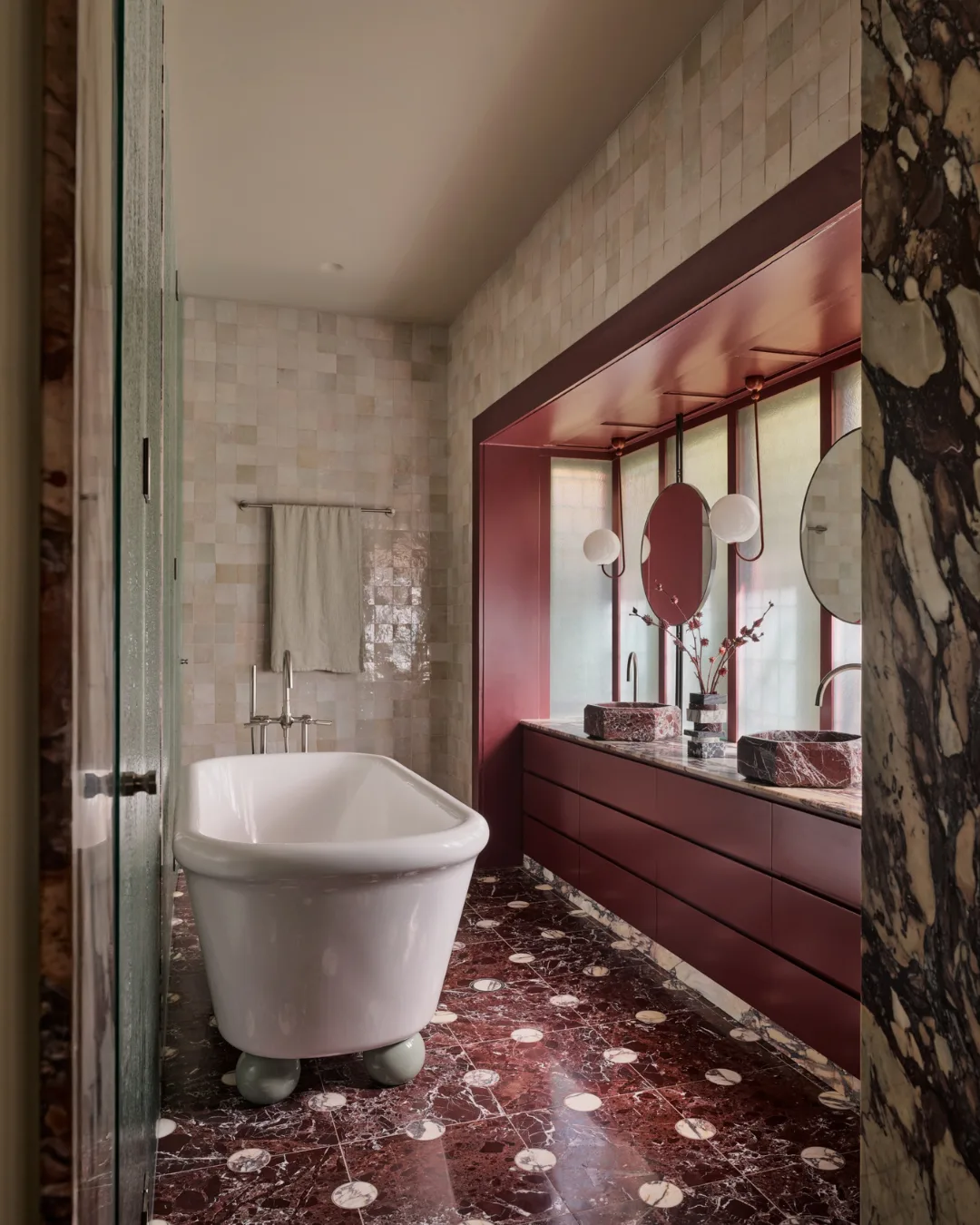
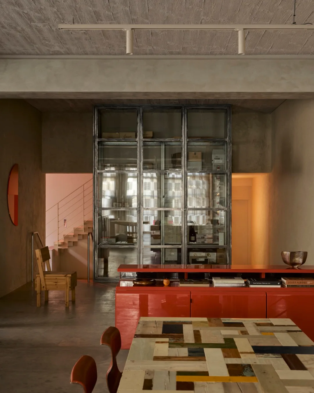
Long associated with intensity and its psychological effects, red can be a commanding presence in interior schemes. Yet these projects demonstrate how the bold colour can make a statement without overwhelming space. In Cinderella Deep by Geller Studio. red appears in glossy cabinetry and artwork, adding a striking accent. Meanwhile, Core House by Folk Studio pairs an almost terracotta shade with baby-blue tiles, in a defiance of bourgeois good taste.

Senior Content Producer
Saskia Neacsu
Senior Content Producer