Ask a designer which typeface they’re using and you’ll often get a considered answer. Ask which one they actually reach for at the start of a new project, and the truth may be more revealing. That’s essentially what we did in Creative Boom’s annual State of Creativity survey… and the results are in.
The fonts that have come up most often aren’t obscure newcomers trying to signal distinction. They’re workhorses, classics and a few sharper, more characterful choices that suggest designers know exactly what they want: type that works hard and holds its own.
Helvetica, Poppins and Futura lead the count by some distance. But further down, the picture gets interesting. The presence of Inclusive Sans reflects a genuine shift in thinking about accessibility, while Bricolage Grotesque, Degular, Trim Poster and Aeonik suggest a growing appetite for type with a bit more texture and personality.
Here are the 15 typefaces our community can’t stop using and admiring in 2026.
Our number-one entry is not the biggest surprise. The neo-grotesque, designed by Max Miedinger and Eduard Hoffmann in 1957, remains the most-nominated typeface in our survey by a considerable margin. Critics argue it’s the lazy choice: safe, ubiquitous, characterless. Defenders point out that neutrality is a feature, not a bug. Either way, Helvetica Now, Monotype’s 2019 update with three optical sizes for micro, text, and display use, has given this timeless font fresh relevance for the digital age. Nobody gets fired for using Helvetica.
Helvetica Now via Monotype
This geometric sans-serif from the Indian Type Foundry, designed by Ninad Kale and Jonny Pinhorn, is one of the most downloaded typefaces on Google Fonts. Its near-monolinear letterforms, generous x-height and clean geometric construction give it a friendly, modern feel that works across fintech apps, lifestyle brands and nonprofits alike. A free font with a full range of weights, it supports both Latin and Devanagari scripts.
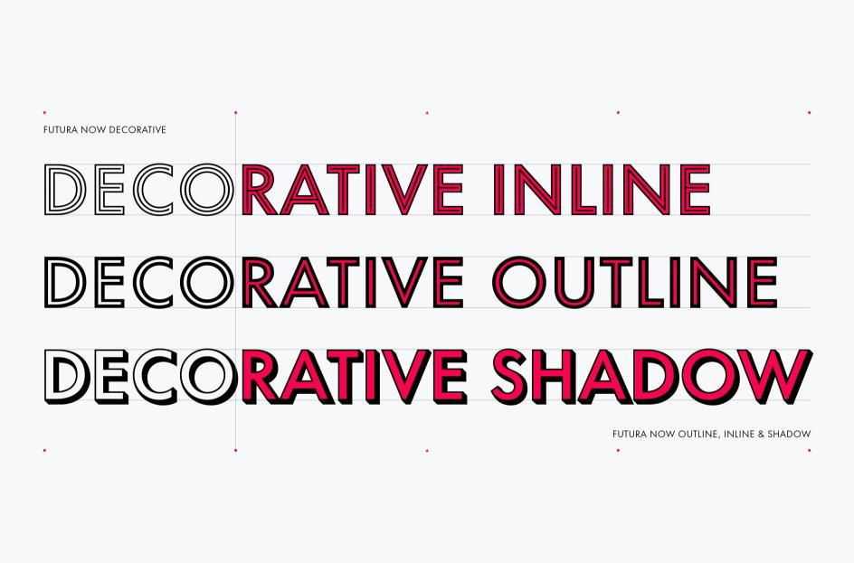
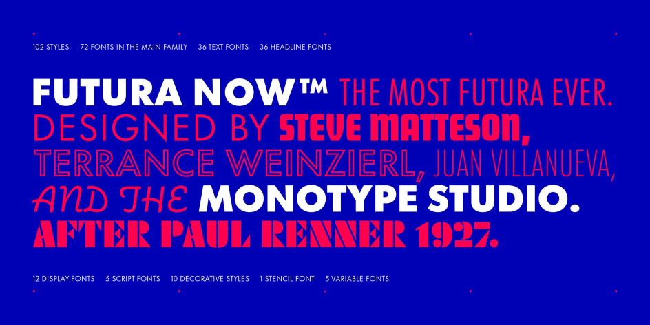
Paul Renner’s 1927 geometric masterpiece is nearly a century old and still feels contemporary. Built from circles, triangles and straight lines in the spirit of the Bauhaus, it’s seen everywhere from Wes Anderson’s title sequences to campaigns for Louis Vuitton, Nike and FedEx. Its low x-height gives it an elegant, almost classical quality at display sizes. For designers seeking geometric authority, Futura remains the obvious choice. It’s also another one to get the Monotype treatment, refreshing it for the digital era with the launch of Futura Now.
Designed by Rasmus Andersson and released in 2017, Inter has become the defining UI typeface of the current era. Created for screen legibility, particularly at small sizes, it features a tall x-height, open apertures and ink traps that improve legibility in dense interfaces. Free, open source and available as a variable font, it was one of the most accessed Google Fonts in the 12 months to May 2025. Its presence here alongside Helvetica and Futura suggests it’s earned the status of a modern classic.
Designed by Australian type designer Olivia King and released as a fully variable family on Google Fonts in 2025, Inclusive Sans was built around accessibility research. Its non-mirrored letterforms, wide-open counters, higher x-height, and generous spacing are designed to support readers who are visually impaired or neurodiverse. Crucially, though, it doesn’t look like a compromise, sporting the confidence of a contemporary neo-grotesque.
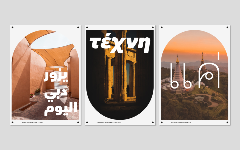
Adrian Frutiger designed Avenir in 1987 and considered it his finest work. Like Futura, it takes the circle as its formal basis, but with a humanist adjustment that makes it warmer and more comfortable over long text. Amsterdam uses it as its corporate typeface, Disney+, Bloomberg, and Snapchat have all put it to work, and it’s been bundled in various forms with iOS and macOS since 2012. In short, Avenir has become quietly omnipresent in a way that feels earned rather than imposed.
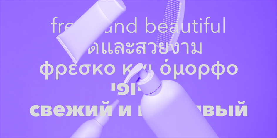
More recently, its evolution has gone global. With Avenir Next World, Monotype expanded the family to support over 150 languages and scripts, from Arabic to Thai, making it a truly international workhorse for brands operating across borders.
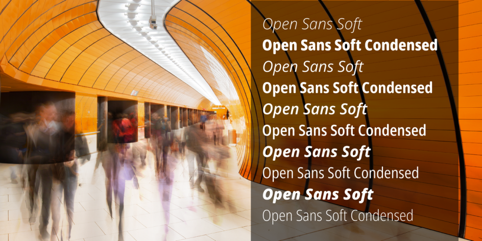
Steve Matteson’s humanist sans-serif, released by Google in 2011, has been one of the most widely used typefaces on the internet for over a decade. Its wide apertures, large x-height and neutral-but-friendly character make it a reliable workhorse for web and app interfaces. In an era of increasingly sophisticated type choices, Open Sans persists because it simply does the job without complaint.
Berton Hasebe’s ultra-condensed, aggressively bold display family was commissioned by Bloomberg Businessweek in 2011 and went on to become one of the most ubiquitous—and polarising—typefaces in editorial and brand design. Inspired by Barbara Kruger’s typographic installations and the tight headline culture of Willy Fleckhaus’s Twen magazine, Druk starts at Medium and goes up to Super, with no light weights to soften it. In an era of neutral grotesques, its blunt graphic power still cuts through.
Oswald Bruce Cooper’s extra-bold 1922 display face is soft, rounded and deeply warm; the temperamental opposite of Helvetica. Over time, it’s become a part of a shared cultural history, appearing everywhere from Pet Sounds and Ziggy Stardust to storefronts worldwide. And right now, in an era of sleek geometric sans serifs, its tactile, analogue personality has a distinct appeal for brands that want to feel human.
Designed by Christian Robertson and released with Android 4.0 in 2011, Roboto is Google’s household neo-grotesque, with a mechanical skeleton and friendly, open curves. Its nominations here likely reflect how embedded it is in designers’ daily lives: it is not only the default on Android but also powers Google Maps, YouTube and Google Play.
Designed by Mathieu Triay and available for free via Google Fonts, Bricolage Grotesque represents a growing interest in type that carries emotional and cultural weight, alongside technical utility. Drawing from Antique Olive, the Grotesque series by Stephenson Blake and the compressed energy of Grotesque Nº9, its exaggerated ink traps give it real character at display sizes.
James Edmondson’s deliberately understated offering from OH no Type Co is, by his own description, an attempt to make something boringly useful: a grotesque as reliable as the Arial lettering on a Mexican restaurant sign. The irony, as Edmondson admits, is that in trying to remove his personality from the work, he failed. Degular is, then, best thought of as a quality grotesque, without the cultural baggage of Helvetica.
Designed by Letters from Sweden, Trim Poster is a condensed display family built to solve a specific problem: tight-leading headlines with diacritics, which cause visual collisions in Swedish, German and French text. Available in eight weights, from Skinny to Fat, with stylistic sets for different diacritics, this is a deeply practical typeface that also happens to look fabulous.
Designed by Mark Bloom and Joe Leadbeater and released by CoType Foundry in 2019, Aeonik is a neo-grotesque with a geometric skeleton. Its strict perpendicular terminals give it mechanical precision, while its rounded bowls provide warmth. Used by Revolut, Eurosport, and Virgin Hyperloop, the platform added support for Arabic, Hebrew, Thai, and Hangul across more than 340 languages in a 2025 expansion. This is a young typeface, but one that’s building real momentum right now.
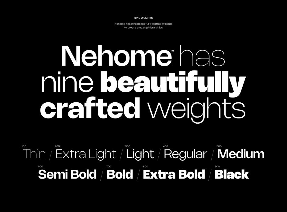
A free neo-grotesque designed by Rajesh Rajput, Nohemi brings clean modern lines and a neutral, adaptable character to branding, editorial and product design. Available as a variable font and free for personal and commercial use, it’s gaining traction among independent designers and studios seeking high-quality type without the licensing overhead.