
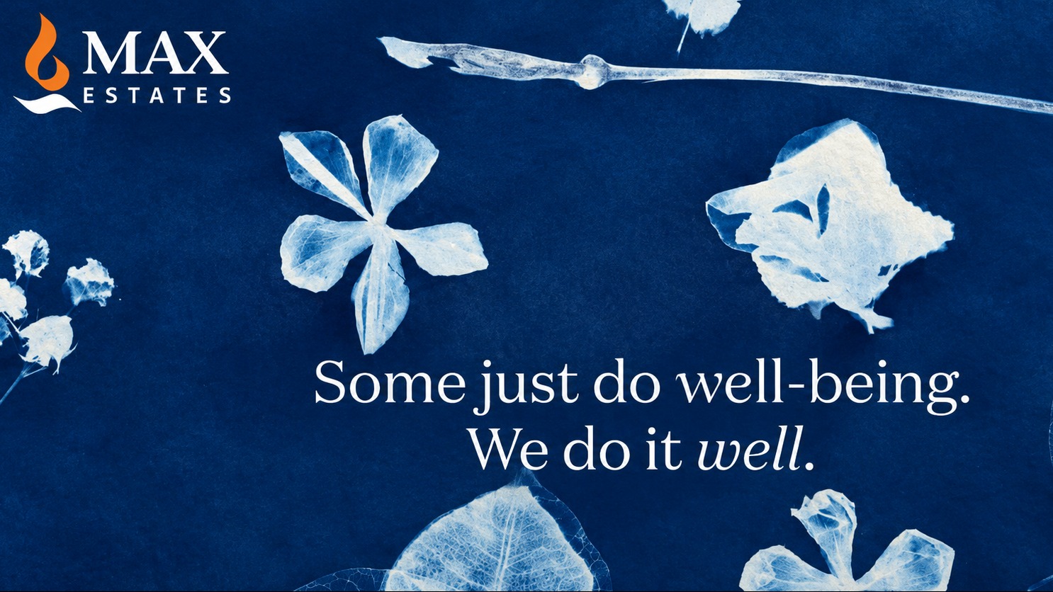
Well-being has become a familiar phrase in real estate marketing, but Max Estates is taking a rather old-school route to talk about it. As the company marks 10 years, it has launched a new integrated brand campaign, ‘Some just do well-being. We do it well.’, built around an unlikely creative device: cyanotype, a 19th-century photographic printing process.
The campaign is designed to underline Max Estates’ belief that well-being is not a recent addition to its brand vocabulary, but something that has shaped its approach to developing residential and commercial spaces through its LiveWell and WorkWell offerings.
Rather than relying on the usual glossy imagery associated with real estate advertising, the campaign’s flagship film uses the slow, deliberate process of creating cyanotypes as its central visual language. The technique, known for its distinctive blue-toned prints, becomes a way of reflecting the company’s approach to creating spaces with patience, intention and attention to detail.
The campaign will roll out across outdoor, digital, social media and owned platforms in phases. The first phase introduces the central thought, while subsequent communication will explore what well-being means within the Max Estates ecosystem.
The choice of cyanotype also gives the campaign a visual departure from the category. Instead of simply showing finished spaces, the film uses the process of creating an image to draw a parallel with how environments are conceived and built, and how they can influence the way people live, work and connect.
Speaking about the campaign, Arjun Gandhi, Head of Marketing, Max Estates, said, “Well-being has been part of the way we think about real estate long before it became a widely used category conversation. It has shaped the way we plan, design and deliver our developments, with the belief that thoughtfully created environments can meaningfully enhance how people live, work and connect.
“With this campaign, we wanted to give that philosophy a distinct voice and visual identity. The thought ‘Some just do well-being. We do it well.’ captures that belief simply. We chose cyanotype because its slow, considered and intentional process felt intrinsically connected to how we think about creating environments, with patience, purpose and attention to detail. Instead of simply talking about well-being, we wanted the campaign itself to reflect the thought behind it.”