
‘I am famously anti-trends – I think they are designed to make people feel bad about what they don’t have,’ Nate Berkus admits to Homes & Gardens. This is less a hot take than a long-standing policy – Nate has never been interested in what’s new; he’s interested in what survives.
Still, even the counter-trend contingent notices shifts. And if there’s something in the cultural air that’s caught his attention as we move into 2026 – not a design trend, but a sensibility – it’s organics.
You may like
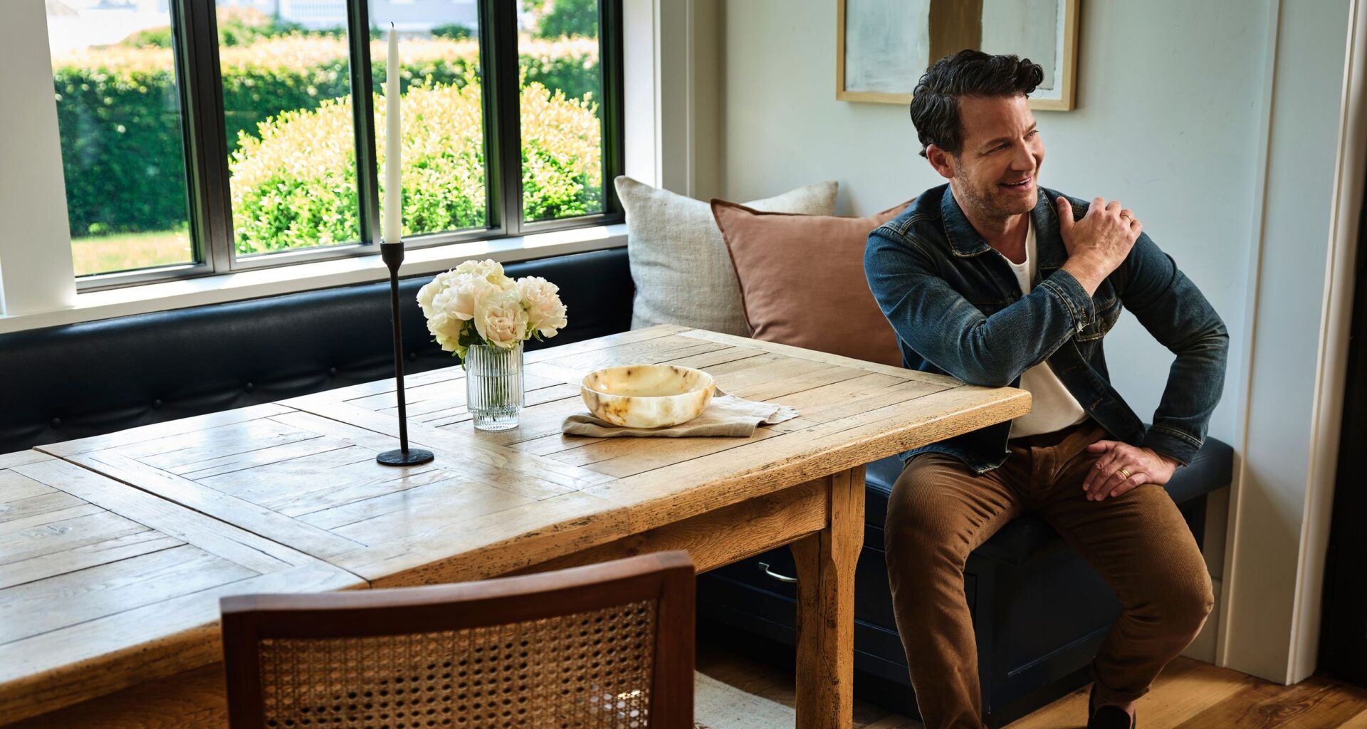
(Image credit: Interior Design: Nate Berkus Associates / Photography: Peter Murdock)
‘I’ve never believed that timelessness means standing still,’ adds the recent Foundations author. ‘It means paying attention. What’s feeling exciting to me right now isn’t a single trend, but a shift in sensibility.’
Which suggests that the defining sensibility of 2026 may actually be an old one – or at least something we perceive as such. For Nate, that return to story and substance starts the same way his designs always do: with feeling.
‘Ask yourself how you want a room to feel when someone enters,’ he advises. From there, source ‘things made by hand, old things that have patina and tell a story.’
That process can start small and ideally, close to home – at an antiques mall, a vintage shop, a thrift store. Simply, Nate says, ‘see where your eye lands and what sparks interest.’
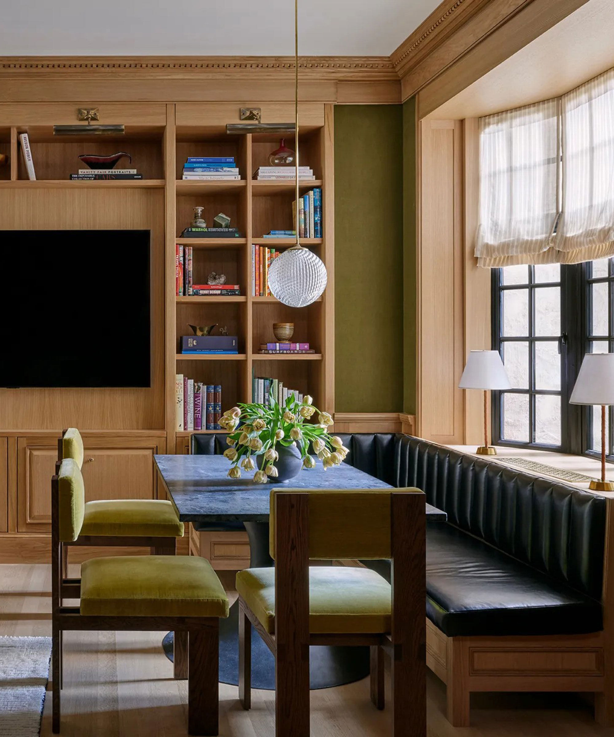
(Image credit: Kelly Marshall/Nate Berkus and Jeremiah Brent)
Of course, if something is coming back in, something else is on its way out. And topping Nate’s 2026 no-go list of dated trends is the opposite of all this: anything overly contrived.
‘Rooms that aren’t personal, that are designed to photograph well but don’t reflect the people who live there,’ are what he’s avoiding – always, to be fair, but especially now.

(Image credit: Rugs USA)
Nate’s 2026 brief, then, isn’t actually to buy so much as to discover. Start with feeling. Let things age. Go au natural. Make it yours. ‘The best interiors I have seen are ones where people took risks,’ he muses.
You may like
Ahead, a line up of pre-patinated, organically interesting pieces we’re confident he’d love – now, in 2026, and long after the next ‘trend’ has come and gone.
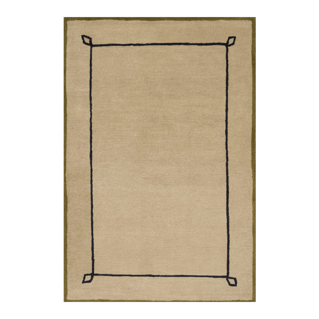
Rugs USA x Nate Berkus
Serge Bordered Wool Rug
It’s obvious, but the best way to understand where Nate Berkus’ design affections lie is to look at what he’s actually putting his name on. This rug from his best-selling Rugs USA collaboration is a good place to start. The slightly irregular, mid-century-inspired border is a subtle imperfection that aligns with everything he’s been eyeing for 2026.
Crate & Barrel x Jeremiah Brent
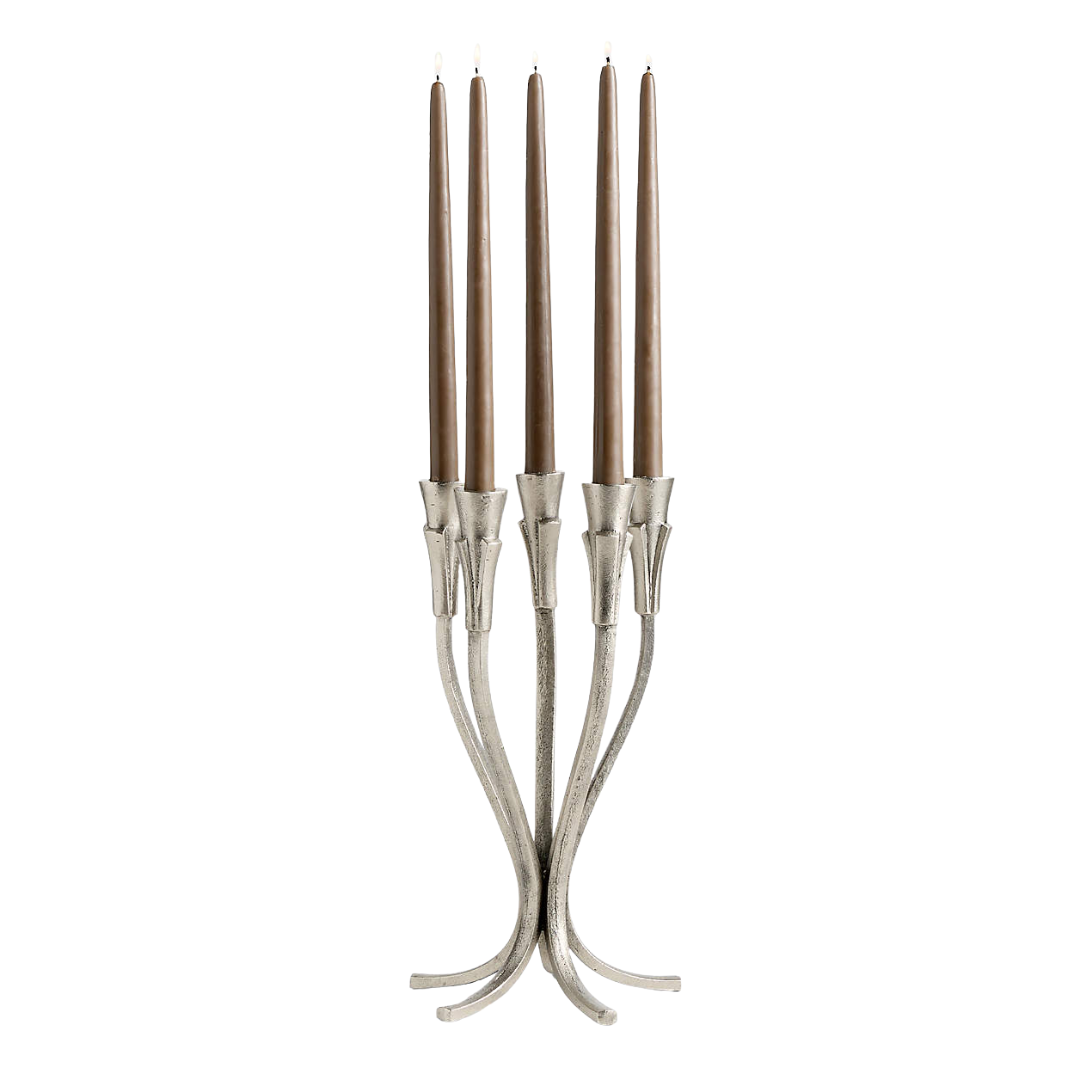
Peutre Antique Pewter Taper Candelabra
At home, the same point of view plays out. Nate lives with his husband, Jeremiah Brent, who shares a similarly organic, intentionally aged approach. This Art Deco–inspired pewter candelabra from his Crate & Barrel collection delivers sculptural form, hand-finished patina, and atmosphere in one go.
CB2
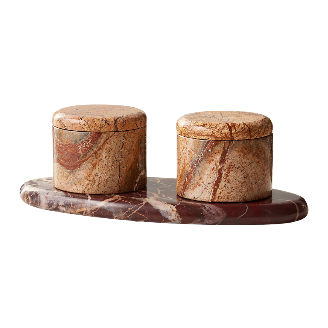
Zetes Tan and Red Marble Salt Cellars, Set of 3
Irregular stone isn’t always jagged or overtly rustic. This heavily veined, inverse-toned salt cellar proves the point, pairing forest brown marble with Italian Levanto red for contrast. It sits on the kitchen table and shifts the energy around anything it orbits.
Quince
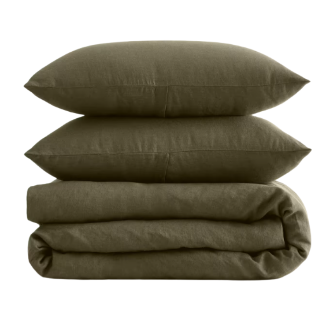
Linen Duvet Cover Set in Dusty Olive
Nate’s drawn to deeper, earth-rooted color trends heading into this year, so if you’re due for new bedding, this is where to look. A dusty olive shade is an easily stylable entry point – especially in European flax linen, which comes pre-washed and perfectly broken-in. Think of it as the bed’s equivalent of patina.
GreenRow
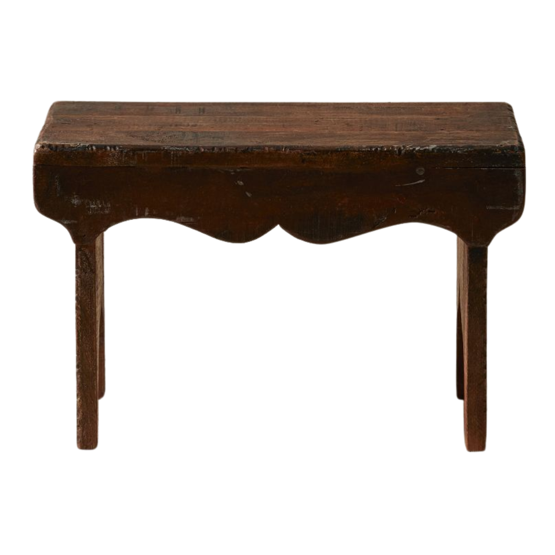
Reclaimed Wood Decorative Pedestal
Not everyone is going to stumble onto a perfect antique, but GreenRow’s reclaimed wood pieces are a solid workaround if you want the salvaged look without buying something newly distressed. Each stool is genuinely one of a kind and works just as well beside an armchair as it does as a pedestal for a planter or vase in an otherwise overlooked corner.
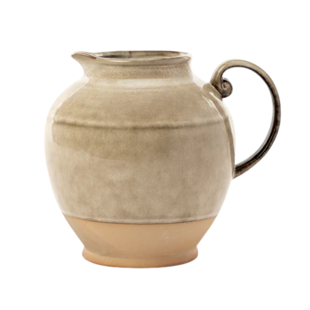
McGee & Co.
Brown Stoneware Pitcher
This stoneware pitcher from McGee & Co. checks nearly every box Nate has flagged for 2026, marrying nature-forward hues and an irregular glaze with weighty stoneware. Even the spiraled, antique-referencing handle seems to understand the assignment. If you’re buying one object that reads unmistakably now – and unmistakably Nate – this would be it.
Now in 2026, we couldn’t not ask Nate about the color conversation that managed to dominate the year before it officially began: Cloud Dancer. Is it an in, or an out? And can a white – of all things – carry the kind of narrative weight his work is built on?
‘I like that Pantone selected a neutral for a change, and a white at that, it’s interesting,’ Nate Berkus says, adding, ‘there are a lot of nuances with white, and they can really change a room depending on how they layer and work with the light.’
His take echoes the growing consensus that this non-color-color is ultimately about clearing space, swiping the TikTok scribble-scrabble slates clean. ‘At the end of the day, there’s a lot of noise out there,’ he says. Cloud Dancer – like anything old and decidedly not du jour – cuts through the clutter.