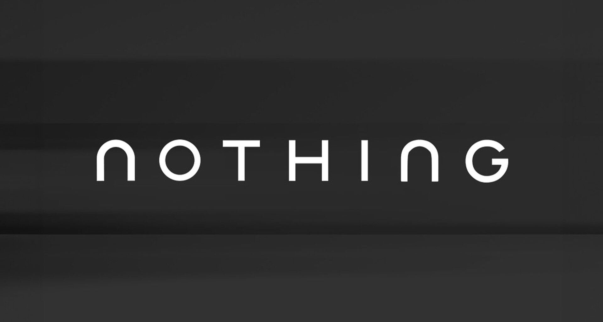
Tech brand Nothing has (seemingly) revealed a new logo, much to the dismay of fans. Unveiling a stripped-back wordmark, the design follows the recent minimalist logo design trend that has proved controversial for brands like Cracker Barrel and Jaguar.
The best logos are often simple, but there’s a fine balance to be struck between tasteful minimalism and cut-and-paste corporate design. Whether Nothing’s unexpected logo tease is real, fan reactions prove that many are fed up with the basic design outbreak.
With the caption “getting ready to make history,” Nothing teased the ‘new’ design alongside its current identity. With clean sans-serif letterforms accentuated by curved design, the ‘new’ logo bears a striking resemblance to the controversial Jaguar rebrand, and I don’t think it’s a coincidence.
You may like
Typically used in X fan spheres, the “getting ready to make history” format often spotlights an iconic celebrity moment, such as an album release or an infamous meme. While Nothing’s new logo appears to be the brand merely getting in on the joke, those who weren’t familiar with the trend were torn by the design.
“Love the new logo,” one fan praised, while another added, “Finally changing that terrible logo congrats!” Others were less complimentary, with one critic writing, “It’s giving Jaguar rebrand,” while another distraught fan added, “Wait why… I love the pixel-ish design. Why is the new logo so… soulless. Pls don’t tell me nothing is changing its design philosophy. It would honestly sadden me.”
Despite Nothing’s new logo likely being a bit of fun, the reactions prove how important logos are to fans. While some accepted the minimalist design, others felt that Nothing was losing its sense of originality. If Nothing chooses to rebrand in the future, it’s clear that maintaining its brand personality is key.

