
Diogo’s paintings mark a new era in his creative career. Back in 2023, It’s Nice That spoke to Diogo about his graphic design work and his two decade career at the head of some of Lisbon’s most prominent graphic design studios. Designing for Festival Iminente and Lux Frágil, Diogo tuned his style to skillfully meet the needs of clients, but now he’s on his own wave. Paint and canvas lets Diogo go visually off the chain, no longer aiming for experimentation with readability or adhering to client expectations, but more so disregarding narrative cohesion altogether.
“When I’m painting, I try not to look at too many things so I don’t become overly influenced. But we can’t really escape ourselves,” says Diogo. “There are imaginations from other people that I love.” Diogo’s work is a colourful combo of Alejandro Jodorowsky’s strange filmic palettes, Japanese sci-fi and vintage posters. As we all know, rules never applied there, either.
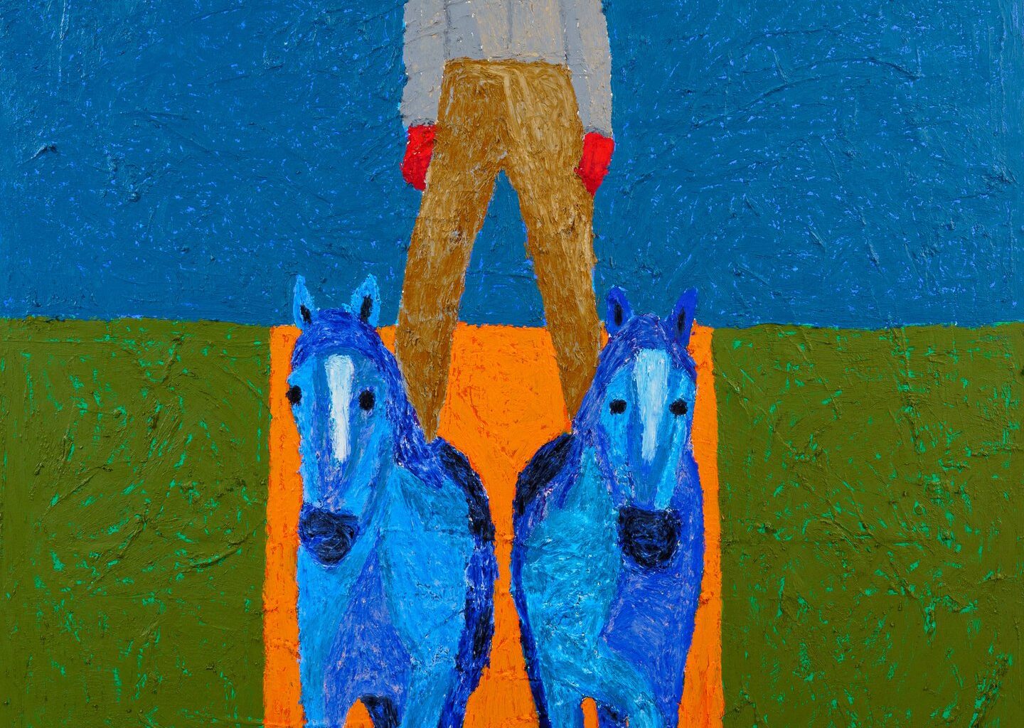
This departure from graphic design to move towards painting is significant, because now the dimensions of heavy layering of paints turns his work into 3D objects. Texture is a big part of works, as seen in Norte que a morte te conforte, where a painted teddy bear’s image is disrupted with blue oil sticks that feel like a child defiling a bedroom wall with crayons.
In some works, you can see the white canvas underneath the scribbling of DIY textural paste, in others you can see the thick globs of paint and the shadows caught underneath them in the photos. Whereas most artists study colour theory and abide by the rulebook, Diogo’s paintings are lawless, mixing garish colours together, sometimes making figures look like inverted photographs or implementing polar opposites to subvert from the expectations of figurative and object painting. It works because of the innocence Diogo speaks of, a thrash metal candidness that begs to harmlessly offend.