
It’s a tricky old time in the world.
Given, well, everything, it would be easy to write off fripperies, ephemera, the stuff that in the wider scheme of things doesn’t really matter. If you look up from the Instagram reel you’re watching, or the game you’re playing on your phone, or the footballer you’re getting annoyed at, and see on the news a missile destroying a building on the other side of the world, it’s difficult not to feel a pang of guilt.
But, really, these are the times when that stuff is most important. Now is the time to take joy in anything that gives you a bit of happiness, or escape, or makes you feel warm. Whatever works.
And what works for this writer are powerful hits of nostalgia, preferably from childhood, preferably in relation to football, preferably, and more specifically, to the aesthetics of football.
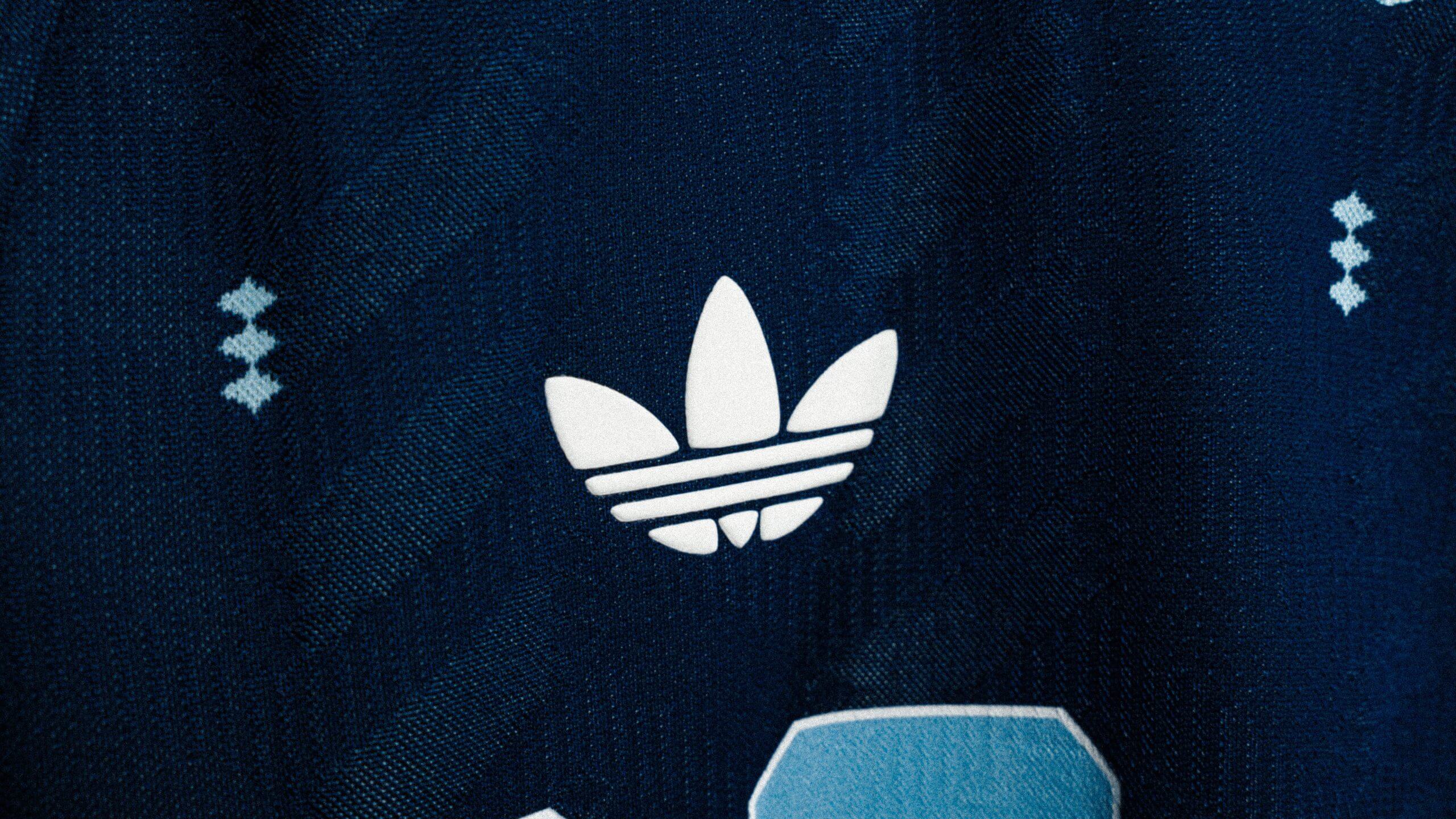
So you can imagine my delight when Adidas announced that, for the first time in 36 years, their kits at the upcoming World Cup will feature their famous trefoil logo.
The trefoil has been present on a few of their club kits and some special edition international shirts in the last couple of seasons, but this is the first time we’ll see the logo at a World Cup since 1990.
This is the first time we’ll see the trefoil logo at a World Cup since 1990 (Adidas)
That tournament has undergone several critical reassessments. For years, it was regarded as the heady summer that helped rehabilitate the image of football in England, but over time people remembered that the actual football was broadly terrible, with the lowest goals-per-game rate of any World Cup in history, the cynicism and negativity so objectionable that it brought about a few rule changes, including banning goalkeepers from picking up back passes and the introduction of three points for a win, up from two.
But it remains my favourite World Cup, partly because it’s the first I remember, but also because of the aesthetics.
Everything from the stadia in Italy, to the TV graphics, to the wine bottle in the shape of the trophy that my family once had but, unforgivably, got rid of at some point. Everything looked incredible… until the teams started playing and ruined it a bit.
A big part of that wonderful aesthetic was the kits, the best of which came from Adidas: West Germany, Colombia, Yugoslavia, Argentina, Sweden, the Republic of Ireland, Cameroon, Egypt, the USSR, and Czechoslovakia. Design classics, all of them.
The trefoil was a big part of how iconic they all became. It feels pretty ridiculous to have any sort of emotional attachment to what is essentially the logo of a corporation with revenues of around $25billion last year, but these things have a way of becoming a huge part of popular culture, and therefore part of your consciousness.
Adidas, generally, and the trefoil in particular, are synonymous with everything from Run DMC to Lionel Messi. Without wishing to sound like a budget Don Draper, when you associate the trefoil with such fond childhood memories, it’s no surprise it brings a strong dopamine hit when you see the logo.
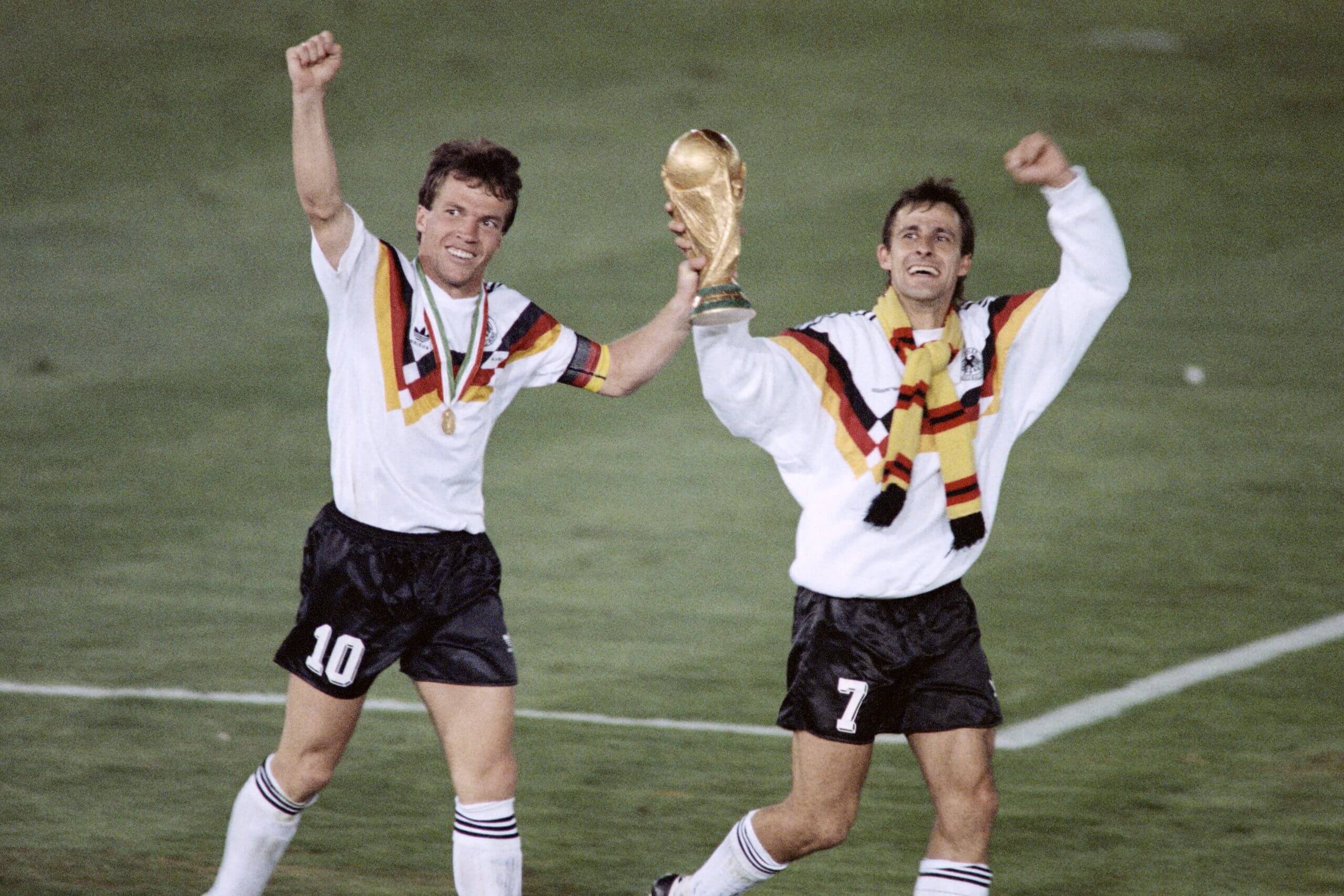
West Germany’s Lothar Matthaus (left) and forward Pierre Littbarski celebrate with the 1990 World Cup trophy (AFP via Getty Images)
The trefoil disappeared from football kits in the early 1990s, Adidas’s logo shifting to the slanted three stripes that was presumably more consistent with their general aesthetic.
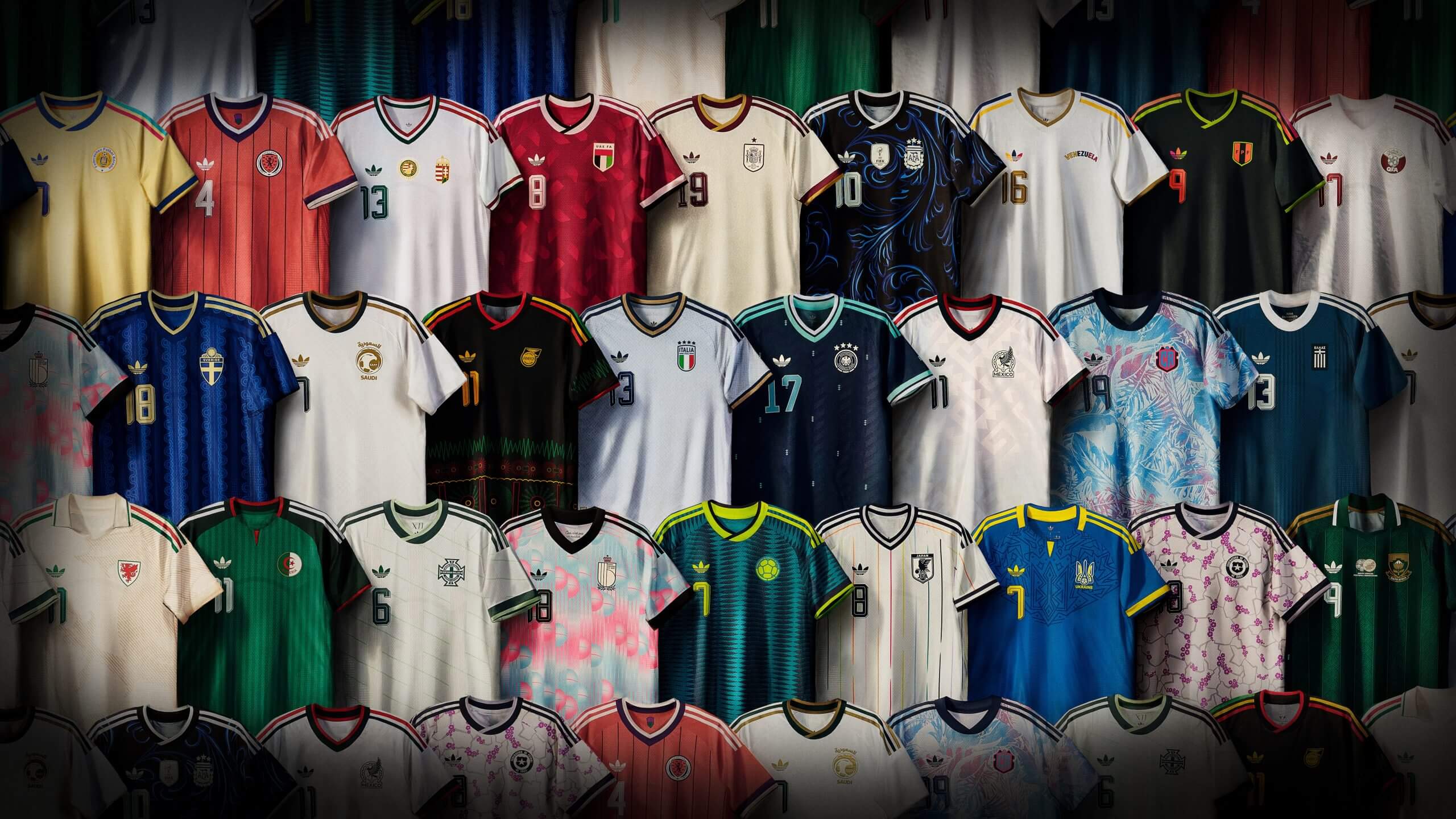
But thanks to football’s obsession with nostalgia and retro design, it’s back, adorning the away kits of 25 nations, 12 of which have already qualified for the World Cup and a few more that could join them through the play-offs.
It helps that the designs for the World Cup away kits Adidas have just released are almost all brilliant: to give you a peek behind the editorial curtain, we originally planned to rank this batch of shirts, but some of the point of rankings is to have some fun by being a bit snide and snippy about the bad ones. That proved slightly tricky with this lot.
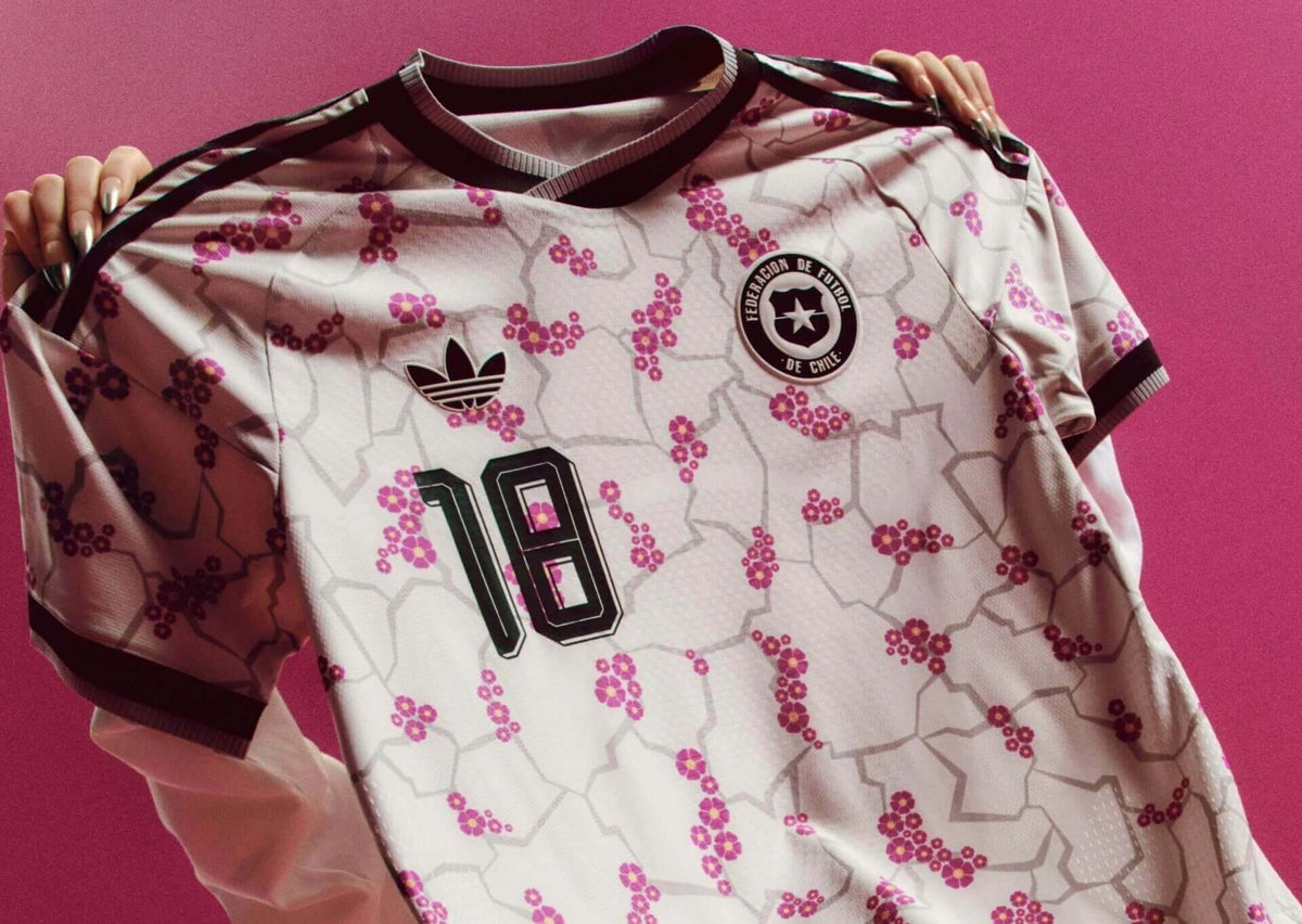
Personal favourites include the multicoloured pinstripes of Japan, the cherry blossom-esque patterns of Chile and the Rene Magritte-inspired pinks and blues of Belgium. But there’s barely a dud. Even if the football this summer is terrible, plenty of the teams are going to look great.

The aesthetics of a tournament matter. If you showed most football nerds a still from a World Cup match, without giving them any sort of additional information or context at all, they would probably be able to tell you which year it was from, simply from the look. The stadia, the ball, the quality of the image, the goal nets, the camera angles, the pitch-side advertising: it all feeds into a particular visual identity. The look has become pretty homogenised in the last few editions, so any point of difference is all the more important.
There is a reasonable argument to be made that nostalgia, particularly current decisions informed by nostalgia, are by their nature regressive and should be discouraged. Or, as Tony Soprano put it: “‘Remember when’ is the lowest form of conversation.”
It’s also a very powerful force. The return of the trefoil might be regressive, it might be frustrating that they haven’t come up with something new, it might be just another example of ‘remember when’. But, for me, and I suspect quite a few more, it will bring a warm, comforting glow. Whatever works.