
Environmental education charity Natural Habitat has got a new brand identity courtesy of WMH&I.
Natural Habitat was having problems communicating its core purpose, which was impacting engagement as well as fundraising.
Article continues below
You may like
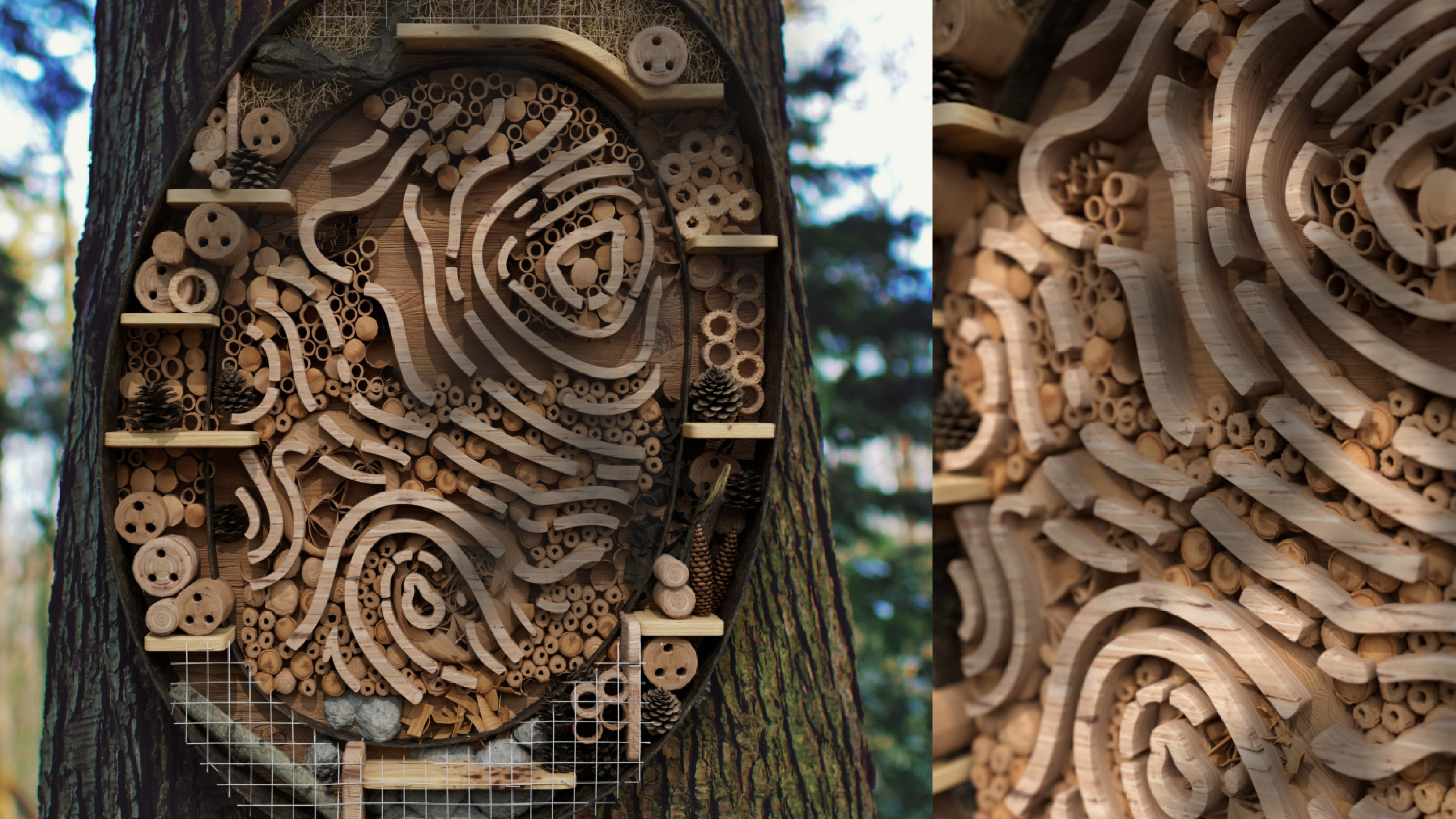
The logo becomes a home for bees (Image credit: Natural Habitat)
It’s not just about pretty pictures either, the branding is designed to do good. Branded elements double up as the likes of bee hotels, habitats for wildlife, learning trails and tools that encourage collective action.
Also inspired by topography is the flexible grid system, which creates structure for storytelling across the physical and the digital.
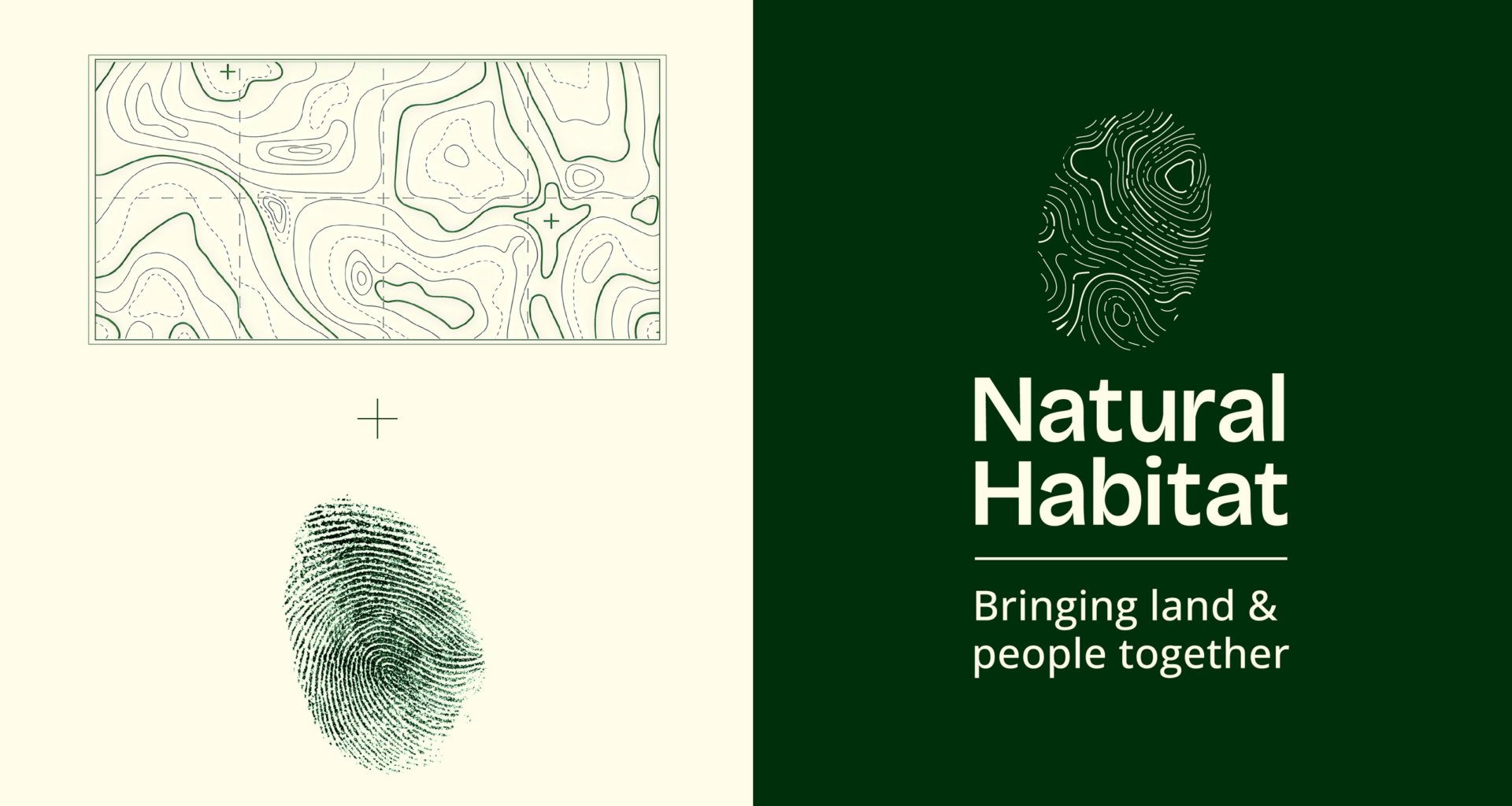
The typeface is Bricolage, which was chosen for its warmth and accessibility, while the colour palette draws on hues found in the changing seasons of the natural world: fresh spring greens, vibrant summer blooms, earthy autumn rusts and crisp winter tones. This helps the identity stand out from the often quite muted tones in this sector.
Image 1 of 5
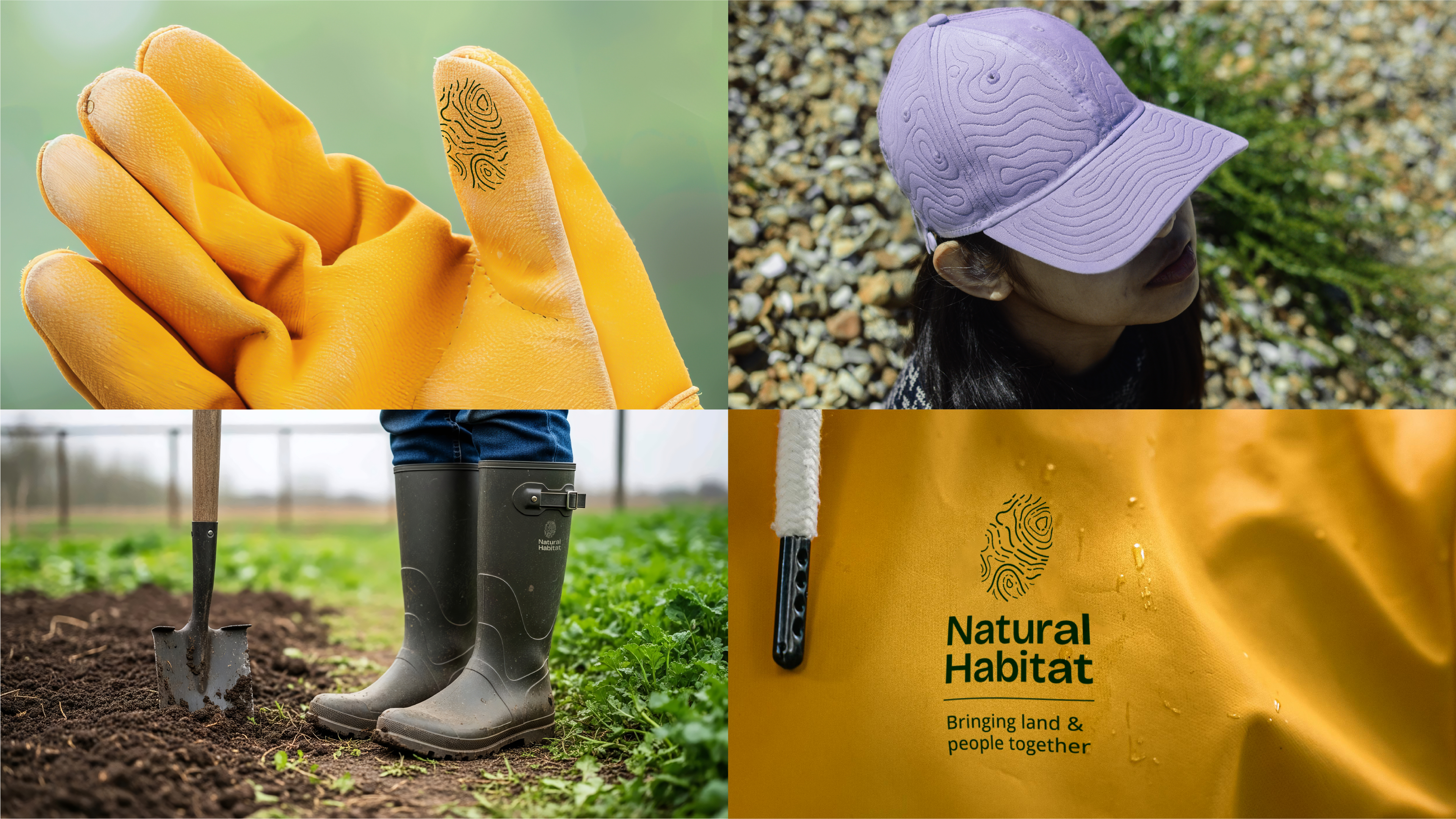 The logo across touchpoints(Image credit: Natural Habitat)
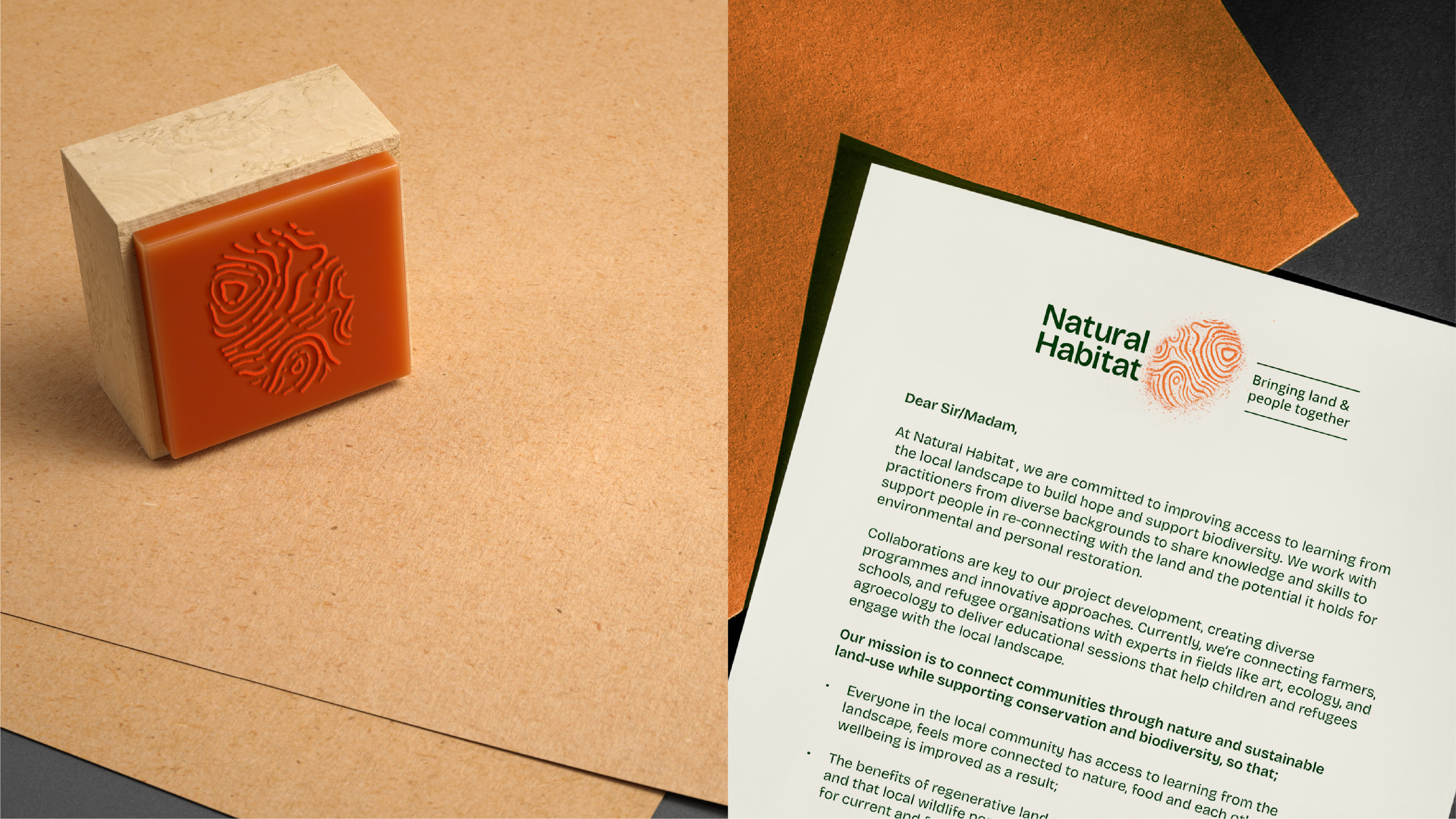 As a stamp of approval(Image credit: Natural Habitat)
 More branding in use(Image credit: Natural Habitat)
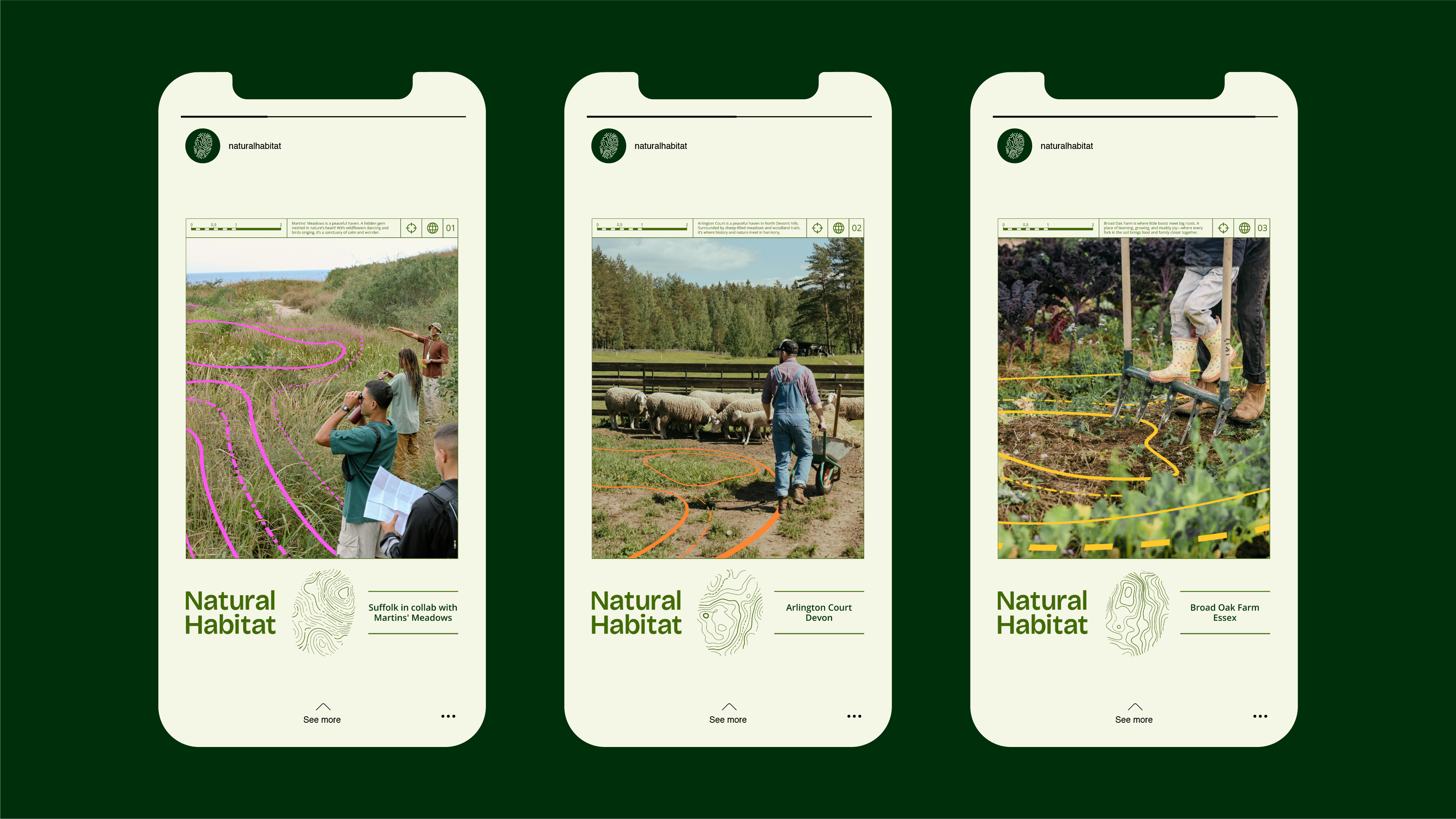 On mobile(Image credit: Natural Habitat)
 Out in the wild (Image credit: Natural Habitat)
“Our new identity has given us the emotional clarity we previously lacked, transforming us from a charity into a living ecosystem that people instinctively understand and want to be part of,” says Carrie Phoenix, founder and executive director, Natural Habitat. “Since our soft launch, we have seen stronger engagement, and improved fundraising and we will continue to scale our activity and broaden our partnerships.”
“Our goal was to help Natural Habitat unlock the emotional power of its purpose and create a platform that would grow, adapt and regenerate over time,” says Mark Nichols, creative director at WMH&I. “By creating an identity that more clearly represents the connection between land and people, the brand now plays an active part within community engagement and driving sustainable action.”