
Art
Portrait of Pat Lipsky. Photo by Thomas Victor. Image via Wikimedia Commons.
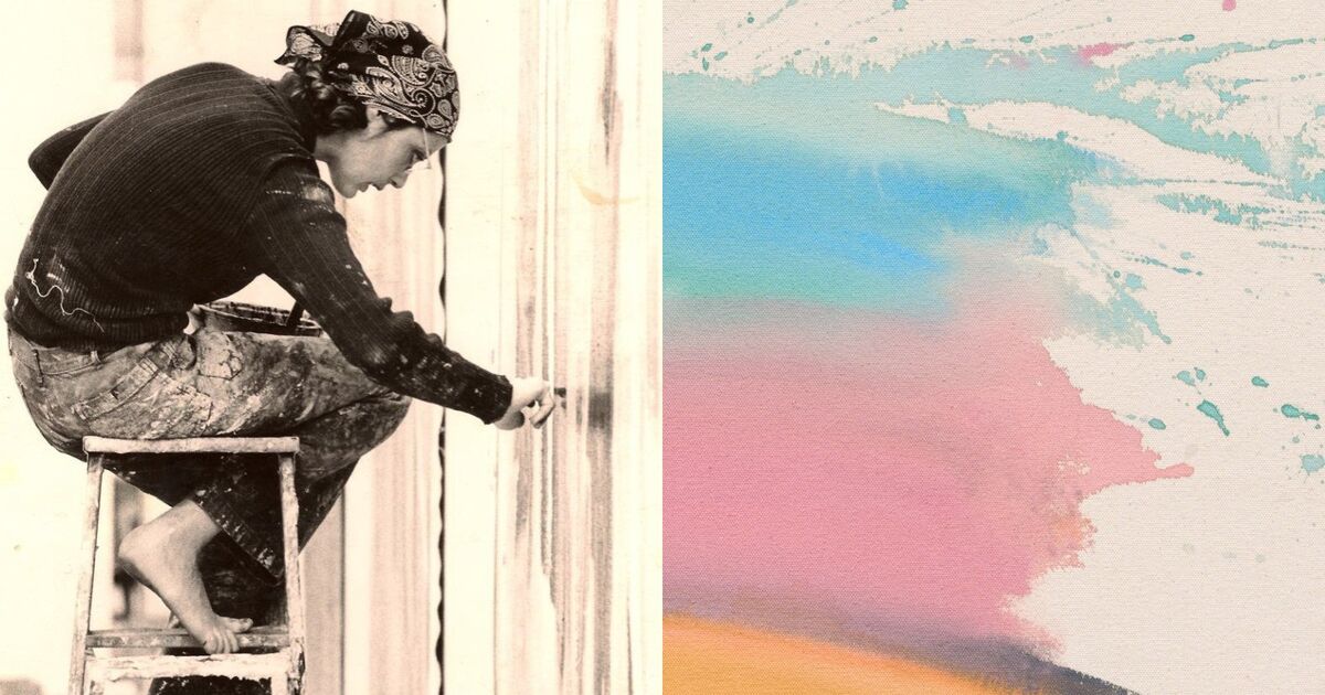
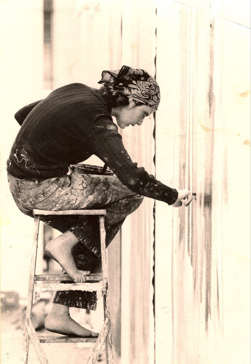
When she was in the second grade, artist Pat Lipsky took a watercolor class at school. The teacher walked down the aisle, checking the class’s progress, until she stopped at Lipsky’s desk. Holding it up for the class, the teacher announced, “Look at Pat’s beautiful colors!” Lipsky recalled. “Ruined my life!” she joked, more than 70 years later, when I visited her in her 10th-floor New York studio.
The 84-year-old painter has been grappling with color ever since that moment. Her abstract color-field canvases are built on contrasts, where hues collide and find precarious balance. It’s a matter of instinct, she said—a magical moment when the materials suddenly come alive. Lipsky has been showing in galleries since 1968, but her paintings are seeing a new surge of attention. On October 9th, James Fuentes will open her solo show of new and old works, “Color Next to Color,” in Tribeca, timed with the release of her memoir Brightening Glance: Recollections of a New York Painter (2025). Together, the exhibition and book spotlight her career-long pursuit of color’s expressive force. Many of her new works use similar techniques to one of her favorite works: Chrysanthemum (1971), a large stain painting shown at Frieze Los Angeles 2025 and acquired by the de Young Museum. “I would give my right arm if I could do that again,” she said—and with the new canvases, it looks as if she’s getting close.
Early life
Portrait of Pat Lipsky in her studio. Courtesy of James Fuentes Gallery.
The wall above Lipsky’s desk is covered with images tracing her entire life. After attending Cornell University, Lipsky enrolled in a master’s program at Hunter College, where legendary sculptor Tony Smith became her mentor. Lipsky recalled, “As a teacher, he was just incredibly engaging. He would sit down right next to you, no matter what you were working on—even if it was the dumbest picture you ever saw—and he would just talk to you. That was so touching to me.” Enrolled in what was technically a one-year program, she stayed for four years, simply to keep working with Smith.
In the late 1960s, Lipsky briefly turned to mathematics as inspiration. Influenced by Frank Stella’s geometric rigor and Smith’s fascination with geodesic domes, she began sketching curves on graph paper. The results were three large canvases she came to call her “Turing” paintings, named after the famed mathematician Alan Turing. The paintings translate the mathematics of natural patterns—like ripples in water—into painted curves plotted across a gridded field. Suddenly, she didn’t need to plot these color-fields. Instead, her work transformed into the gestural, sometimes explosive color-field and color-stain paintings she’s known for. The “Turing” works have never been shown publicly until now; two of the three will be included in the James Fuentes exhibition.
Shortly after graduating in 1968, Lipsky set her sights on finding a gallery. She took a small box of Kodachrome slides to the gallery of André Emmerich, then one of the most influential dealers in New York. “I went over and said to the secretary, ‘I’d like to show these to Mr. Emmerich,’ and she said, ‘Oh, of course he’s not seeing anything.’ And he was standing about 50 feet away. This was one of the great moments in my life—I just walked right past her and showed him.” Within two years, Lipsky was represented by Emmerich, alongside color-field painters like Morris Louis and Helen Frankenthaler. In her first year, she sold 70 paintings.
Color-stain technique
Lipsky’s early canvases drew energy from the color-stain innovations of Louis and Frankenthaler, and the full-on force of Jackson Pollock. “Pollock was really the main influence,” she said. “I was riveted by the intensity of the colors [Louis] was getting—there was something very charismatic about the work.” Though Lipsky was inspired by Frankenthaler, she proved to be a more complicated presence. “I hated her and she hated me—she was a horrible person,” Lipsky said, laughing.
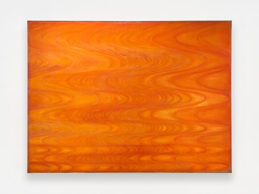
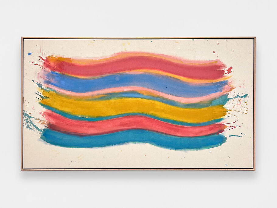
In the late 1960s and early ’70s, she harnessed her natural sense of color. Winter (1971), on view in the James Fuentes show, features a dark gradient that bleeds from midnight blue to a luxurious purple, one of her stain paintings, which she mostly worked on between 1968 and 1975. Other works, like the polychromatic Springs Fireplace (1969) or new quad-color abstraction Emamate (2025), show Lipsky’s interest in contrast that has endured over the years.
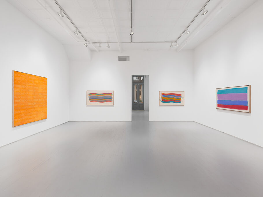
Pat Lipsky, installation view of “Color Next to Color” at James Fuentes Gallery in New York. Photo by New Document. Courtesy of the artist and James Fuentes, New York and Los Angeles.
Lipsky explained that her practice is purely instinctual. “I have no interest or belief in color theory,” she clarified.“I approached painting in a Freudian way.…I just free associate,” said Lipsky. “You don’t tell the painting what to do. You’re with the painting, and painting is, in some sense, guiding you.”
Current work: a return to acrylic
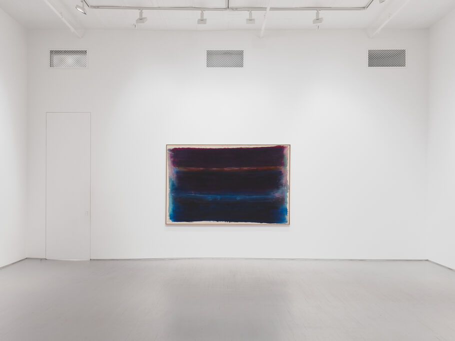
Pat Lipsky, installation view of Winter (1971) in “Color Next to Color” at James Fuentes Gallery in New York. Photo by New Document. Courtesy of the artist and James Fuentes, New York and Los Angeles.
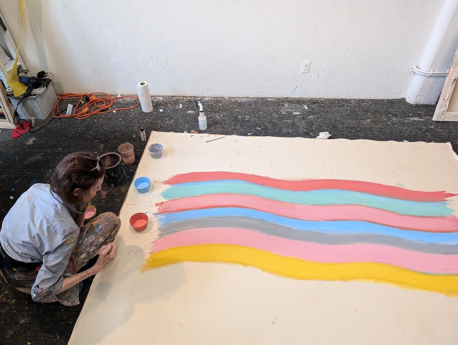
While Lipsky began her career working in acrylic, she then pivoted to using oil paint for several decades, creating “heavy” and “austere” works, as she called them. “I was going crazy with oil paint syndrome,” she said. However, more recently, she has returned to the acrylic style that she made her name with after uncovering some unstretched canvases from the 1970s. Her new works tap into her older technique, where the color-fields appear iridescent.
At this moment in her career, she’s comparing herself to French novelist Gustave Flaubert. Though best known for Madame Bovary, it took him years to return to the narrative techniques that made him famous, in the short story A Simple Heart. “It’s exactly the style of Madame Bovary,” Lipsky explained. “He went back to the style, and I deliberately went back.”
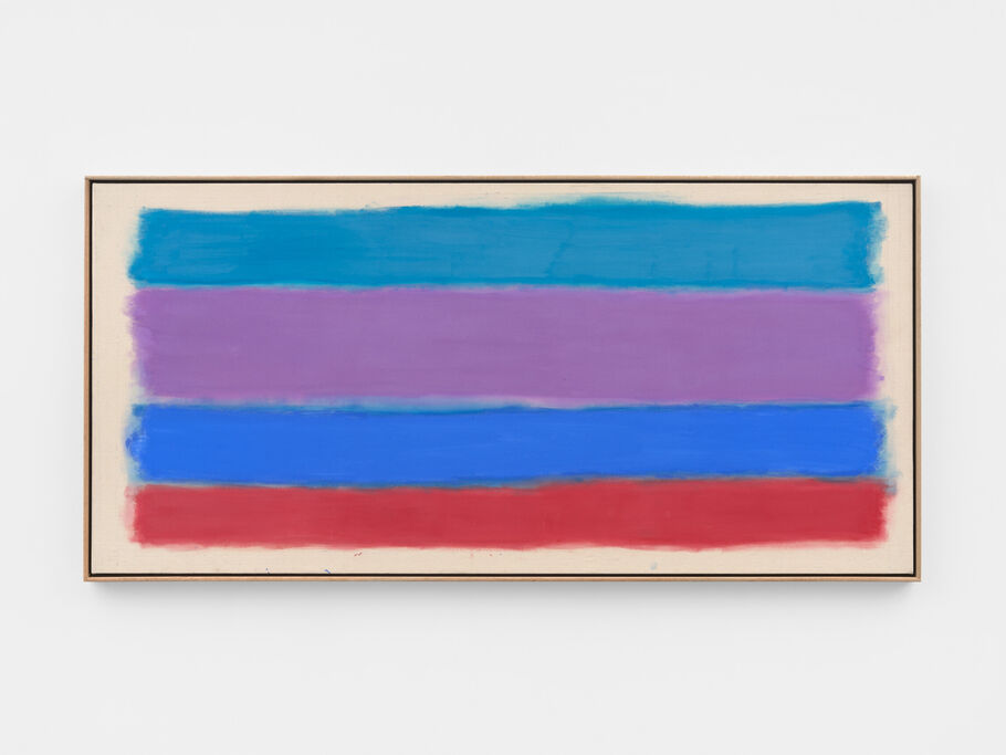
Lipsky called acrylic a “New York paint,” because it dries quickly, and “New York is fast.” Some of her new works feature giant blocks of color, like the red color-field in Lost Painting (2023). At James Fuentes, the selection of new paintings draws a throughline across her career. Dream (2024), featuring horizontal bands of turquoise, purple, midnight blue, and red, delivers the same immediacy and urgency of her younger years. Meanwhile, the new quad-color abstraction Emamate (2025) features pastel bands which appear to float gently across raw canvas, soft yet insistent, much like her earliest works, where rivulets of color bled outward onto the canvas. This show underlines how her language of color—whether explosive or restrained—has remained central.
Reminiscing on her early works, she recalled how “it was tremendously exciting to do.” “I was flying,” she said. Today, she’s tapping back into that sensation with unmistakable glee.
MR

Maxwell Rabb
Maxwell Rabb (Max) is a writer. Before joining Artsy in October 2023, he obtained an MFA from the School of the Art Institute of Chicago and a BA from the University of Georgia. Outside of Artsy, his bylines include the Washington Post, i-D, and the Chicago Reader. He lives in New York City, by way of Atlanta, New Orleans, and Chicago.