
You’re told never to judge a book by its cover, but be honest: How many times have you bought a book solely based on cover art? I’m a sucker for used-book stores, and my first stop is always the horror section. When given a vintage printing of a horror novel or a contemporary copy, I will always spring for the retro edition. Why? It’s not because of the “old book smell” or collectability, but for the design.
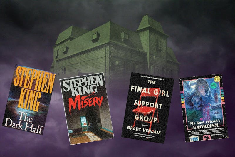
The look of these books is classic, featuring vibrant colors with horrific, shocking designs. Skeletons, creepy kids and mad scientists — you name it, and it’s on a macabre cover. Some of the most common publishers of this pulp horror were Zebra, Tor and Signet. But who painted them? That answer isn’t straightforward. Some of the artists are known: Dan Brautigam did work for Stephen King (“The Dark Half”) and Dean Koontz (“The Bad Place” and “Midnight”); author Clive Barker sometimes did his own art; Tim Jacobus created the original “Goosebumps” covers. However, many were painted by freelance artists on fairly quick deadlines. Because of the gig-like nature, we don’t have detailed information on their identities.
One of the most notorious Stephen King novels is “Pet Sematary,” a dark tale about the dangers of reversing death. Part of its infamy stems from the 1983 Signet edition’s artwork. Designed by Linda Fennimore, the cover shows a large hissing cat in front of an ominous graveyard — the Pet Sematary — with the silhouette of a man and corpse in the background. The imagery is haunting and evidently much care was put into it. Contrast this with the current Scribner edition: a photoshopped cat against an image of a graveyard. I do have to give this cover some credit: As opposed to some horror books that try to mask their genre, this contemporary cover is obviously horror and proud. However, when contrasting it with the original Fennimore artwork, you can see where the homage falls to its predecessor.
King’s 1987 novel “Misery” has one of the most iconic covers in horror. Painted by Robert Giusti, it features an imprisoned writer stuck in a wheelchair beside a bleak window. Looming over him is a woman’s shadow wielding an axe. A chilling visual, it raises many questions: Who is she? What’s the axe for? Contrast this with current mass-market paperbacks: They often only feature an axe or a snowy landscape. While these still inspire dread and unease, the effect is lessened without the detailed, human aspects of the original.
By and large, I think my main issue with contemporary covers lies not in new releases, but with reprints. I have been pleased with several contemporary horror covers. Stephen King’s “Fairy Tale” (2022) features a cover that hearkens to his original book designs, presenting an illustration of a boy with a lantern and a dog above an endless spiral staircase, dominated by blue hues broken by yellow lantern light. There are no obvious computerized images, which I appreciate. Another contemporary writer whose books have classic-feeling covers is Grady Hendrix, author of “The Final Girl Support Group” and “My Best Friend’s Exorcism,” the latter of which features a cover inspired by 1980s VHS tape boxes.
My theory for the quality decline in reprints is that publishers no longer see a need to sell readers the story. “Pet Sematary” and “Misery” are both modern classics; fans are going to read them regardless of the cover. However, in the 1980s, when they were new, people had to be convinced that the stories were worth their time. Thus, the over-the-top and maximalist vibe. The generic photoshopped reprints today feel uninspired beside their vintage counterparts.
Furthermore, horror experienced an ’80s boom, but by the ’90s and 2000s, the genre was less appreciated; audiences preferred “thrillers.” This distaste for horror was even seen at The Oscars. “The Silence of the Lambs” (1992), which is undoubtedly a horror film, won Best Picture; however, the Academy did not call it “horror,” but instead “thriller.” With this increasing genre disinterest, publishers didn’t want to spend extra money on artists when a digitally edited stock photo does the trick. In an age where AI is able to generate a book cover in seconds, it really increases appreciation for personal touches in classic painted or illustrated covers. A machine could never create the horrors these artists realized.
E-books also prompted a shift in cover preferences. Detailed covers aren’t needed when a book doesn’t physically exist; a simple title on a screen suffices.
However, despite these shifts, there seems to be increased demand for retro covers. During my last Barnes & Noble trip, I was pleasantly surprised to see several Stephen King novels with throwback-inspired covers. What’s fun about these nostalgic printings is that they’re designed to look worn; the age comes printed into the artwork. Additionally, the “Paperbacks from Hell” series is reprinting vintage horror with original covers. Some might call it nostalgia baiting, but regardless, I’m glad to see these traditional designs making a comeback. Part of the charm of horror novels is the art; the imagery is just as tied to the genre as the authors who write the nightmares.