
This time last year, my feed was awash with pops of red. A lampshade here, a glossy lacquered table there. All in the name of the viral ‘unexpected red theory’.
The idea was simple enough: add a touch of unexpected red to any space, no matter the color scheme, and watch the room come alive. It was unique, playful, and everywhere. And like most TikTok interior design trends, I half-expected it to fade as quickly as it arrived.
But designers say, more than a year on, that splash of something surprising hasn’t gone anywhere. It’s simply… evolved. Here’s how the unexpected red theory looks in 2025 and beyond.
You may like
How is the unexpected red theory holding up a year on?
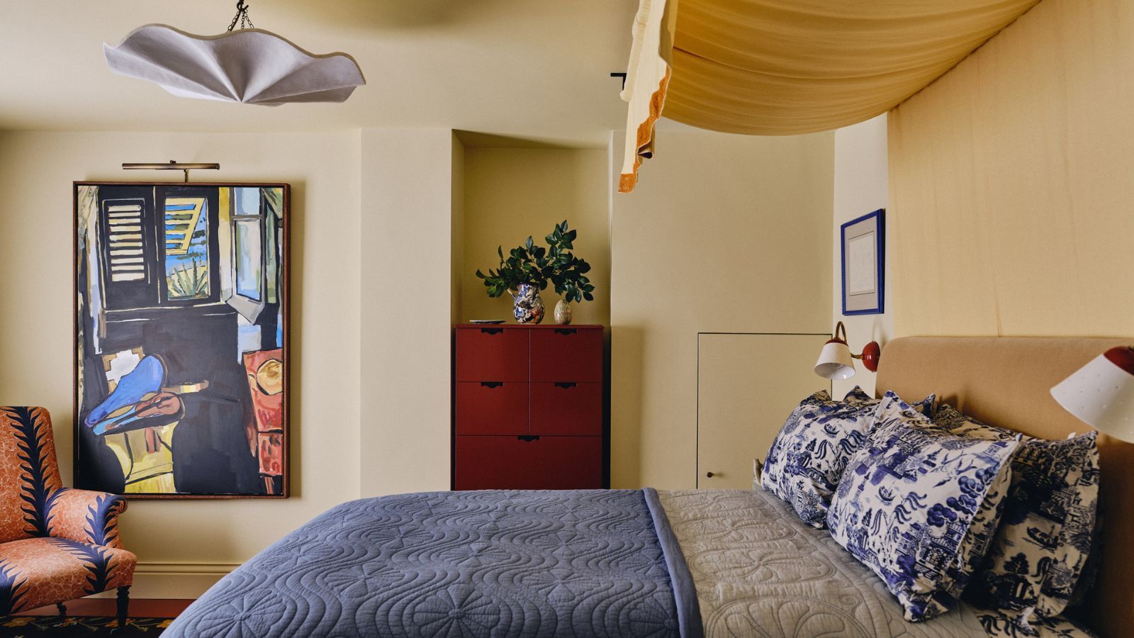
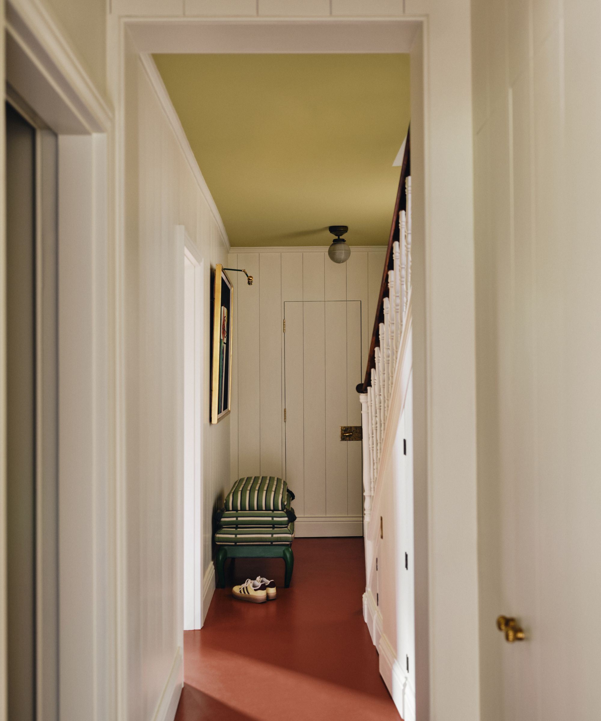
(Image credit: Studio Duggan / Photography Sarah Griggs)
After years of decorating with neutrals, the unexpected red theory was a warm welcome into our homes. ‘It was a natural antidote to the soft minimalism and beige palettes that dominated the past decade,’ says designer Nina Lichtenstein. ‘It punctuates the calm with a little thrill.’
This divisive color trend cropped up in the most unlikely places – an earthy red pantry in a warm white kitchen, a crimson trim around a cream doorframe, a glossy red lamp against a sea of white.
‘This time last year, design lovers were painting the town red, literally,’ adds Nina. ‘The bold pop of crimson that stormed TikTok, sneaking into living rooms, kitchens, and closets alike, felt daring, energizing, and just a little rebellious.’
‘The reason it’s lasted is simple: red is emotional,’ she explains. ‘It draws the eye, awakens the senses, and adds instant character. A year later, the trend isn’t about flooding a room with scarlet, but about learning to use it with restraint and intention.’
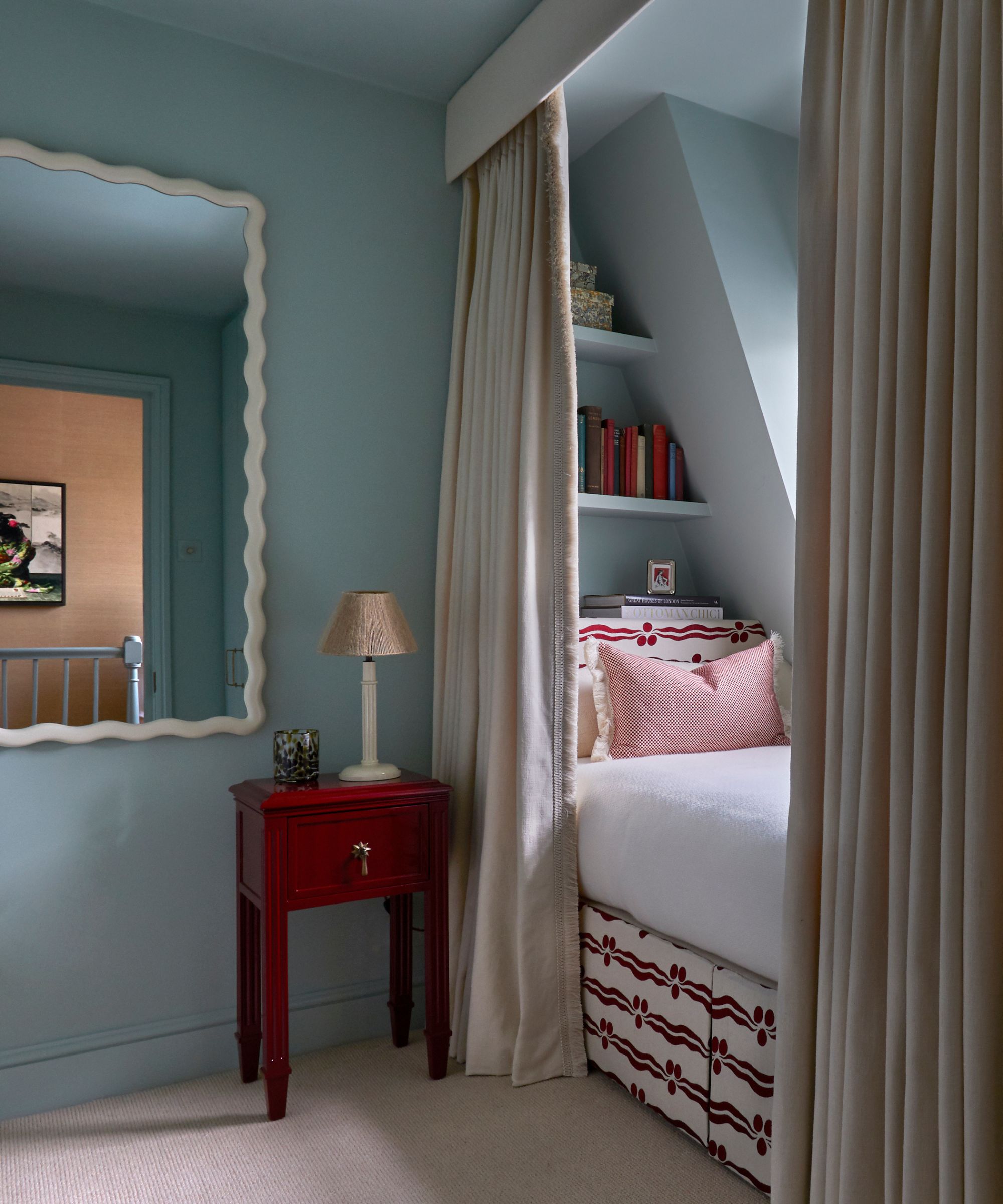
(Image credit: Pelican House / Lucy Williams / Milo Brown)
And that energizing, almost jarring hint of color might be why it’s endured. As Kailee Blalock from House of Hive Design Co. explains: ‘The unexpected red trend is here to stay. At its core, it isn’t just about a TikTok fad – it’s rooted in color theory, which is a timeless foundation in art and design.’
In other words, while the algorithm may have moved on, pops of red itself never went out of style.
‘Some fads come and go, while others evolve to create a new visual concept. The surprising red trend has evolved over the past year and is now employed as an accent rather than a dominant color within the room,’ says Daniel Smith, founder of Danetti.
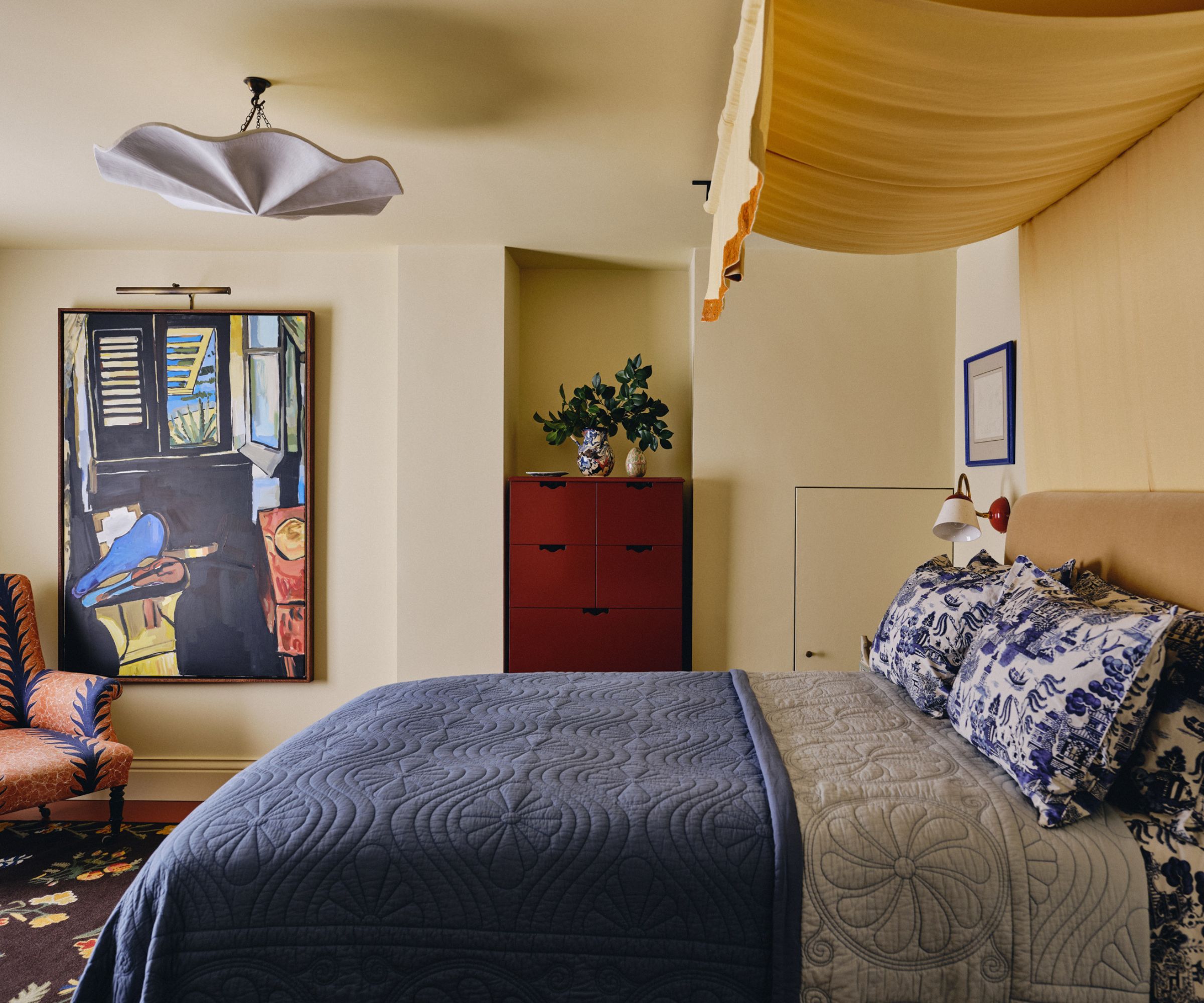
(Image credit: Beata Heuman x Mylands / Photography Beth Davis)
In essence, red’s staying power has very little to do with TikTok. Decorating with red just has a certain pull.
‘Red carries a captivating presence in a room, which is why it resonates so strongly,’ says Kailee. ‘While the spotlight might shift occasionally to other primaries like blue or yellow, red will never truly disappear. It’s a classic accent that continues to reassert its relevance.’
So is the unexpected red theory still on trend?
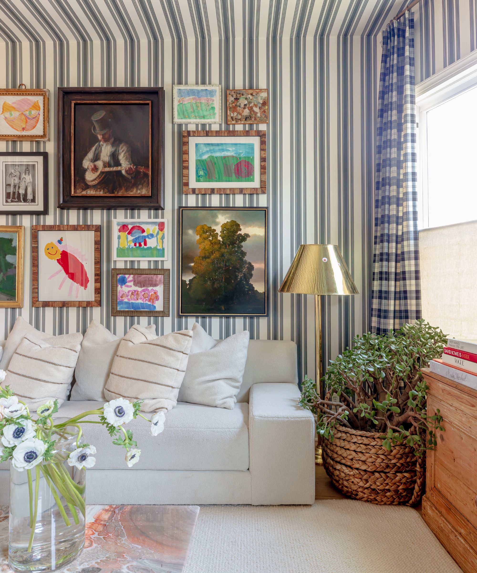
What’s interesting is that the trend seems to have sparked something bigger. Once people realized how transformative a single pop of color could be, they started experimenting with other hues, textures, and design moments too.
(Image credit: Beata Heuman x Mylands)
‘Unexpected red is still going strong,’ says designer Bethany Adams. ‘But it’s also paved the way for ‘unexpected color’ in general.’
If you’re wondering, does the unexpected red theory work with other colors? Bethany suggests: ‘A pop of yellow, orange, or magenta is equally arresting in a room. The idea is that not everything has to line up on the color wheel, and sometimes a seemingly random hue can make a space come alive.’
Kristina Khersonsky from STUDIO KEETA agrees. ‘The ‘unexpected red’ moment has definitely held its own,’ she says, ‘but I’d argue it’s evolved into something even more interesting. We’re not just seeing red anymore. It’s become more about the unexpected element in a space – a pop of color, an unusual texture, or a surprising shape that gives a room life.’
‘Red just happened to kick it off,’ she adds. ‘The trend is still going strong, but it’s matured into something a bit more intentional, less of a gimmick, more of a design tool.’
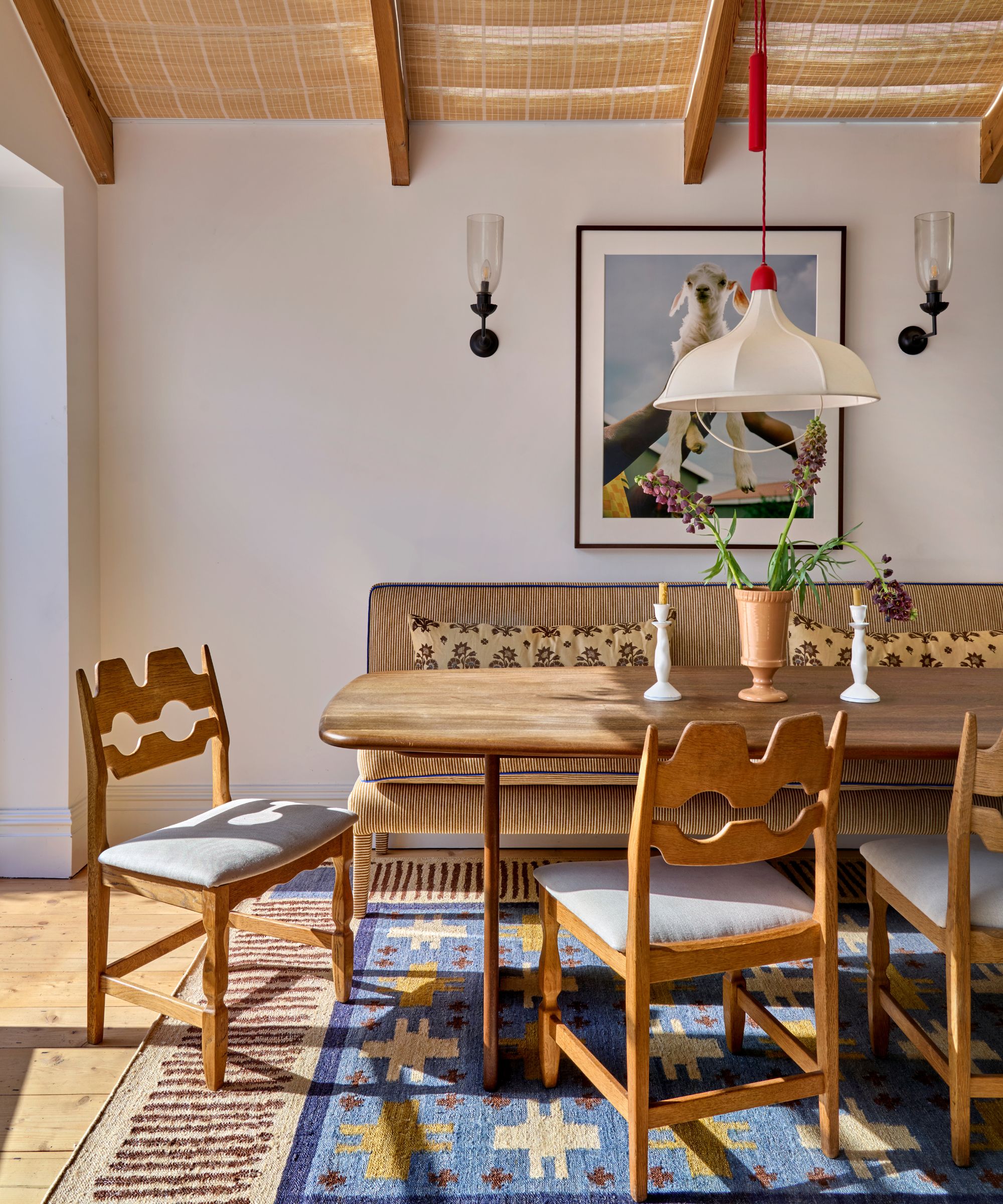
(Image credit: Lindsay Rhodes / Photography Mary Craven)
As Kristina says, red might have kicked things off, but what it really ignited was a love for the unexpected: a bold print in a pared-back room, a surprising material or unexpected chrome mix, or a sculptural piece that feels just a little out of place – in the best way.
What began as a trending color experiment has evolved into a shifting mindset in the industry: one that breaks a few design “rules”. Because when it comes to creating a home that feels unique, a little unexpectedness might just be the most fun idea of all.
If you’re tempted to bring an unexpected color or unexpected style combination into your own home, designers agree the key is to do it with intention.
Interior designer Lauren Gilberthorpe’s advice is simple but smart: think long-term. ‘My advice to clients is always to choose colors they’ll be comfortable living with for years,’ she says. ‘Introducing a color pop through accessories, textiles, or artwork is a simple way to experiment without committing to something that may feel overwhelming in the future.’
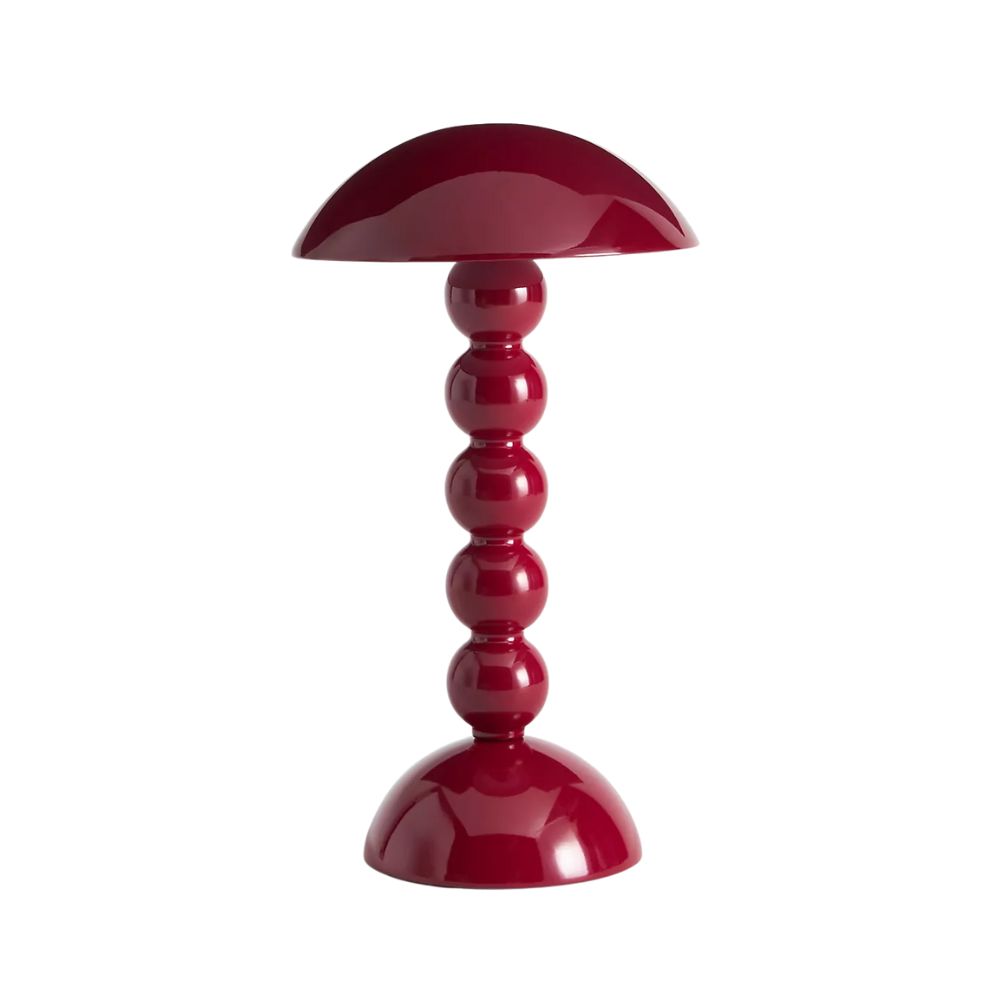
Bobbin Rechargeable Table Lamp
Available in a myriad of colors, Addison Ross’ beloved bobbin rechargeable table lamp is the most playful way to introduce a new bold color, thanks to its glossy lacquered layers and sweet silhouette.
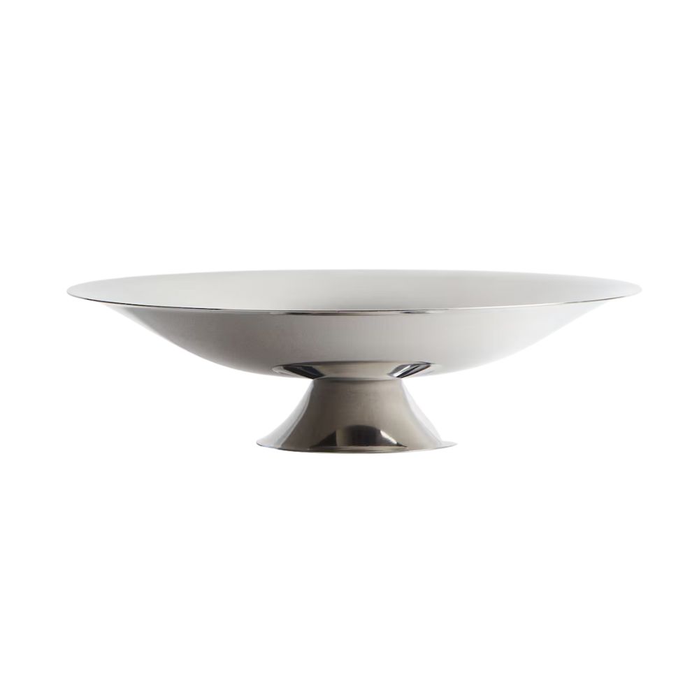
Footed Stainless Steel Bowl
Always been a gold girl? It can be hard to convince someone that mixing metals is a good idea, but the unexpected chrome theory proves otherwise. Try something small, like this low pedestal bowl, for a pop of contemporary shine.
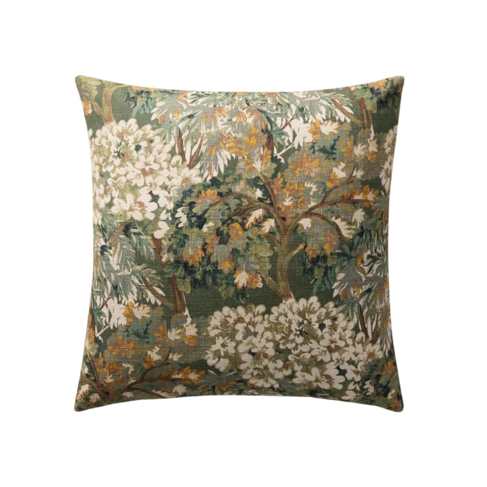
Cosima Pillow Green Multi
You can also bring in new patterns in a surprising way, but this has to be done with restraint. A collection of mismatched pillows won’t do the trick, but a traditional tapestry print cushion in a minimalist living room? Super chic and totally unexpected.
So if you’re wondering what’s replacing the unexpected red theory? The answer is really, the unexpected. Whether it is a pop of red, yellow, chrome, or florals, the idea is to work something that seemingly doesn’t ‘match’ into your spaces and watch how it brings it to life.