
When you think of December colors, the shades that come to mind are likely rich greens, deep reds, and luxurious golds – the colors you traditionally associate with the festive season. However, if you follow the monthly birthstones and their associated hues, December’s shade leans more summery than seasonal.
Turquoise, a vivid green-blue, brings to mind tranquil tropical waters and warmer climates. But to call it a summer-only shade is to limit it, because turquoise is more versatile and varied than just its brightest form. As with any bolder color, the best way to incorporate it into your home is to choose more nuanced versions – the slightly muted shades that maintain its uplifting nature while offering a little less of its lively vibrancy.
So, if you want to be inspired by December’s birth month color and try decorating with this unique blue, here’s how we’d recommend bringing this underrated shade into your home in a way that’s elegant and livable.
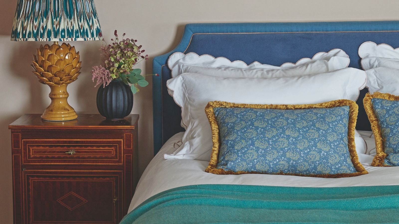
This bedroom is the perfect example of how to decorate with turquoise without overwhelming a space. Turquoise by Edward Bulmer Natural Paint pairs with soft yellows and deep reds to create a cozy layered bedroom.
(Image credit: Future)
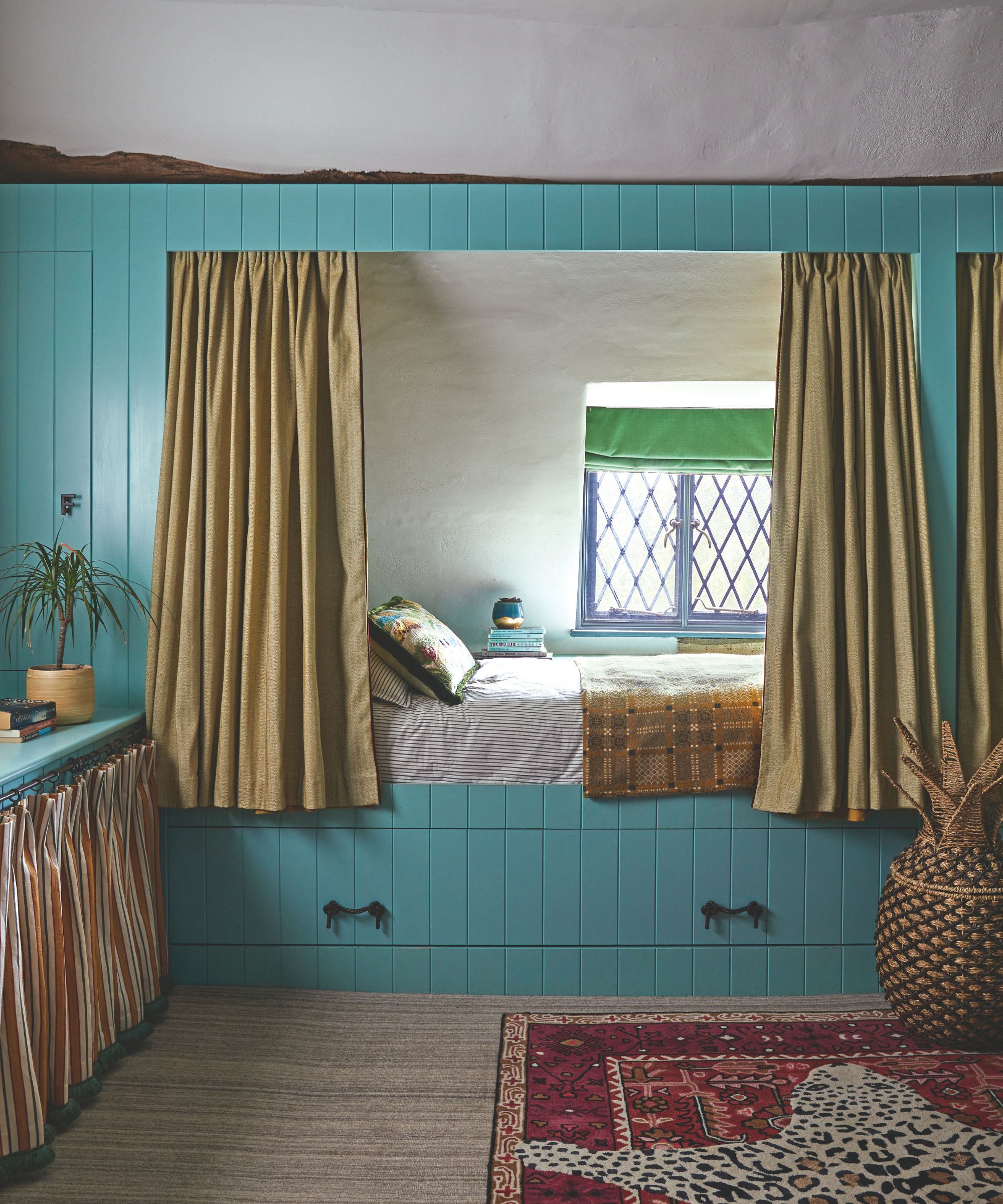
Firstly, unless you’re aiming for a very bold look, choose turquoise tones that are slightly more muted – shades like Farrow & Ball’s Vardo, Benjamin Moore’s Spirit in the Sky, and Behr’s Bubble Turquoise. Then you’ll want to pair them with colors that help bring out those softer hues – think ochre yellows, rich reds, and plummy purples. Layering these warm, saturated shades with the blues will balance any cooler tones and help ground the overall color scheme.
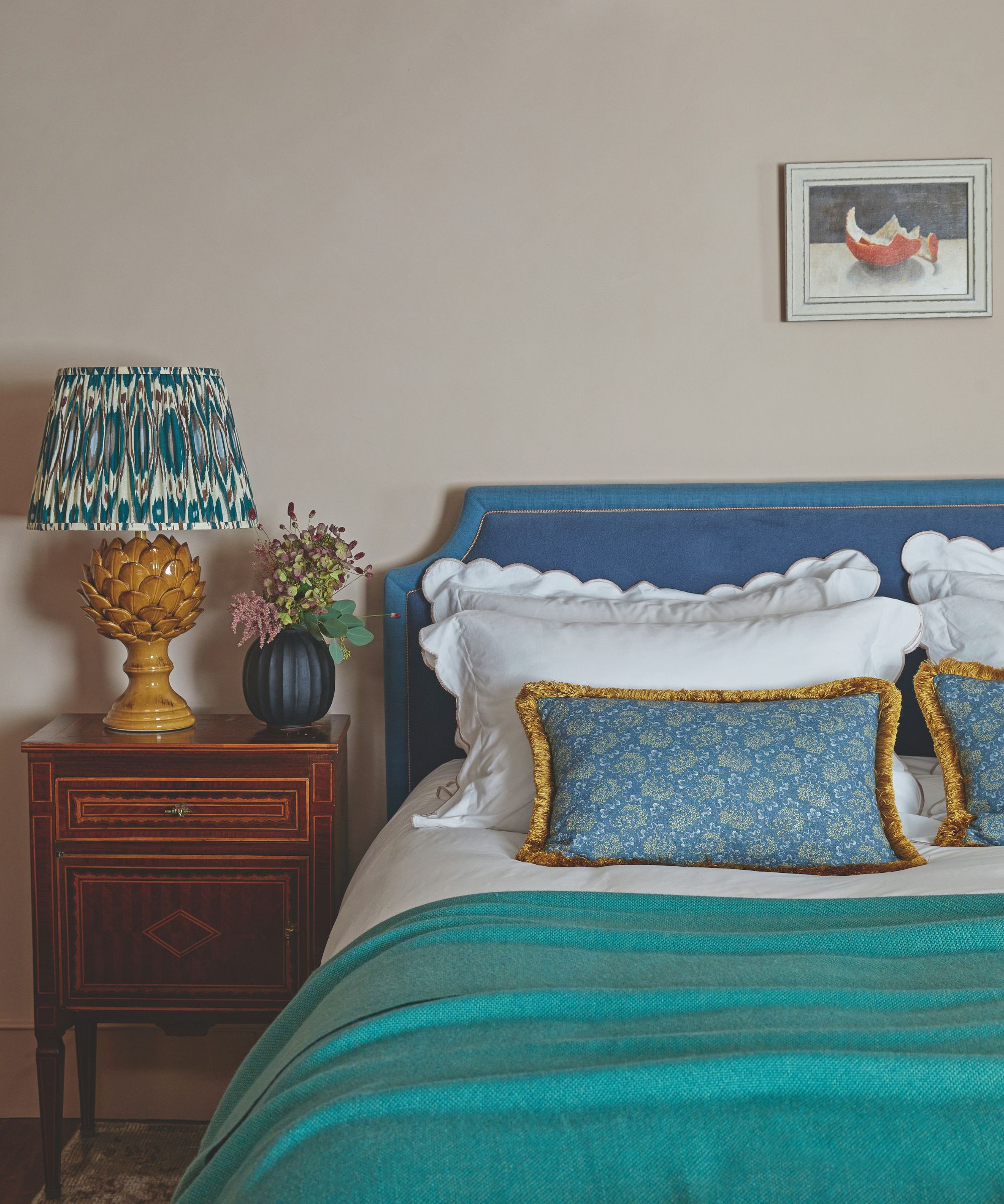
In this bedroom turquoise shows itself as a cozier color; paired with a richer dark blue, soft whites and warm yellows
(Image credit: Future)
Layers of texture as well as color matter, too. You’ll want to soften turquoise with tactile materials like velvet, bouclé, linen, and jute. Pair a soft turquoise throw – like this tonal style from IKEA – with creamy linen bedding – such as this best-selling set from Quince. Or – for more of a statement – layer a turquoise-toned rug with a larger jute area rug to create a relaxed, cozy feel.
Do avoid a feature wall; it will look too stark against the surrounding white walls. Instead, opt for a feature ceiling. A pale green-blue makes perfect sense as a ceiling color because it mimics the brightness of a soft blue sky overhead. In this living room, the feature ceiling has been painted in Farrow & Ball’s Lulworth Blue, and paired with creamy white walls, it feels fresh and uplifting.
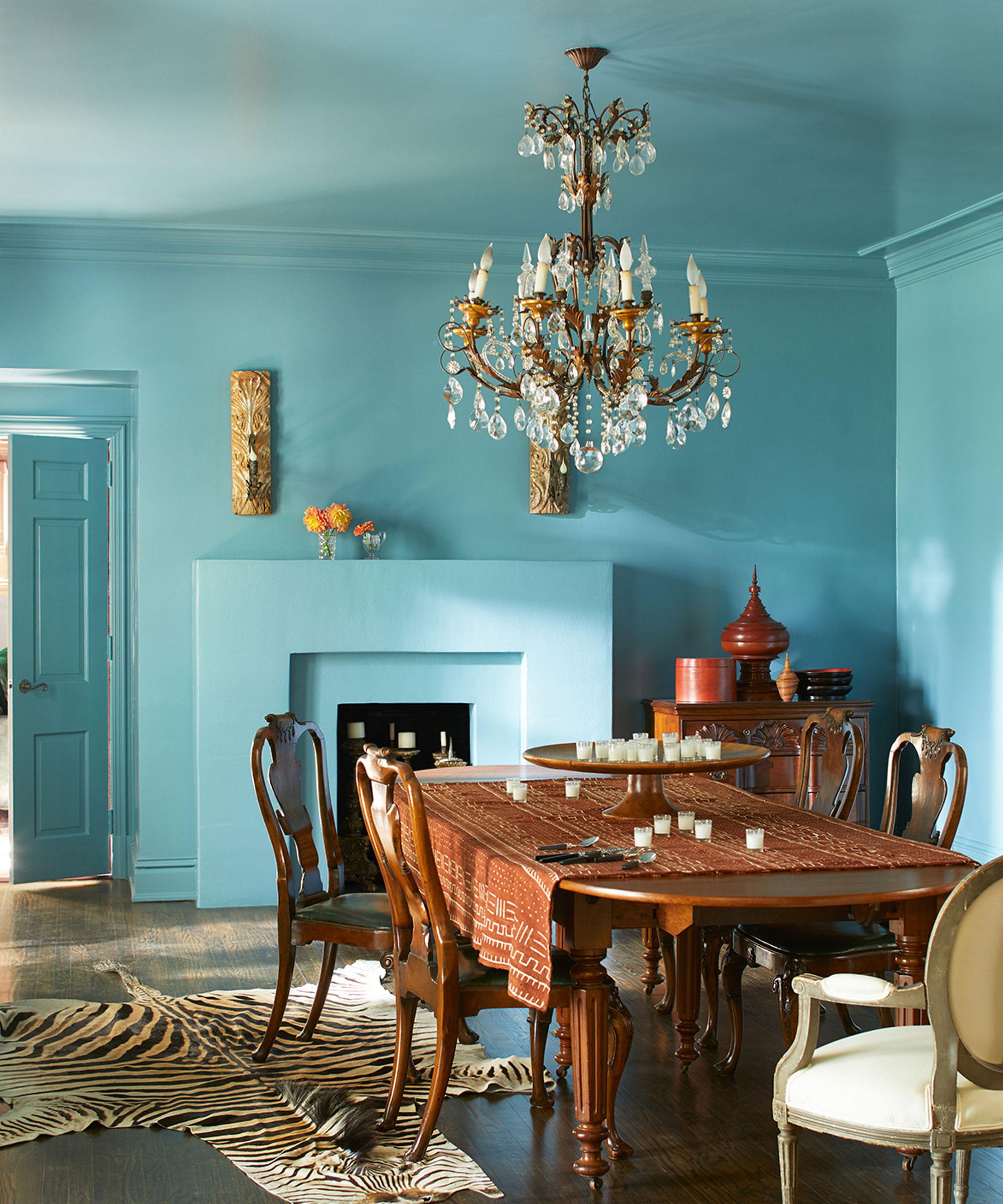
This dining room is drenched in Benjamin Moore’s Spectra Blue 2049-50, which looks unexpected chic as a backdrop for the antique wooden pieces
(Image credit: Benjamin Moore)
Of course, color drenching is the most on-trend way to paint any room right now, and turquoise-toned blues, in the right space, often look best when you fully commit and take the color across all the surfaces – walls, ceilings, doors, and woodwork. Think of trendsetter Lucy Williams’ iconic blue living room, pictured below, which is drenched in Farrow & Ball’s Yonder. The blue almost becomes a neutral, far more subtle than a feature wall that stands starkly against the rest of the space.
Both the blue dining room above and Lucy’s living room are layered with unique vintage finds that create an intriguing contrast with the blue walls; it’s unexpected, yet it works, giving the layered décor a fresh and distinctive backdrop.
Shop Turquoise Home Decor
If you’re inspired to decorate with December’s color of the month, these turquoise buys will bring a touch of the shade into your home – from practical pieces for the kitchen to soft décor for the bedroom. Turquoise is a far more versatile shade than you might imagine.
Turquoise might not be the color that first comes to mind at this time of year, but December’s birth month color can be every bit as cozy and comforting as more traditional wintry hues. Used in the right way and paired with the right colors and textures, it can in fact warm up a room, add depth, and create a layered, inviting atmosphere.