

I’m fiercely interested in logos. I used to design them for a living, in a former professional life, and I have thoughts about them that I’ll happily share with any poor bastard unfortunate enough to be sat next to me on an airplane, at a banquet, or on a grand jury. Carmaker logos are an especially interesting sub-category, because they’re the sorts of logos that people tend to have a lot of feelings and opinions about, so dramatic changes tend to be met with a lot of resistance. Sometimes a hell of a lot. As a result, carmaker logos tend to make pretty subtle changes to their logos when they do change them. Honda just made a change to their logo, and I think it qualifies as subtle, and maybe even a bit of a throwback.
Their new logo – which they refer to as an “H mark,” I suspect because of, and I’m going out on a limb here, the big H – is going to be the new symbol of “Honda Automobile Business.” The logo will start to be rolled out on next-gen EVs and Hybrids, but will soon be used for everything, as their press release notes:
![]()
![]()
Moreover, Honda will expand the use of the new H mark to represent Honda automobile business as a whole, including not only automobile products but other customer touchpoints such as dealership locations, communication initiatives and automobile motorsports activities.
 Image: Honda
Here’s what the new logo looks like:
If that logo looks familiar, it probably should, as it’s very close to the logo Honda proudly (and hugely) stamped on their very first automobiles, like the T360 mid-engined truck of 1963:
 Image: Honda
These trucks are so fun. Let’s watch a promotional video about them!
This same type of wide, stylized H persisted and was used on subsequent cars, like the N600:
![]() Image: Honda
Image: Honda
Proportions of this H were fairly malleable; a very narrow version was used on the hood ornaments of Accords in the 1980s:
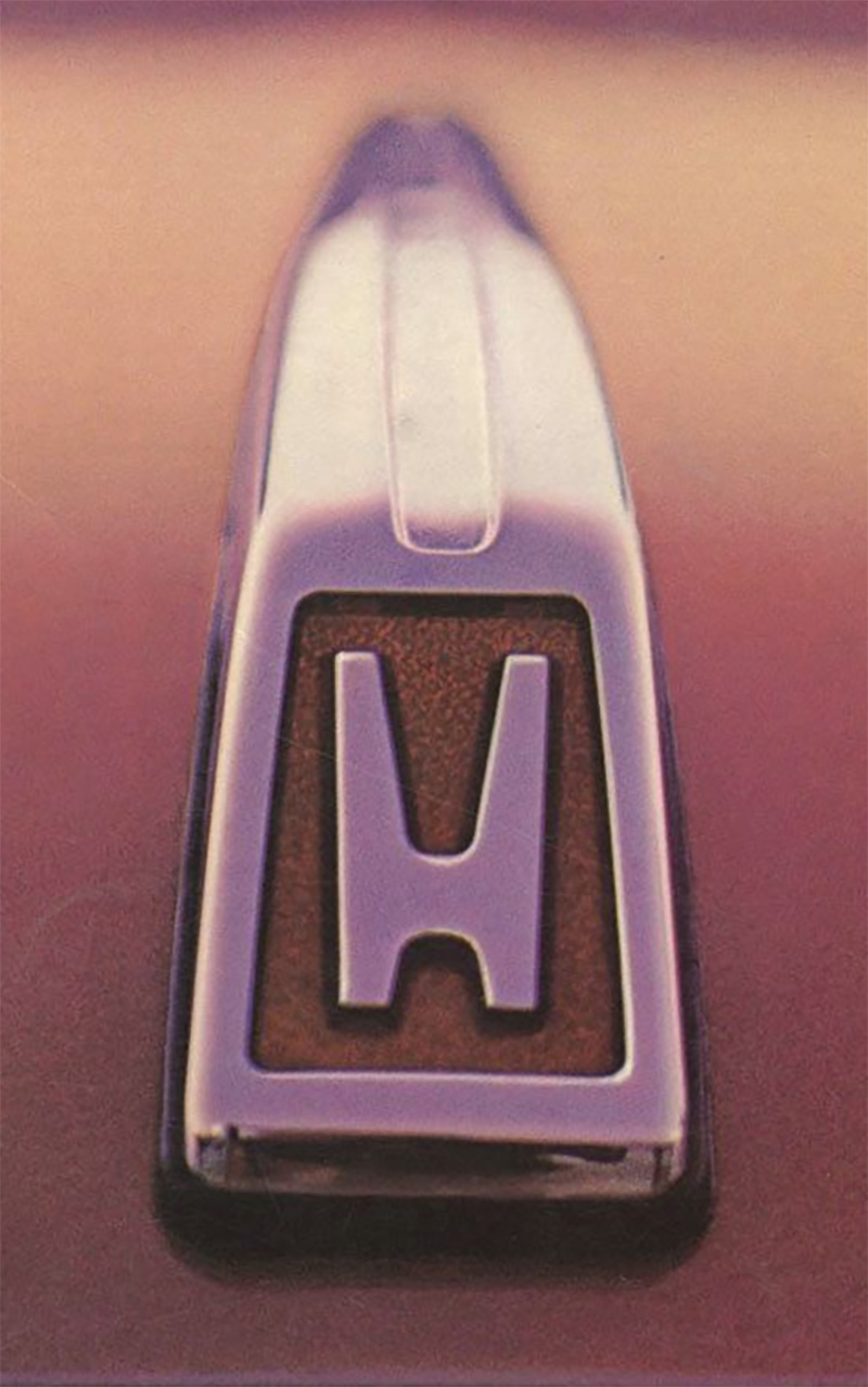 Image: Honda
Soon, the default Honda badge circumscribed the H with a rounded-corner sort of trapezoidal/squarish border, as you can see on this Passport:
 Image: Honda
This was also the sort of Honda badge Superintendent Chalmers lamented the loss of on his Accord:
 Image: Honda, Screenshots: Fox
This new Honda logo is a nice throwback to the original source, a clean, simple H. Of course, Honda’s press release can’t just leave it at that, suggesting that they appreciate the logo on deeper levels (emphasis mine):
The H mark design was refreshed in conjunction with the development of next-generation EVs, including the Honda 0 Series, which are being developed with the determination to “create new EVs from ‘zero’ by going back to the starting point of Honda as an automaker.” Honda refreshed the H mark design to express its commitment to the transformation of the company as well as its corporate attitude of going beyond the origin of Honda and constantly pursuing new challenges and advancements. The new design expression, like two outstretched hands, represents the commitment of Honda to augment the possibilities of mobility and sincerely serve the needs of the customers of Honda automobile business.
Two outstretched hands? What do they mean? Like, connected by the thumbs? Like this?
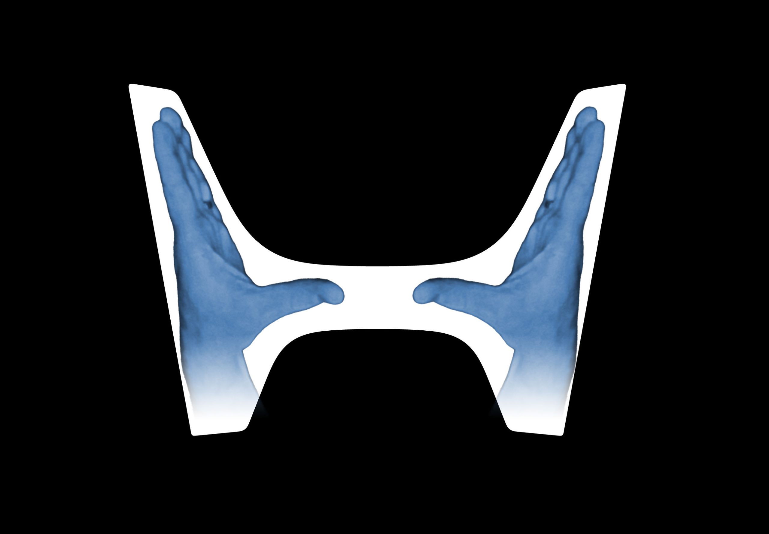 Image: Honda, modified by Jason Torchinsky
Is that what they’re getting at? This feels like a stretch. A stretch in the same way that Hyundai’s claim that their H-logo is supposed to represent two dudes shaking hands:
Come on, Hyundai. Really?
Still, silly made-up-by-PR-hacks outstretched hands explanation aside, I think Honda’s new logo is pretty good, and I think going back to the original, clean source is a wise idea.
This’ll look good on grilles or grill-free front ends alike, illuminated or chrome or matt. It’s a good logo. But it’s an H, not two damn hands.