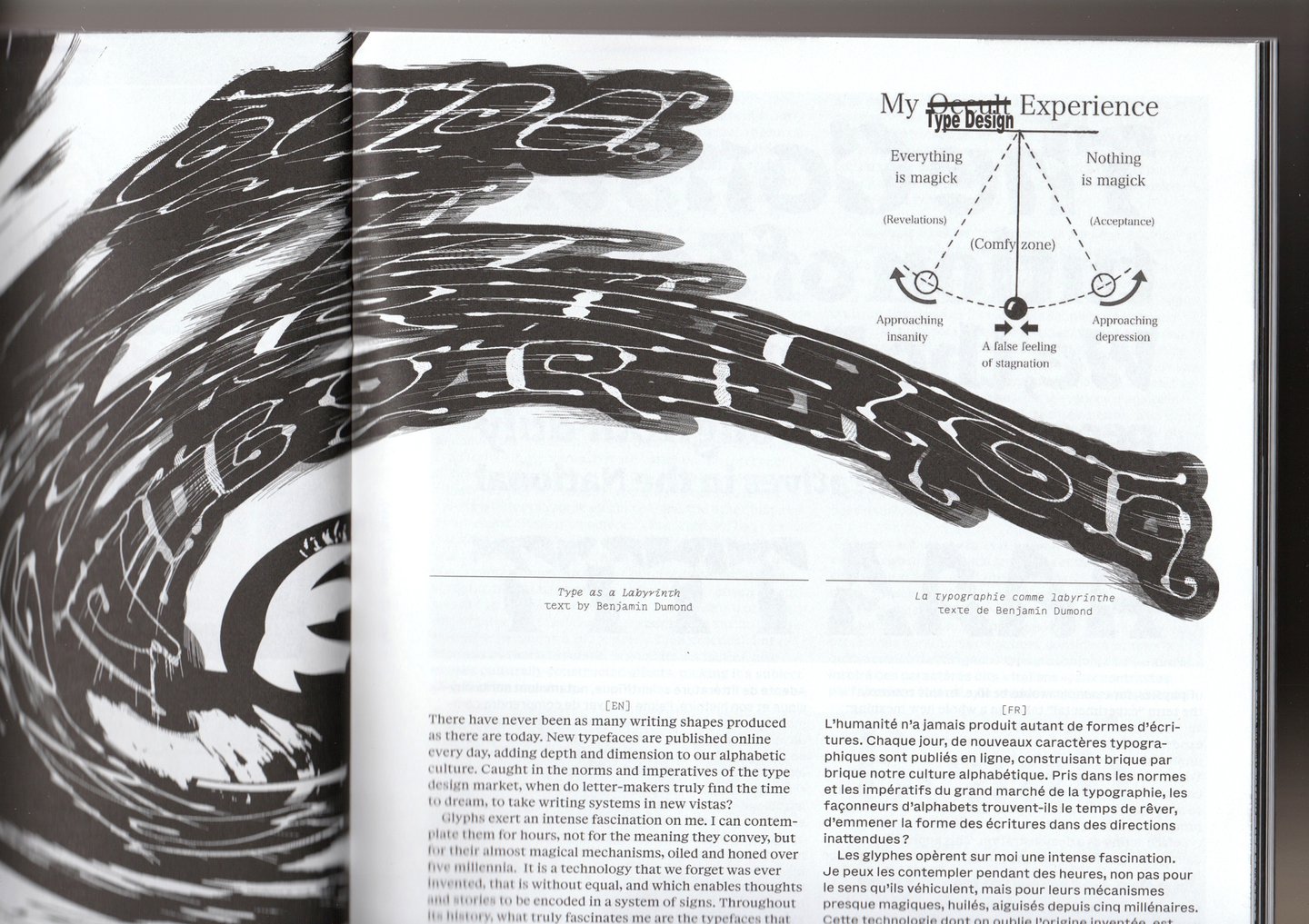
“We defend a poetic vision of type design,” says Lucas Descroix, founder of Plain Form, the boundary-pushing type foundry behind Plain Text, type design publication full of contributions from recognised practitioners as well as curious beginners. “We aim for Plain Text to be a space where letters are free from utilitarian expectations.” As an independent magazine without a distributor, they aim to make an inclusive space for designers to share doubts, successes and failures through bizarre typographies and alternative shapeforms. “Often, the market encourages self-censorship, inventive projects get clipped because they might confuse potential customers,” says Lucas. Through collecting and studying type faces that are non-traditional, Plain Text opens up new avenues for stories to be told through design.
Featuring essays, interviews, portfolios, re-publications, fiction and visual works, Plain Text doesn’t just attempt to please experts in their field but students too, by offering valuable insights to language and communication. Plain Text’s first issue features calligraphic cursives and bold fonts blown to bits with distortive elements, turning otherwise ordinary typeface into barrages of spikes and assaults of waveform. Quite literally, the typographic norms that have laid the bed for typeface design is decimated and glued back together. “Typography works because of norms—but those norms are neither natural nor fixed,” says Lucas. “Alternative approaches to type design allow us to question what a system of letters does, what it’s allowed to do, and what kinds of relationships we can invent between form and meaning.”

