
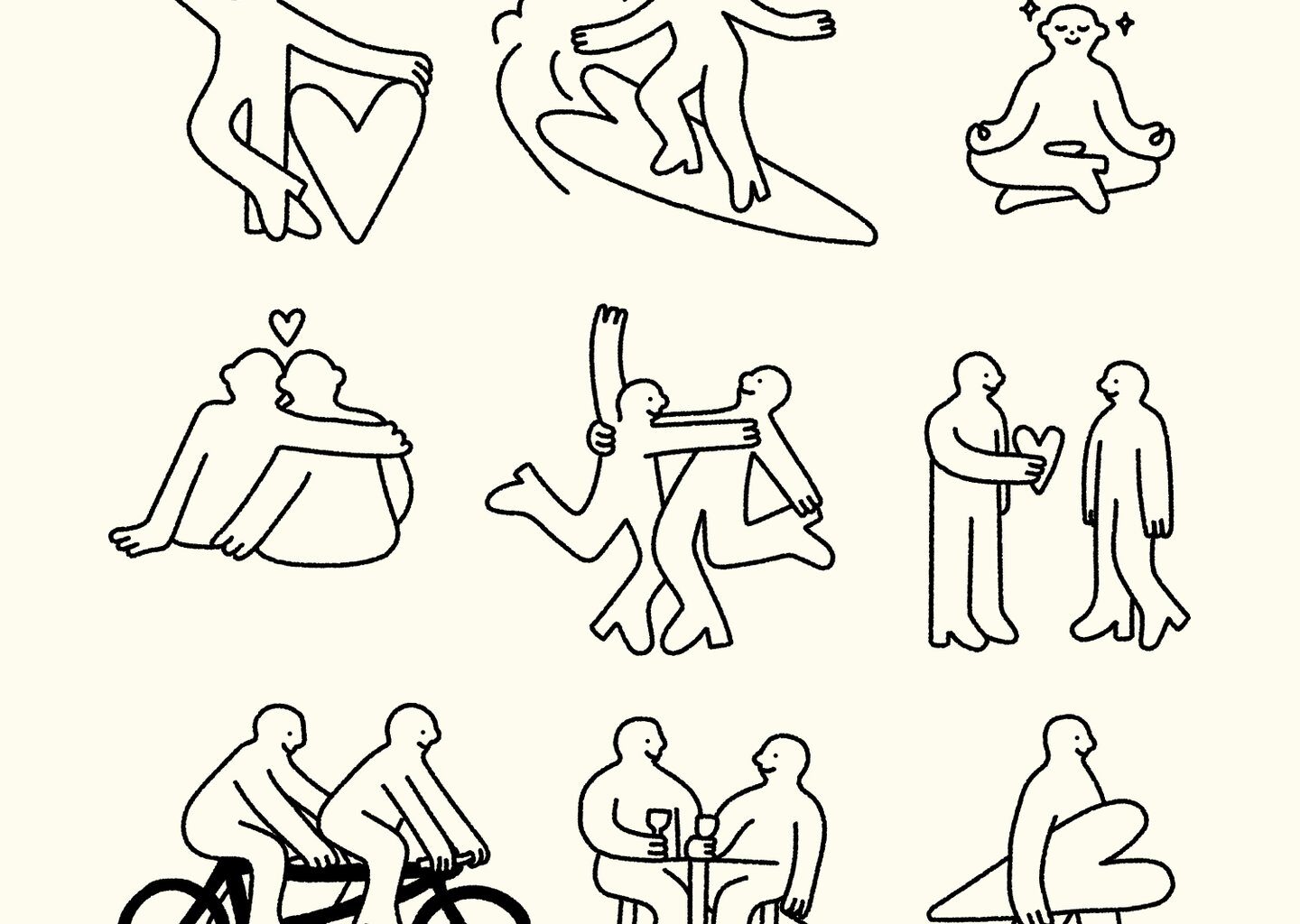
Just because the likes on Cerca are anonymous doesn’t mean the visual identity had to be too. When one uses Cerca, they’re more likely to connect with people they tangentially know, which has fed into Saint Urbain’s taglines ‘making love easy to find’ and ‘fewer matches, better connections’. Visually, the branding mirrors that – expressive and human, a world full of mutuals rather than strangers. Saint Urbain were careful to not turn those ideas into messaging about safety or the morality of using dating apps, opting for lighter visuals: rabbits, figures made of pink clouds and drawings that allow people to paste themselves onto the characters.
“The illustrated characters and animals are intentionally silly, loose and very human. They represent the personalities you actually meet through mutuals,” says Alex. Saint Urbain developed Heart Boy, a flexible motion graphic that could exist as chrome, clouds, fur, bubbles, grass or galaxies. The agency also makes great use of text-based animation to create motion out of the word ‘cerca’, baking the ethos across the whole project. “Each version represents a different social circle or micro-community. Within every small group of mutual friends, there’s its own universe, its own vibe,” says Alex.