
Color confidence was seemingly at the very heart of 1980s interiors. Teamed with chintz, pattern on pattern, and reflective surfaces, this decade embraced maximalism in all its glory. And while the eccentricity of the ’80s has largely been replaced with more understated design styles, few decades provide as much inspiration for immersive color palettes.
Today, interior designers are channeling ’80s-inspired hues, but fear not, the look is liveable, grounding, and soft. From moody shades of teal that add depth to pastel tones that bring freshness, designers are proving that these once-dated color palettes bring warmth and personality to modern homes.
Article continues below
You may like
1. Purple
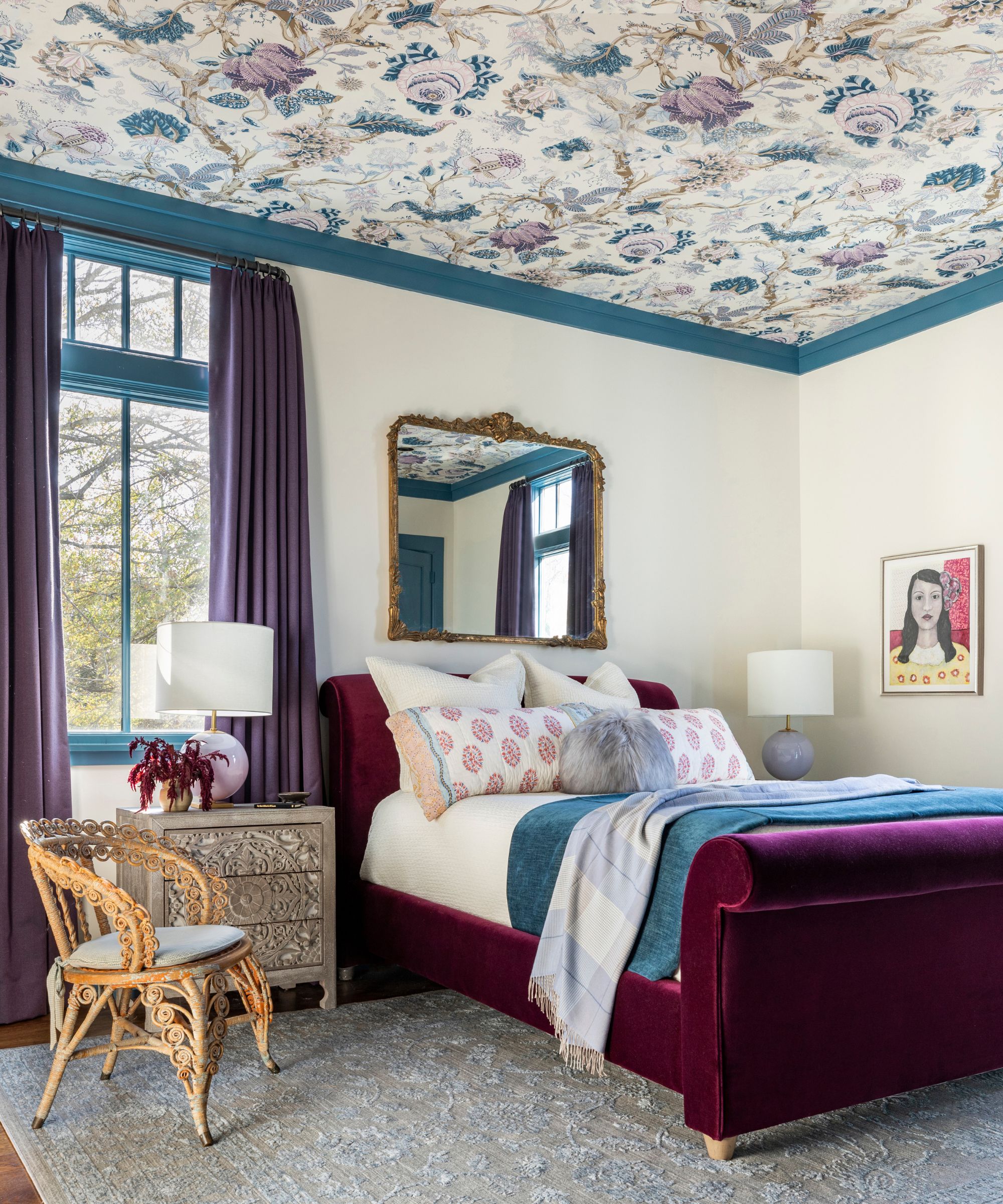
In this bedroom, purple is given a modern twist with the plum-toned upholstered bed and lilac curtains. It is teamed with Benjamin Moore’s Twilight on the trim, along with a Schumacher wallpaper on the ceiling.
(Image credit: Julie Soefer. Design: Linda Eyles Desgin)
Decorating with purple is widely regarded as a nostalgic color trend, one that feels especially aligned with the 1980s. While there was a general shift away from this rich hue in fear of it looking dated, it has, in the last couple of years, made its way back into interiors.
In this bedroom, purple was used as an accent color against the neutral walls and blue trim, putting a livable twist on this bold color. ‘For this guest room, we were looking for a sophisticated, bohemian vibe, so the color combination needed to be arty and unconventional,’ says the designer Linda Eyles. ‘The plum tones feel lush and romantic. Rather than pairing the purple shade with a complementary color like yellow or green, we mixed it with blue for an unexpected and peaceful feeling.’
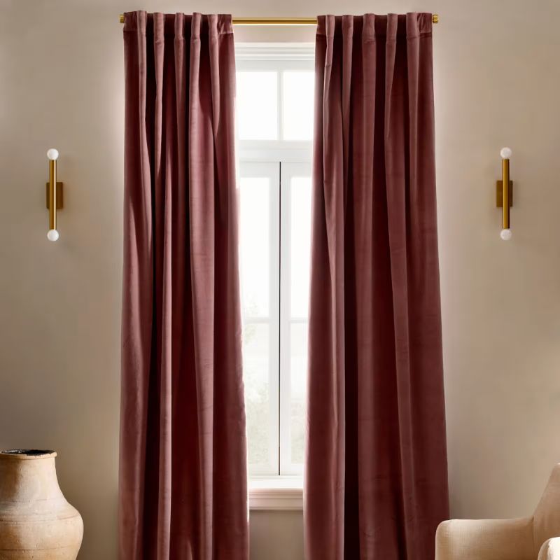
Quince
Cotton Velvet Curtain
Take inspiration from this bedroom and add warmth and texture with purple window treatments.
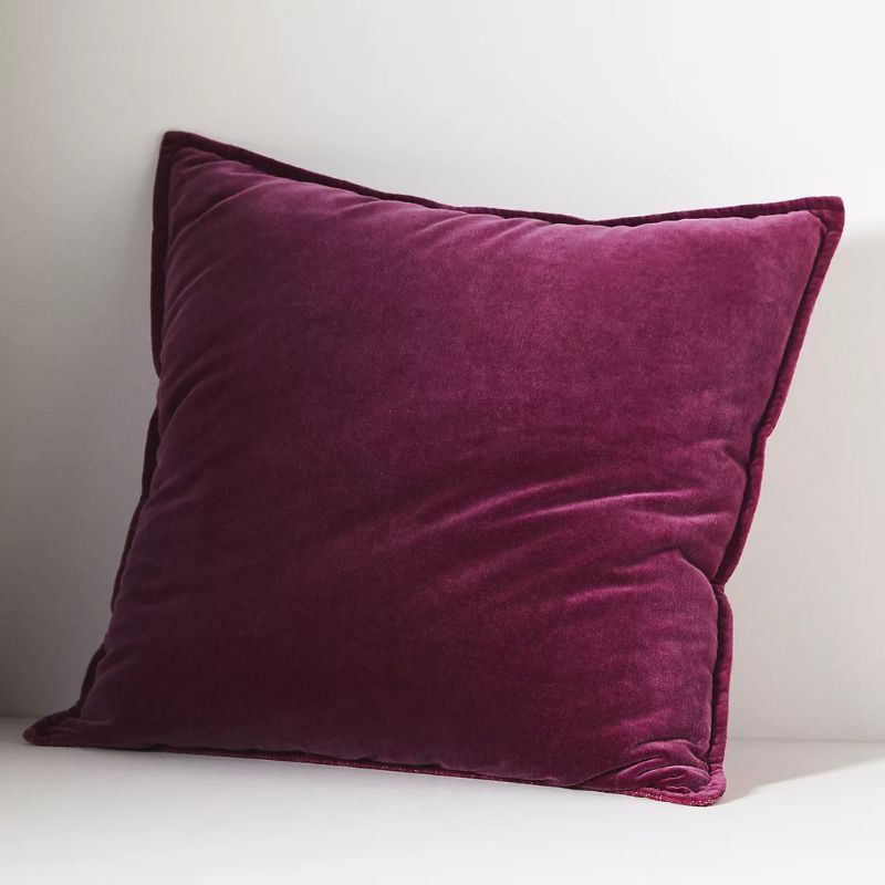
Anthropologie
Velvet Trova Pillow
This velvet pillow brings sophistication and nostalgia in equal measure.
Candice Olson
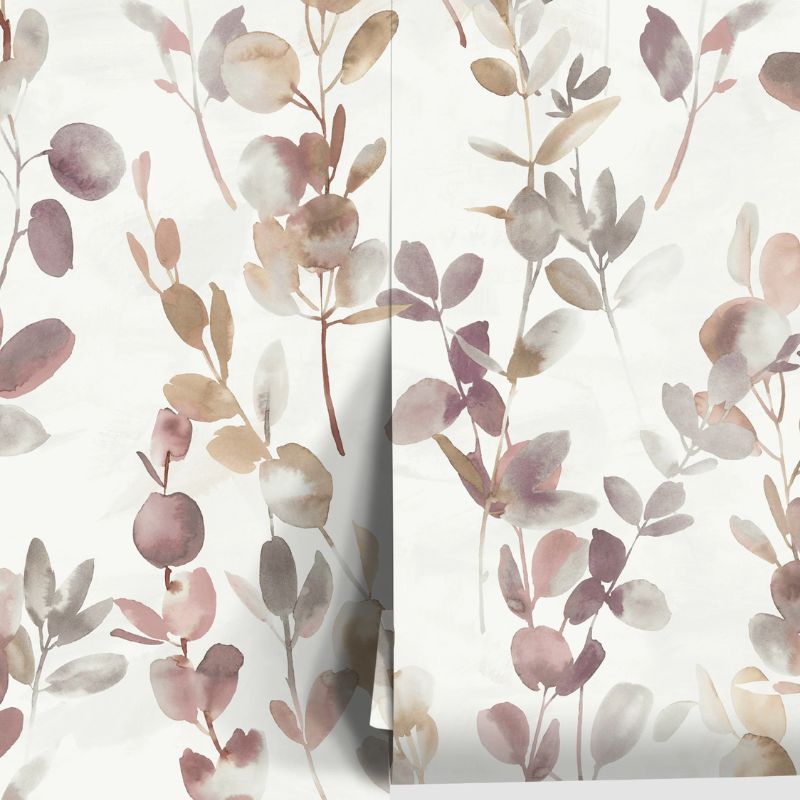
Joyful Eucalyptus Wallpaper
To keep wallpaper feeling modern, use it in unexpected ways, such as on the ceiling.
2. Hot Pink
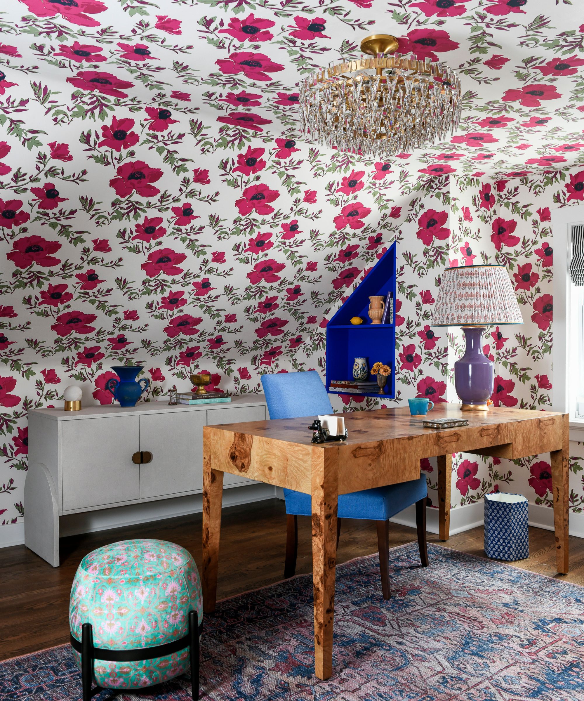
In this home office, the bright pink wallpaper from Lake August adds a fun and unexpected look.
(Image credit: Erin Kelly. Design: Michelle Gage Interiors)
The ’80s were all about loud, cheerful interiors that embraced maximalist decor, and what better color to embody that than hot pink? Similar to purple, it’s a hue that has shifted out of favor in recent years, but today, designers are proving that it can work as a stylish shade when used thoughtfully.
Here, the designer Michelle Gage incorporated this playful hue with the floral wallpaper. ‘The client actually requested that her office feature the color heliotrope,’ she says. ‘The moment she said this, I knew the exact wallpaper we’d use in the room. This Barbie pink lipstick shade is so exciting for an office space.’
‘I find pink to be one of the most fun colors to work with,’ Michelle adds. ‘It’s shocking and playful – and when done right, very sophisticated. Pink pairs well with a lot of colors – greens, blues, and even yellow.’
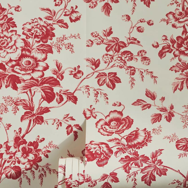
Anthropologie
Anemone Toile French Red Toile Wallpaper
This floral wallpaper is timeless and fresh – a wonderful choice to welcome the soon-approaching spring months.
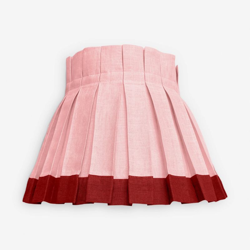
Cielle Home
Color Block Classic Box Pleat Lampshade
Combine warming pink with rich red with this box pleat lampshade – a great choice for bedrooms.
Anthropologie
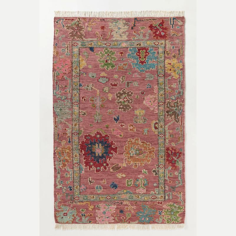
Perry Wool Hand-Knotted Persian-Inspired Rug
Add this color trend underfoot with this patterned wool rug.
3. Mint Green
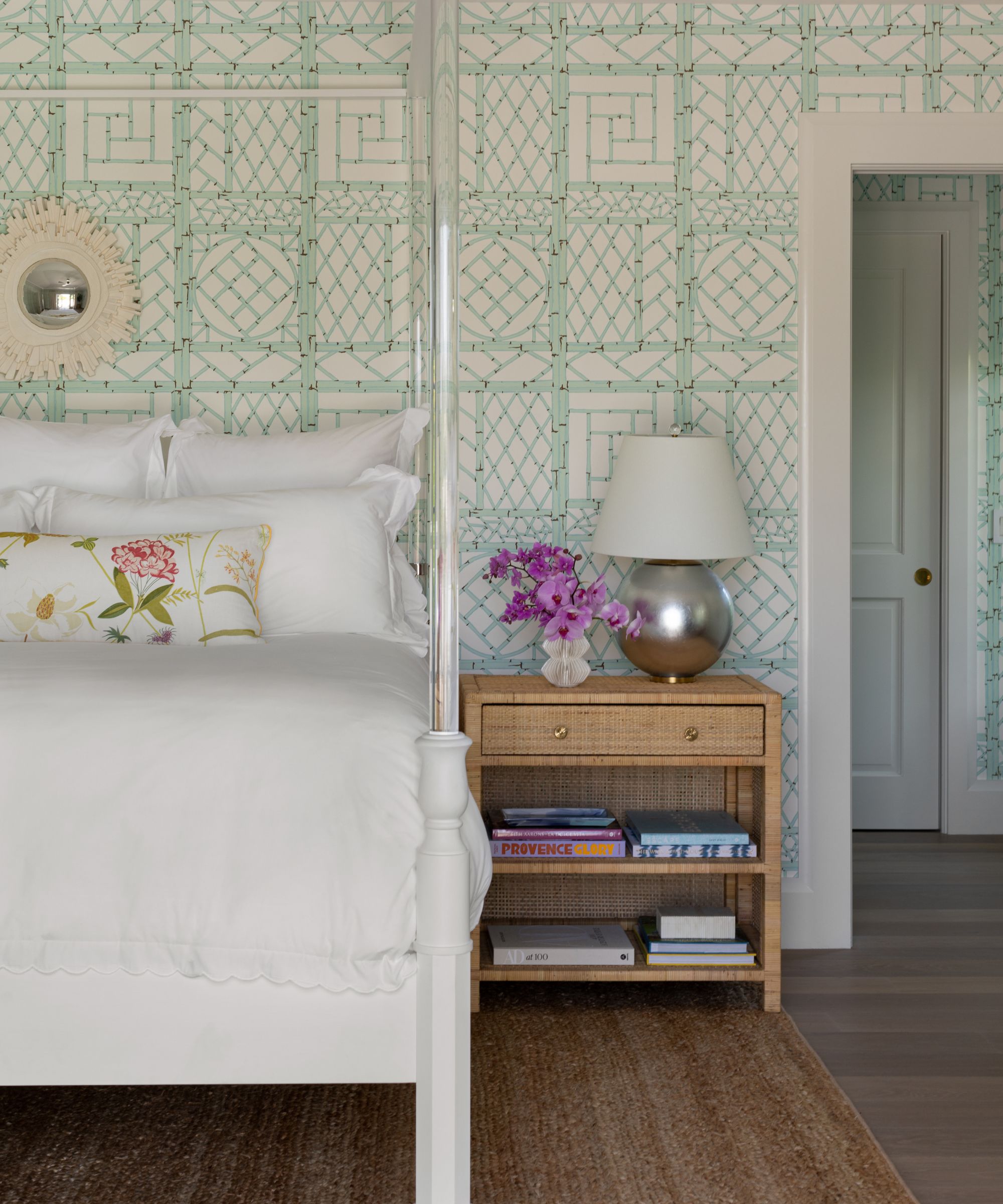
Mint green is incorporated into this relaxing bedroom with the wallpaper from Quadrille in the shade ‘Aqua Brown’.
(Image credit: Aimée Mazzenga / JBSA. Design: Paloma Contreras)
Pastel tones, such as mint green, brought freshness to ’80s interiors. Today, designers are nodding to this nostalgic hue to create calming, light, and airy rooms that provide balance to warm color schemes.
‘We chose mint green for this Palm Beach bedroom because it feels fresh and light, which suits the coastal setting naturally,’ says the designer Paloma Contreras. ‘Mint can easily lean nostalgic, so to keep it feeling current, we paired it with crisp white bedding, tailored upholstery, and natural woven textures that add a beautiful balance. The overall mood of the palette is airy, relaxed, and layered.’
What to read next
McGee & Co. x Loeffler Randall
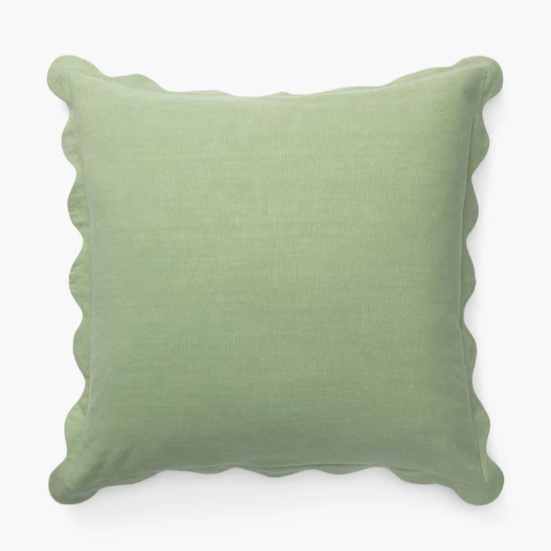
Colette Scallop Border Pillow Cover
Refresh your space for spring with this uplifting shade of green.
McGee & Co.
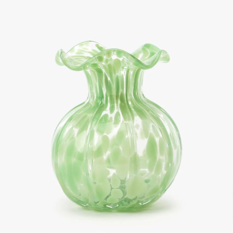
Ruffled Edge Vase
For a smaller addition of mint green, go for this glass vase.
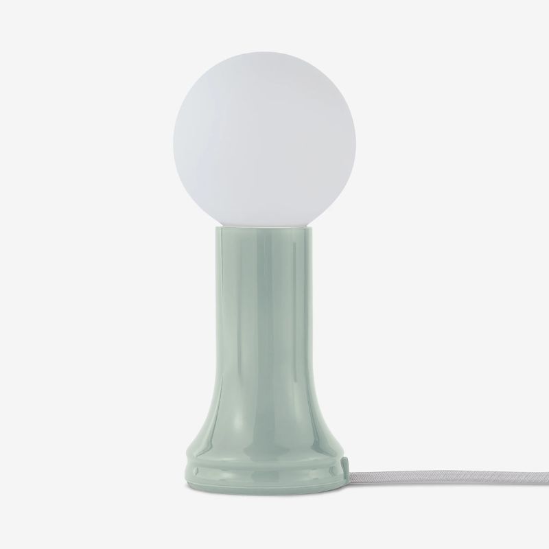
Tala
Shore Mini Table Lamp
The green tone of this lamp is soft and subtle, perfect for neutral rooms.
4. Teal
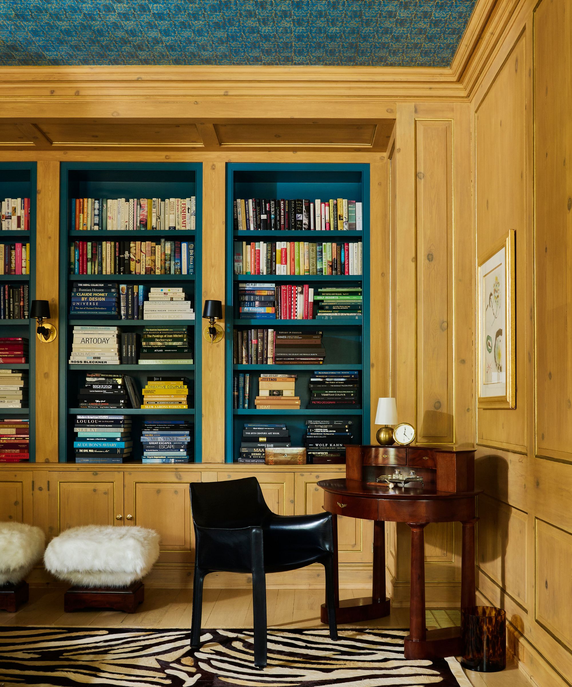
Wood tones complement the teal of the bookshelves: Benjamin Moore’s Bermuda Turquoise.
(Image credit: Jack Thompson. Design: Nadia Palacios)
Teal, a standout shade from ’80s interiors, has been making its way back into our homes, although this time around, it’s arguably in a more sophisticated and understated way.
‘The romanticism and exuberance of the ’80s, with its embrace of bold color, has origins in the post-war optimism of the ’50s,’ explains the architect and designer Nadia Palacios. ‘It was fitting then that we took inspiration from the original 1950s wallpaper on the ceiling of this renovated library to paint the cedar bookshelves a bold teal.’
‘The key to making a strong color like a 1980s teal work is restraint and intentionality,’ she adds. ‘Rather than painting every surface, we applied the teal exclusively to the bookshelf interiors. Adding a graphic black-and-white zebra rug anchored the composition by providing a contemporary counterpoint, and vintage touches, like a Biedermeier desk and antique hand sconces, balance out the space with character.’
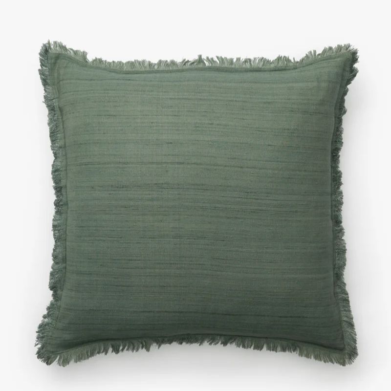
McGee & Co.
Abbey Silk Fringe Pillow Cover
Not too saturated, this teal pillow cover puts a modern twist on this nostalgic shade.
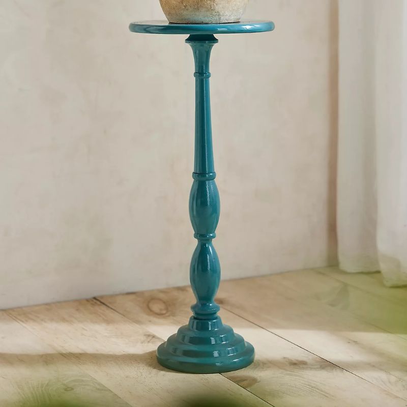
Terrain
Spindle Aluminum Side Table
Add a pop of teal to your home with this side table that also works as a plant stand.
Morris & Co.
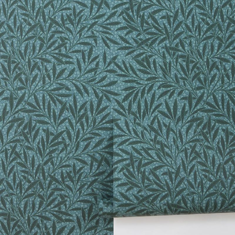
Emerys Willow Leaves & Trees Wallpaper
Go bolder with your teal decor by covering the walls in this willow-print wallpaper.
5. Warm Plaster Tones
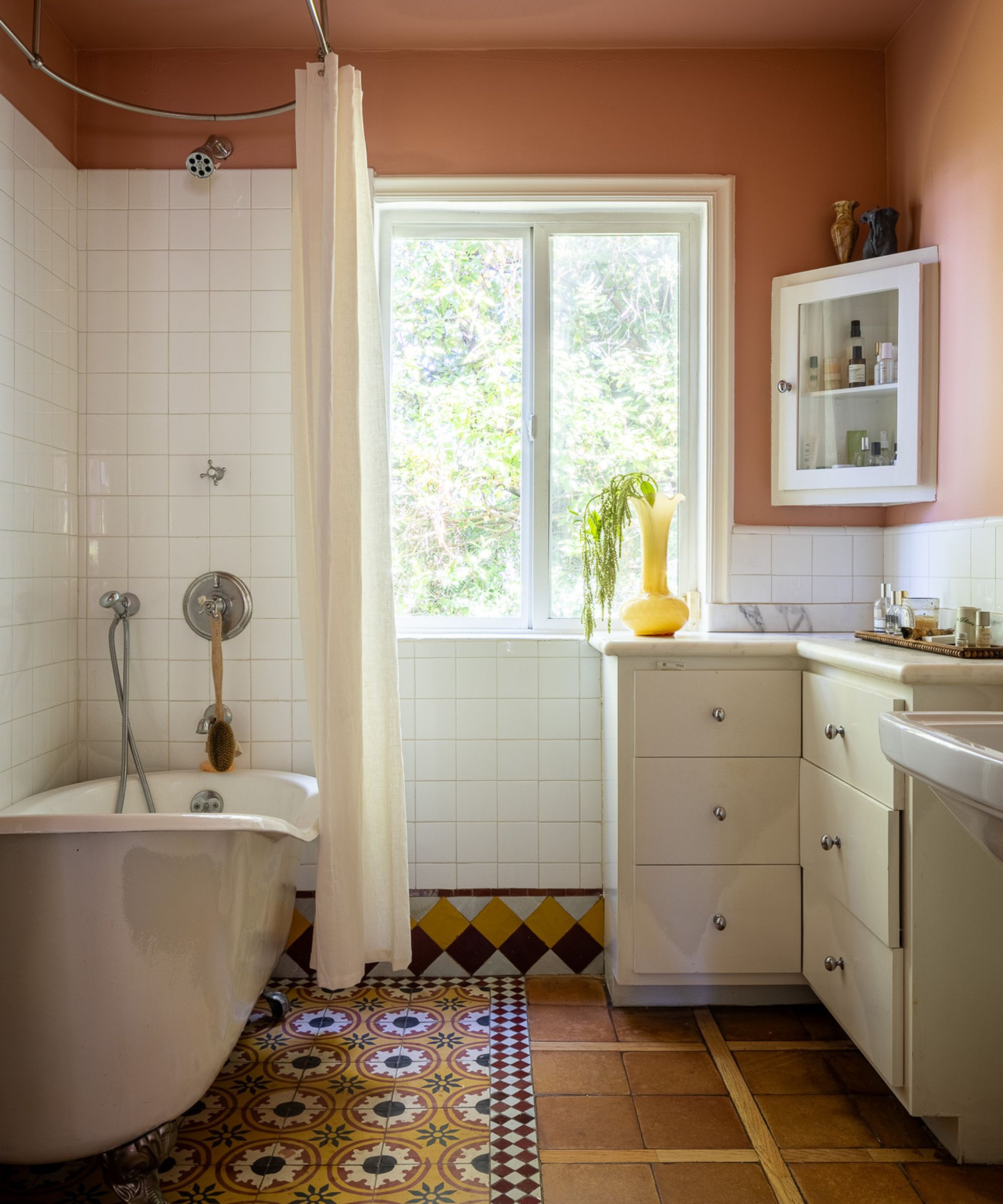
36 Hours in Marrakesh by Backdrop was used on the upper walls in this bathroom, along with white fixtures to keep things modern.
(Image credit: Tanveer Badal. Design: STUDIO KEETA)
For a more neutral take on ’80s color trends, designers are turning towards warm and earthy plaster pinks. With enough depth, the right shade of plaster pink can reflect a retro look, serving as a richer take on lighter neutrals.
‘We chose this warm, terracotta-leaning pastel because it holds depth without overwhelming the space,’ explains the designer Kristina Khersonsky of STUDIO KEETA. ‘In a bathroom, which is a highly utilitarian space, we sought to introduce warmth and softness.’
‘Nostalgic tones can easily skew retro without thoughtful integration and context,’ she adds. ‘We balanced warmth with creamy neutrals to keep the composition feeling structured and also in juxtaposition. By limiting the color only to the upper walls and grounding it with a simple white tile, the room maintains visual airiness.’
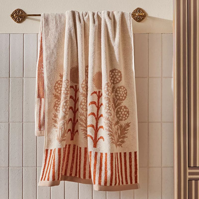
Ellen Merchant
Cottage Cotton Towel Collection
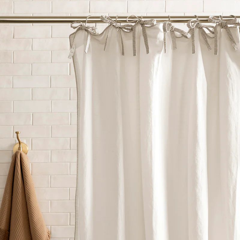
McGee & Co.
Lillian Shower Curtain with Striped Ties
As inspired by this bathroom, go for a neutral shower curtain to add lightness to plaster walls.
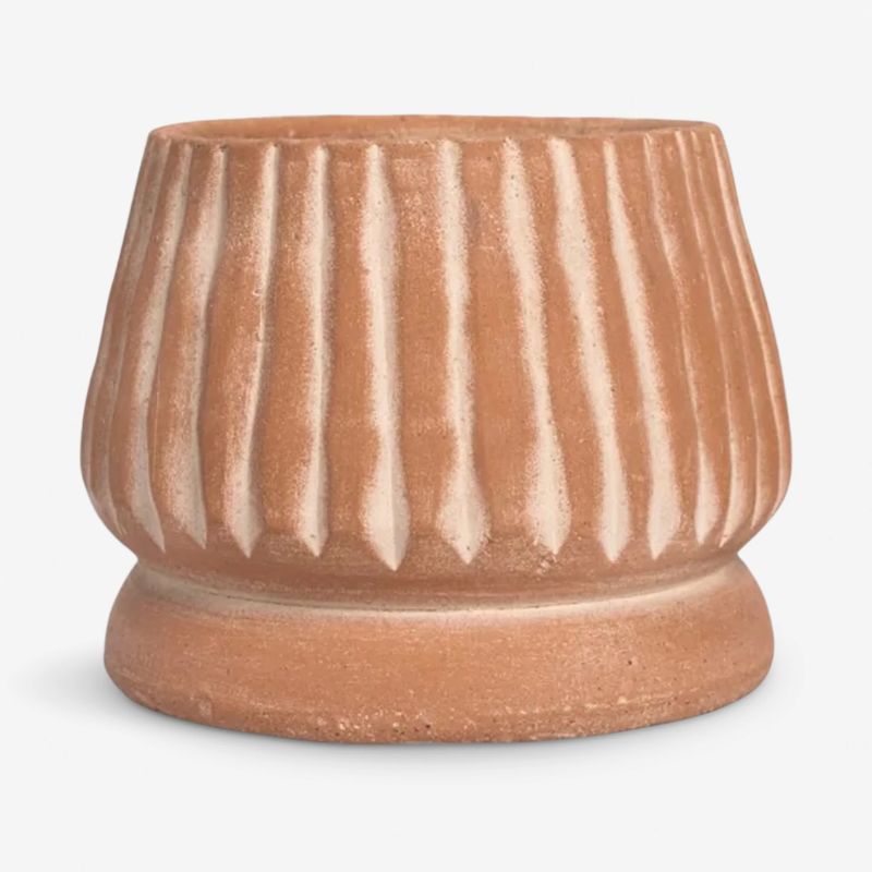
This plant pot is a timeless piece that would work in many rooms, from bathrooms to kitchens.
These ’80s-inspired colors are all about embracing warm and welcoming color palettes that add depth, fun, and personality – a push against the all-neutral schemes of recent years. By choosing slightly muted variations of each of these colors, your space will feel livable rather than overly saturated, while natural materials bring balance.
Love beautiful design ideas, expert advice, and inspiring decor trends? Sign up for our newsletter and get the latest features delivered straight to your inbox.