
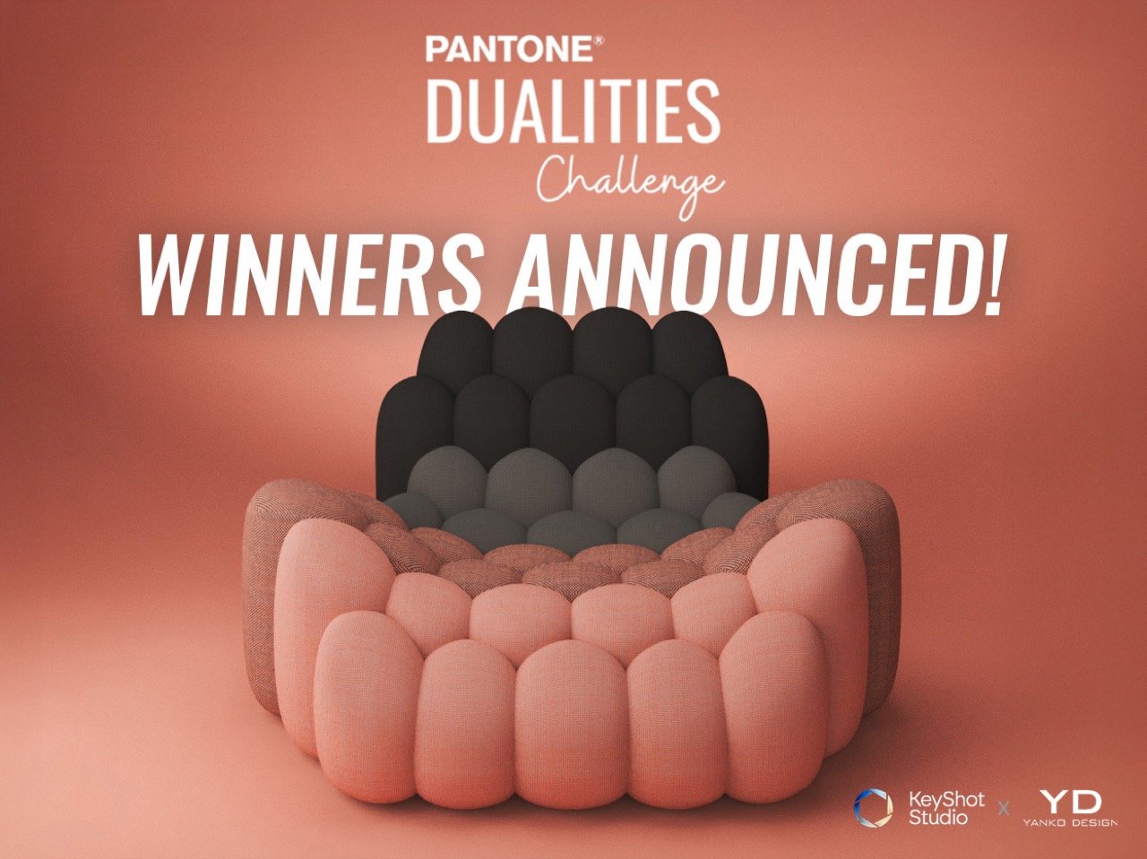
This July, Yanko Design and KeyShot partnered with Pantone to bring their magical Dualities color palette to life through rendering (and a touch of AI). The Pantone Dualities Challenge kicked off on the 18th of the month, finally coming to a close at the end of August and we’re here to introduce you to the winners! The brief for the challenge was simple – explore Pantone’s Dualities palette and its set of 175 color combinations, comprising subtly eye-catching pastel and warm/cool grey shades.
The challenge also introduced a new game-changing feature from KeyShot’s latest 2025.2 update – AI Shots. Although optional, we also encouraged participants to tinker around with the AI tools in KeyShot Studio (which run locally, so you don’t need credits or an internet subscription, and you don’t have to worry about companies accessing and training on your data), that let you generate materials, backgrounds, and even new designs entirely. While these features do require a fairly powerful GPU, they truly represent the new era of design and visualization we’re entering… although first, let’s just appreciate the winners of the Pantone Dualities Challenge and the gorgeous hues on their winning designs!
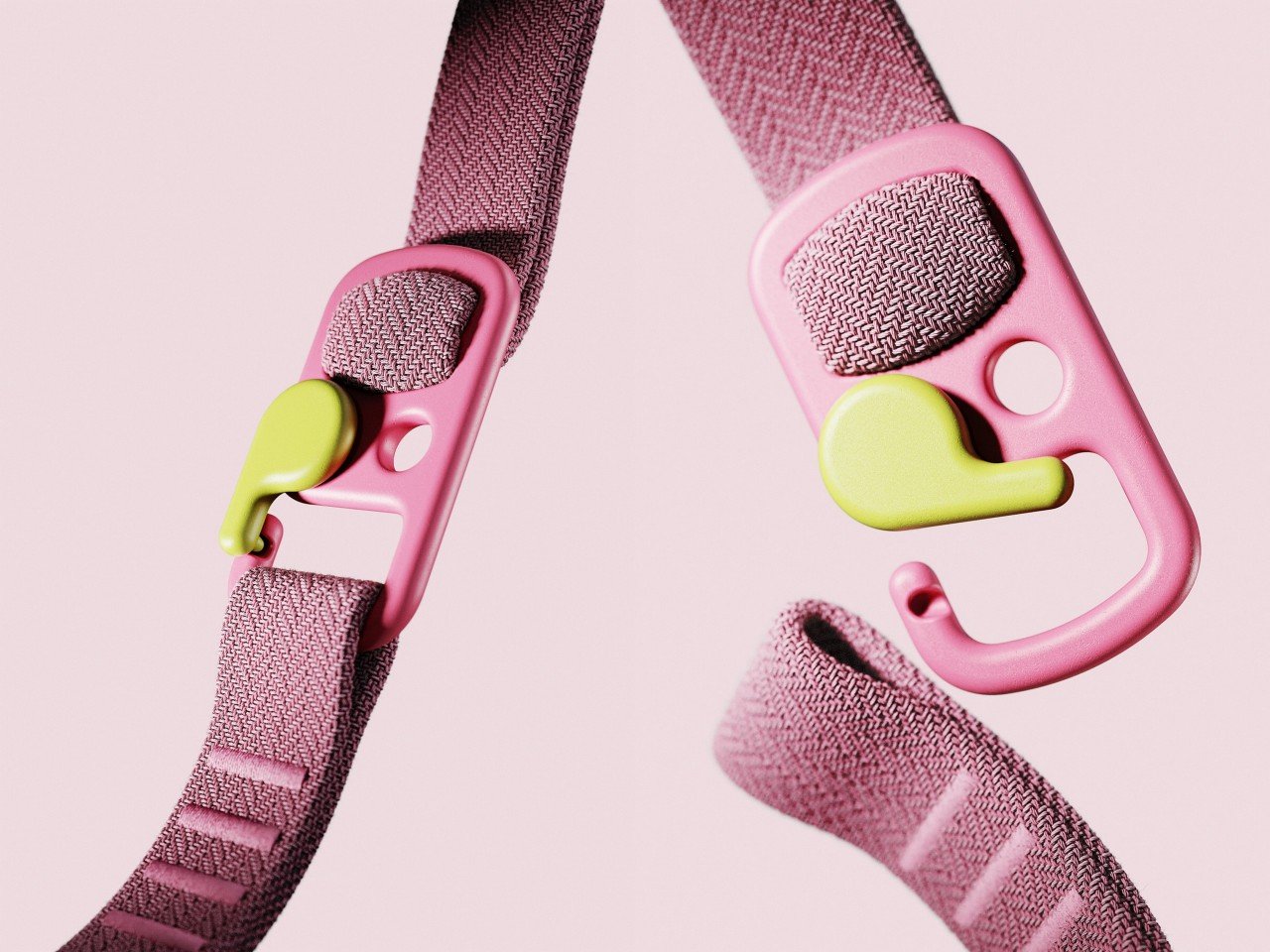
Sam Weise’s design ended up snagging the gold for one unique reason – understanding and executing the brief flawlessly. Weise simply chose two colors (that don’t usually work together) and combined them into a novel carabiner design. The carabiner looks simple, but is brilliantly rendered, with a fabric strap that shows off KeyShot’s RealCloth material with sheer grace.
The colors, pink and lemon green, don’t usually work on paper because of one being warm and the other being cool. But here, they pair well, creating harmony as well as a fair bit of visual drama that allows you to quickly understand where the carabiner’s arm is and intuitively open it whenever you want! The brief was to explore Pantone’s palette and create a duality of colors that’s uniquely pleasing… and Weise nailed that.
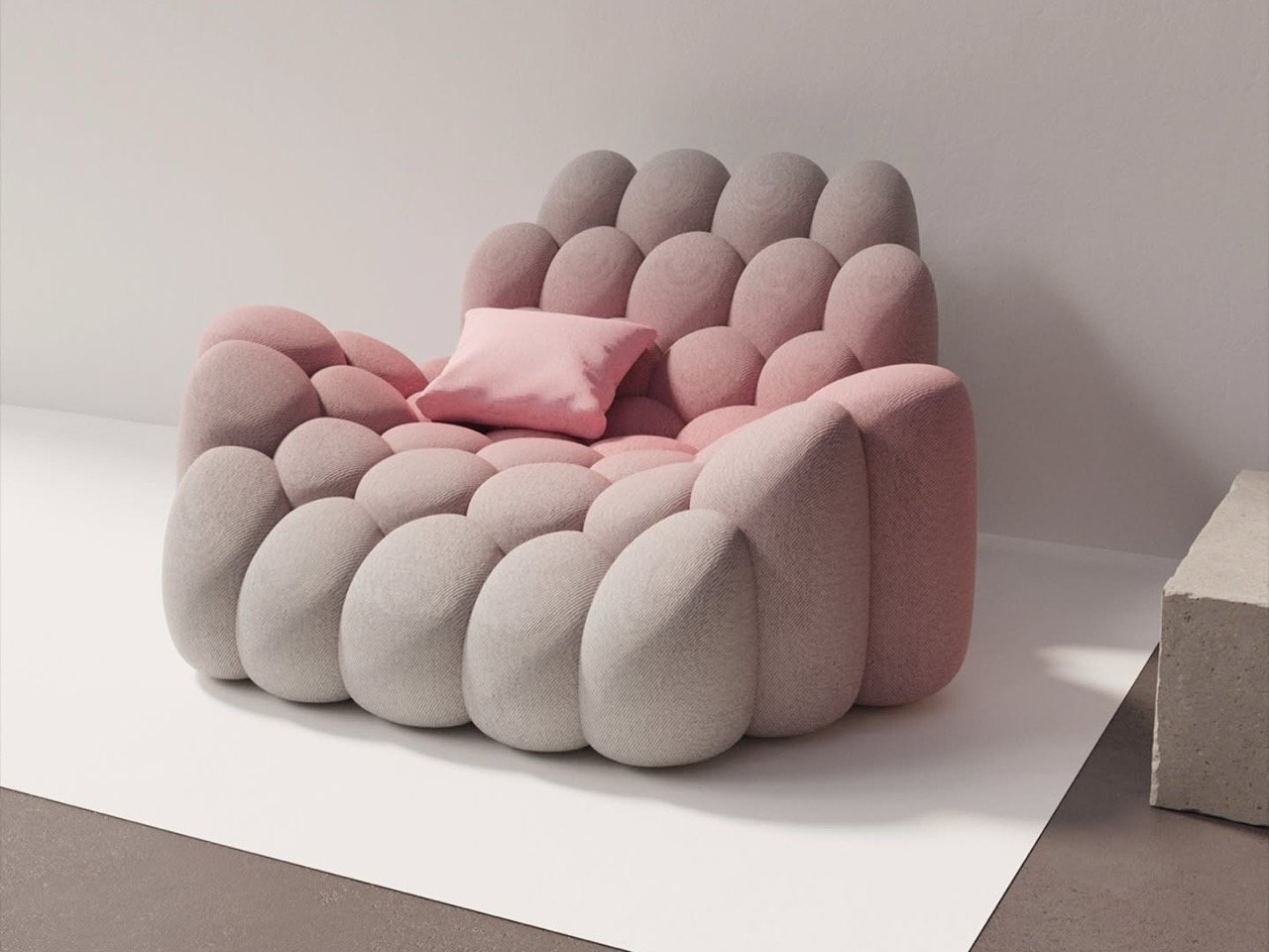
James Wolf took the Pantone Dualities Challenge’s chair and gave it a spin of his own. Rather than simply choosing colors that go together, Wolf decided to literally blur the lines, creating a gradient that honestly feels like magic. Doing the visual job of ‘well blended makeup’, this chair shows a warm grey along with a pink hue, blended effortlessly together.
There’s something so pleasing about how this gradient translates onto the chair’s feminine design. Each of the chair’s segments sort of looks like a lipstick’s stick, so to then apply makeup-inspired colors to the chair feels quite literally like a match made in heaven! I do hope James turns this into an ongoing series!
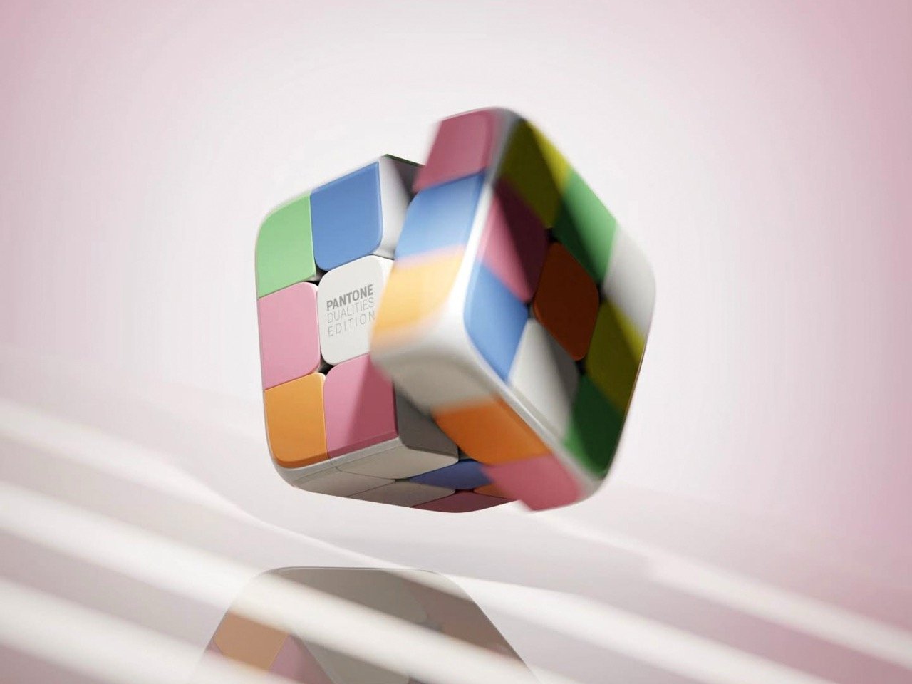
I’m a little jealous of this one for being such a phenomenal idea. From the mind of Sidhant Patnaik, this bronze-winning entry said ‘to hell with dualities’, and created a palette that embraced a bit of color and chaos. Sidhant imprinted the Dualities palette onto a Rubik’s Cube, turning the hand-eye-coordination toy into a palette-maker.
Play around and create chaotic color combinations as you go. There’s no winning or losing, there’s only experimentation, which I’m absolutely a fan of! Does this embrace the brief of ‘Dualities’? Not quite. But does it use the colors in a way that inspires other designers? Absolutely! Pantone, you guys better work on a Rubik’s Cube next!
Honorable Mention #1 – Paradigm.ooo
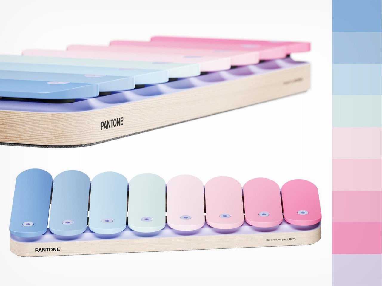
A lot of people see color in a linear fashion. Unless you’re looking at a wheel, most color palettes are laid out in a straight line on software. So what if you just applied those colors on something else that had a straight line? This gorgeous xylophone from Paradigm takes a set of colors ranging from pink to blue, and orients them on the instrument’s keys.
It’s really cleverly done, to be honest. Aside from just how pretty it looks, the fact that the larger (lower-pitch) keys are blue (masculine), and the smaller (higher-pitch) notes are pink (feminine) feels like an accidentally awesome touch! No? Paradigm didn’t win an award, but this entry definitely deserved a mention.
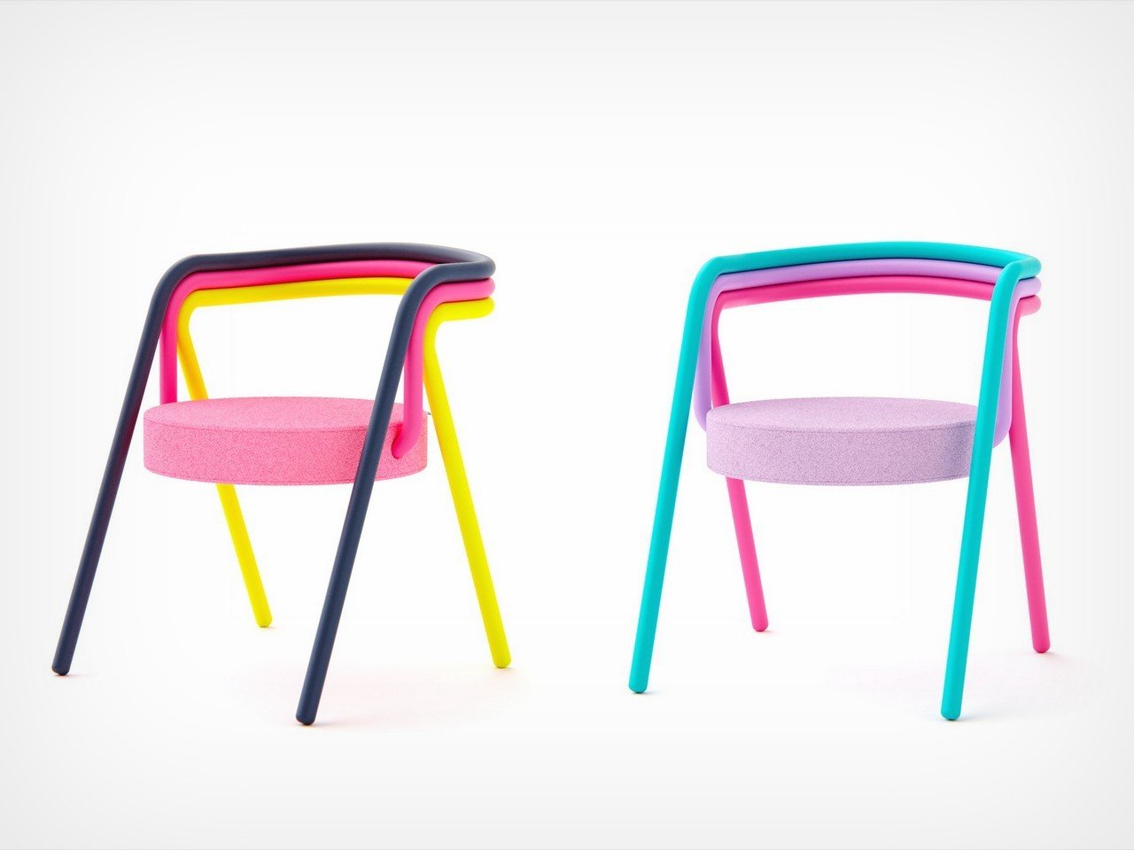
The final honorable mention goes to Liam de la Bedoyere of Bored Eye Designs, who decided to model a chair of his own for the challenge. Relying on multiple piped structures that wrap around a foam seat, Liam’s design creates a few distinct canvases to apply the colors from the palette. While over-all simple in design, the chair uses linear and block elements, that create a neat opportunity to show how colors look in stripes and swatches when placed together.
The result is fairly interesting, opening up the opportunity to really experiment with a whole bunch of colors. For example, the chair on the left relies on high-contrast to grab your eyeballs, while the other plays on a different kind of contrast, created by pairing two fairly opposite colors like blue and pink, with a harmonious purple in between!