Is it that time already? The clocks have gone back, the weather is getting colder and wetter, and the countdown to 25 December has begun in earnest. But for designers looking for exciting new fonts, it might feel like Christmas has come a couple of months early. October has delivered one of the most eclectic typographic hauls of the year.
We’re talking a variable font five years in the making, a humanist sans designed for dyslexic readers, a display typeface assembled from clay impressions of gravestones, and a geometric stencil that can switch between sharp and rounded at the pull of a variable axis. Elsewhere there’s elegance in a new revival of a 1921 Garamond interpretation, a sense of solidity in an eight-weight industrial slab named after a metallurgical hardness test, and outright quirkiness in a type system that deliberately sits “at the threshold between reading and looking”.
In short, while it’s easy to feel design and creativity are being taken over by AI, the fresh typefaces we’ve collected below remain very much hand-crafted. That thought alone should keep you warm and cosy as the nights draw in.
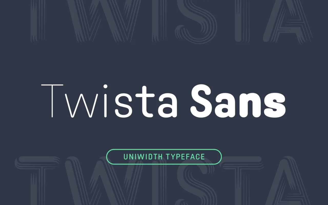
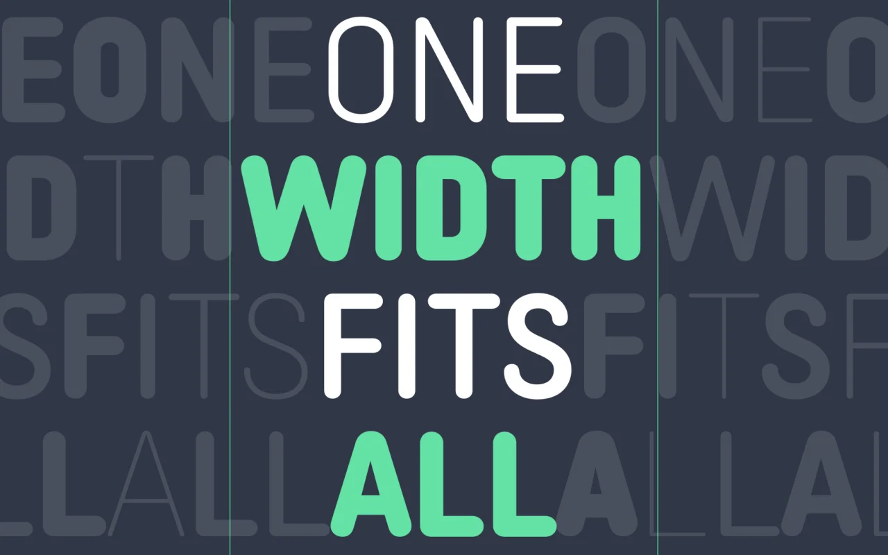
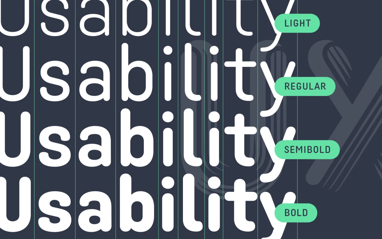
Twista Sans is something different: a uniwidth typeface. That’s not the same as being monospaced: Twista Sans keeps characters proportional. But all its glyphs share the same horizontal width, so you can switch weights without your layout reflowing, opening up new possibilities for hover effects and UI animations. Designed as a sans companion to Nübel’s display face Twista, Twista Sans could work well for packaging, branding and editorial.
 2. Corsario by Felix Braden
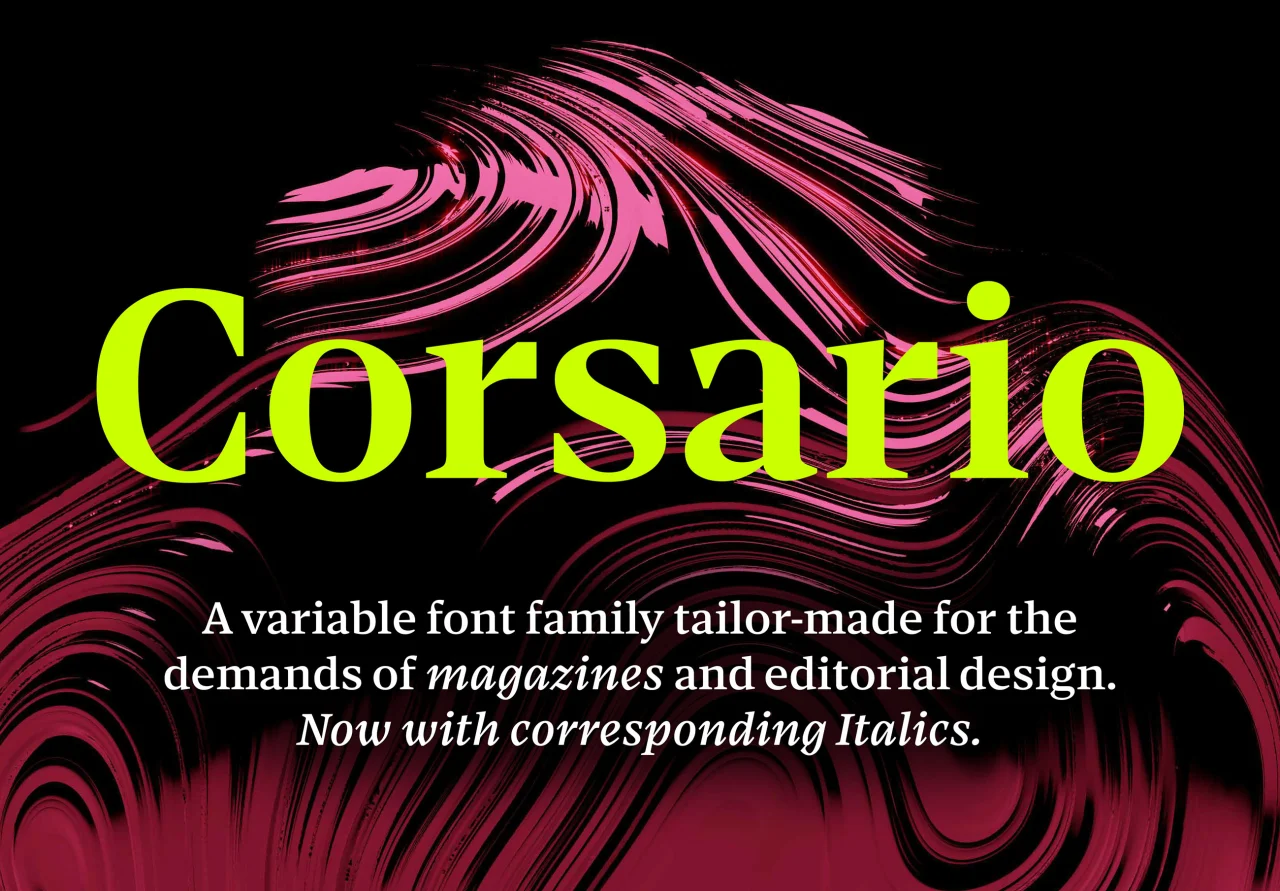
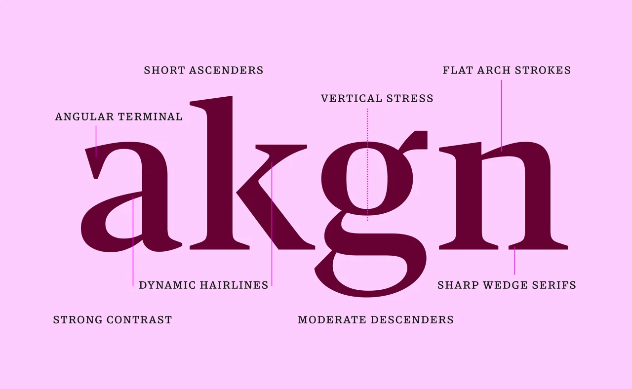
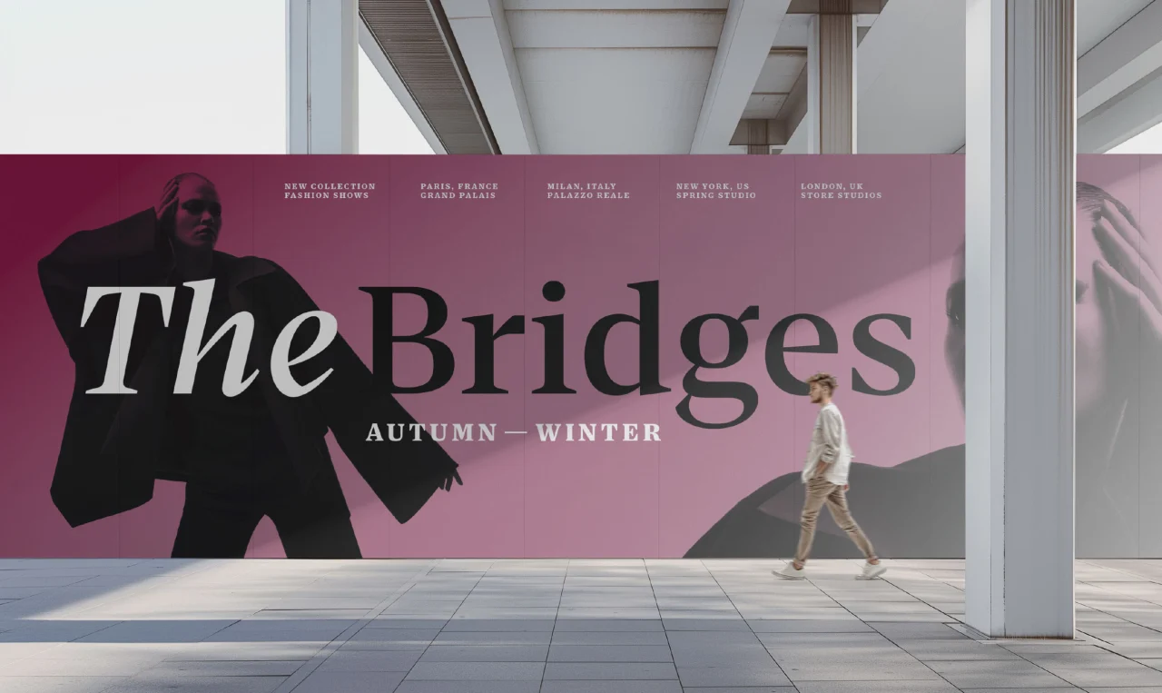
Cologne-based Felix Braden, the designer behind Floodfonts, has channelled five years of work into Corsario. Inspired by the British transitional style, it features sharp, prominent serifs that make text stand out. With 54 styles, this variable font family lets you set both elegant headlines and legible captions from a single font file.
 3. Triode by MuirMcNeil
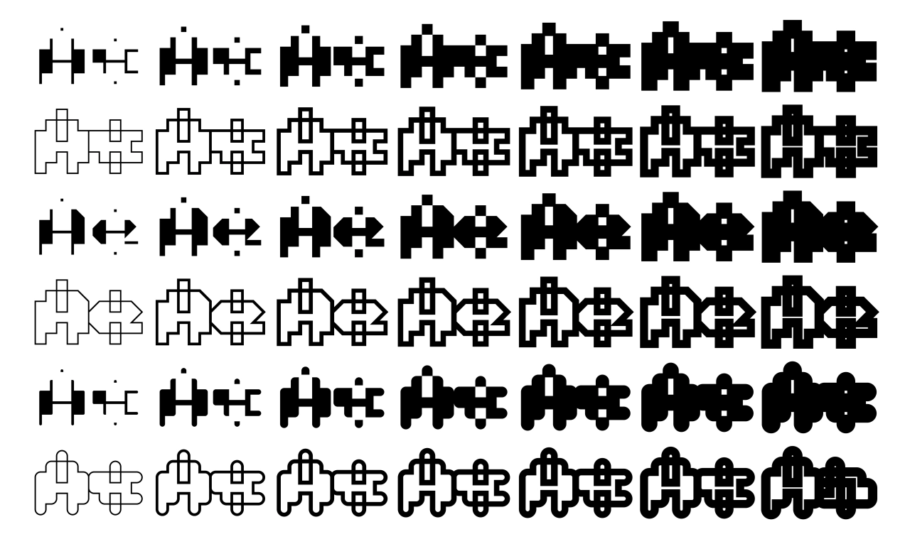
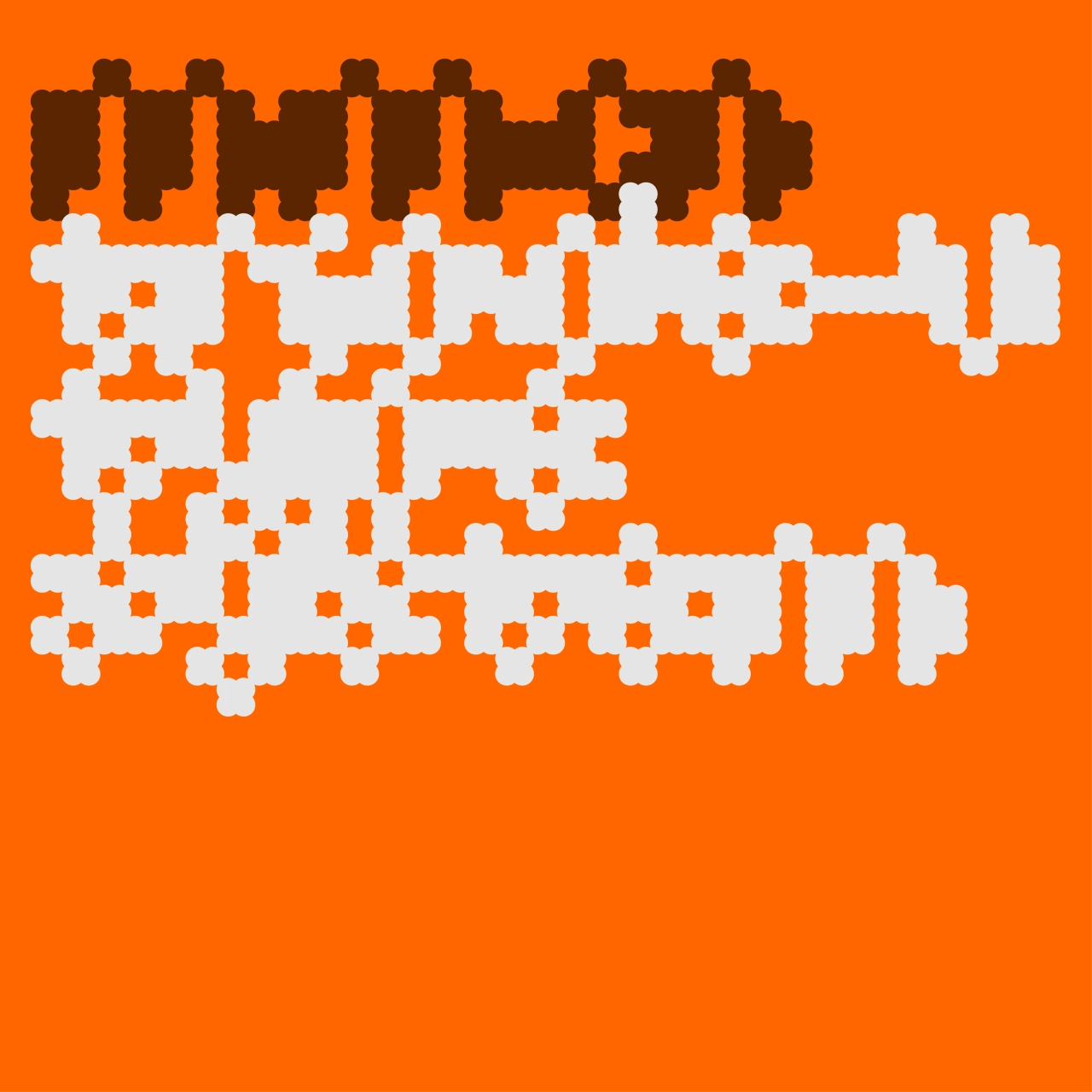
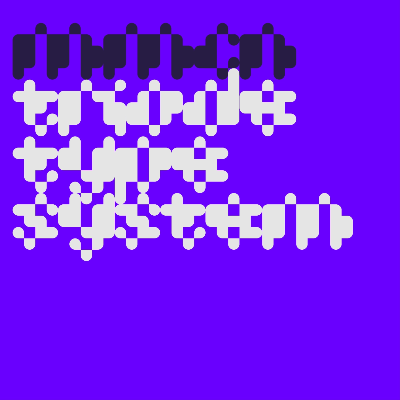
MuirMcNeil’s work sits somewhere between typeface design and visual art, and Triode is a prime example. This new geometric type system explores what happens at the crossroads between language and pattern. Its precisely calibrated components can be combined, layered, and offset to create transitions and collisions between language, image, pattern, and texture. To mark the release, MuirMcNeil has published an edition of 40 unique colour posters, each measuring 50 × 70 cm.
 4. Kellarie by Laura Worthington
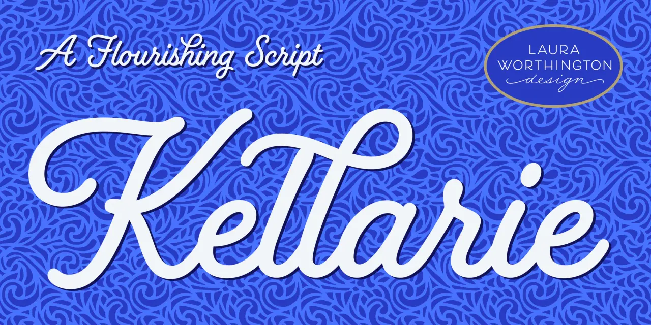
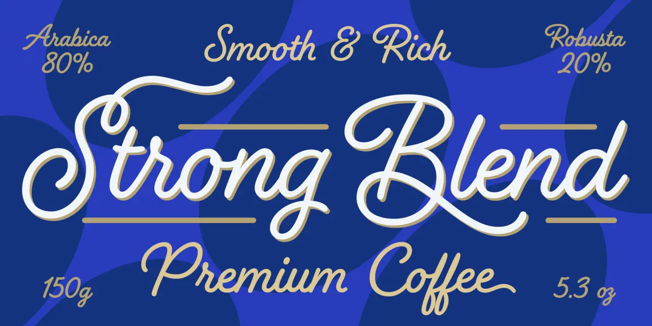
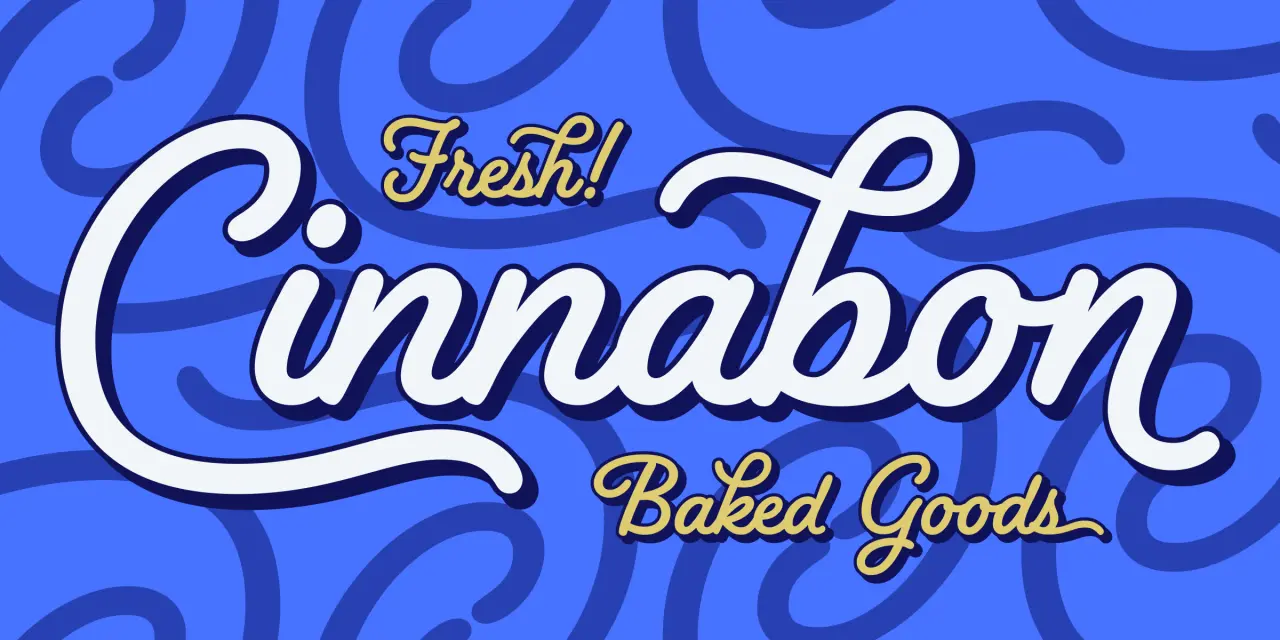
When you need a script with real warmth that feels hand-drawn, Laura Worthington is usually worth checking out. Compact lowercase forms, buoyant rhythm, and a lively forward slant give words the momentum of hand lettering, while sweeping capitals, generous loops, and curling flourishes add personality. This font works well on packaging, stationery, and editorial headers.
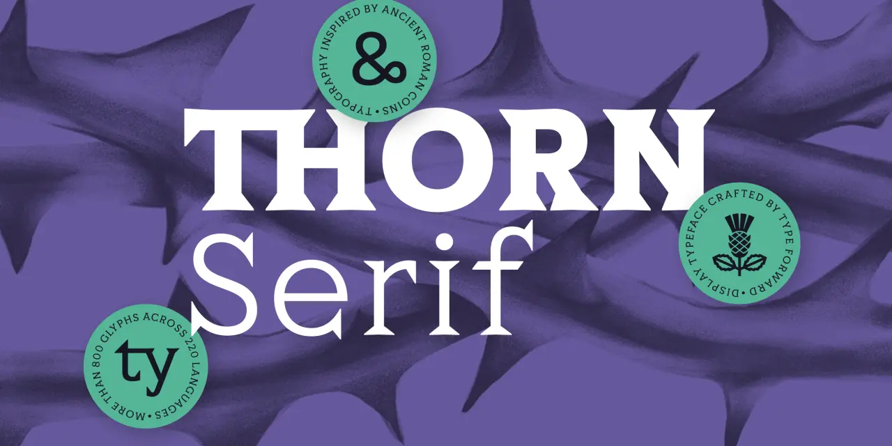
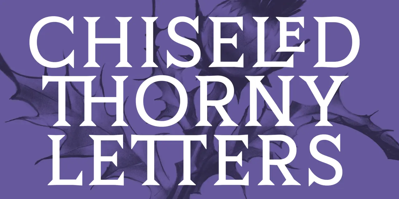
Type Forward has an interesting catalogue, and Thorn Serif is a confident new addition. It’s inspired by the raw, distinctive lettering on ancient Roman coins. The family takes the compact proportions, heavy serifs, and low-contrast construction of these historical forms and translates them into a contemporary type system.
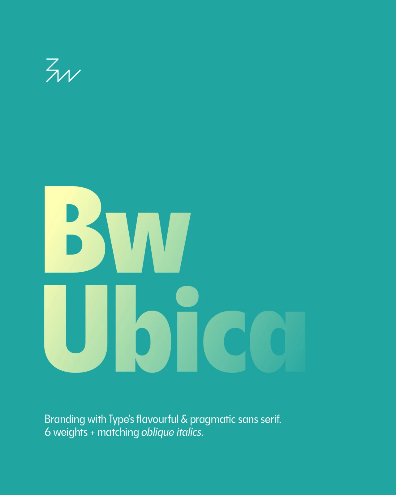
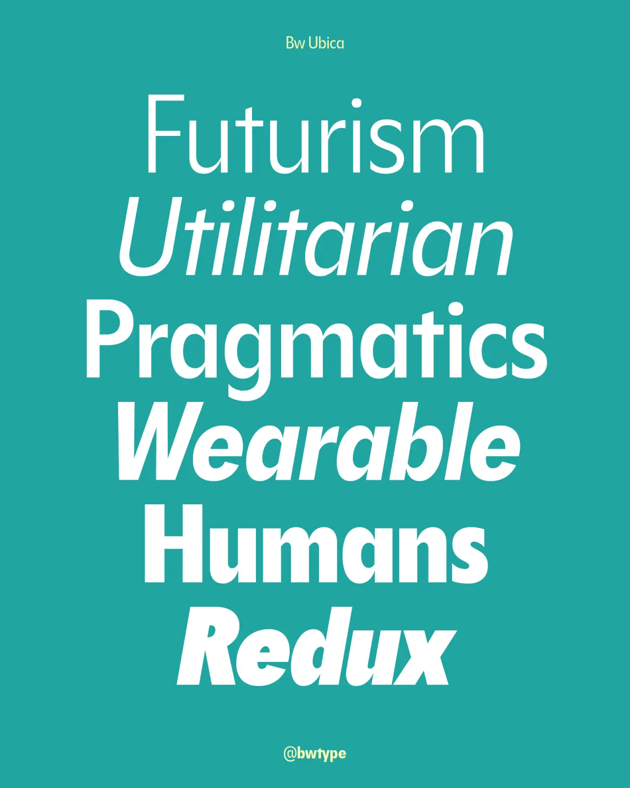
 6. Bw Ubica by Branding with Type
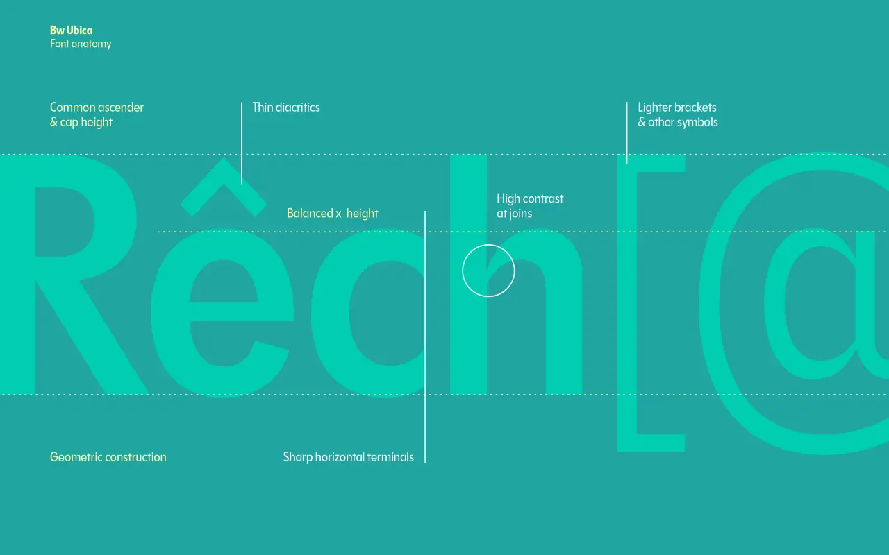
Branding with Type is known for sans-serifs that are clean without being anonymous, and Bw Ubica continues in that tradition. Its sharp geometry and balanced anatomy provide impact, while its balanced x-height and slightly condensed proportions are optimised for high legibility without losing a single hint of its character. Available in 12 styles, this font gives brands a unified voice across editorial layouts, user interfaces, and physical product sleeves.
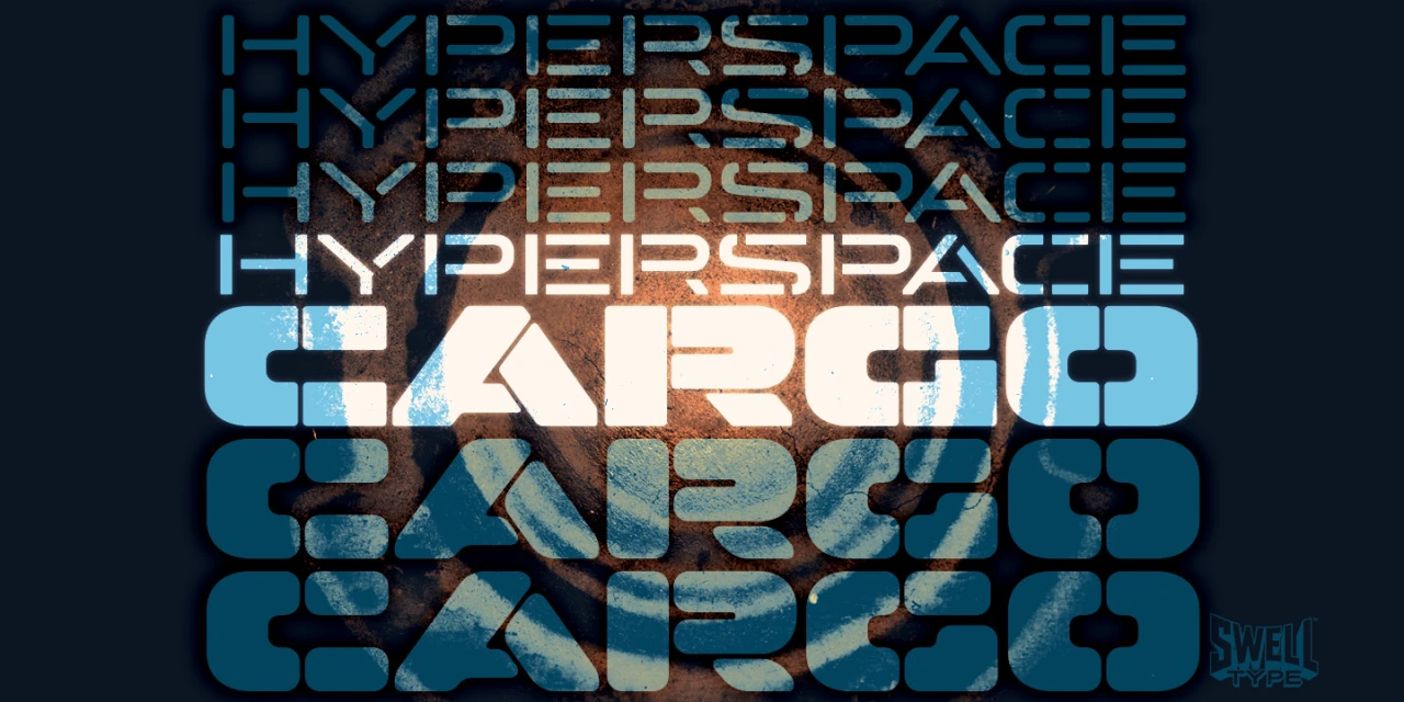
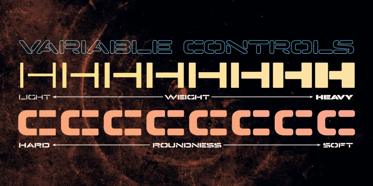
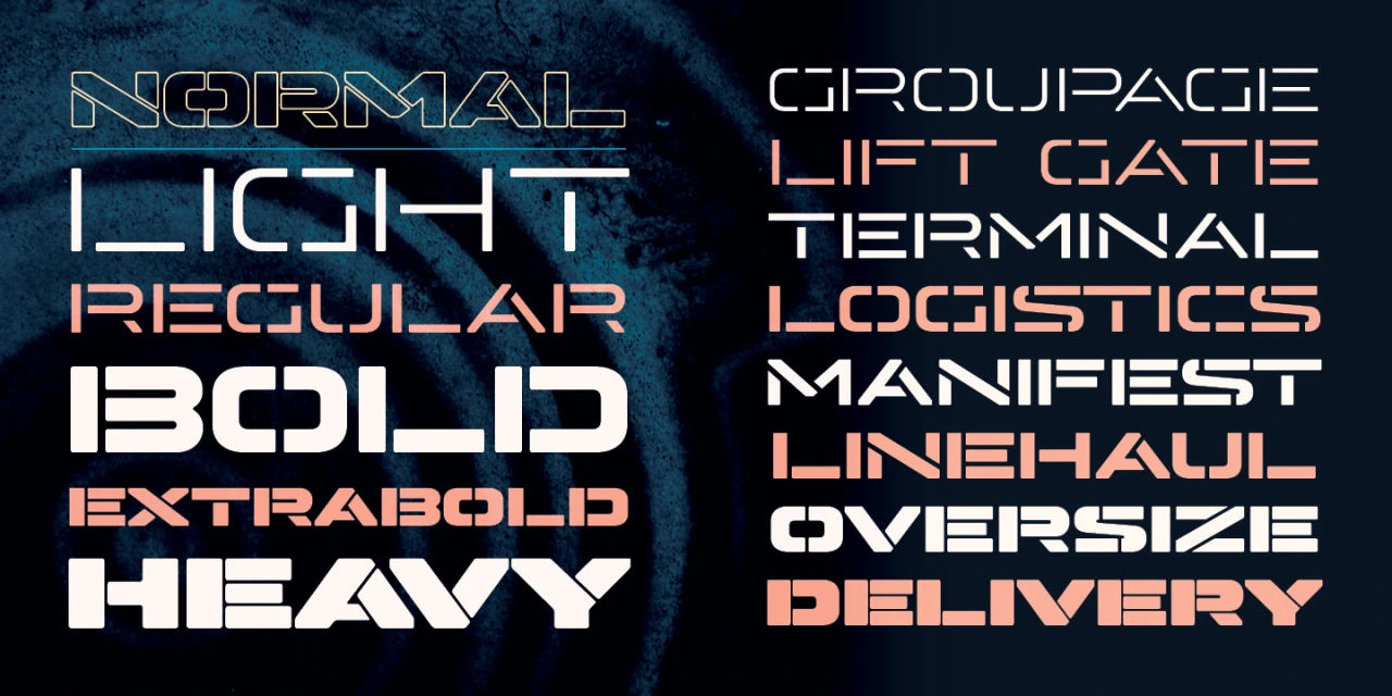
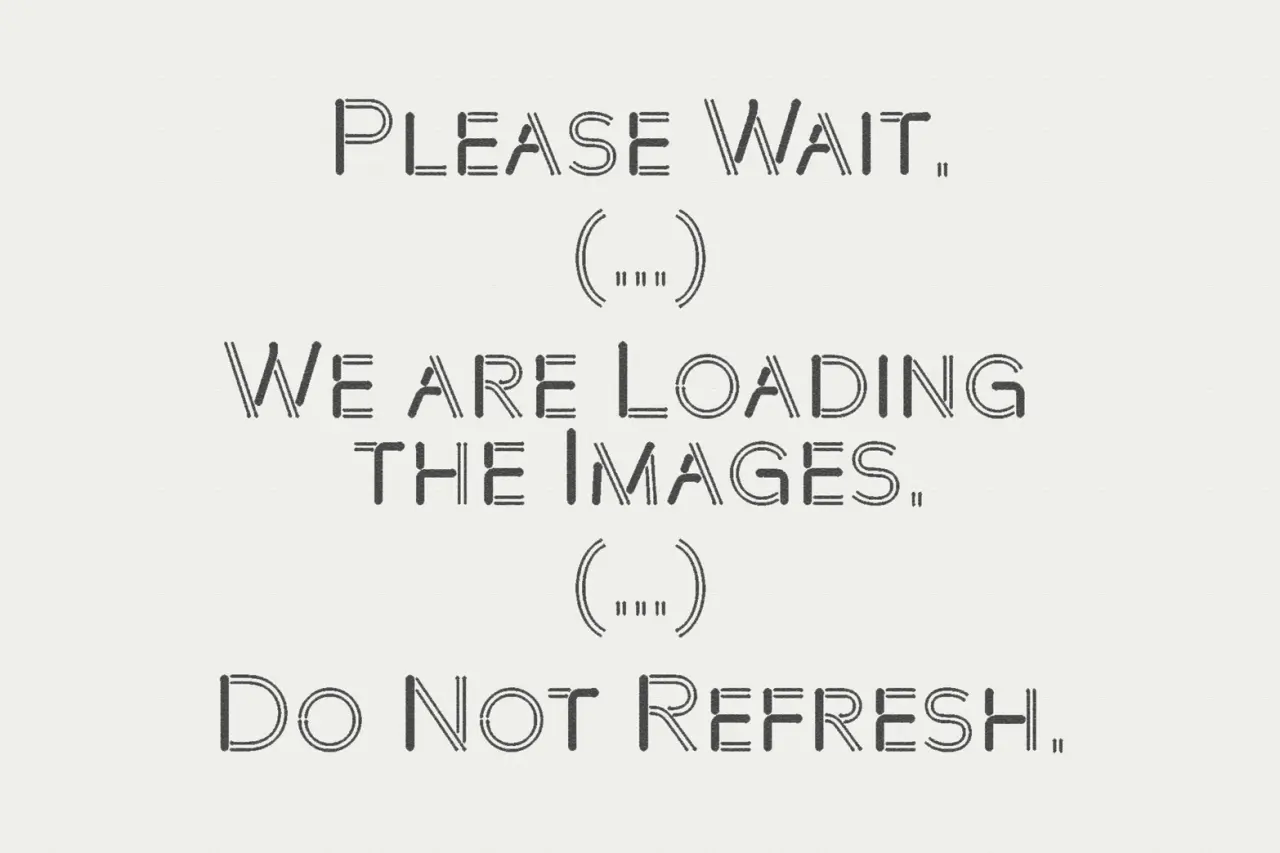
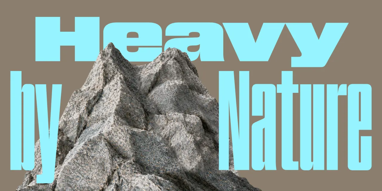
Hyperspace Cargo looks exactly like its name. Derived from the earlier Hyperspace Race, it’s an all-caps, stencil typeface available in a range of weights from Light to Heavy. Horizontal-line Stylistic Alternates add further variety, and it also supports Cyrillic, Greek and Vietnamese. The variable version offers Weight and Roundness axes for extra flexibility.
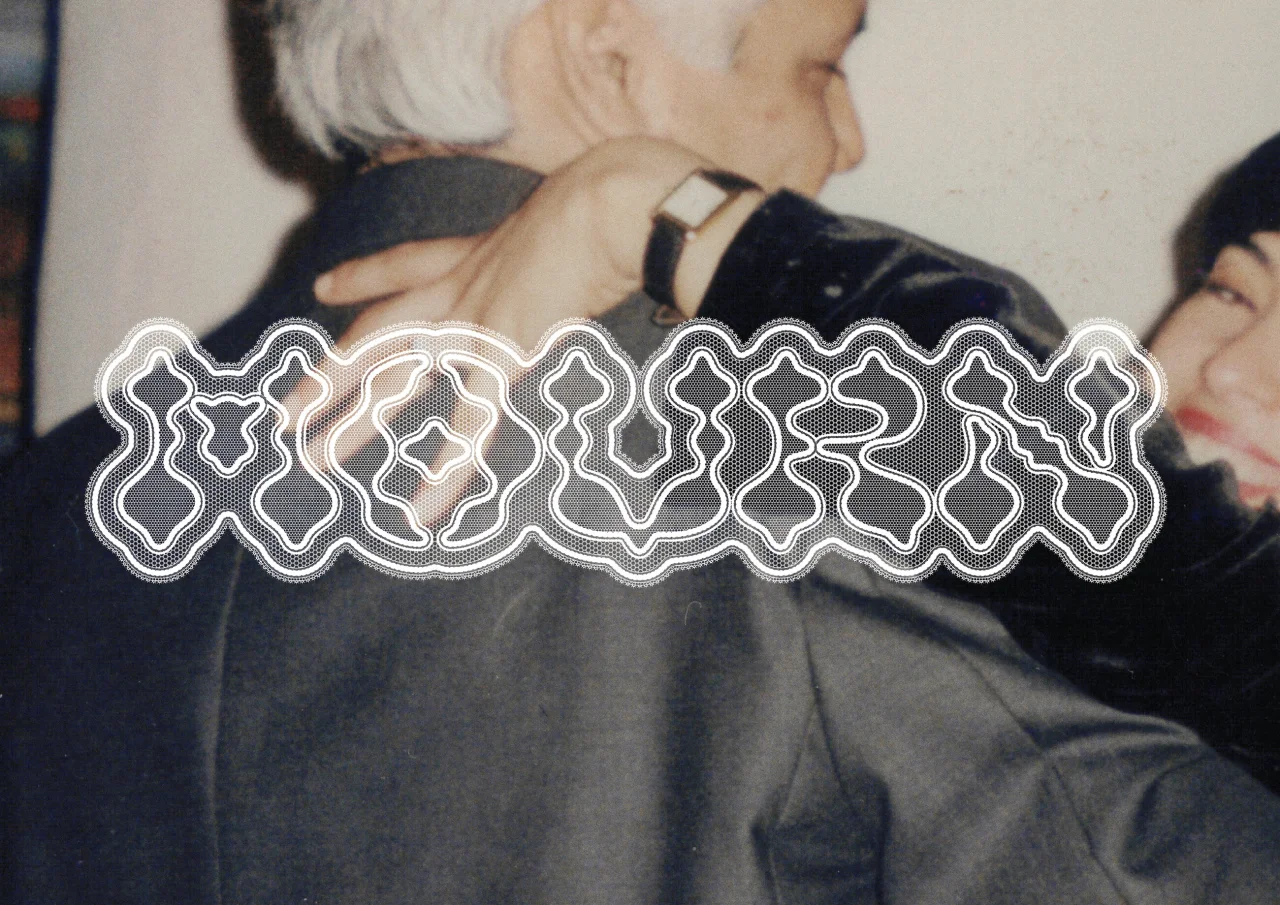
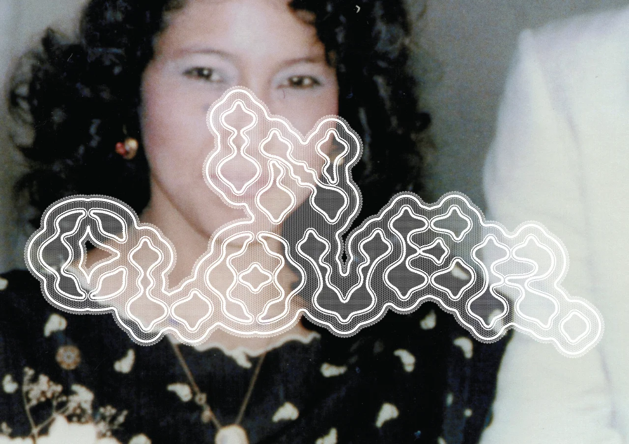
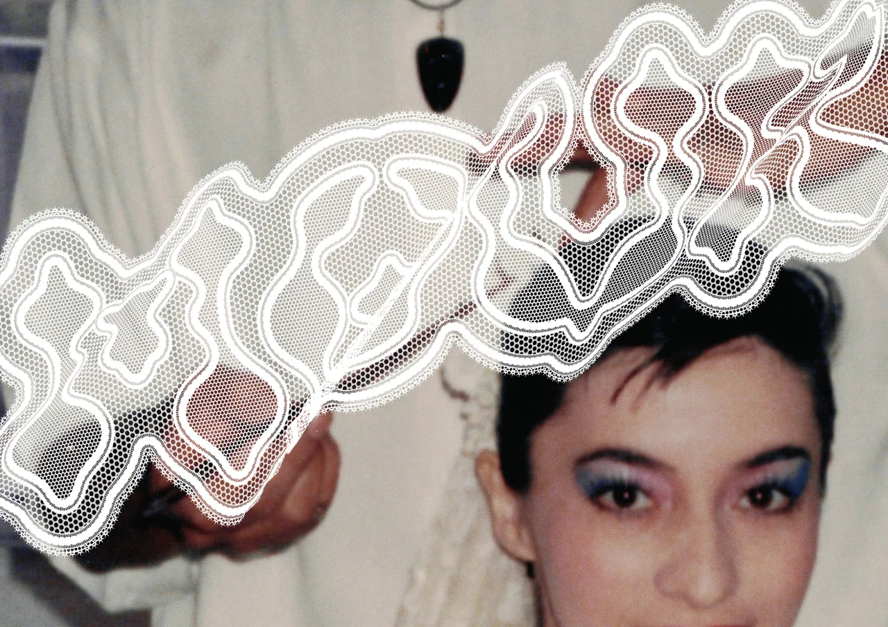
 8. Mourn by Nina Type
Mexican type designer Ubaldo Ortiz spent two years building this display face around the structural logic of bobbin lace, painstakingly constructing each character letter by letter before weaving lace patterns around them. Mourn is the launch typeface for his new studio Nina Type, which also offers the sharp serif Osé and everyday workhorse Nina Sans.
 9. Pen by DDOTT × Morula
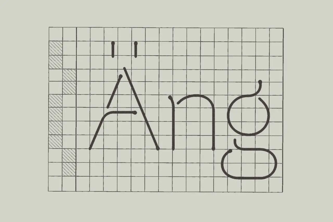
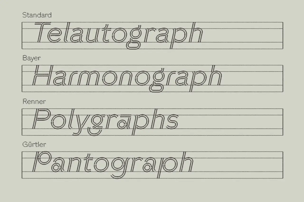
What happens when a pen pauses on paper? Those small drops of ink at the moment of hesitation, correction, or interruption form the core concept of Pen, a new typeface from DDOTT, developed in collaboration with Morula. Designer Dominik Thieme launched the project with a live plotting performance in Barcelona, and the release includes a thoughtful essay tracing the history of automated drawing and writing.
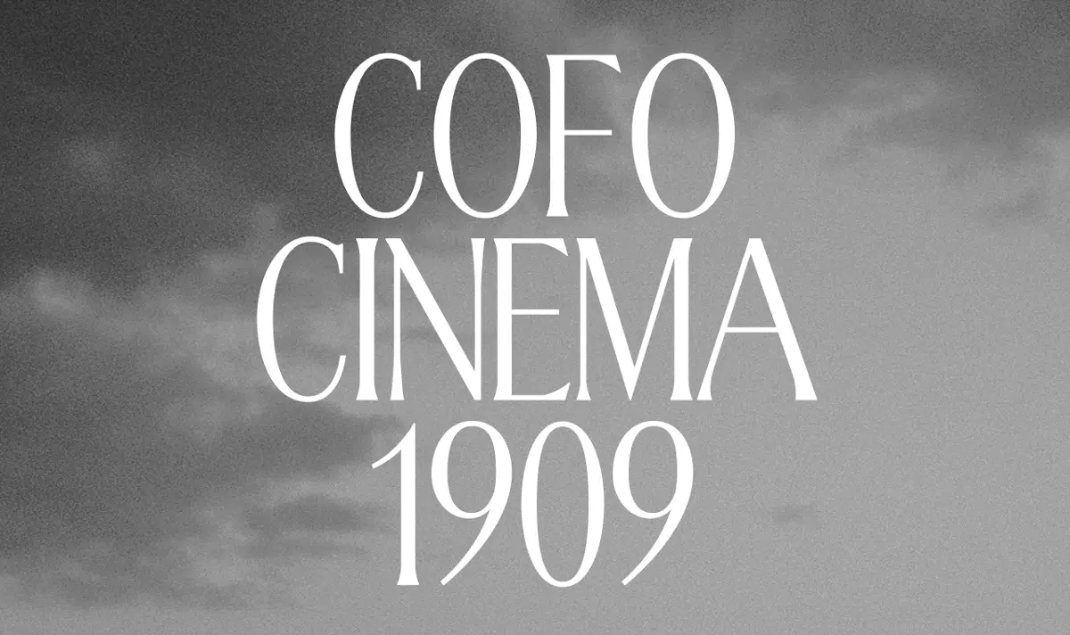
Cinema1909 began as a custom typeface for one of the world’s oldest cinemas, inspired by metro-station lettering, before being released as a retail typeface. This month, Contrast Foundry published a significant update, adding lowercase letters, ordinals and expanded language support. Combining elegance and decorative details with a refined feel, it works particularly well in tight, compact headlines.
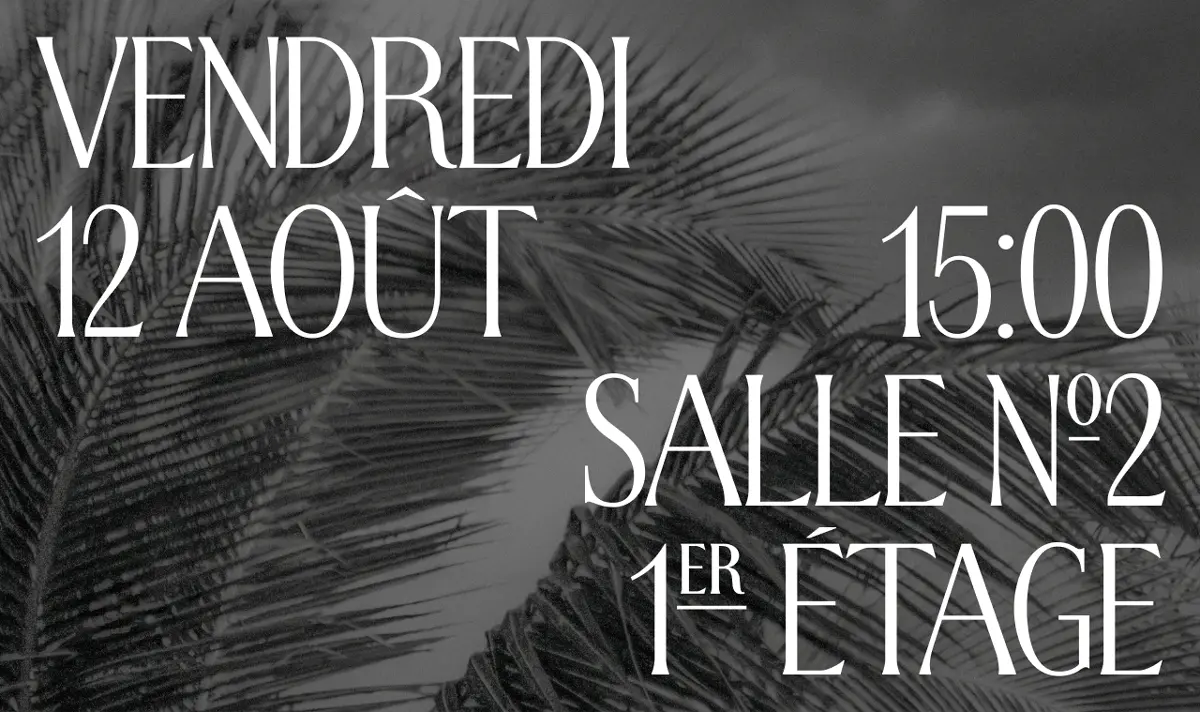
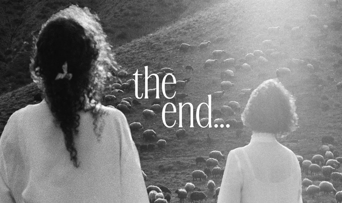 11. WTF Hammer by W Type Foundry
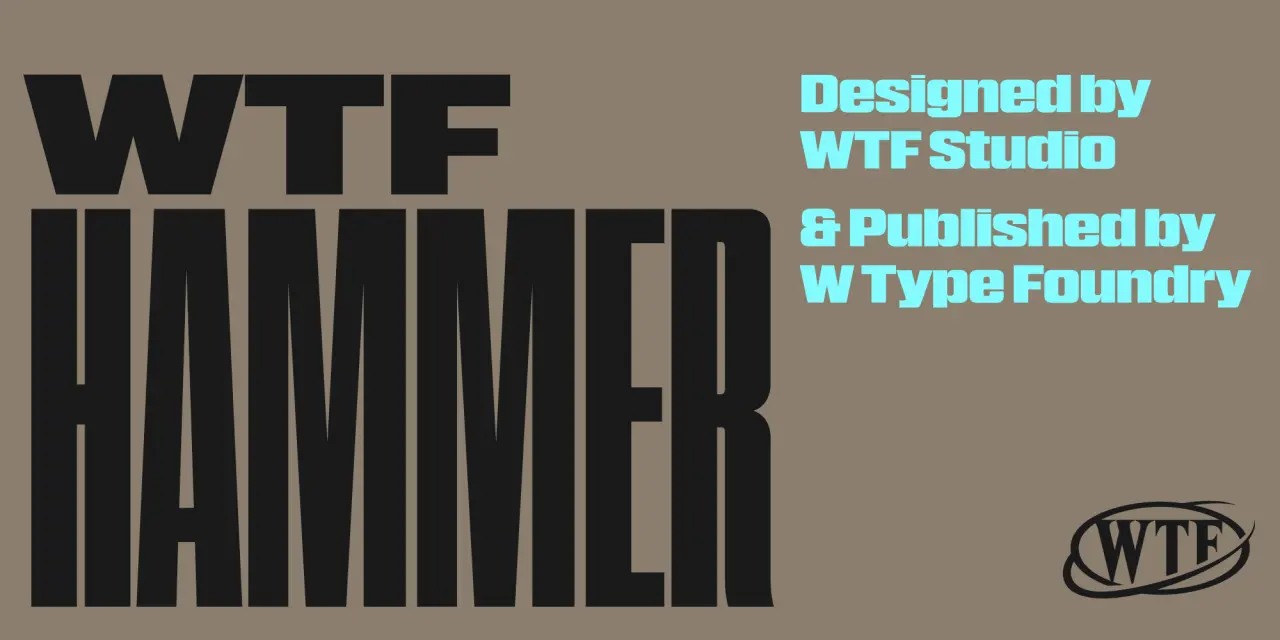
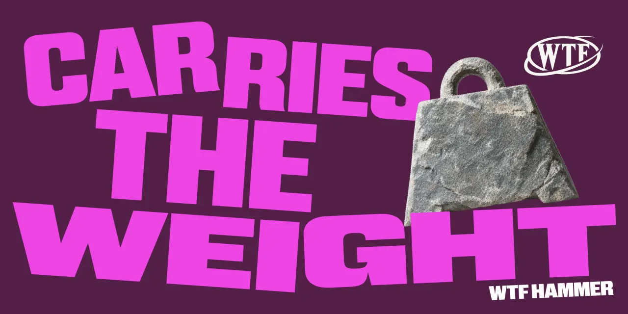
W Type Foundry built Hammer around a single premise: what can you do with proportion alone? The answer seems to be: well, quite a lot, actually. This contemporary grotesk superfamily features 12 width variants, plus matching italics. Moving between styles creates rhythm and contrast, making headlines and layouts feel dynamic, not static.
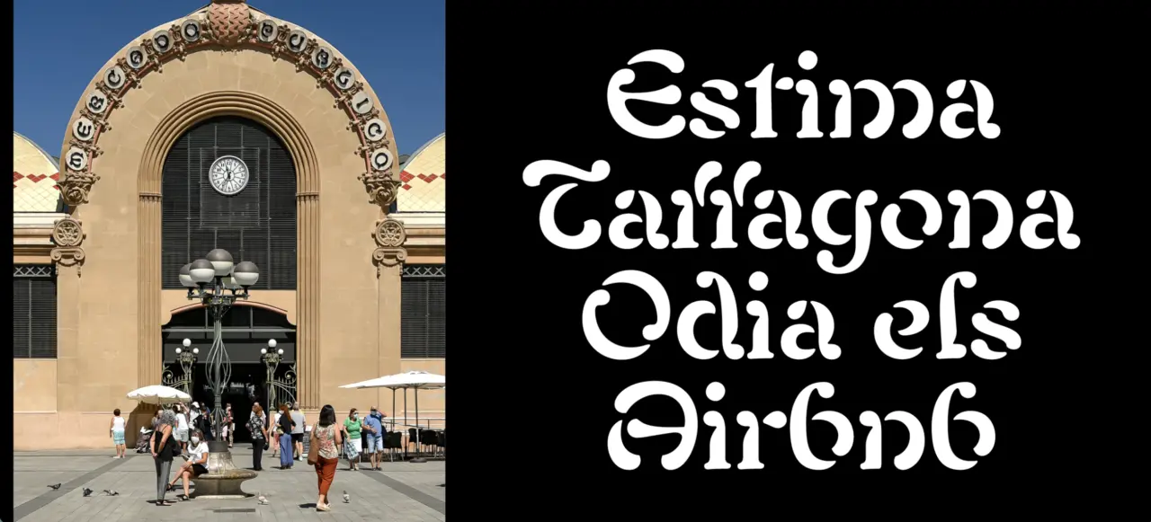
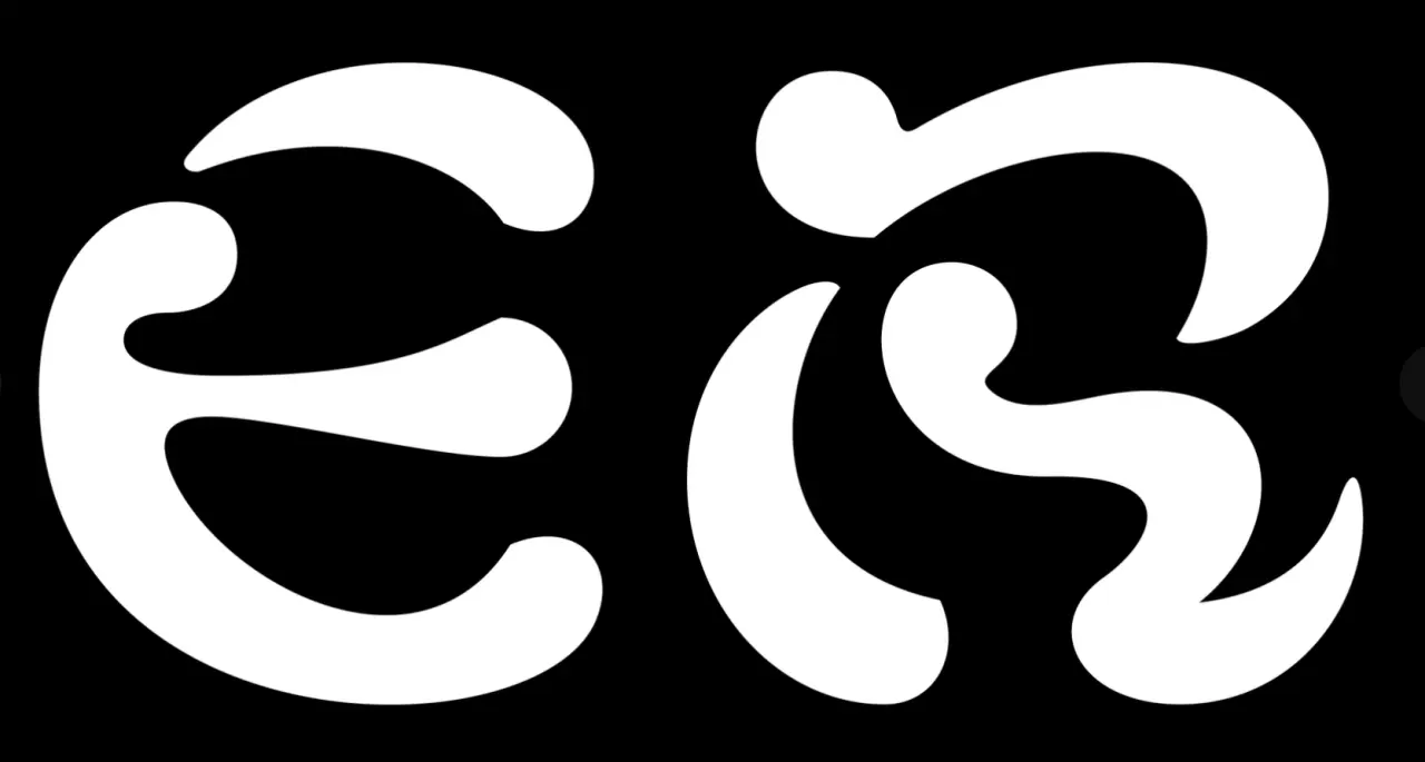
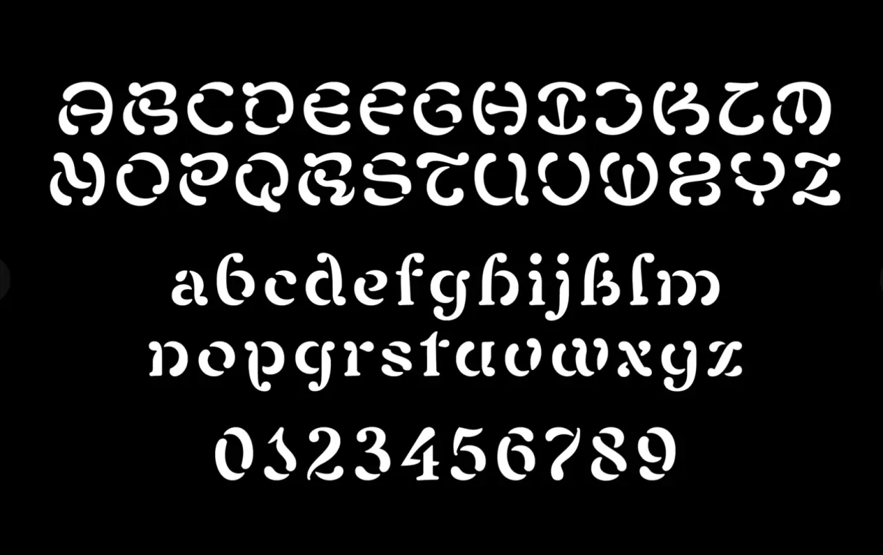
Gerard Sierra has spent a lot of time with the ornate lettering on the façade of the 1920s Art Nouveau market in the Spanish city of Tarragona. The font this inspired carries its source material’s character while adding a stencil-like, rebellious feel. The lowercase expands this language, creating a typeface with enough identity to shift between the vernacular and sharper, more contemporary contexts.
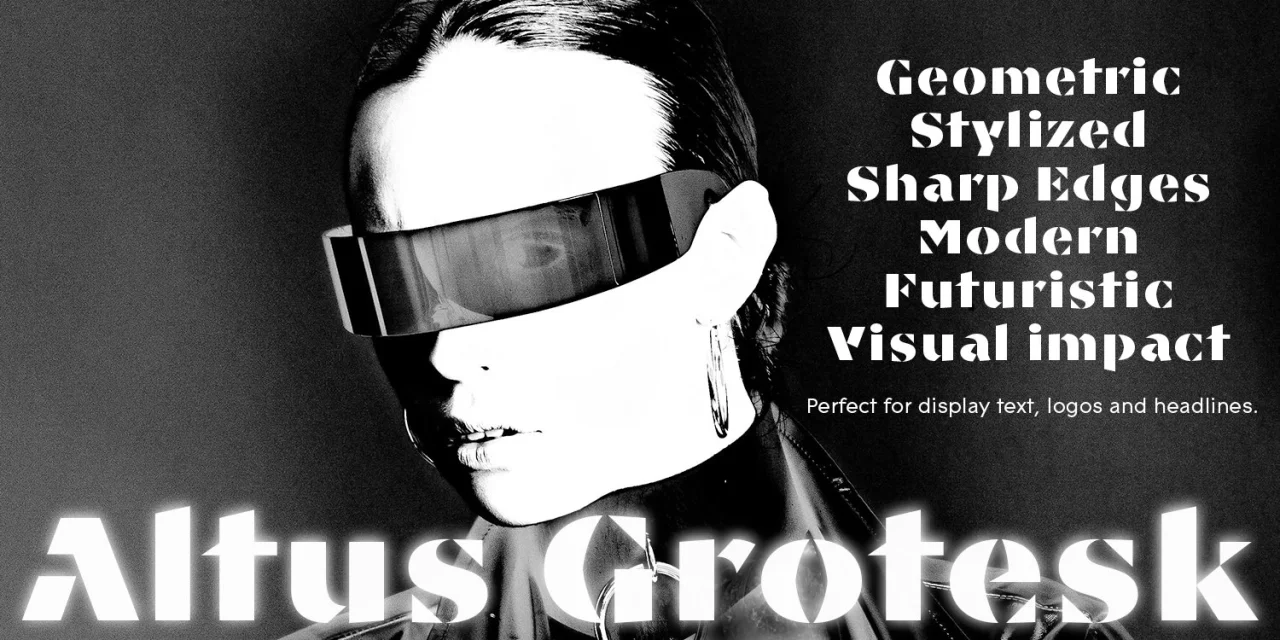
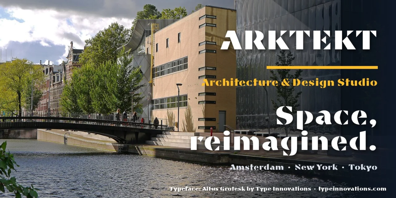
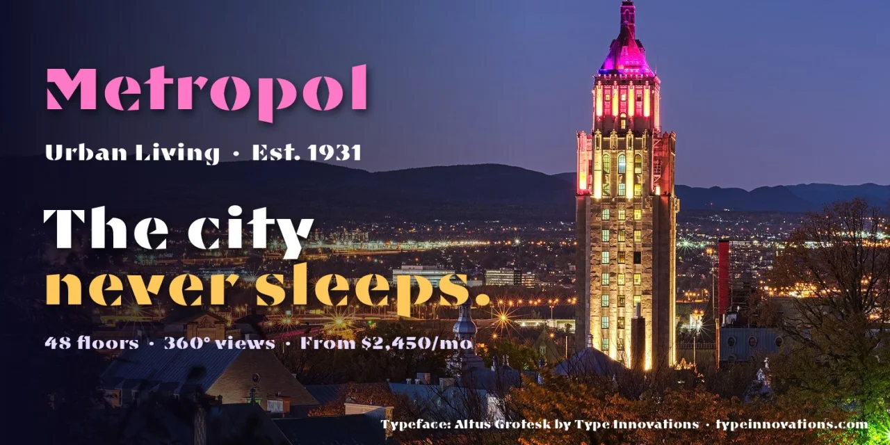
Alex Kaczun, former principal type designer at Linotype-Hell, helped shape the Adobe PostScript Font Library, and his solo foundry, Type Innovations, continues to build on that legacy. Altus Grotesk is a high-impact geometric display font that combines sharp-cornered, highly stylised capitals with clean circular forms and generous proportions. A strong choice for logos, posters, and headline branding work where you need both presence and clarity.
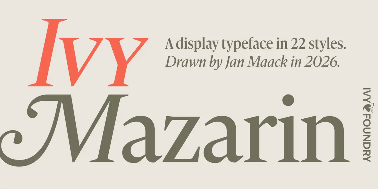
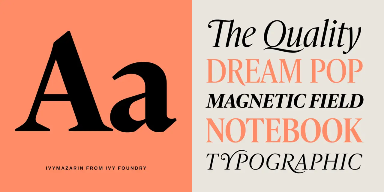
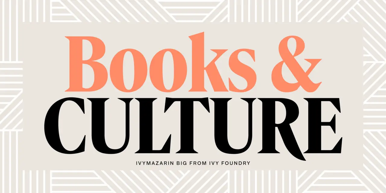
IvyMazarin demonstrates the difference between reviving a historical typeface and simply reproducing it. Designer Jan Maack took Astrée, a 1921 Garamond interpretation commissioned for the Imprimerie Nationale in Paris, and drew out a display version with precision and sensitivity. Think dramatic contrast, generous proportions and a sense of grandeur.
 15. Thalo by Signal Type Foundry
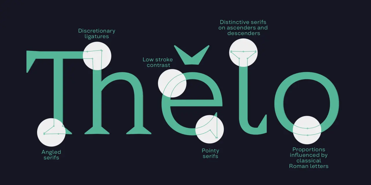
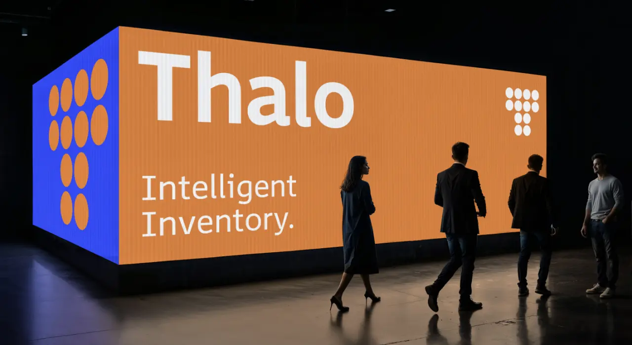
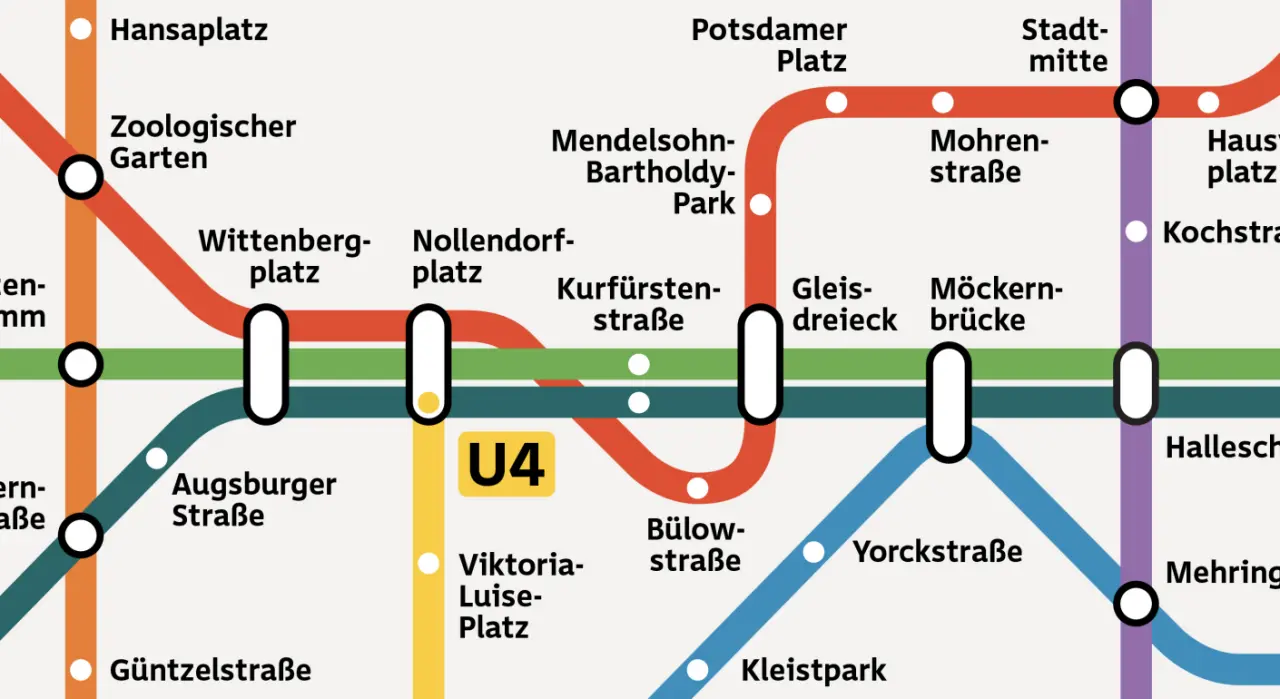
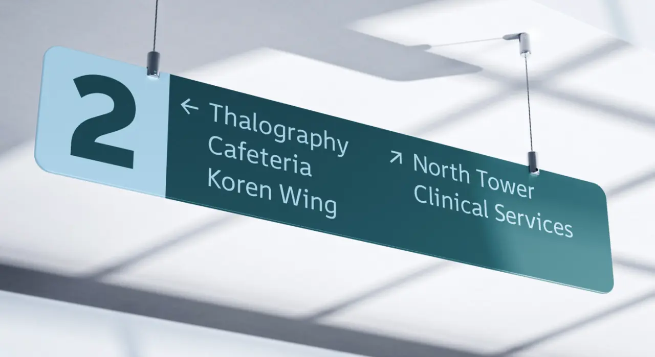
Thalo began as a commission from a state transportation agency: a humanist sans designed to meet accessibility requirements for signage and timetables. Max Phillips at Signal Type Foundry in Dublin has kept contrast low, with generous letterspacing and open counters and apertures throughout. Letters such as b, d, p, and q have been carefully drawn to minimise confusion for dyslexic readers, while I, l, 1, and i are as distinct as possible. This clarity means Thalo can create impact in branding and editorial, as well as signage.
 16. Shuffle by Local Type
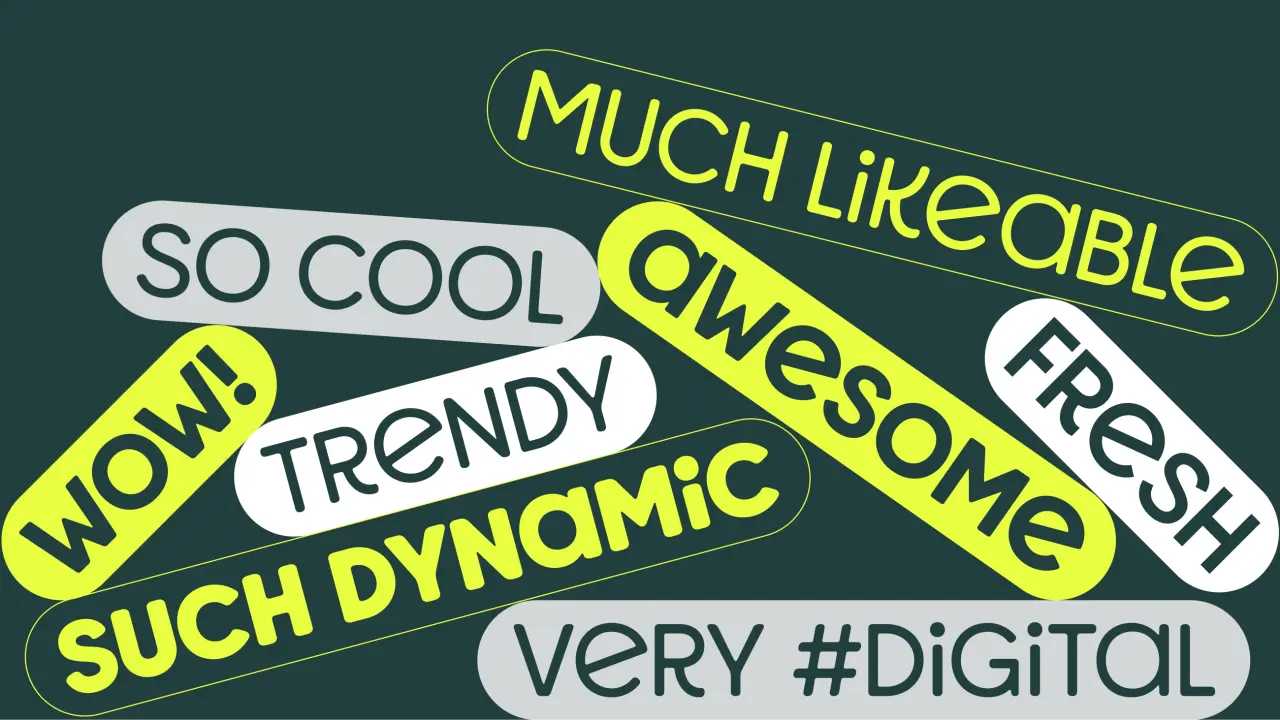
Originally designed for a children’s healthcare centre in Brazil, Shuffle is a two-axis variable display font (weight and bounce) that ranges from bold and exuberant to lighter and sharper, with 12 static styles too. It’s the first release from Local Type, João Luiz Wittkowski’s new foundry based in Valencia, Spain, and one style is free for personal and commercial use.
 17. Blubird by Rajesh Kumar
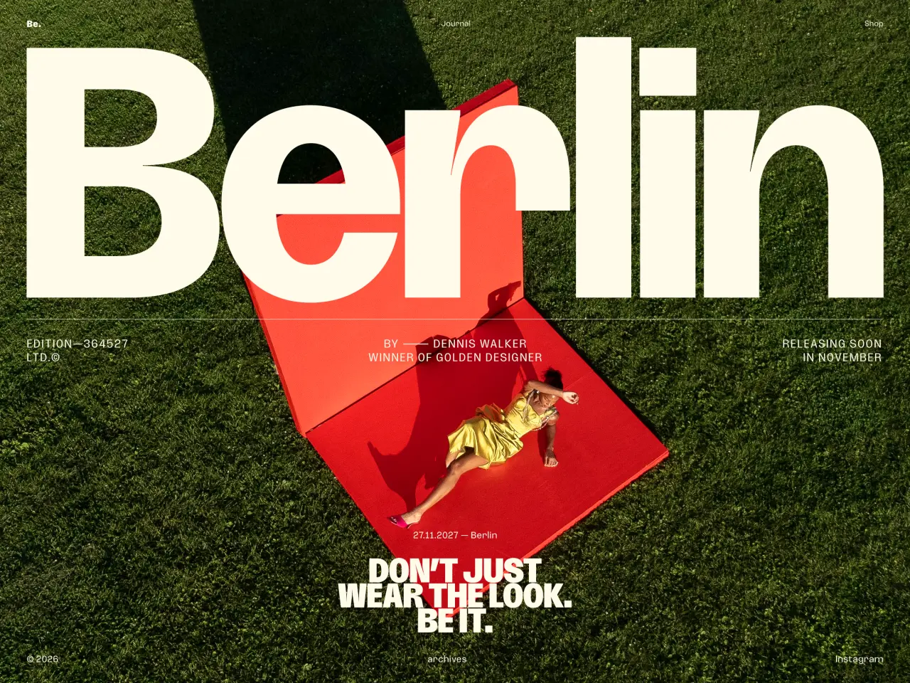
Blubird is a contemporary narrow sans-serif with nine weights, 36 styles, and two optical sizes (Display and Text) for genuine range. With dedicated italics, this font strikes a strong balance between visual impact and typographic refinement.
 18. Vestige by Claire Wilde
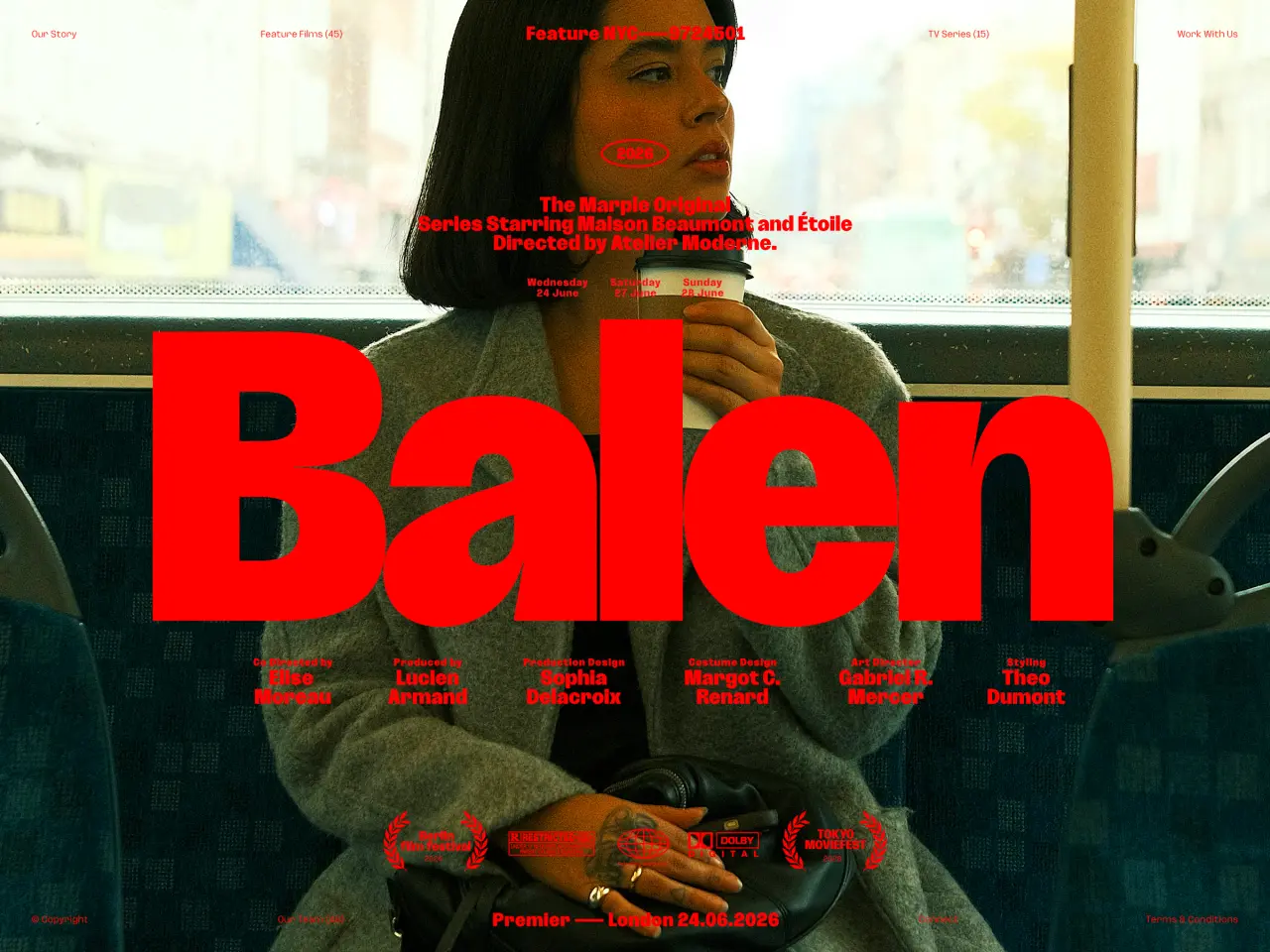
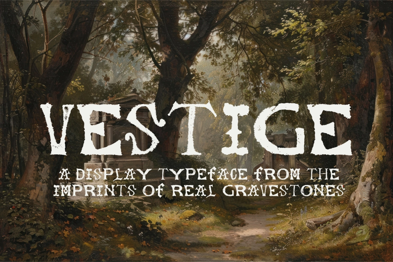
Vestige takes the idea of a handmade typeface into new, unusual territory. Designer Claire Wilde developed this uppercase display typeface from physical clay impressions of lettering found on gravestones, while retaining the irregularities and weathered character of the original impressions. Her documentation of the process has reached 147k views.
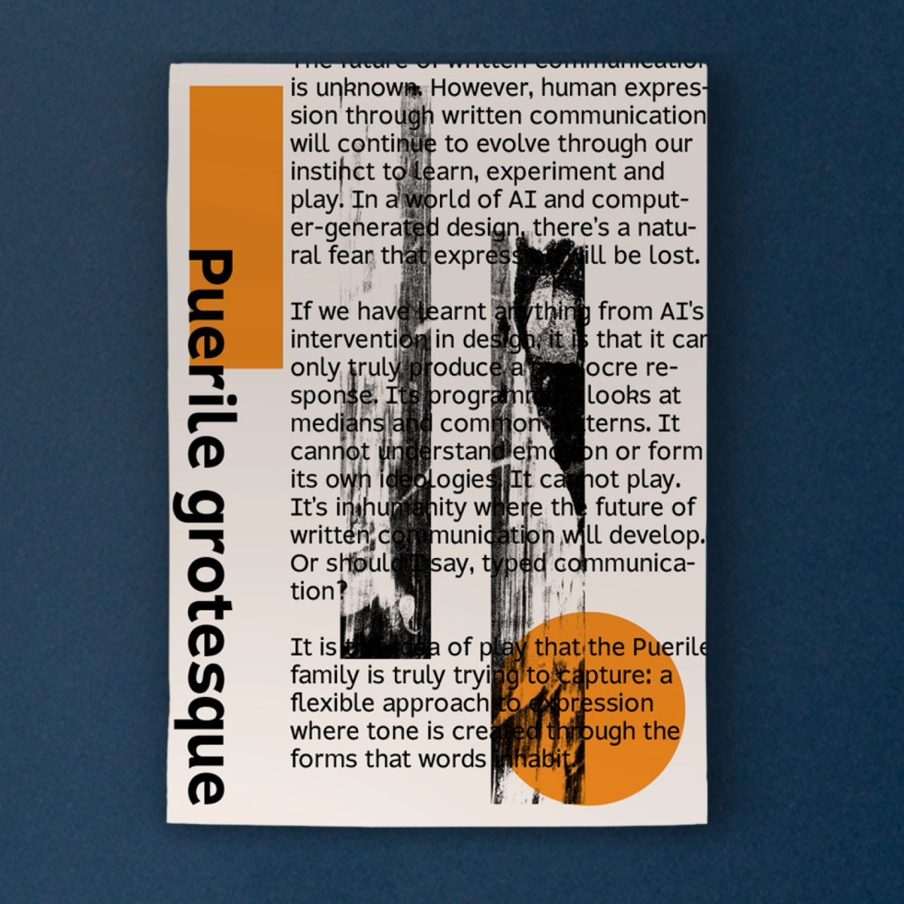
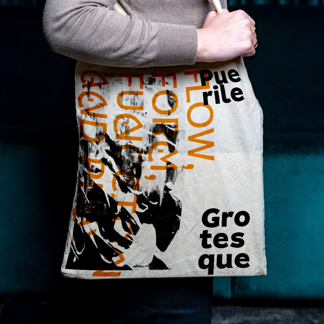
 19. Puerile Grotesque by Applied Systems Design Studio
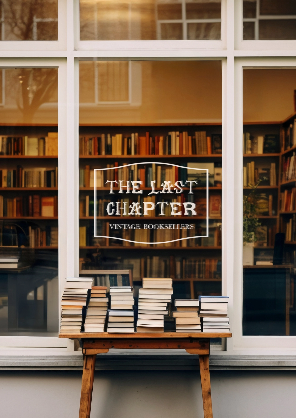
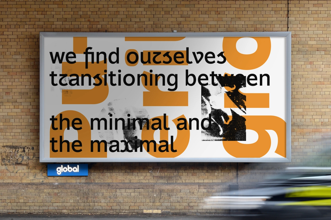
Alister Shapley at Applied Systems Design Studio has been thinking about what “play” actually means in typography, and Puerile Grotesque is his answer. While his earlier font, Puerile Display, explored ornament and expressive forms, Puerile Grotesque questions the underlying structure of letterforms. Together, they form a complementary, convention-busting family.
 20. Magmæ by Arillatype
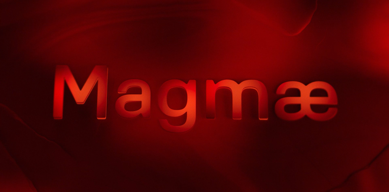
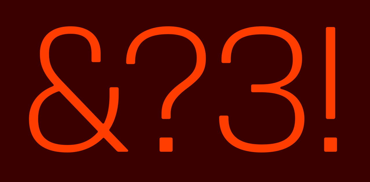
Pedro Arilla and Cristina Villellas at Arillatype named their new industrial typeface after the molten rock beneath the Earth’s crust. It’s a design of opposites: fluid, organic curves contrast with a mechanical digital skeleton; soft outer contours meet structured, squared counters. Engineered for high functionality and precise performance, this font has a raw energy that makes it a strong choice for packaging, industrial branding, and architecture-based projects.
 21. Scooch by Fred Wiltshire
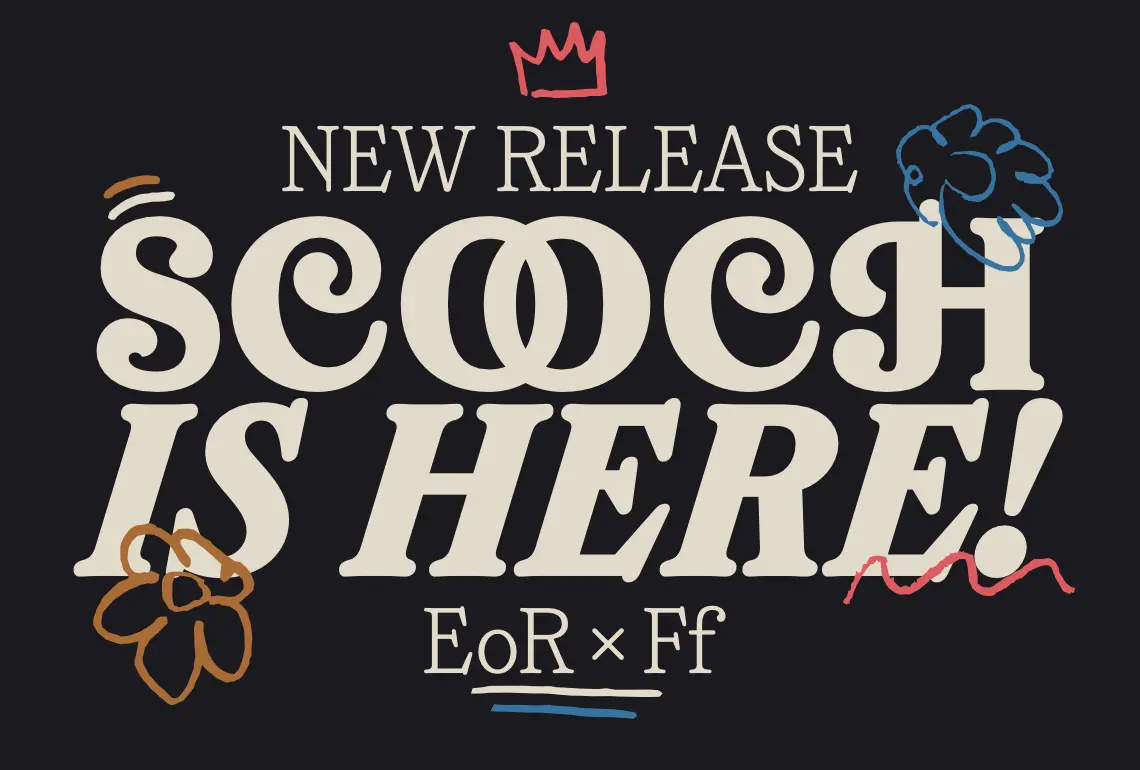
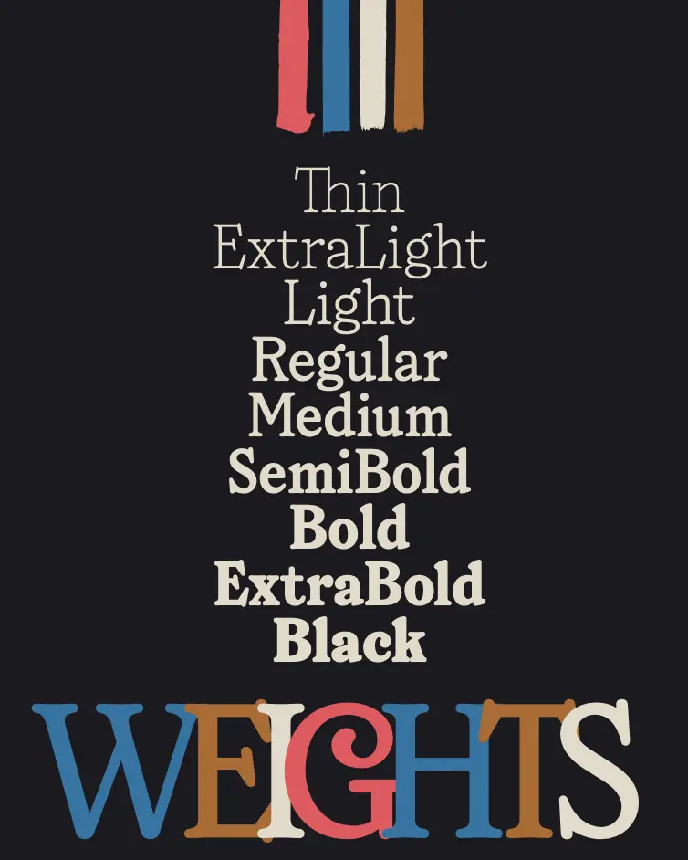
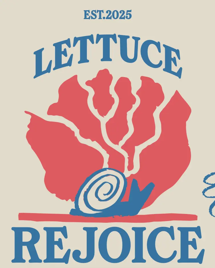
Scooch is a large serif family that pairs gaiety with typographic rigour – no mean feat. The swash capitals, influenced by 19th-century display typefaces, add flourish; the lowercase is tamed by comparison, with a simplified “t” that runs through the family as a visual thread. One of those rare display families that can function as text when needed.
 22. Clamp by Daniel Iglesias
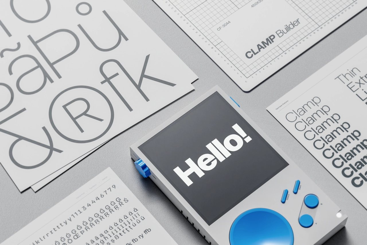
Clamp is a type system that builds multiple personalities directly into a single typeface, rather than creating separate styles. Designers can adapt it to different contexts by changing its character through OpenType alternates.
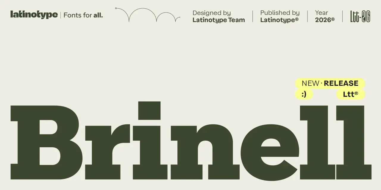
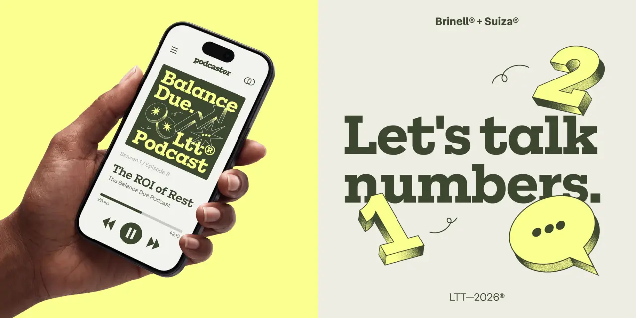
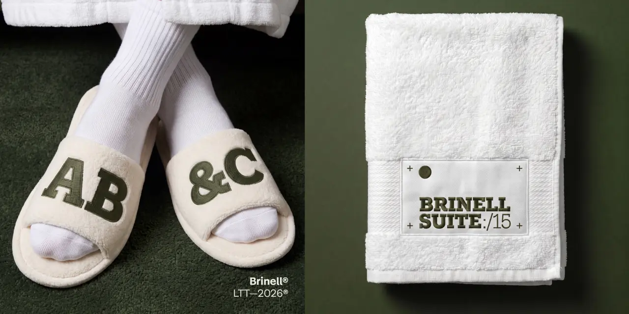
 23. Brinell by Latinotype
Latinotype named its new slab serif after the Brinell hardness scale, a 1900 engineering test that measures a material’s resistance to deformation. The team drew on classic industrial slabs like Rockwell and updated the proportions and details by removing some serifs, flattening contrast, and creating a cleaner overall look. Its intentional inconsistencies (the terminal on the /a, the slightly off-rule details) give it a warmth that precise, corrected type often lacks.