We’ve all been in a room where the design scheme almost works, but something feels off. A wall colour that fights with the sofa, a trend that’s been taken way too far (I’m looking at you boucle) or furniture that makes the space look like a dolls’ house. Yep, even the most stylish spaces can go astray with a few simple missteps. Here’s how to spot (and fix) the seven styling errors most likely to ruin a room.
Colour confusion
When it comes to colour, I don’t believe that there should be any hard and fast rules. However, there is such a thing as colour chaos, and too many competing hues and clashing undertones will make even the most beautiful room look thrown together.
The biggest culprit behind colour chaos is lack of restraint. It often happens when we fall in love with too many shades at once, (thanks Pinterest), or when we try to recreate a look from a photo without considering how it fits within our own lighting or scheme. A deep forest green that looks chic in a north-facing London townhouse may feel oppressive in a small, sun-drenched flat. Similarly, cool greys can look sleek in theory but quickly turn flat in a space that lacks warmth or natural light.
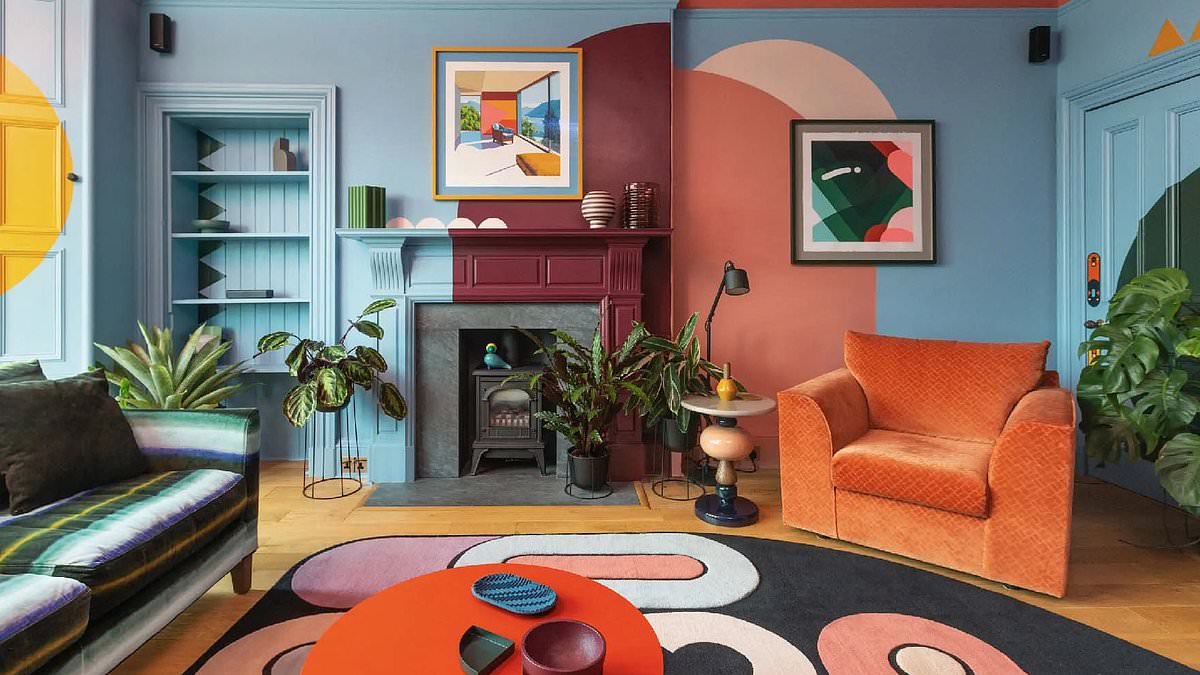
There shouldn’t be any hard and fast rules when it comes to colour, writes Nicole Gray, but too many competing hues will make even the most beautiful room look thrown together
The best place to start when it comes to choosing your palette is to look at the surrounding elements; pick out two or three colours from the rug, cushions or artwork and use them on the walls, window frames, ceiling and woodwork to bring a sense of cohesion to the space.
If in doubt, I’m also a fan of the 60-30-10 rule: use 60 per cent of a dominant colour (usually on your walls and larger furniture pieces), 30 per cent of a complementary secondary tone (curtains, or rugs), and 10 per cent of an accent shade (cushions, artwork, skirting, decorative accessories). This ratio has been designed to help unify a space without resulting in colours competing for attention.
Poorly positioned artwork
The general rule of thumb is that the centre of an artwork should sit at roughly eye level, which is about 145-155cm from the floor for most people. This ensures that art feels connected to the space, not floating awkwardly above it or sinking too close to the floor.
In living rooms, where you’re often seated rather than standing, you can drop it slightly lower to align with your line of sight from the sofa. A lone picture hung too high above a sofa or console table creates a strange gap that disconnects the art from the rest of the room and you will strain your neck looking up at it.
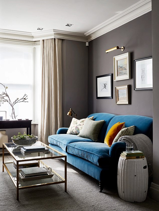
The general rule of thumb is that the centre of an artwork should sit at roughly eye level, which is about 145-155cm from the floor for most people
Ideally, leave around 15-20cm of space between the top of the furniture and the bottom of the frame-close enough to feel part of the arrangement, but not cramped. And, whatever you do, don’t go for a tiny piece of artwork on a big expansive wall. It will just be dwarfed.
Curtains that are too short
Curtains need to graze the floor lightly, so that when they are drawn they fall in a smooth, elegant line, not hovering several inches above your skirting boards.
If you want a more luxurious or romantic effect, you can let them ‘puddle’ slightly – a soft, deliberate drape of extra fabric can give a sense of abundance and works well in bedrooms.
Curtains need to graze the floor lightly, so that when they are drawn they fall in a smooth, elegant line, not hovering several inches above your skirting boards
Most people install their rods directly above the window frame, thinking it’s the logical choice – but doing so actually shrinks the perceived height of the room. Instead, hang your pole or track closer to the ceiling (or at least halfway between the window frame and the ceiling line). The higher placement draws the eye upward, elongating the walls and creating a grander sense of scale.
Furniture that’s too small or too large
Many people make the mistake of buying furniture based purely on aesthetics, without considering how it will actually sit within the room. A sofa that looked perfectly sized in a vast showroom might look like a small ship once you get it home. Alternatively, dainty pieces such as two-seaters or loveseats will be swallowed by a large room.
If your room has high ceilings and generous square footage, you can afford larger, weightier furniture-think deep sofas, broad armchairs, or a statement dining table. These anchor the room and make it feel grounded. In smaller spaces, however, bulkier pieces can dominate and block light. Opt instead for slimmer silhouettes, raised legs, and streamlined shapes that create an illusion of space and flow.
It’s important to consider the size of your rooms when purchasing furniture, writes Nicole, and mocking up a layout can help you plan your space
Before buying, always measure and mock up a layout using masking tape on the floor to outline the footprint of furniture pieces you’re considering. This simple trick can reveal whether a piece will crowd the room, block walkways, or feel dwarfed by its surroundings. Remember that circulation space is part of the design too. Try to leave at least 45-60cm between furniture items to allow for easy movement.
Skipping the rug (or choosing the wrong size)
Few things can pull a room together quite like a well-chosen rug – yet it’s astonishing how often this step gets overlooked. Many people skip rugs altogether, especially if they’ve invested in beautiful wooden flooring, thinking it’s a shame to cover it up.
But a rug isn’t just for decoration.
In an open-plan living area, it will help delineate zones – separating the seating area from the dining space, for instance – and gives the eye somewhere to rest. In smaller rooms, it can actually make the space feel larger by framing the furniture and drawing everything inward. It also introduces another layer of comfort underfoot.
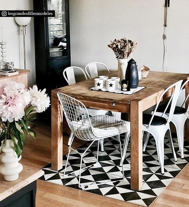
In open plan living spaces rugs can help delineate zones by separating the seating area from the dining space
But just as skipping the rug is a mistake, so is choosing the wrong size. It’s one of the most common styling errors out there. A too-small rug under a coffee table that looks like a postage stamp or a rug so big that it covers the floor completely.
In a living room, the rug should be large enough for at least the front legs of all key pieces (sofa, armchairs, coffee table) to sit comfortably on it. In a dining area, it should extend roughly 60cm beyond the edges of your table so chairs stay on the rug even when pulled out.
Pushing a sofa up against the wall
It’s the default move a lot of us make when arranging a room: shove the sofa right up against the wall to ‘make space.’
Unfortunately, this instinctive layout choice rarely makes a room look bigger – it actually does the opposite. When everything is lined up along the perimeter, you create a big empty void in the middle that feels empty.
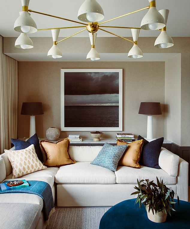
Pushing your sofa up against a wall rarely makes a room look bigger and, in fact, actually does the opposite
Pulling the sofa even 20–30cm away from the wall can make a dramatic difference. It instantly adds depth and gives the illusion of breathing room. It also allows you to layer other pieces – a slim console table or floor lamp behind the sofa, for example – which adds interest and texture. That subtle gap tells the eye that the furniture was placed intentionally, not just pushed aside out of necessity.
Try floating your sofa slightly forward and pairing it with a small rug and coffee table to define a cosy seating zone. It will create the sense of a ‘room within a room,’ and give proportion even when space is limited.
Basing a scheme on trends
Scrolling through Instagram it’s hard not to convince yourself that you need that lozenge-shaped sofa, that arch-shaped mirror, or that earthy terracotta wall colour (personally, I would sell a finger for a coloured stone kitchen). But what looks gorgeous online doesn’t always translate into real life – or stand the test of time.
One of the biggest pitfalls in decorating is chasing trends too eagerly. While a trend can be a great source of inspiration, building an entire room around one is a fast track to what designers call ‘style fatigue.’ Think of all those once-hot looks that quickly became overdone – the all-grey living room, the neon sign over the bar cart, the endless pampas grass in every corner. What felt fresh one season feels stale the next.
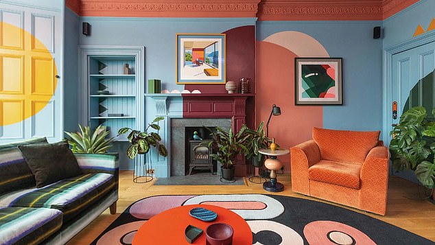
Chasing trends too eagerly can end poorly as what looks gorgeous online doesn’t always translate into real life – or stand the test of time
That doesn’t mean you should avoid trends altogether. The trick is to use them as accents, not anchors. If you adore the current dopamine trend (bright colours and playful patterns), bring it in through cushions, prints, or vases rather than committing to a fuchsia sofa. Similarly, if the minimalist ‘Japandi’ style is your thing, try incorporating its calm aesthetic through natural materials and soft neutrals instead of gutting your entire room to fit the look.
Before you buy, ask yourself: Would I still love this if it wasn’t trending right now? If the answer is no, walk away.
