Packaging design is a fine art form, allowing you to show, not tell, your audience what to believe. A bright, garish-patterned candy wrapper evokes the spirit of childhood delight, while a minimalist design sings of promised luxury. The truth is, packaging design is more manipulative than we might think.
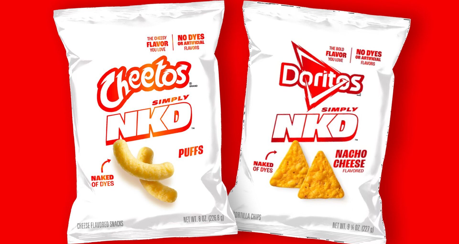
Expertly demonstrating the power of packaging is Frito-Lay’s stripped-back Simply NKD Cheetos and Doritos – a duo of plain packaged chips designed to make a statement. With its minimalist design and additive-free flex, the branding of the new snacks points to a shift towards a minimalist-loving, health-conscious market.
‘Healthwashing’ packaging is nothing new. Most of us are familiar with the allure of some minimalist, overpriced organic hummus, creating a subconscious link between stripped back design, health and luxury. Simply NKD Cheetos and Doritos boast no artificial flavours and dyes, capitalising on the increasingly health-conscious consumer that still yearns for the familairity of household brands.
You may like
With its plain white packaging and rebranded name creating the illusion of a clean, refined product, Frito-Lay’s Simply NKD line sells moral superiority. A fantasy of health, Simply NKD and similar minimalist ‘healthwashed’ packaging empower shoppers, subconsciously suggesting they’re making a healthier choice (regardless of how factual that illusion truly is).

(Image credit: Frito-Lay)
The Simply NKD line proves that packaging design can transform a conceptually dull product like artificial flavour and dye-free chips into an illusion of health superiority. It proves that whether you’re looking to create a bright, standout brand or a subdued, luxurious identity, the power of packaging shouldn’t be overlooked.
For more branding inspiration, take a look at the drinks brand making Papyrus cool again or check out Blank Street’s minimalist makeover.

