
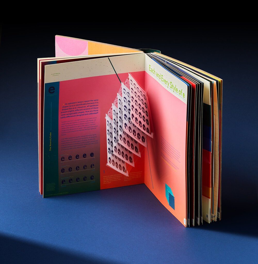
Like her former challenges in paper engineering, Kelli wanted to make abstract ideas about type tangible in Alphabet in Motion, “getting people’s hands and minds working in tandem”, she says. “Letterforms are shaped by culture, but also the technology that renders them. It’s hard to make obsolete technology real and vivid and empowering for a reader who has never (for example) operated a phototypesetting machine. That’s why tinkering is both a very human way of reasoning, and a method to empathically connect with the designer’s hand.”
Turning the pages of Alphabet in Motion, you certainly share in Kelli’s infatuation with letterforms: “tiny, fairly benign-seeming shapes” that have the ability to “transport you” to another time and place, but you also share in the designers love for the handheld revelations and the unlimited number of interactions that are possible with paper. It channels all of the knowledge the designer has acquired over her career about making and designing books that don’t quite behave as we expect.
True to Kelli’s sideways approach, instead of establishing an authority on typographic history, the pop-up publication lets us shape our own experience and understanding of type, firsthand. “The notion of the ‘firsthand’ is at once the most natural, accessible way to learn, and also the most radical,” Kelly concludes. “A person who believes that truth is to be acquired first-and-foremost through their own senses is empowered. My books are intended to engage directly with that part of ourselves.”