
I’ve written about (and personally decorated with) countless blue hues over the years, but Etsy’s 2026 Color of the Year, Patina Blue, is one of the most surprising I’ve come across.
Decorating with blue is hardly new territory, yet this newly crowned Color of the Year feels different – softer, moodier, and totally vintage. Named after the timeworn blue tinge that aged copper takes on, Patina Blue has a lived-in, nostalgic quality that, despite first glance, can easily fit in with just about any interior design style.

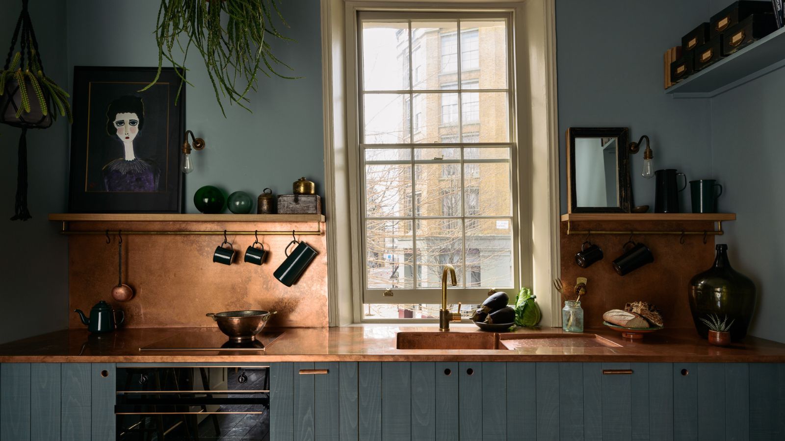
(Image credit: deVOL)
In 2026, interior design trends are moving away from glossy perfection and toward tones and textures that carry depth and story. Etsy’s chosen tone taps into that desire for decorating with vintage and moodier color – and the surge in searches for “blue copper” (more than 3x!) on the online marketplace shows just how deeply this hue is resonating.
You may like
‘Right now, people are craving homes that feel restorative, places that help them slow down and unwind,’ explains Dayna Isom Johnson, Etsy’s Trend Expert. ‘Patina Blue offers that calm, grounded feeling, but it also brings depth and character. It’s less about perfection and more about ease, which really reflects the shift toward slower living rather than feeling like everything needs to be totally polished.’
‘There’s also something beautiful about the way this tone is inspired by materials that evolve over time,’ she continues. ‘Patina Blue celebrates pieces that wear in, not out – a mindset shift we’re seeing across everything from fashion to home decor. That same sensibility is reflected in our Texture of the Year, Washed Linen, which has that soft, lived-in feel people are gravitating toward right now.’
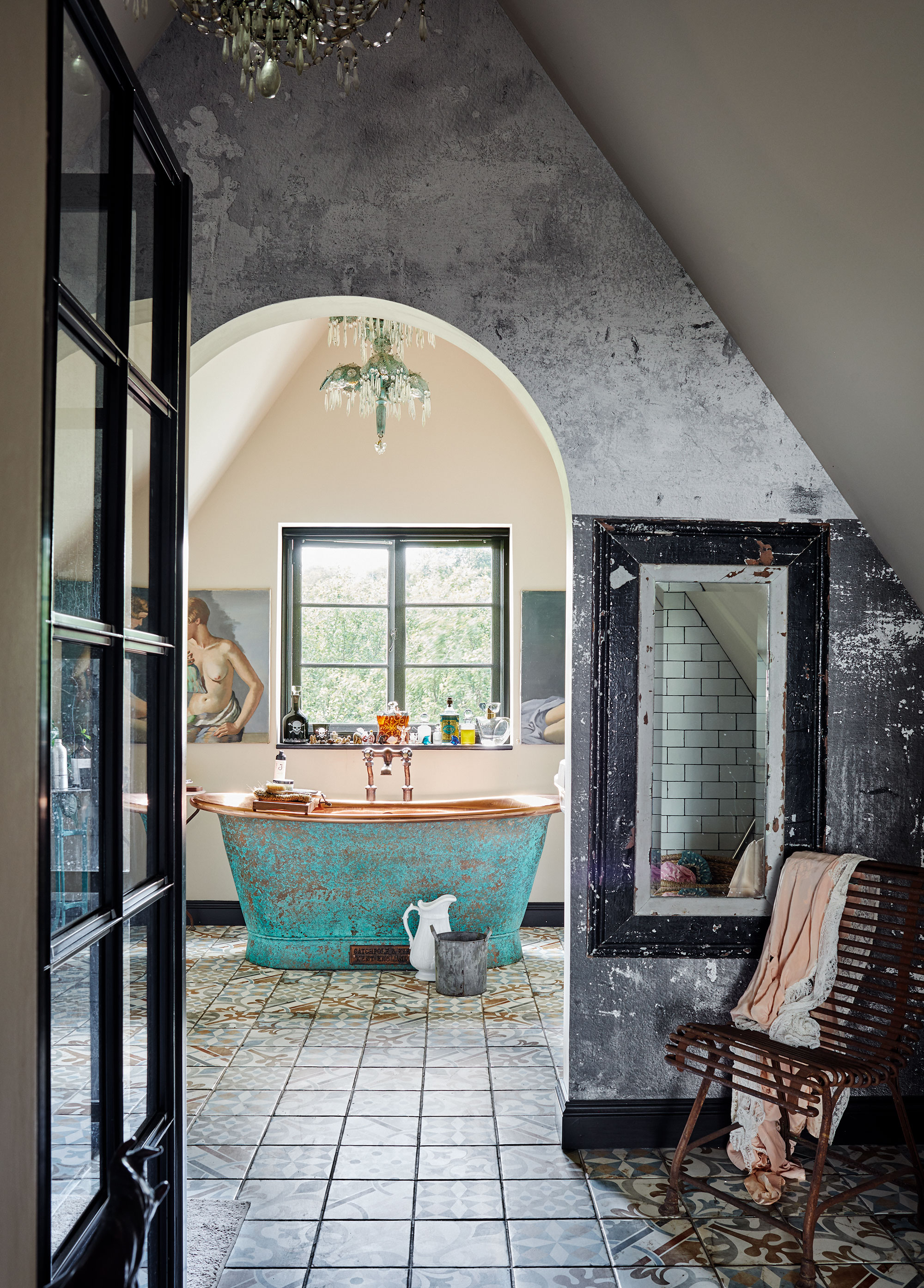
(Image credit: Brent Darby)
The good news is that a little patina goes a long way.
‘Patina Blue is surprisingly easy to weave into your home,’ says Dayna. ‘For a softer touch, bring it in through bedding, cushions, or ceramics, small moments that add a sense of calm without overwhelming the space.’
But if you’re ready to lean in a little further, the color has the depth to hold its own. ‘If you want something bolder, it makes a beautiful accent wall or works well as statement lighting that instantly becomes a focal point,’ she suggests.
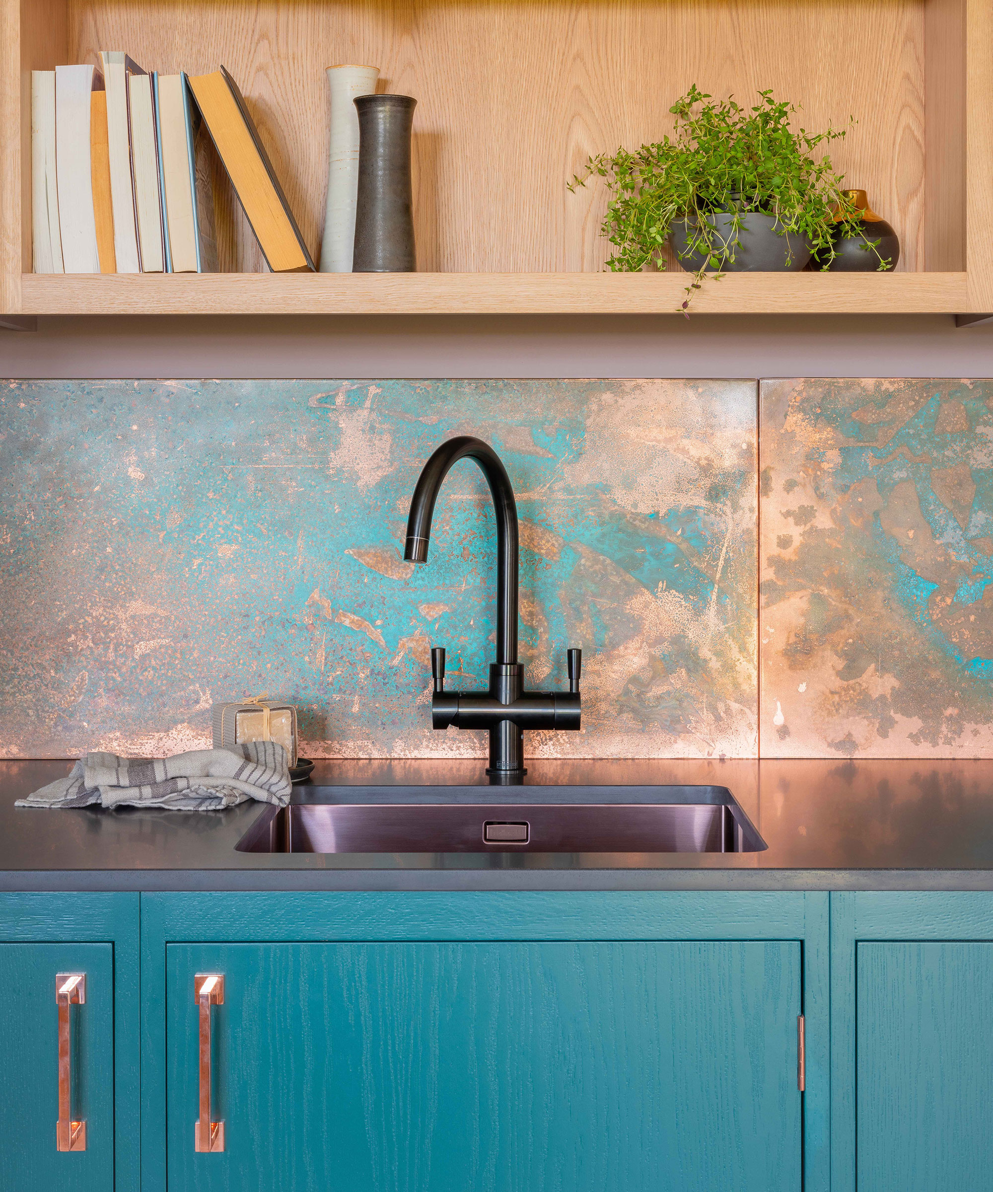
(Image credit: Naked Kitchens)
‘I recommend looking for blue paints with a soft green or gray undertones,’ Dayna advises. ‘Those slightly muted, weathered tones mimic the way copper naturally transforms over time. Anything that feels a little time-worn or patina-inspired will get you very close to the depth and softness of Patina Blue.’ It’s less about finding an exact match and more about embracing the mood.
‘The color is incredibly forgiving and pairs naturally with warm metals and organic textures. Patina Blue paired with washed linen is such a natural match,’ she adds. ‘The combination of that calming, mineral blue with linen’s relaxed, tactile quality feels effortless and beautifully lived-in. A hint of copper or brass really brings out its weathered, lived-in character.’
Shop ‘Patina Blue’ Home Decor
Whether you’re sprinkling it in through cushions and ceramics or committing to a statement wall, Etsy’s Color of the Year, Patina Blue, has the rare ability to feel both soft and moody. Will you be trying it?