
When Pantone unveiled Cloud Dancer, a soft, billowy white, as its 2026 Color of the Year, the idea was serenity: a “blank canvas” for a noisy world, a hue meant to signal calm, clarity and fresh starts.
The internet seems to have responded with a collective shrug — and a swipe toward phthalo green instead.
A ‘non-color’ color of the year
Pantone leaders described Cloud Dancer as a natural, airy white meant to bridge our digital lives and our “primal need for human connection,” something that can sit quietly behind family photos, couches and Christmas trees.
But a white shade — especially the first white Pantone has ever crowned as color of the year — was bound to stir opinions. And it has.
Some designers praised Cloud Dancer as soothing and sustainable, noting that many people already own white clothing and home goods, which might actually make this one of the most rewearable colors Pantone has picked.
Others read the selection as a sign of the times: another neutral after the last two years’ Peach Fuzz and Mocha Mousse, a color that fits recession-era minimalism and “clean” aesthetics more than it does joy or risk.
And then there’s the backlash.
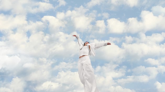
 A promotional image of Pantone’s 2026 Color of the Year, Pantone 11-4201 “Cloud Dancer.” | Pantone When a white shade meets a complicated world
Several critics have argued that choosing a shade of white in 2025 feels culturally tone-deaf, especially when conversations about race, representation and “whiteness” are already charged.
The Guardian noted concerns from forecasters who saw the pick as underwhelming or problematic, while design curator Priya Khanchandani told Wallpaper that a white color of the year can look like resistance to plurality rather than a celebration of it.
Forbes and other outlets described the online reaction as swift and sharp, with social media users accusing the pick of being dystopian or “whitewashing,” and some viral posts labeling Cloud Dancer “racist” or Sydney Sweeney-coded.
Pantone has pushed back, per WWD, emphasizing that skin tones were not part of the decision-making process and that the color is meant to represent calm, not identity politics. Executive director Leatrice Eiseman framed Cloud Dancer as a deliberate simplification — a way to enhance focus and offer a moment of clarity.
Others went to social media and podcasts to say that it’s just purely boring.
On the “Armchair Expert with Dax Shepard” podcast, co-host Monica Padman shared that she uses the Pantone color of the year as her phone screensaver each year. This time, she’s not so sure. Padman said it almost feels like she lost “something that I enjoy a lot and that … makes me happy” and that something “I look forward to is no longer a thing.”
the pantone color of the year is… white
im sure this is going to go super smooth, wont spark any conversation at all pic.twitter.com/zPqROTA9tu
— Oren John (@orenmeetsworld) December 4, 2025
i know it’s just a color and it’s not that deep etc etc but pantone picking white as the color of the year during a time where white s*premacy is on the rise is so
— courtenay lou who ☃️❄️⛸️ katseye la (@svviftlet) December 5, 2025
Pantone color of the year being greyish white is a a recession confirmation
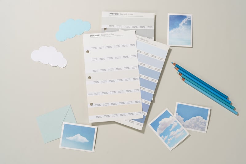
— diet coke with lime (@beejohnie) December 4, 2025 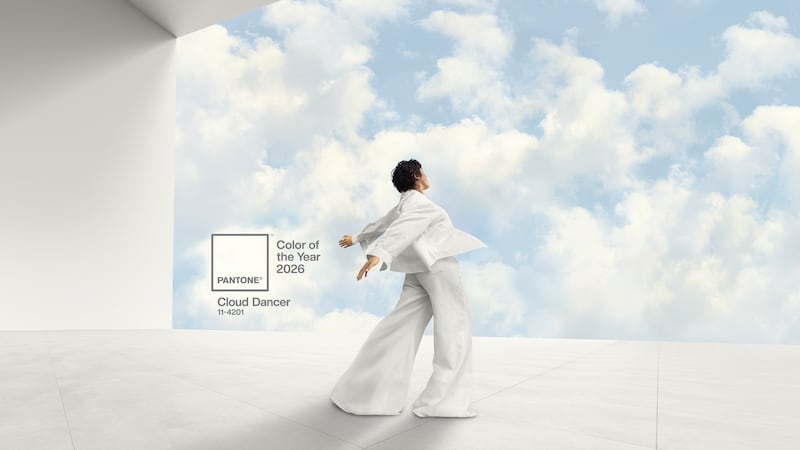 A promotional image of Pantone’s 2026 Color of the Year, Pantone 11-4201 “Cloud Dancer.” | Pantone Enter phthalo green, the internet’s ‘expensive’ color
Meanwhile, another hue has been quietly staging a takeover.
If Cloud Dancer is the blank canvas, phthalo green is what a lot of people are actually painting on top of it.
A Livingetc color expert recently called it one of the most “expensive-looking” colors you can put in a home, praising its rich, jewel-toned depth and the way it sits somewhere between green, blue and black.
Designers say that because it behaves almost like a neutral, it works on everything from paneled offices to built-in bookshelves.
So while Pantone’s official palette for 2026 is white, a lot of people’s mood boards are still drenched in very dramatic green.
not choosing phthalo green as color of the year feels like a mistake pic.twitter.com/mtd9ecLvCg
— SB (@spookyxxboobs) December 6, 2025
“I love that we’ve all agreed to just ignore Pantone and instead choose phthalo green as our color of the year. It really is a fabulous color.” – All of Us
Cloud Dancer⚪️, we don’t know her. pic.twitter.com/YfKI5p7tHi
— Drink. Travel. Dine™ (@DrinkTravelDine) December 5, 2025
Sorry, @pantone. A shade of white isn’t it for 2026. We’re in our romantic goth era as a people. We won’t recognize white as the color of the year when pthalo green and aubergine gleam are just sitting there. Power to the people! pic.twitter.com/SfHUtVJvlx
— Jessica Jewett (@JJ9828) December 5, 2025