
Local decorators say their clients are following colorful threads, reconnecting with individuality, and looking to outlast fast fashion.
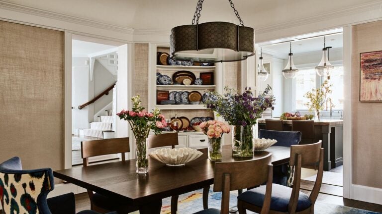
Newton-based interior designer Vani Sayeed used patterns and rich hues in this dining room. Jared Kuzia
The Pantone Color Institute probably didn’t mean to kick off the new year with fighting words, but that seems to be what happened.
“White is a conciliatory color,” Laurie Pressman, Pantone’s vice president, wrote about white hues, and who introduced the institute’s 2026 color of the year, “Cloud Dancer.” But it was not.
White, Pantone suggested, represents “the purest of the pure.”
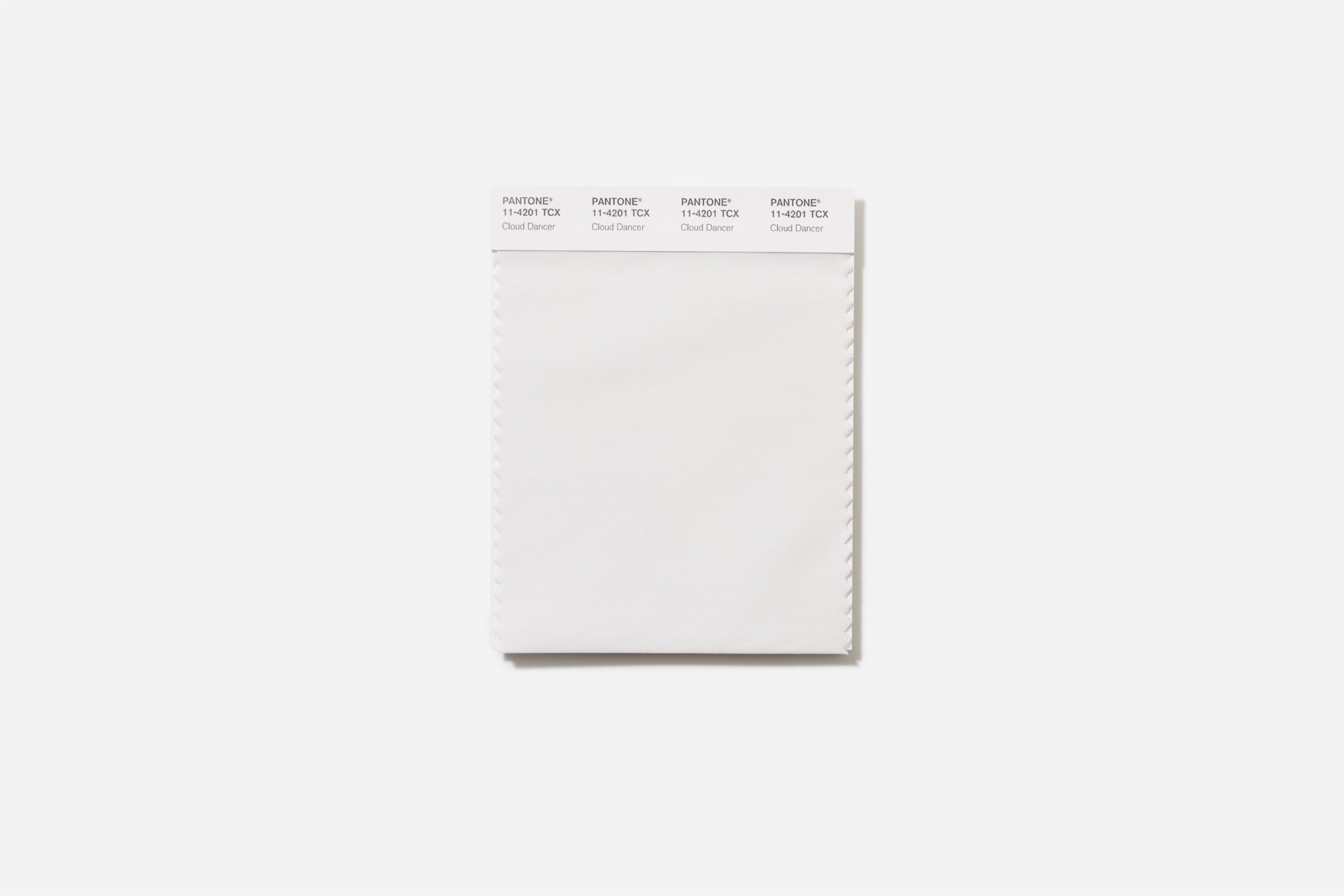 The Pantone Color of the Year for 2026 is “Cloud Dancer.” – Pantone
“Read the room,” answered many in the design community. Social media users clapped back, calling the selection politically tone deaf, and quipped that Cloud Dancer might be better called “Landlord special.” Forbes put out an article titled, “Backlash hits Pantone after Color of the Year slammed as ‘tone deaf,’ ‘dystopian,’” and the New York Times chimed in as well.
“I think they have the wrong pulse,” said Vani Sayeed, a Newton-based interior designer. “[Pantone] may be experts in understanding color and all of that, but I don’t think they are reading it in a global sense. They are probably reacting to a very alternate consciousness of culture and society.”
Local designers said if anything, their clients are following more colorful threads, reconnecting with individuality, and looking to outlast fast fashion.
Color drenching
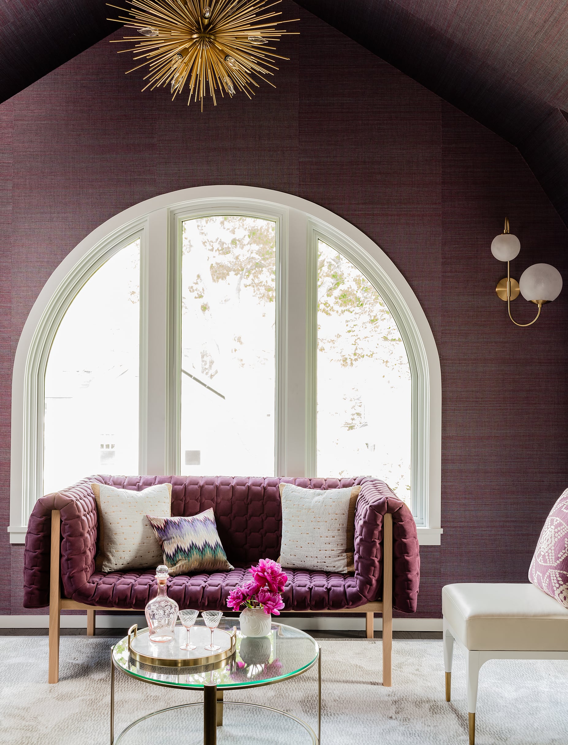 Color Theory Boston achieved color drenching in this room with textured wallpaper rather than paint. – michael j lee
Sayeed, who recently traveled to Mexico City where she observed the bold, color-infused architectural work of Luis Barragán, as well as Art Basel Miami Beach, said that people are tired of beige, white, and gray, and are seeking joy through color.
“Because of all the chaos that’s happening politically [and] socially, in the world, I think people want to celebrate what they have,” she said. Color is symbolic, and a means of self-expression, said Sayeed. “By dumbing color down, I think you’re defeating the purpose of a culture.”
For a recent client who lives in a house dominated by white tones, a bold red kitchen ceiling added a swath ofcontrast.
“Color drenching” is one way to fully embrace color, said Kendra Amin-Dufton, an interior designer and co-owner of Color Theory Boston, referring to the practice of painting everything in a room in a deep, saturated color — including trim and doors. She said she’s seeing clients become less afraid of embracing personalization.
“The more that they’re exposed to, the less they’re becoming really afraid of committing to those bigger ticket areas, whether it’s a full living room and doing all of the walls or kitchen cabinetry, just going really heavily designed like a powder room where we’re doing the wallpaper and the color on the molding and a really beautiful light fixture,” she said. “It’s kind of what … as designers, you want to push for. You’re looking to take people outside of their comfort zones and ask them to trust their own preferences.”
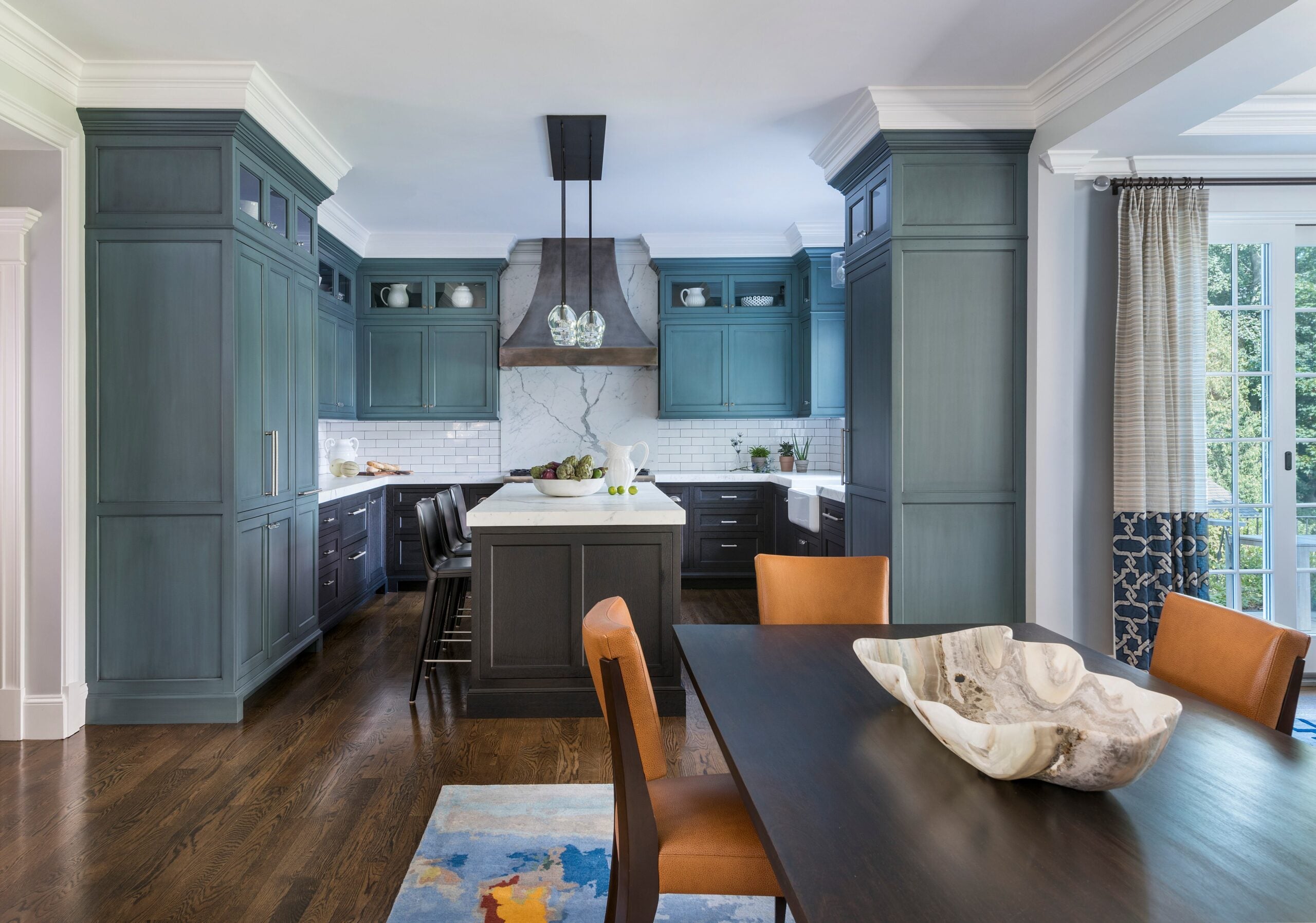 This teal kitchen was designed by Newton-based interior designer Vani Sayeed. – Nat Rea
For color selections, Amin-Dufton is seeing a lot of warm, cozy shades inspired by desert sunsets, such as blues and greens with warm gray or brown undertones, terra-cotta, smoky lilac, and rose. Drenching can apply to wallpaper, too: a confident full-room treatment avoids what can look like an often haphazard accent wall.
And maybe skip the shortcuts.
“Although [some] stores seem to offer a peel and stick DIY wallpaper option, they are a lot more tricky to apply than you think,” said Tess Leeds, of Tess Leeds Redesign in Newton. “It’s worth hiring a professional if you have a busy pattern and want it to turn out well.”
Tactile textures
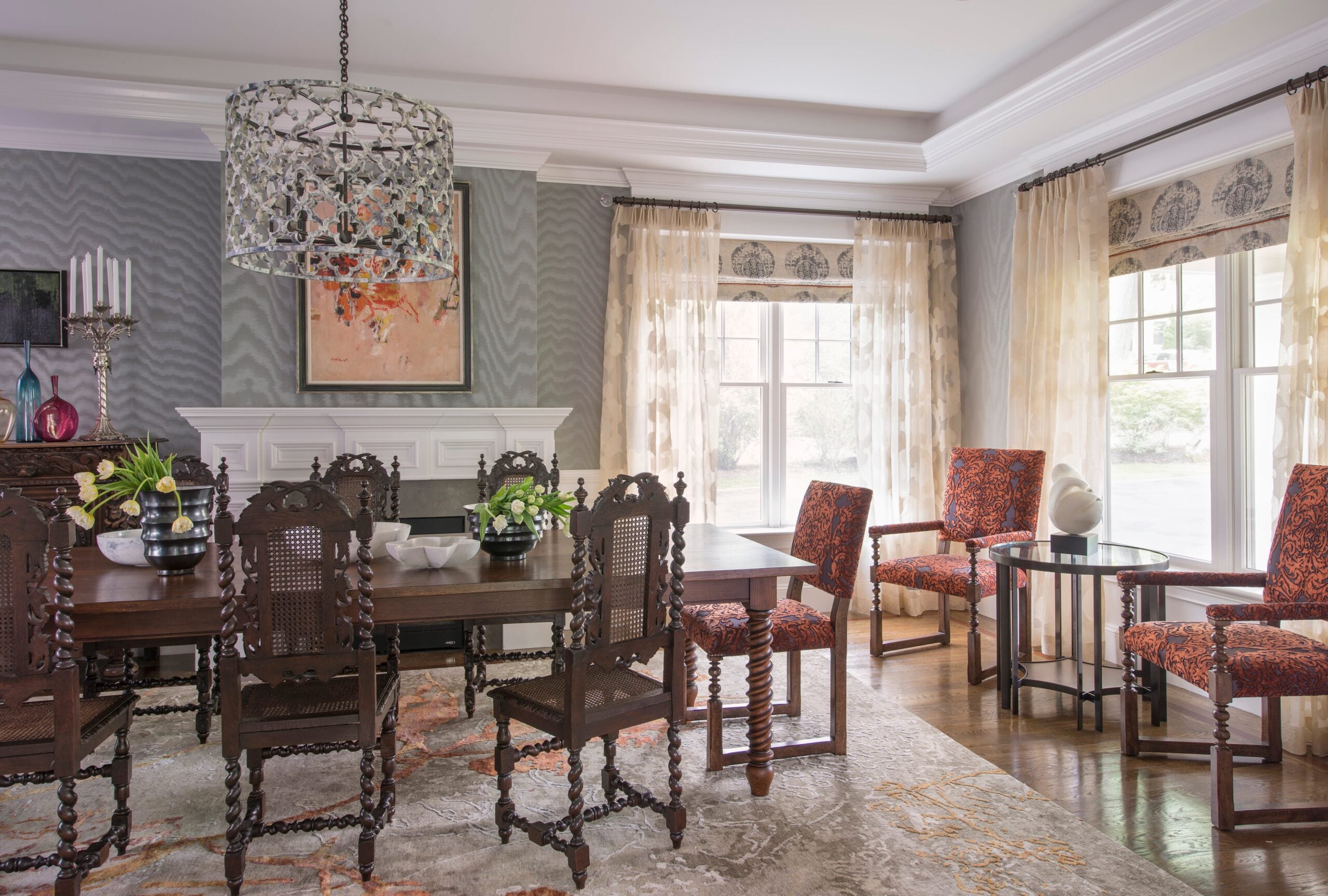 This dining room by Newton-based interior designer Vani Sayeed features different textures, patterns, and colors. – Nat Rea
Besides paint and wall covering, Sayeed said, pattern and texture can provide further expression, especially when augmented by light. Find additional texture in textiles, rugs, and finish materials, such as natural stone.
“I’m talking about natural stones … the blues, the greens, the reds, the purples, the plums,” she said. “It’s beautiful … It adds visual interest. It’s tactile.”
In addition to bland tones becoming passé, so are some of the adjoining trends like white boucle upholstery.
“I think that kind of was like a gateway drug for a lot of people to go into something that feels a little bit more luxurious and luxe,” said Amin-Dufton. With that interest in texture and color, more “performance” fabrics are on the market, she said.
“That opens the door for a lot more people to feel comfortable embracing something that you know gives a luxurious feeling, but it’s still going to be a piece that you can comfortably and safely live with for a period of time,” she said.
Plants, too, are another way to approach texture, she added.
 Color and texture come into play in this dining room by Newton-based interior designer Vani Sayeed. – Sabrina Cole
As social media compresses major trends into faster-moving “microtrends,” giving your own tastes a digital detox might be a good thing, said Amin-Dufton.
Curate choices organically and take your time.
“Visit the antique malls around New England, and flea markets and things of that nature, rather than just going right to sort of all of the usual suspects, like a West Elm or Crate &Barrel, or, you know, Wayfair, that type of thing,” she said. “I think it’s really important that people be able to identify what they actually respond to, versus just what they’re being fed. Algorithms can become so saturated with the same images over and over that you start asking yourself, ‘Do I really like this, or is it just something that I’m seeing so repetitively that I’m being trained to like it?’”
Sayeed discovered antique Jacobian furniture in one client’s basement.
“I’m like, ‘Why are we not using this?’” she recalled. After repair work revitalized the pieces, they formed the basis of a new, frequently used formal dining room.
“More clients are asking for an eclectic, non-matchy-matchy vibe — desiring a home that reflects them without looking like it all came from the same store,” said Leeds.
Fast fashion, mass-produced, often cheap, and seen as disposable is fuel for a quick-changing trend cycle.
“I’m not looking to do something transient,” said Sayeed, who added her design objectives are more sustainable. “I’m looking at something that will be appreciated for a period of time.”
Amin-Dufton said white walls probably aren’t going anywhere, but there’s nothing fresh about them, either. And if experimenting with color sounds exciting, go for it.
“It’s paint,” she said. “It can always be repainted.”
Address Newsletter
Our weekly digest on buying, selling, and design, with expert advice and insider neighborhood knowledge.