
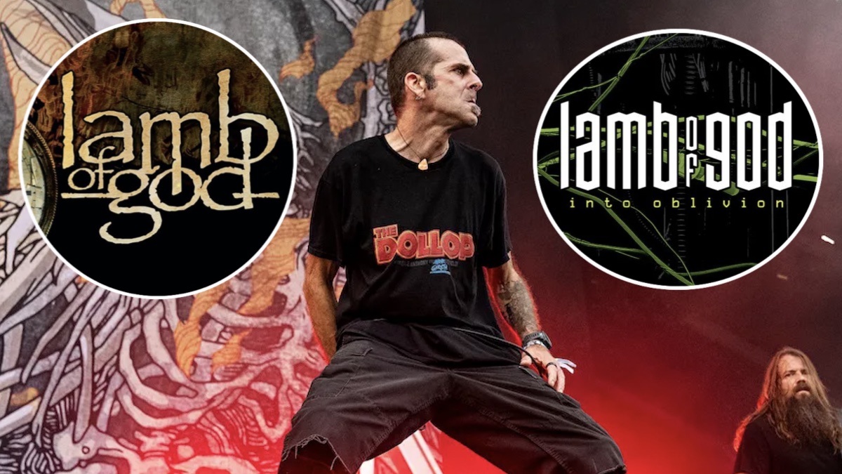
When Lamb of God announced their new album, Into Oblivion, last month, one of the first things fans noticed was a dramatic change to the band’s longtime logo on the cover artwork. Frontman Randy Blythe explains that the a change was needed because the old logo looked like it was from a “falafel restaurant menu.”
The veteran metal band’s longtime logo had graced the cover of nine of their previous 10 albums (2009’s Wrath is the only one without the band’s name on the cover).
When asked by HardLore why Lamb of God decided to change their logo after all these years, Blythe responded, “Well, our logo, to be perfectly honest, needed changing. It’s the papyrus font. And had we known 20-however many years ago that we would wind up looking like a falafel restaurant menu, we wouldn’t have used that. But that was before papyrus font was ubiquitous.”
Related Video
Into Oblivion is set to arrive on March 13th, while Lamb of God and their new logo will embark on a North American tour that with support from Kublai Khan TX, Fit for an Autopsy, and Sanguisugabogg. The outing launches March 17th in National Harbor, Maryland, with tickets available here.
Watch Randy Blythe’s full interview with HardLore below.