
Color has the potential to shape not just how a space looks, but how it feels, and for many rooms, from bedrooms to cozy living rooms, creating a soothing, restful space through is the goal. But what are the best colors to achieve a sanctuary space?
According to experts, it’s not just about the color itself, but its subtle undertones and how it is used in a room. ‘A sanctuary needs softness, which often comes from warmth in the undertone and reduced contrast between walls, ceilings, and woodwork,’ says Tash Bradley, Color Psychologist and Director of Interior Design at paint brand Lick.
‘A sanctuary isn’t created by playing it safe,’ she adds. ‘It’s created by designing a palette that genuinely allows your nervous system to soften.’ From warming neutrals to soft greens, earthy pinks to muted blues, designers reveal below their favorite sanctuary-inspired colors to give you some stylish, yet soothing, room color ideas.
You may like
1. Off-White
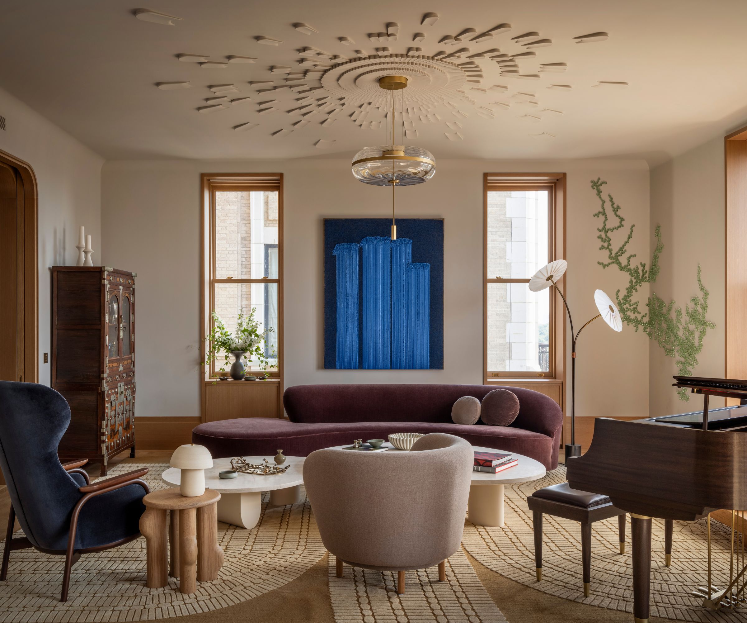
The off-white walls set a calming backdrop in this living room, while interest is added through the furniture and artwork.
(Image credit: Aaron Leitz. Design: Jessica Helgerson Interior Design)
Decorating with neutrals is a timeless way to create a calming space, whether that be in a living room, kitchen, or bedroom. Offering a blank canvas for furniture, textiles, and artwork to build upon, light neutrals are favorites among designers.
In this living room, the Portland-based Designer Jessica Helgerson opted for Farrow & Ball’s Cornforth White on the walls, a soft off-white paint that sets a tranquil feel. ‘We chose it because we were looking for something that was essentially white to be extremely light with all the beautiful light coming in from the windows,’ explains Jessica.
‘Cool colors are calming, and a lack of complementary contrast is calming, so this quiet, soft, tone-on-tone palette reflects the colors that the clients love as well as their goal of creating a calming space to wind down in, from their incredibly busy New York lives.’
McGee & Co.
Abbey Silk Fringe Pillow Cover
Bring timeless appeal to your space with this cream throw pillow cover.
Lulu & Georgia
Danzi Hand-Tufted Wool Rug
Add a soft neutral hue underfoot with this wool rug. The patterned border offers a decorative, elevated look.
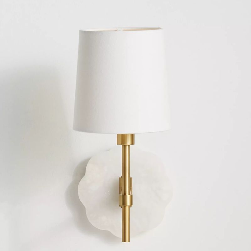
Regina Andrew
Mia Swing-Arm Sconce Wall Light
This wall sconce is a wonderful choice for neutral rooms, from living rooms to bedrooms.
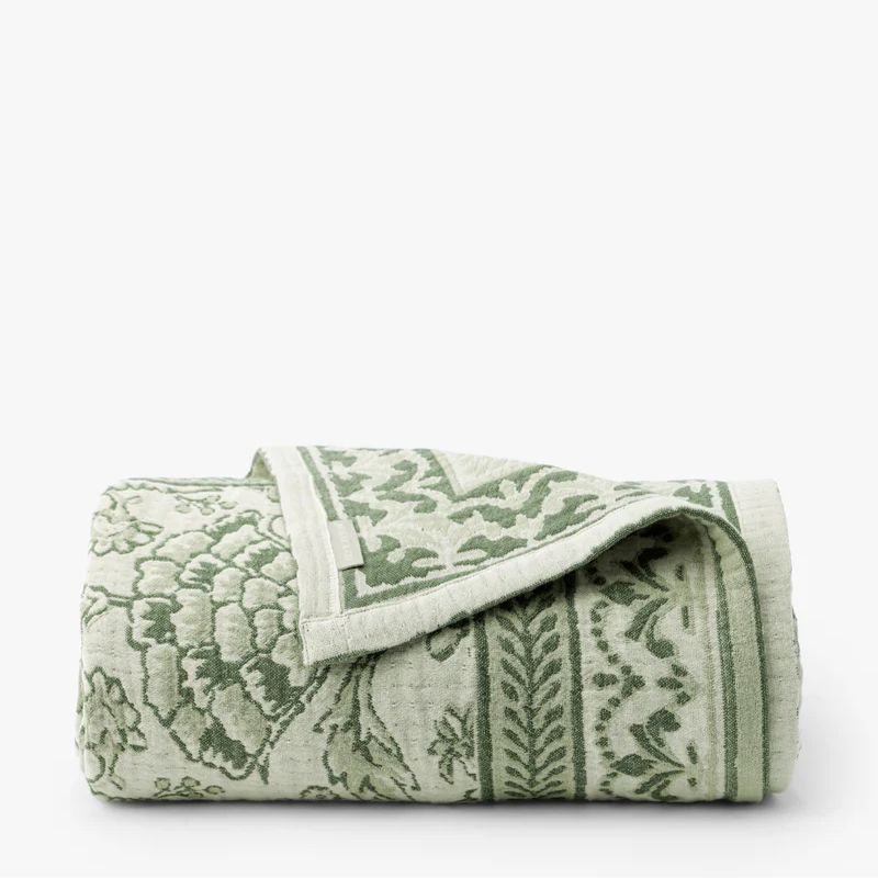
2. Pale Green
The use of color-drenching with this soft shade of green enhances the room’s restful feel by avoiding harsh contrast.
(Image credit: Joyelle West. Design: Opaline Interiors)
Green room ideas are perhaps the most fitting color choice when creating a sanctuary space, and designers are especially drawn to light tones. ‘Pale green feels calming and relaxing because it reminds us of the natural world,’ says the designer Gabrielle Bove of Massachusetts-based design studio Opaline Interiors. ‘Its tone isn’t too saturated, so it is easy for the eye to take in.’
In this relaxing bedroom, Sherwin-Williams’ Oyster Bay was used to color-drench the space, a soft and cool green paint that reads almost as a neutral. ‘This home is surrounded by mature trees and overlooks a pond, so we enveloped this room in Oyster Bay to make it feel like an extension of the outdoors,’ says Gabrielle. ‘The hue is soft and calming and creates a serene space that feels as if you’re in a treehouse. The palette also calms the angles of the room’s ceiling and creates a space that truly cocoons you.’
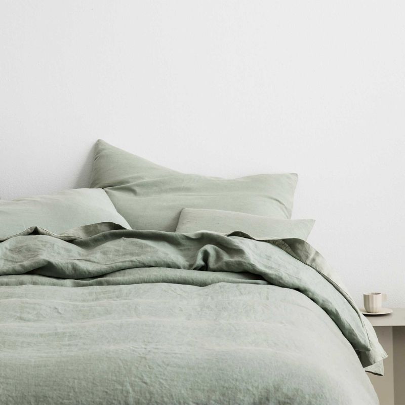
CULTIVER
Linen Duvet Cover – Sage
Refresh your bedding with this linen duvet cover in a soothing sage green hue.
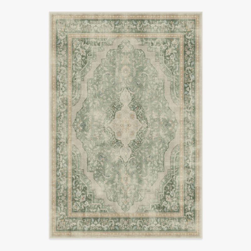
Ruggable
Adeline Natural Sage Rug
Or, ground your scheme with this calming green rug with a subtle pattern.
McGee & Co.
Eulalie Matelasse Coverlet
This coverlet feels both fresh and timeless, and would work wonderfully to elevate a neutral bedroom.
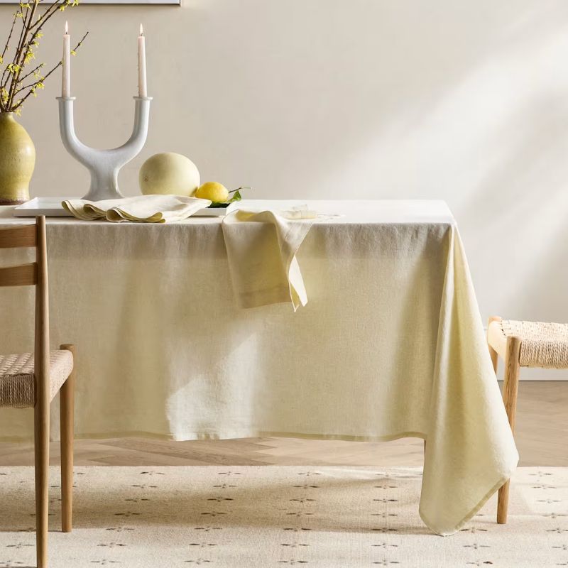
3. Butter Yellow
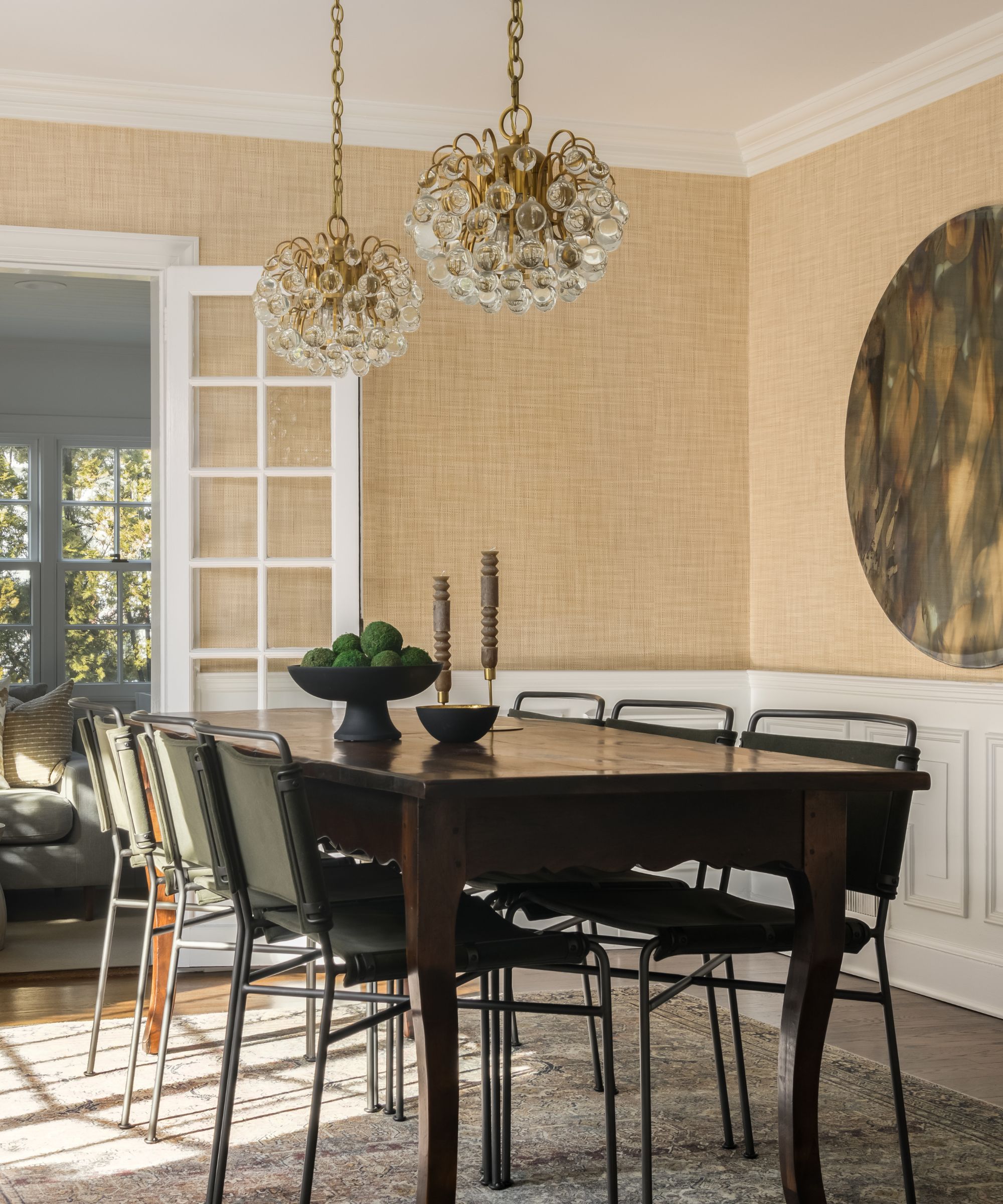
The butter yellow wallpaper is Driftwood by Phillip Jeffries, which adds a tactile element to the room.
(Image credit: Meghan Balcom. Design: Jessica Hobson Design)
While butter yellow is a fun and on-trend hue, mellow and not-too-saturated versions can be a great way to create a calming space, especially if you also want to add warmth to a room.
‘Butter yellow is a naturally calming color that works almost as a neutral,’ says the New Jersey Designer Jessica Hobson. ‘It exudes a calming, understated happiness which can be a great backdrop to any room.’
What to read next
In this dining room, Jessica opted for a butter yellow wallpaper, which adds texture as well as a hint of color. ‘When using this color on the walls, I love picking a texture or subtle pattern to add interest while still keeping it all tonal and creating an overall soothing vibe,’ she adds. ‘This pale color can add a serene warmth to any space.’
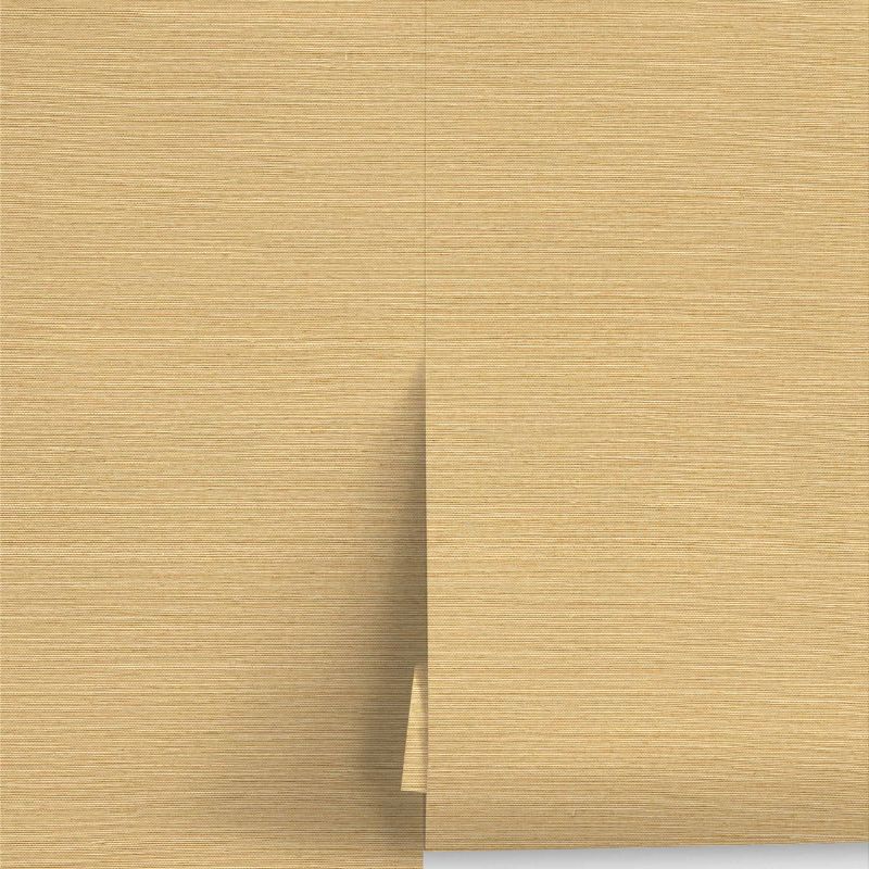
Lulu & Georgia
Beale Grasscloth Wallpaper
Take inspiration from this dining room and add softness to walls with this butter yellow wallpaper.
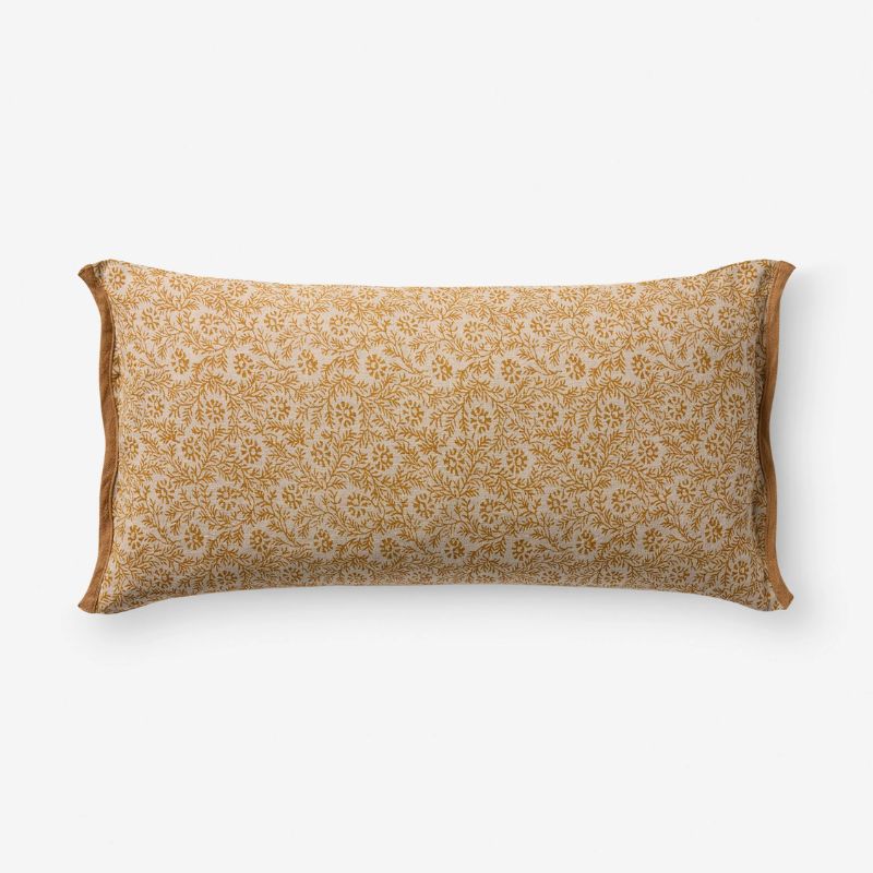
Lulu & Georgia
Brittany Linen Pillow
For a smaller addition of this warming, on-trend hue, go for this linen pillow.
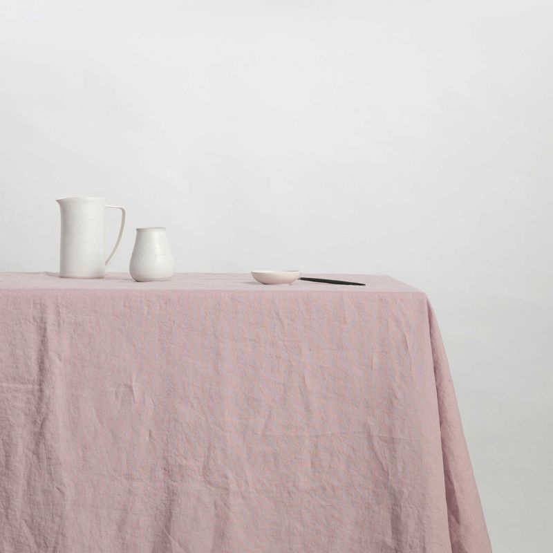
Quince
European Linen Tablecloth
Perfect for the spring months, this linen tablecloth is a fresh shade of creamy yellow.
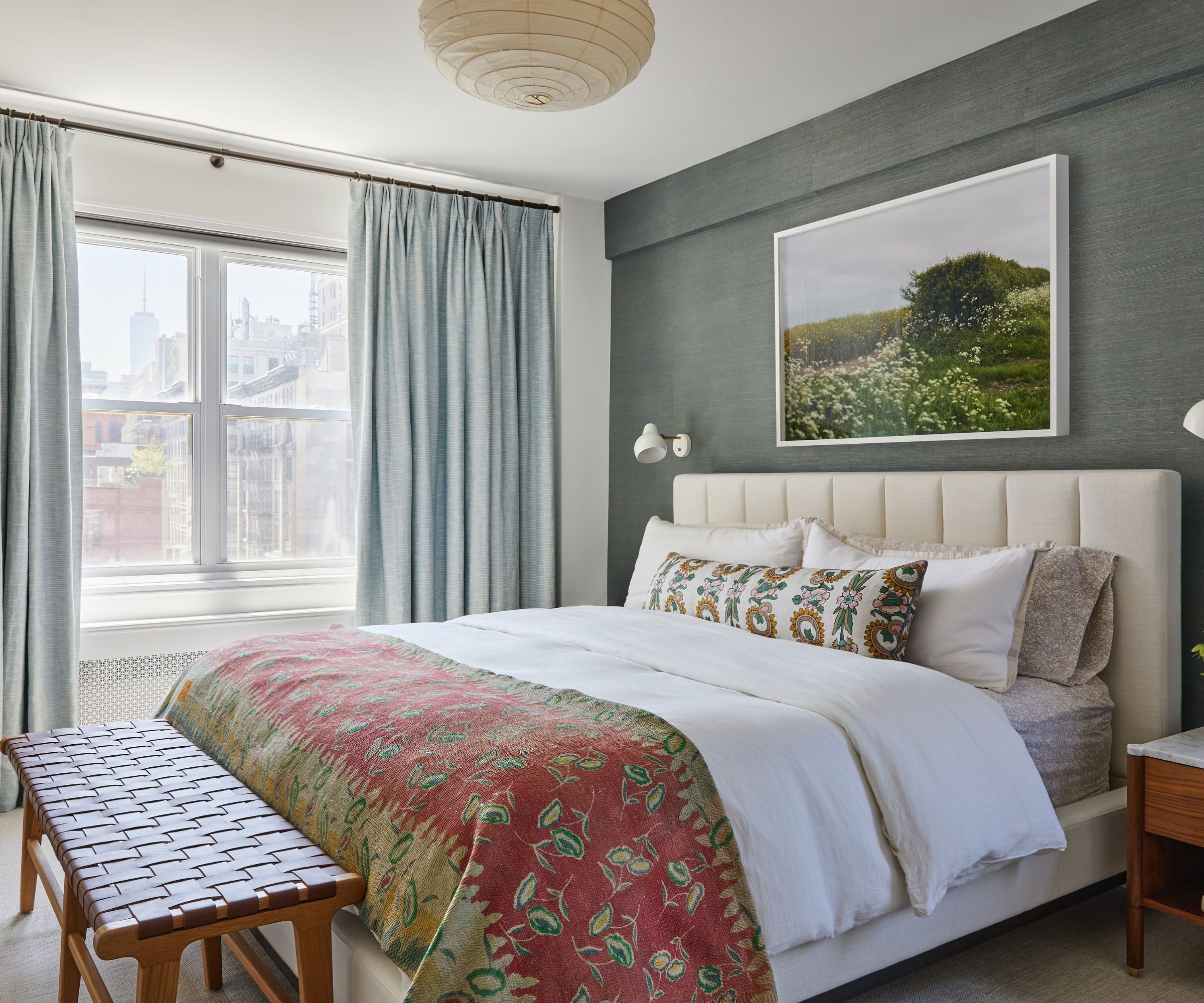
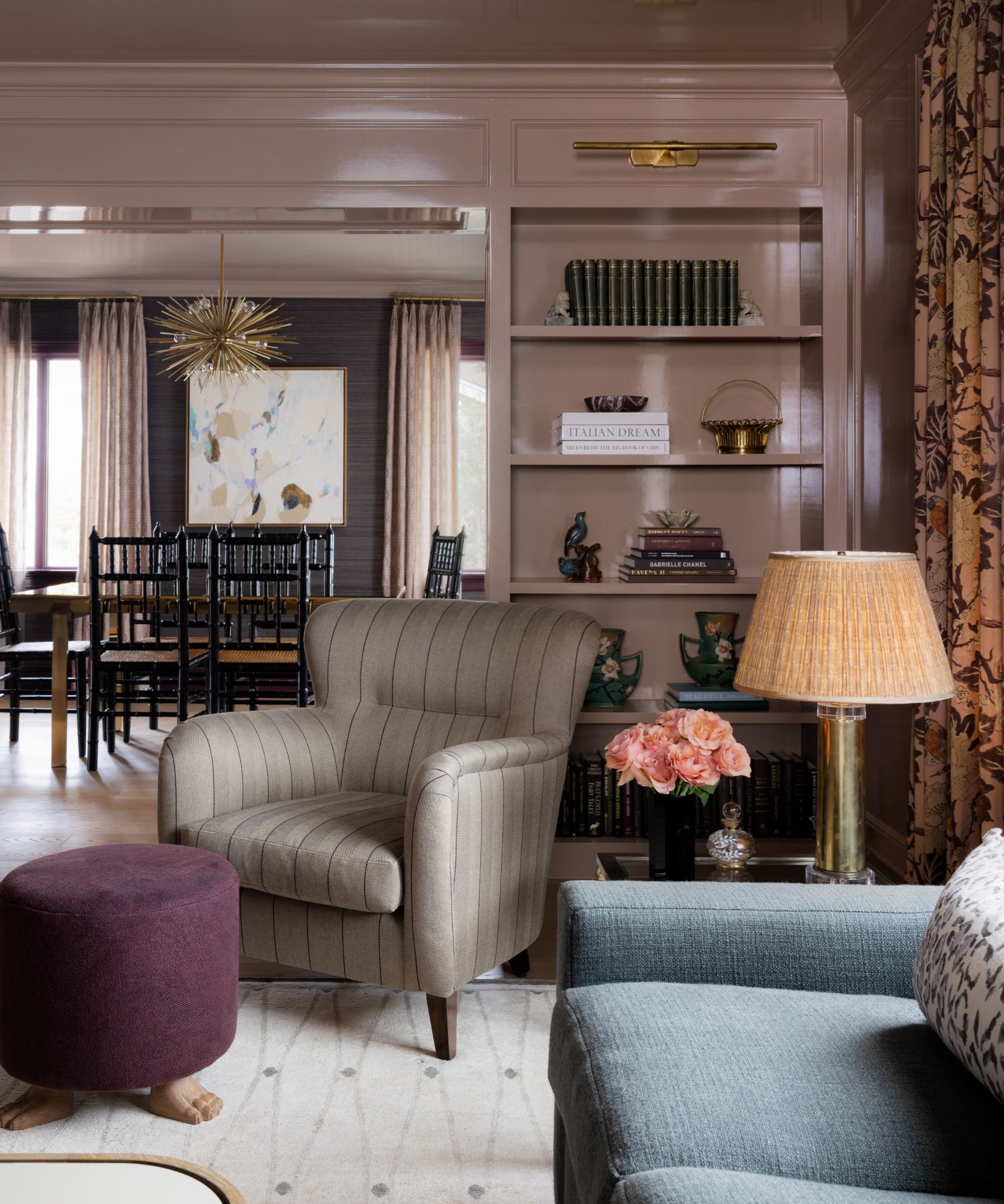
4. Muted Blue
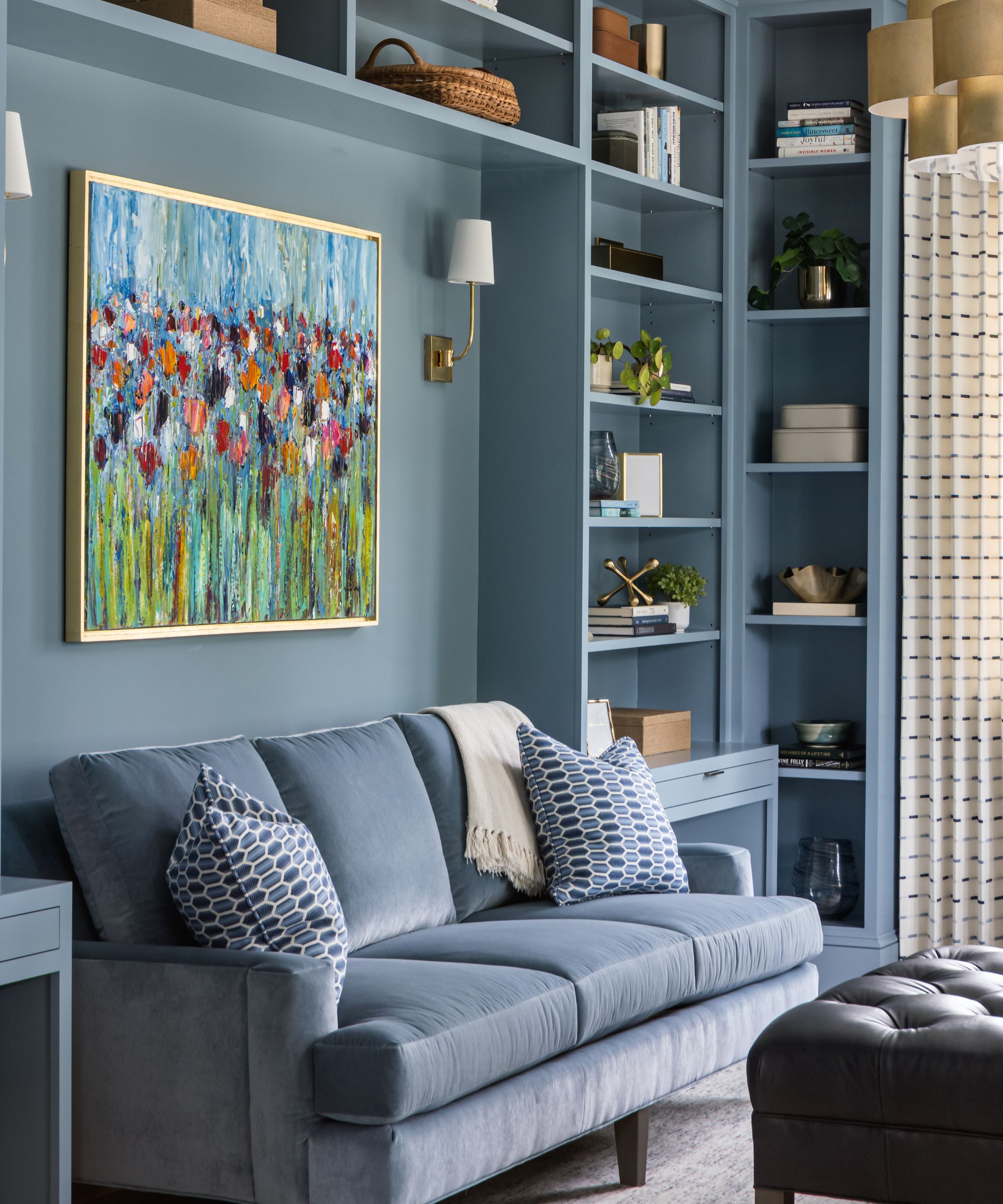
Soothing blue walls wrap this library room, along with a blue sofa to create a cohesive, calming sanctuary.
(Image credit: Peak Visuals. Design: Susan Sutter Interiors)
Blue is widely known as one of the most tranquil colors, and the right shade can be used boldly while still feeling soothing, much like Benjamin Moore’s Amsterdam. ‘This exact shade creates a serene, enveloping backdrop that feels both timeless and restful,’ says the Arlington, Virginia-based Designer Susan Sutter, who used this blue paint in this home library.
‘We saturated the walls, trim, and shelving to offset the home’s 10-foot ceilings and make the large space feel cozy,’ adds Susan. ‘The blue offers a calm and serene feel, mirroring nature’s sky and ocean, perfect for a busy family’s retreat space.’
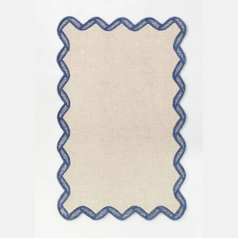
Anthropologie
Hand Tufted 100% Wool Scalloped Border Rug
If you have blue walls, this rug would work well to complete the color scheme, while adding a playful look.
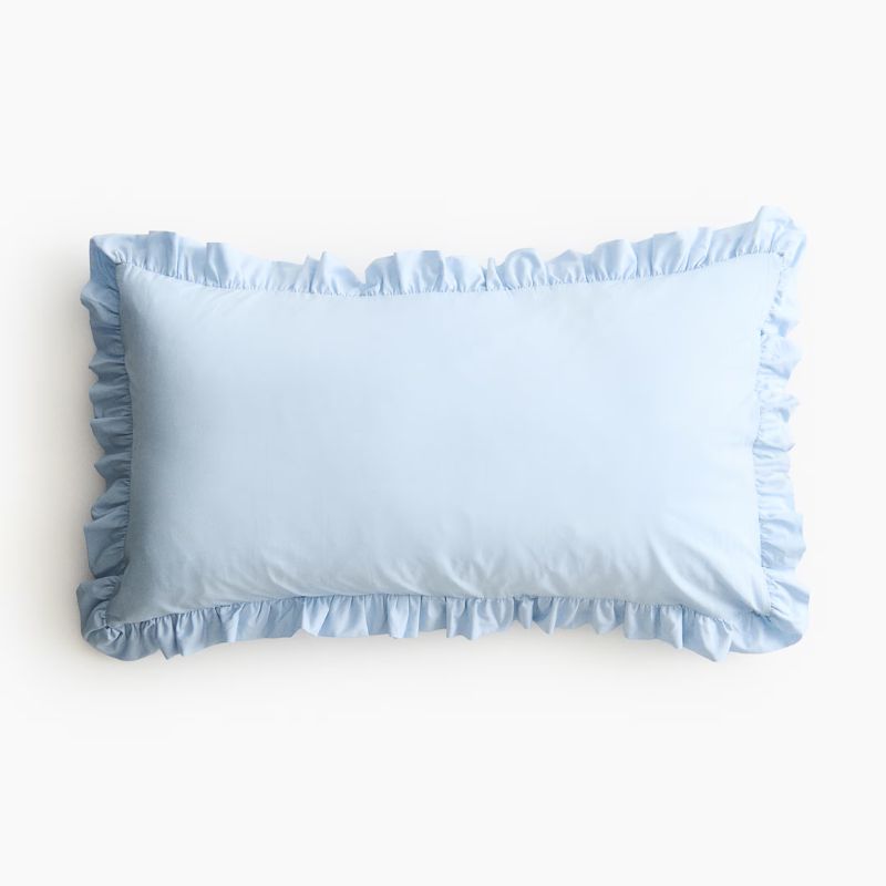
H&M
Ruffle-Trimmed Cotton Cushion Cover
The soft blue tone of this cushion cover feels aligned with spring color ideas – a great choice for a bedroom refresh.
Terrain
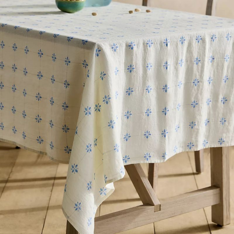
Tilework Linen Tablecloth
Bring tranquil blue to your dining table with this stylish linen tablecloth.
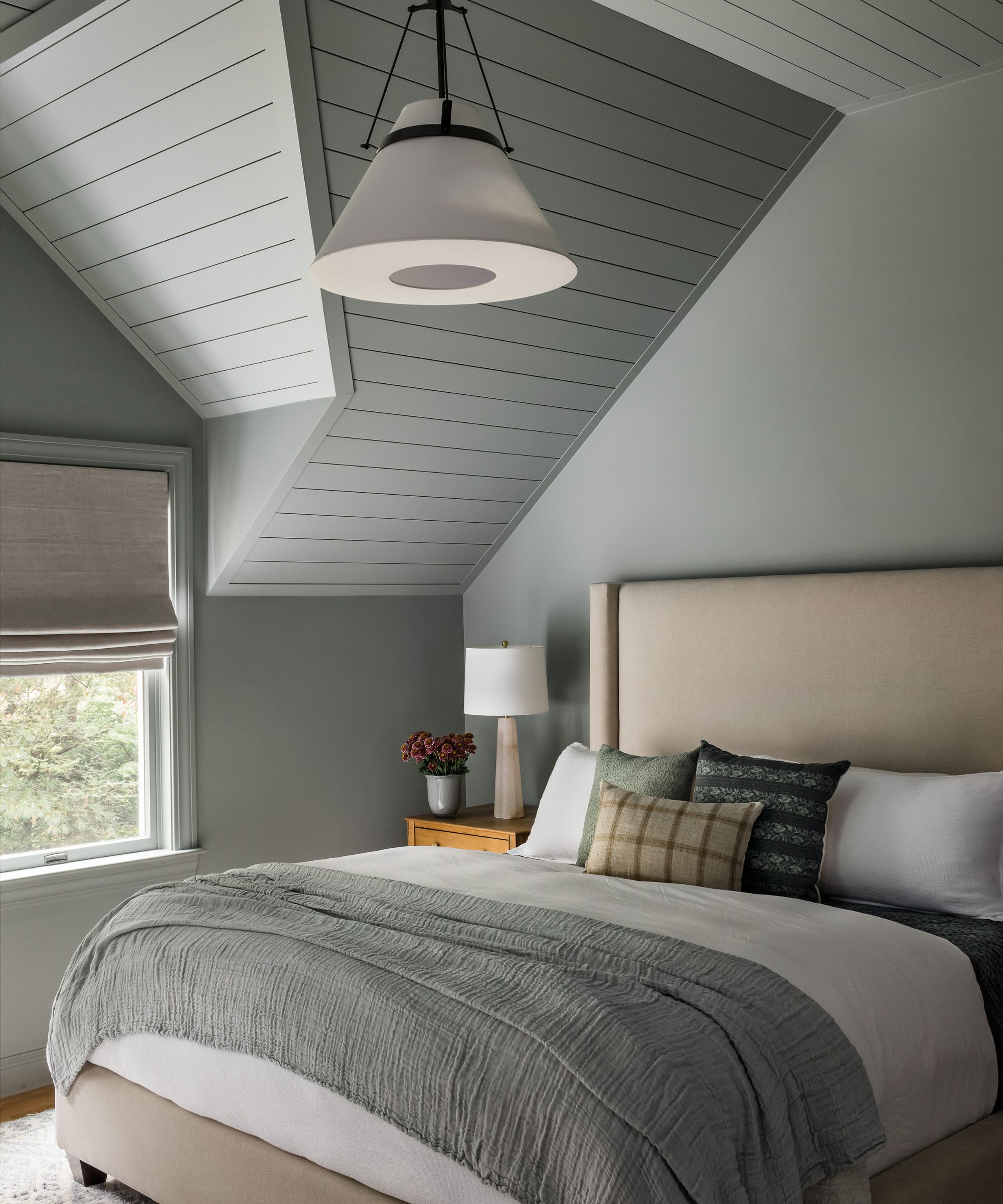
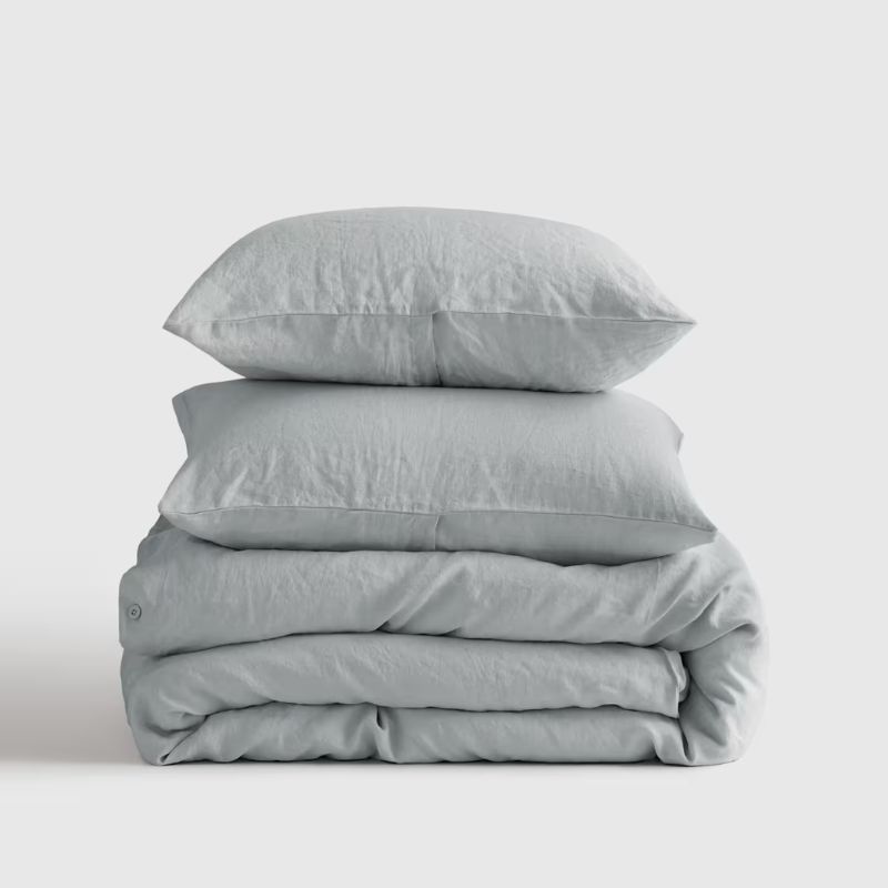
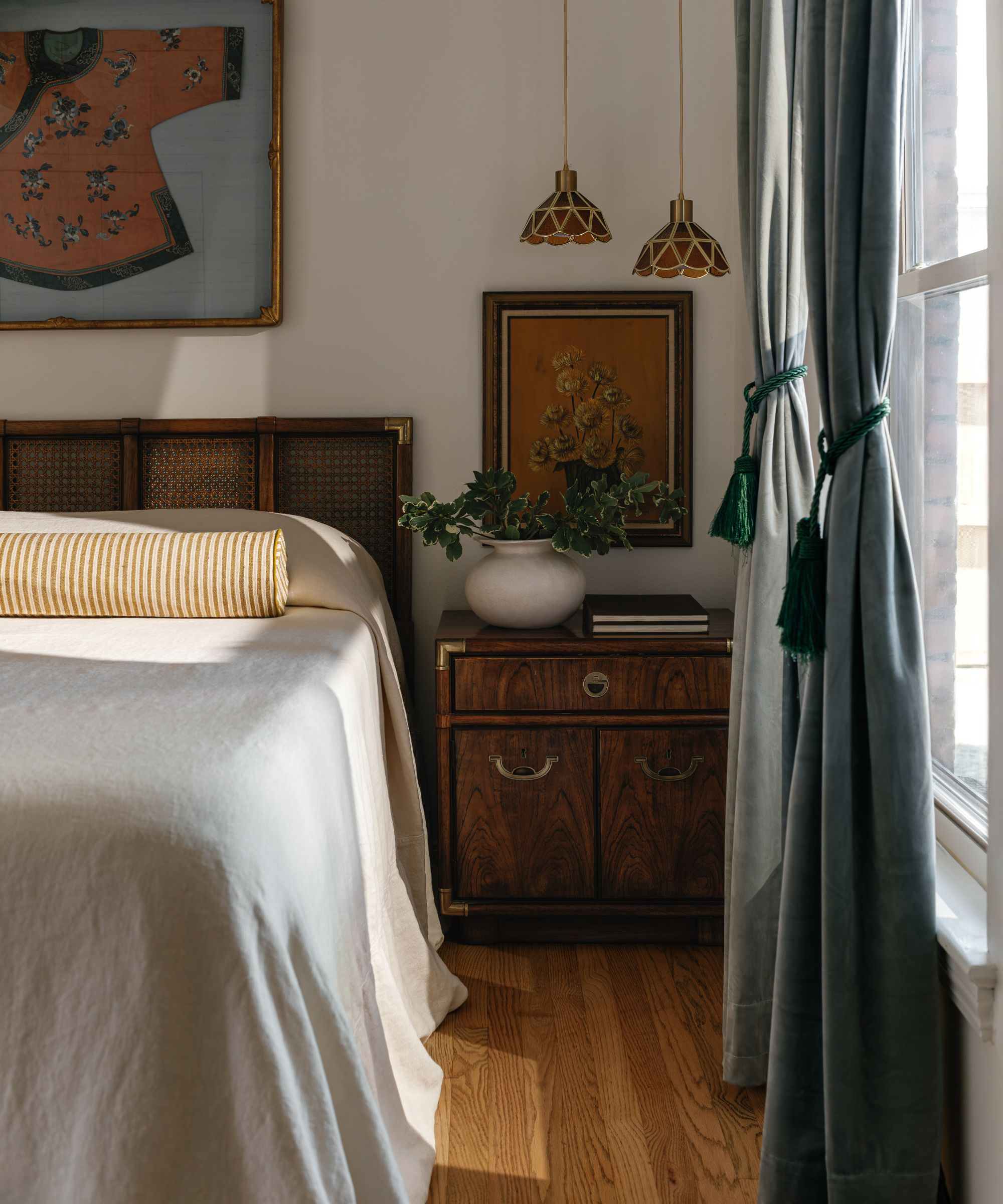
5. Gray-Blue
The wallpaper in this bedroom is a soothing shade of gray-blue, adding depth while setting a calm backdrop for the more colorful decor accents.
(Image credit: Kirsten Francis. Design: Studio Olivine)
Decorating with gray is another way to channel a neutral scheme that feels soothing and restful. But rather than drab grays that fall flat, those with blue undertones can offer a much more welcoming look. ‘I find blue with a hint of gray to be a very calming color,’ says the NYC Designer Hannah Blumenthal of Studio Olivine.
‘I love the calming hues of the wallpaper and curtains in this bedroom,’ adds Hannah. ‘Even though the accent colors are more active and colorful, I think the blue-gray hues really ground the space and keep it very dreamy.’
Paired with warm wood tones throughout the space, the gray-blue feels balanced. ‘Having these simple building blocks in calming, natural tones creates a sense of serenity and cohesiveness in the space,’ says Hannah.
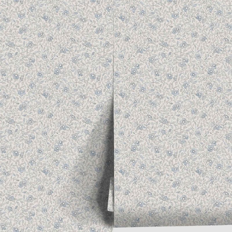
Sandberg
Scalamandre Stella Wallpaper
Much like this wall in this bedroom, this wallpaper adds subtle depth and a calming feel.
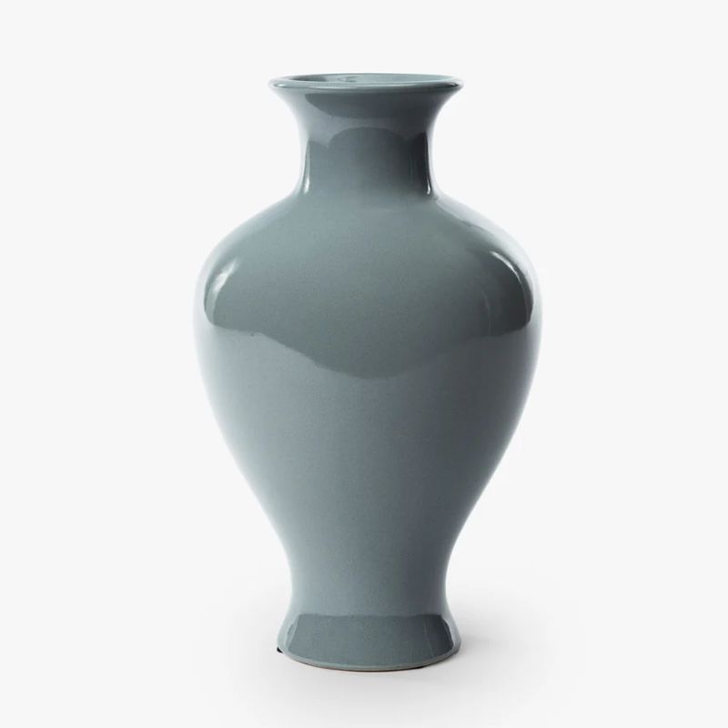
This vase is a classic piece that would look wonderful in kitchens or entryways.
Quince
European Linen Duvet Cover Set
Bring gray-blue to your sleep space with this linen set – a fresh color choice for spring.
6. Earthy Pink
Grounding shades of pink, such as Farrow & Ball’s Dead Salmon, adds warmth and a comforting feel to rooms.
(Image credit: Molly Culver. Design: Greer Interior Design)
If you’re drawn to warm color schemes, earthy and plaster pinks are an on-trend way to go. ‘When a soft, warm hue like Farrow & Ball’s Dead Salmon is used to color-drench a room, it creates a serene, calming space that feels relaxing during the day and cozy and romantic in the evenings,’ says Jennifer Greer Hartmann of the Austin-based design studio Greer Interior Design.
‘The homeowner’s garden is full of plum colored shrubs and flowers, and this just felt like the right color to complement those hues and welcome you at the front door,’ she adds. ‘Dead Salmon is a color that doesn’t overwhelm the eye but also feels interesting, warm, and soothing. It can also morph from a fresh daytime color (which was important to us), yet still feel cozy and inviting at night. It’s kind of the ideal soothing color.’
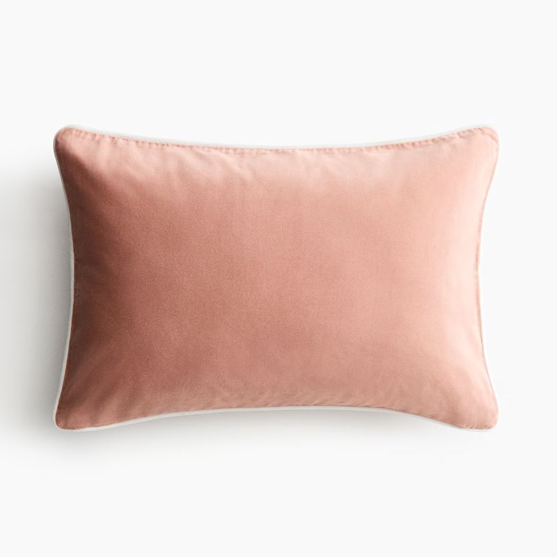
H&M
Piping-Detail Velvet Cushion Cover
Add a tactile element to your scheme with this velvet cushion cover in a soft pink hue.
Morris & Co.
Simply Severn Soft Pink Rug
For a more subtle nod to pink, go for this rug in a neutral-pink tone.
CULTIVER
Linen Tablecloth – Dusk
Soft, earthy pink also lends itself to kitchens and dining rooms for springtime hosting.
7. Soft Teal
Teal drapery adds depth and richness to this neutral bedroom, while extending the tranquil feel.
(Image credit: Becca Lea Photography. Design: Saab Studios)
Teal combines two of the most calming colors: blue and green, so it’s no surprise that it’s a favorite shade to decorate with when creating calming, sanctuary-inspired spaces. In this bedroom, teal was added through the drapery against a palette of timeless neutrals.
‘Soft blue-green drapery instantly lowers the volume in this bedroom,’ says the Dallas-based Designer Lauren Saab of Saab Studios. ‘This isn’t a sharp coastal blue or a trendy sage. It’s a hushed heritage hue that absorbs light instead of reflecting it, which creates a cocooning effect as soon as you enter the space. Pairing that muted blue-green with warm walnut and brass keeps the room rooted in warmth rather than feeling chilly. Many believe calming colors need to be pale and washed out, but calm actually comes from tonal richness and subtle saturation. When color feels anchored in natural materials, it settles the nervous system instead of stimulating it.’
CULTIVER
Quilted Bedcover – Bluestone
Teal is a soothing color to use in bedrooms, and this bedcover can be layered with various other hues.
McGee & Co.
Perla Pillow Cover
Offering a traditional look with its small-scale pattern, this green-blue cushion is elegant and sophisticated.
CB2
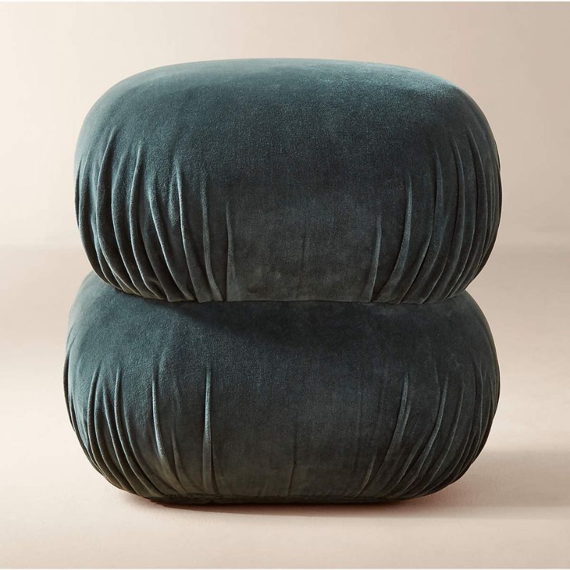
Ruched Dark Teal Velvet Pouf
Complete your scheme with this teal pouf – a stylish choice for living rooms or snugs.
When selecting colors for a sanctuary space, you should start with the hues that you’re naturally most drawn to. By choosing earthy, soft variations of typically bolder colors, your space will feel restful and cocooning rather than stimulating.
That said, experts warn that you may want to steer clear of certain shades when creating a soothing space. ‘Colors that are very high contrast, overly cool and stark, or heavily saturated can keep the brain slightly switched on,’ says Tash Bradley. ‘I’d also be cautious with very stark, blue-based whites. In certain lights, they can feel clinical rather than comforting.’