
I love green enough that three of the rooms in my house are painted in some variant of the color – not to mention a few of my favorite bags and jackets are a shade of green. But, put a camera in my hands, and my love for the color green quickly changes to frustration.
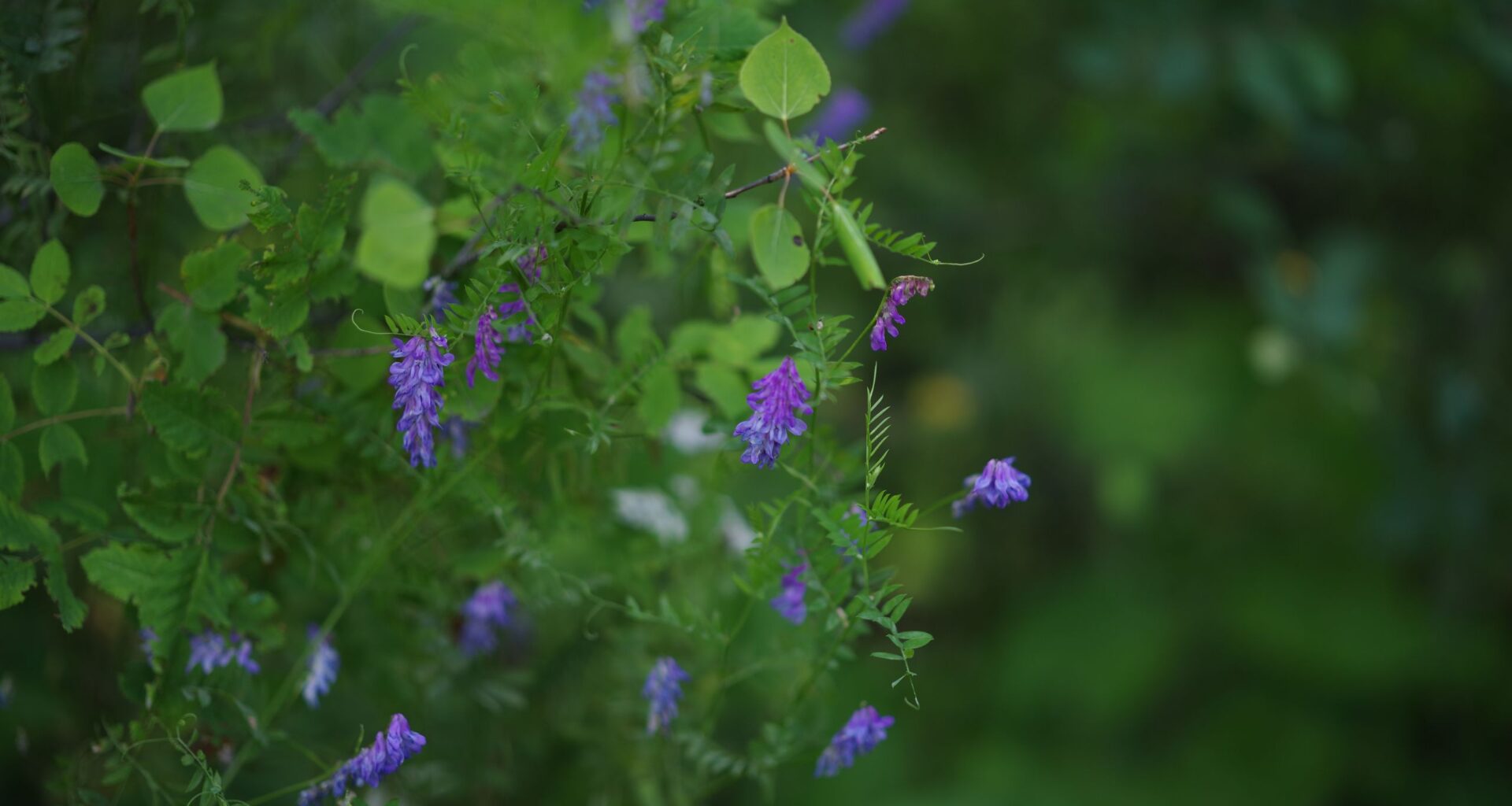
Green is one of the more frustrating colors to edit as a photographer, partially because the color is so dominant in nature and partially because of how most camera sensors capture the color.
A CMOS sensor sees in color by using a pattern of color filters over the pixels. Many modern camera sensors use what’s called a Bayer color filter. This Bayer pattern is typically made up of 25 percent red, 25 percent blue, and 50 percent green. That means a camera sensor is more sensitive to green than blue or red.
Article continues below
You may like
There are a few reasons that manufacturers prioritize green inside the camera sensor, one of them being that green tends to look brighter to the human eye. That means using more green filters on a sensor creates better contrast. The Fujifilm X Trans sensor, which is often praised for its colors, even uses slightly more greens than the typical Bayer pattern at around 55 percent.

(Image credit: Hillary K Grigonis / Future)
While dedicating more pixels to green creates better contrast, this also means camera sensors have a tendency to make green feel a bit over the top sometimes.
A camera sensor’s preference for green is easy to adjust in post-processing using the hue, saturation, and luminance sliders. But the trick is to find the balance between a natural green and accidentally creating a post-apocalyptic world where the trees and grass are unnaturally brown. I’ve seen many photographers – and many presets – take the green sliders too far.
The other reason that I have a love-hate relationship with green is from reflected light. When light bounces off a colored surface, it picks up some of the colors from that surface. This applies to all colors, not just green; green just tends to be a common challenge because it’s so prevalent in nature. (Do not get me started about color casts from red walls.)
That means if you take a portrait on a field of green grass, reflected light may make the skin tones a little greener. Reflected light off green surfaces tends to make skin look a bit too green.
That’s why I love photographing portraits in a field of too-long grass that’s a bit more brown than green – it creates warmer skin tones. A light-colored sidewalk or beach sand also has this effect as well.
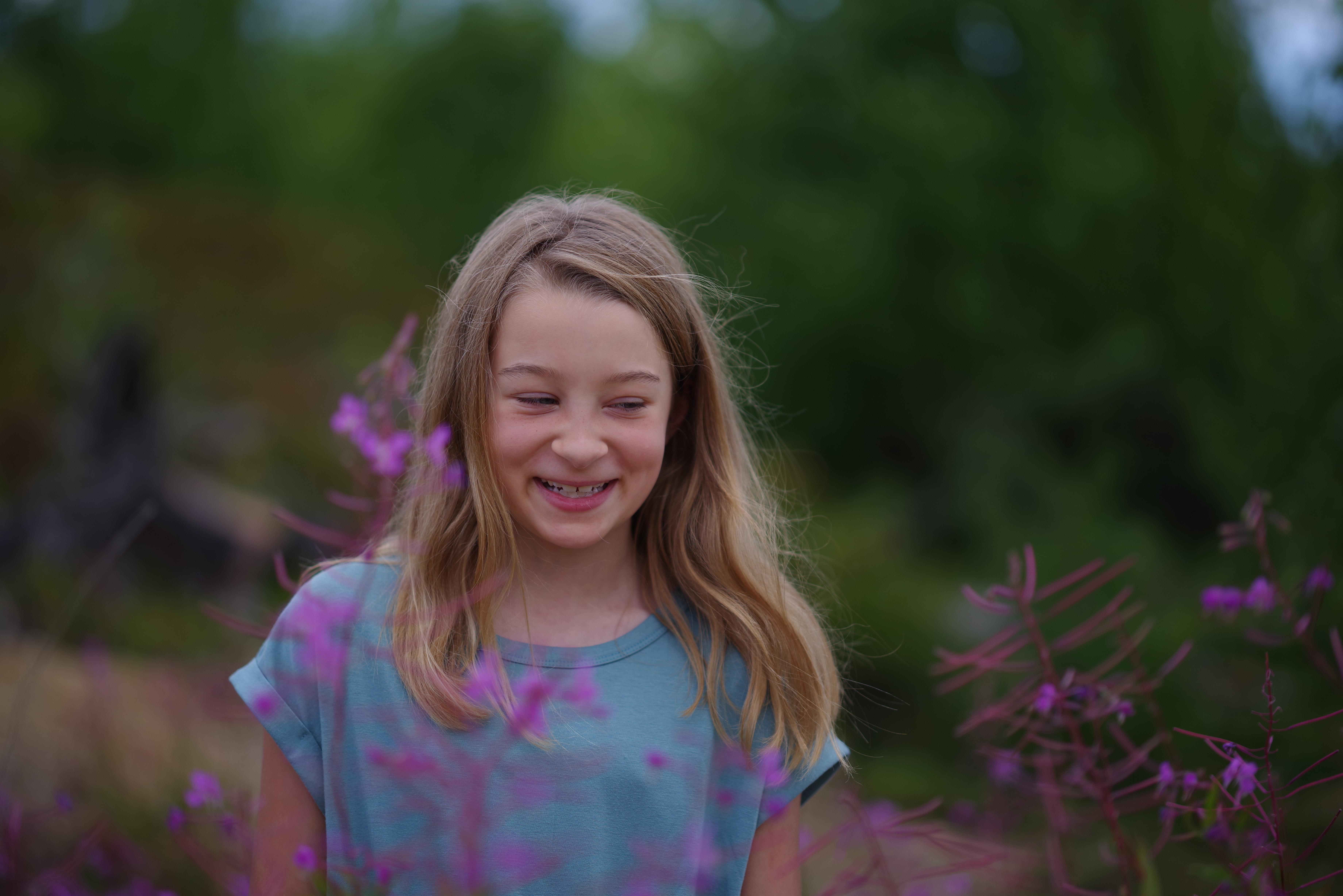
I took this photo, which hasn’t been color edited, standing on sand (Image credit: Hillary K Grigonis / Future)
Do I still take portraits in a field of green grass amid a forest backdrop? Of course – but I do so with a strobe light for less color casts and tweaks to the HSL sliders in Lightroom.
Green Color Editing TipsLearn the HSL sliders. The hue, saturation, and luminance sliders (available in most major photo editors, including Lightroom, Affinity Photo, and Capture One) are key to loving your color edits.There are all kinds of variations on the color green. The green in your photo may be influenced by more than the green slider. For example, green foliage is often adjusted using both the green and yellow sliders. Use the eye dropper tool to select the color range, and adjust every HSL slider affecting those colors at once.Don’t forget the white balance. The green-to-purple tint slider in editing software’s white balance tools can quickly help take out the overall green color cast.Take an editing break. If I’ve been staring at a screen too long, I’m far more likely to overdo the color edits. I like to color edit once, then revisit the photo again later before I finalize the edits. With fresh eyes, I’m more likely to spot an overzealous color edit.You may also like
Learn more with color grading a video or read about Lightroom’s newest slider to adjust color variance.