
Colour is the cornerstone of interior design, setting the tone for a space and influencing all other aspects of design, from lighting to furnishings. Whether your look is based on contrasting colours or neutral tones, knowing some simple colour theory will mean the finish is streamlined and balanced.
“Colour can evoke emotions and enhance moods,” Claire Garner, director of Claire Garner Interiors told Country Living. “Warm hues such as soft neutrals, earthy tones, or subtle pastels create a welcoming and inviting atmosphere in living rooms and dining spaces where social interaction is key. While cooler shades like blues, greens or grey promote relaxation and tranquillity, making them ideal for bedrooms, bathrooms and other spaces where peace and serenity are desired.”
From the 60-30-10 rule to analogous and complementary colour schemes, these are the colour combination rules interior designers and specialists across the UK say they rely on to create balanced, cohesive spaces.
1. Use analogous colours for a cohesive look

Sarah Griggs/Claire Garner Interiors
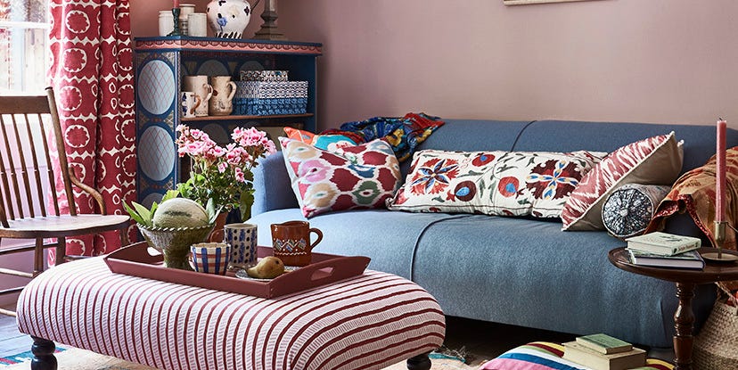
An analogous colour scheme is using colours that sit next to each other on the colour wheel for a balanced effect.
Before choosing a colour scheme, it’s important to understand the colour wheel. This simple tool shows how colours relate to one another and helps you identify combinations that feel balanced.
“This type of colour scheme creates a serene and comfortable design by leveraging the natural harmony between hues,” Claire Garner, director of Claire Garner Interiors, told us. “For instance, incorporating shades of blue, green, and teal together will give you a naturally cohesive look.”
Garner contined: “This approach is particularly effective in creating a unified and soothing design, making it ideal for bedrooms and living spaces. By selecting colours that naturally complement each other, an analogous colour scheme creates a sense of tranquillity throughout the room.”
2. Choose a soft, neutralbase

Matthew Williamson
Pale, soft and neutral tones are popular choices for base colours as they feel much lighter and open up the space – but you don’t always need to opt for white, black or grey, says Matthew Williamson, renowned interior designer and author of Living Bright.
“I am really enjoying using soft plaster pink as an all-over wall colour – it is always my go-to neutral. Warmer than grey, more interesting than beige and more forgiving than white, for me it’s a colour that I’ll return to again and again.
Williamson continued: “Pale and soft tones are often the best choice when it comes to base colours, as they provide a versatile canvas that can be accented with bolder shades to create depth and interest without overwhelming the space.”
3. Pair bold wall colours with an ‘apparent white’

Tom St Aubyn/Georgie Wykeham Designs
White is a common choice when it comes to a base colour, but Georgie Wykeham of Georgie Wykeham Designs, who also offers personalised colour palette service, The Colourist, suggests an ‘apparent’ or ‘off’ white will soften the effect.
“People tend to give a lot of thought to the wall colour and then just stick a standard white on the ceilings and woodwork,” Wykeham told us. “You should look for what I like to call an ‘apparent white’ – a colour that looks white next to the chosen colour. Your apparent white should have a touch of the wall colour in it.”
4. Follow the ‘nature rule’ for balance
Kate Conrad, senior interior designer at luxury homeware retailer Madison & Mayfair, follows the ‘nature rule’ to maximise spaces. She told us: “For colour schemes I follow the ‘nature rule’, whereby you design a room from the ground up.
“Use the darker tones at the bottom, such as a deep-coloured rug or dark-coloured side tables, and then opt for slightly lighter tones in the middle of the room, such as with your sofa or any wall art.
“Then, use the lightest colours at the top of the room, and watch as it transforms it by creating the illusion of being a larger, more open space.”
5. Use the 60-30-10 formula 

Tom St Aubyn/Georgie Wykeham Designs
The ‘rule of three’ is a timeless colour principle that will help you achieve balance in any room. “The ‘rule of three’ recommends limiting your palette to three main colours – one dominant with two accent colours – to avoid a cluttered look,” Nicolene Mausenbaum of Dezyna Interiors told us.
In terms of how to split this, another common rule is the ‘60-30-10’ rule.
“Opt for 60% dominant colour, 30% secondary colour, and 10% accent colour to achieve a balanced effect,” Amanda Foster of Foster Decor told us. “It’s a recipe for visual delight!” She continued: “It’s also worth adding in different textures when thinking about the three colours, as different textures in the same colour can add more depth.”
6. Use complementary colours for contrast

Tom St Aubyn/Georgie Wykeham Designs
Complementary colours sit opposite each other on the colour wheel, as opposed to analogous colours, which sit beside each other.
“Complementary colours add immediate variety and more obvious contrast to a space,” Simone Wilson, Colour and Trend Expert at Voyage Maison told us.
“This type of combination works as the two opposing colours are often similar in tone within their segment on the colour wheel, marrying nicely.
Wilson also recommends trying fresh takes on traditional combinations. She continued: “It’s easy to modernise traditional complementary colour schemes. For example, many of us may associate red and green with traditional spaces – or with Christmas – but a fresh take could be to opt for muted mossy greens and rusty terracotta reds to elevate and modernise this usually more classic colour combination.”
How to choose the right colour scheme for your home
There aren’t hard and fast rules when it comes to the right colour combination rules – a lot of the finish effect will be down to personal taste, but knowing the basics of how colours work together can help you create timeless looks based on your own preferences.
It’s also worth trialling your chosen colours in your spaces before committing, Nicolene Mausenbaum of Dezyna Interiors suggests. She explains: “Once you’ve selected your desired colours, ensure that you paint large test samples in the actual room before committing to a final choice – being sure to let the paint dry properly. Once dry, observe the samples at different times of day, with natural light and with artificial light to fully appreciate the colour values.”
Painting essentials 2″ Paint BrushCredit: farrow-ball.com
 Harris Seriously Good Walls Ceiling Roller SetCredit: dunelm.com
 Amazon Basics Original Multi-Surface Masking TapeCredit: amazon.co.uk