
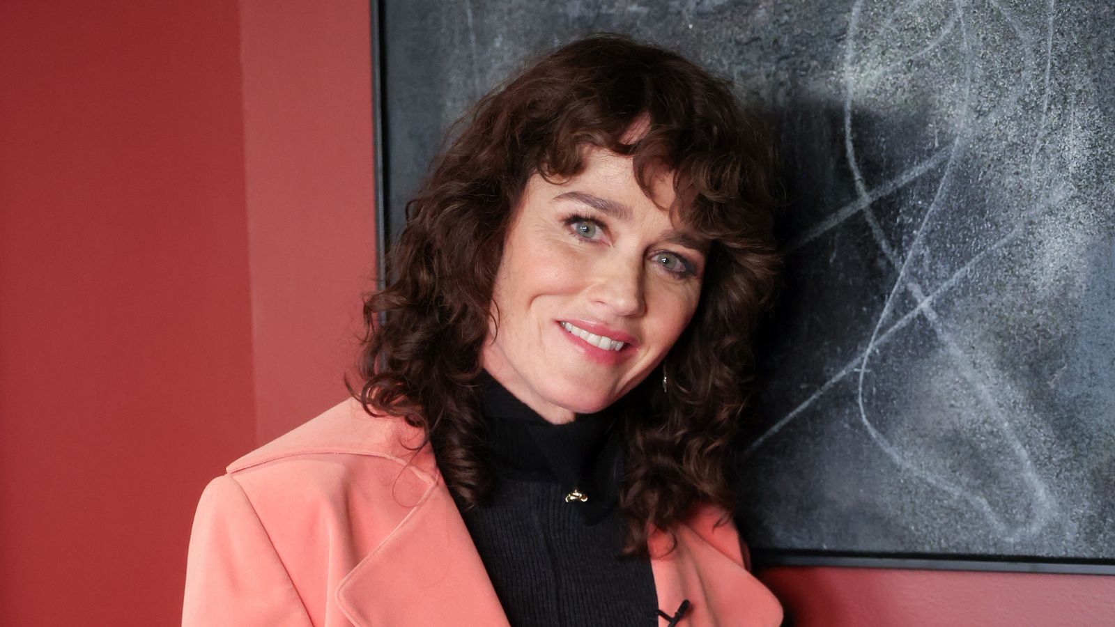
Mid-century design is most often associated with natural materials like wood and leather, and creating interest through shape and texture, but, since seeing this image of The Mentalist star Robin Tunney’s Beverley Hills dining room, I’m convinced that adding color can bring a whole new energy to this aesthetic.
Of all the mid-century modern ideas, color tends to be more of an afterthought – brought in with a single piece of bold artwork, for example, but it’s easy to see that a stronger influence of art and design runs throughout this former home of sculptor Morris Levine, and re-designed by Robin and her interior designer husband, Nicky Marmet.
Article continues below
You may like
Get Robin Tunney’s Warm Retro Look With These Buys
Exact match
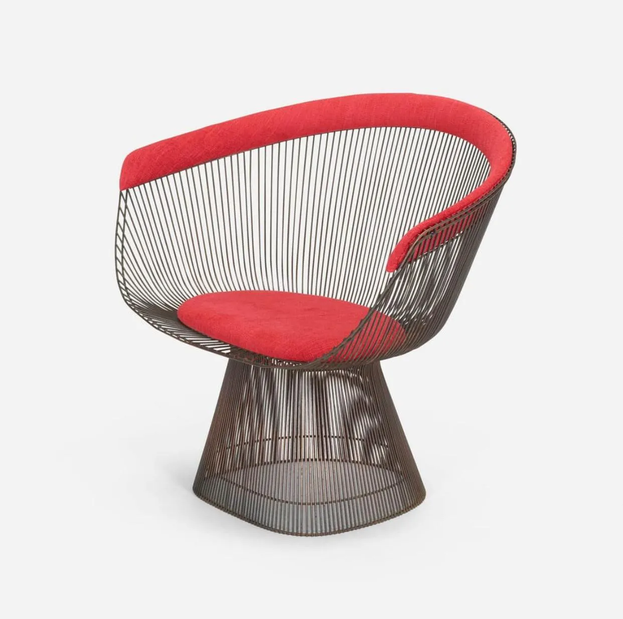
Bronzed Steel Lounge Chair
If you want celebrity style it does come at a price. I’ve found the exact chairs from Robin Tunney’s dining room – an original 1966 design by Warren Platner for Knoll with a bronze-plated frame and red wool upholstery.
Modern twist
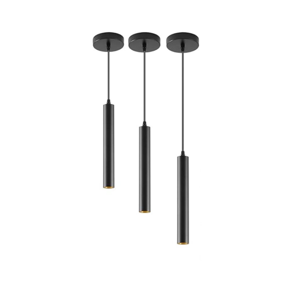
Robin Tunney’s contemporary pendant lights bring an unexpected modernity to her mid-century space. These dimmable ones have a similar look and will be perfect for setting the right ambiance for the occasion.
Unexpected texture
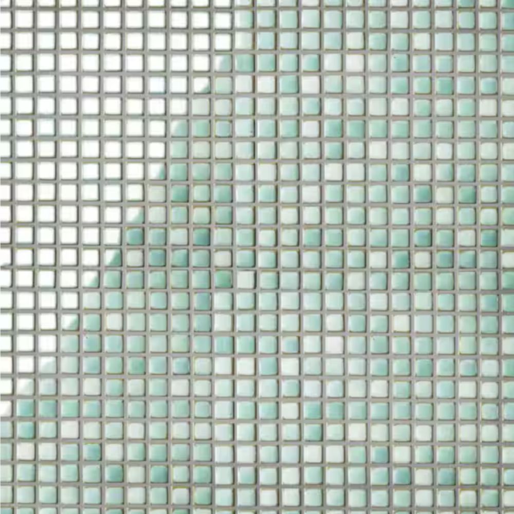
The unique mosaic sideboard in Robin Tunney’s dining room adds an interesting textural element to the space, while the soft mint pairs beautifully with the golden-hued wood. These tiles will create a similar effect.
Retro look
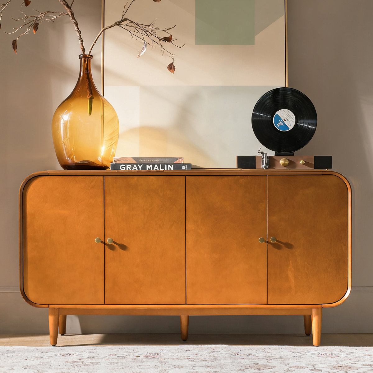
Mid-Century Modern Sideboard
A retro sideboard is ideal for a mid-century dining room and the perfect hosting closet for storing all of your entertaining essentials. The curved lines and golden wood finish mirror the shapes and hues of Robin Tunney’s space.
Striking look
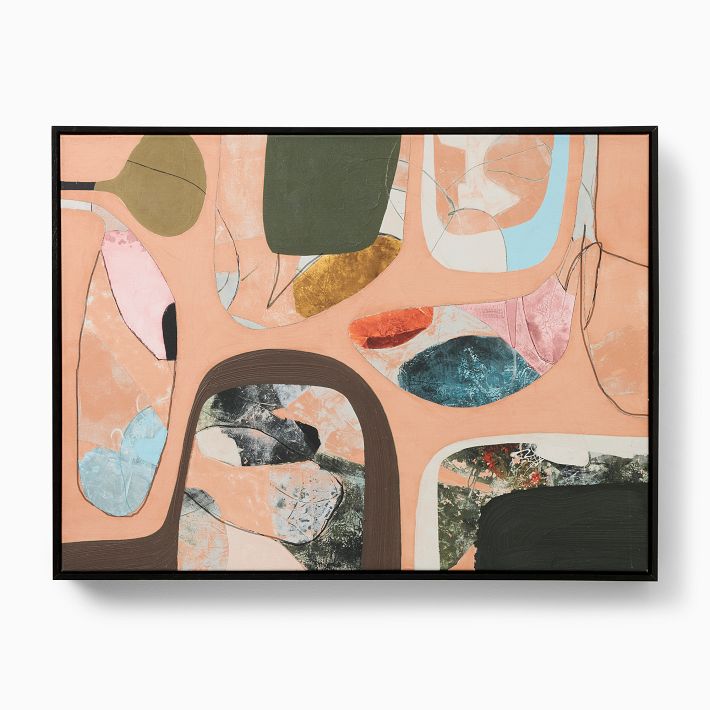
The large graphic tapestry on Robin Tunney’s wall is a unique piece by artist Alexander Calder, but even if you can’t stretch to original artwork, you can bring the same abstract look with some off-the-shelf wall art.
Artisanal look
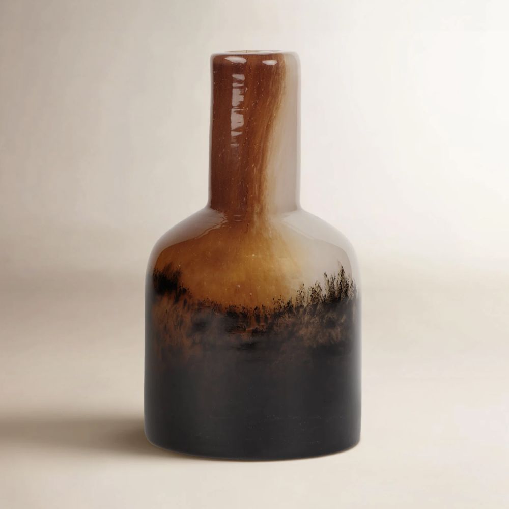
This glass vase picks out those muted mid-century shades with swirls of orange, brown, and white. Team it with ceramics in a similar palette to create a tonal gallery-style collection like Robin Tunney, to display on a sideboard.
Mid-century design is more likely to lead to a wood-drenched space created with a mix of natural materials, than a color palette combining bright reds, mint greens and oranges, like Robin and Nicky’s dining room. Genevieve Rosen-Biller, Founder of Bed Threads, explains: ‘In mid-century modern interiors, colour is generally used quite sparingly. Since this design movement is based on neutral, simple, and material-led elements (such as wood, leather, or steel), pops of colour are introduced selectively, mainly through upholstery or accents.’
Katie Malik, Founder and Creative Director of Katie Malik Design Studio, continues: ‘[This] was a defining era for interiors because it embraced simplicity, functionality, and natural materials. Many homes featured furniture with clean lines and minimal detailing, often crafted from warm woods such as teak, walnut, and oak, materials that brought warmth while complementing the streamlined shapes associated with mid-century design.’
In Robin Tunney and Nicky Marmet’s dining room, they add an element of surprise with the unexpected red theory, which re-directs the focus and draws the eye straight to those sculptural red chairs.
Genevieve speaks to the effect of adding color: ‘In the mid to late 1950s, [mid-century design]began to move in a different direction colour-wise. Interiors notably took on a more playful, optimistic tone with colours like turquoise, cherry red, and sunshine yellow, stemming from the era’s preoccupation with technology and futurism.’ It feels like that’s the exact tone that Robin and Nicky have tapped into here.
The mint green mosaic tile on the sideboard is another interesting color play from the couple, which reads soft and muted while complementing those orange-tinged wood-drenched walls and cabinetry. It’s a clever use of the 60-30-10 rule for creating a balanced color palette – the wood provides a natural base that is 60% of the space; the mint green, which is also picked out in the artwork, makes up around 30%, whilst the bright red takes over just 10% of the space, so as not to overwhelm.
Genevieve summarises: ‘Color acts as a counterweight, breaking up uniformity so the space doesn’t feel flat or clinical. Whichever palette you choose – expressive or restrained – should feel integrated, not overly dominant.’
For another example of how color has been seamlessly integrated into mid-century modern design, see my piece on Chef Daniel Humm’s soulful living space.
If you enjoy our celebrity news and interior design advice, why not sign up for our newsletter so you never miss the latest features?