
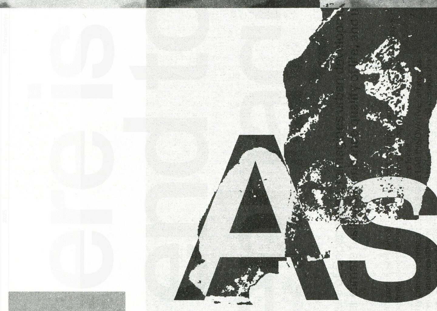
“Collage was central to this identity – as both a medium and a symbol,” says studio co-founder Kristoffer Li. The idea of taking existing fragments of spaces and structures to build something new was a methodology of Cobe’s that was neatly adopted through this technique, but the studio also enjoyed how collage left room for a more playful tone of voice. Print and web assets are layered up like blue prints or delicate architectural plans on layout paper, letting drawings, textures and images of the office’s work float over each other.
Whilst these compositions make your eyes dart all over the page, they still remain systematic. For their inspiration, Alexis Mark was drawn to the graphic language of “large transit terminals”, Kristoffer tells us. Think departure boards, timetables and clipboards at bus stops and train stations. “There’s something compelling about how those systems communicate – practical, urgent, precise, yet strangely rhythmically poetic when you sit with them,” he says.
The animated elements that set the pace of the identity were inspired by breaking news tickers and are very much in the spirit of all of the studio’s urgent, utilitarian signage. Alexis Mark’s references have seeped into a visual system that aims to feel “alive and present”, Kristoffer shares. “Finding references like these that are adjacent to the client’s world – rather than within it – is something we think about a lot. It’s often how you avoid landing in a space that already feels occupied,” he says.