
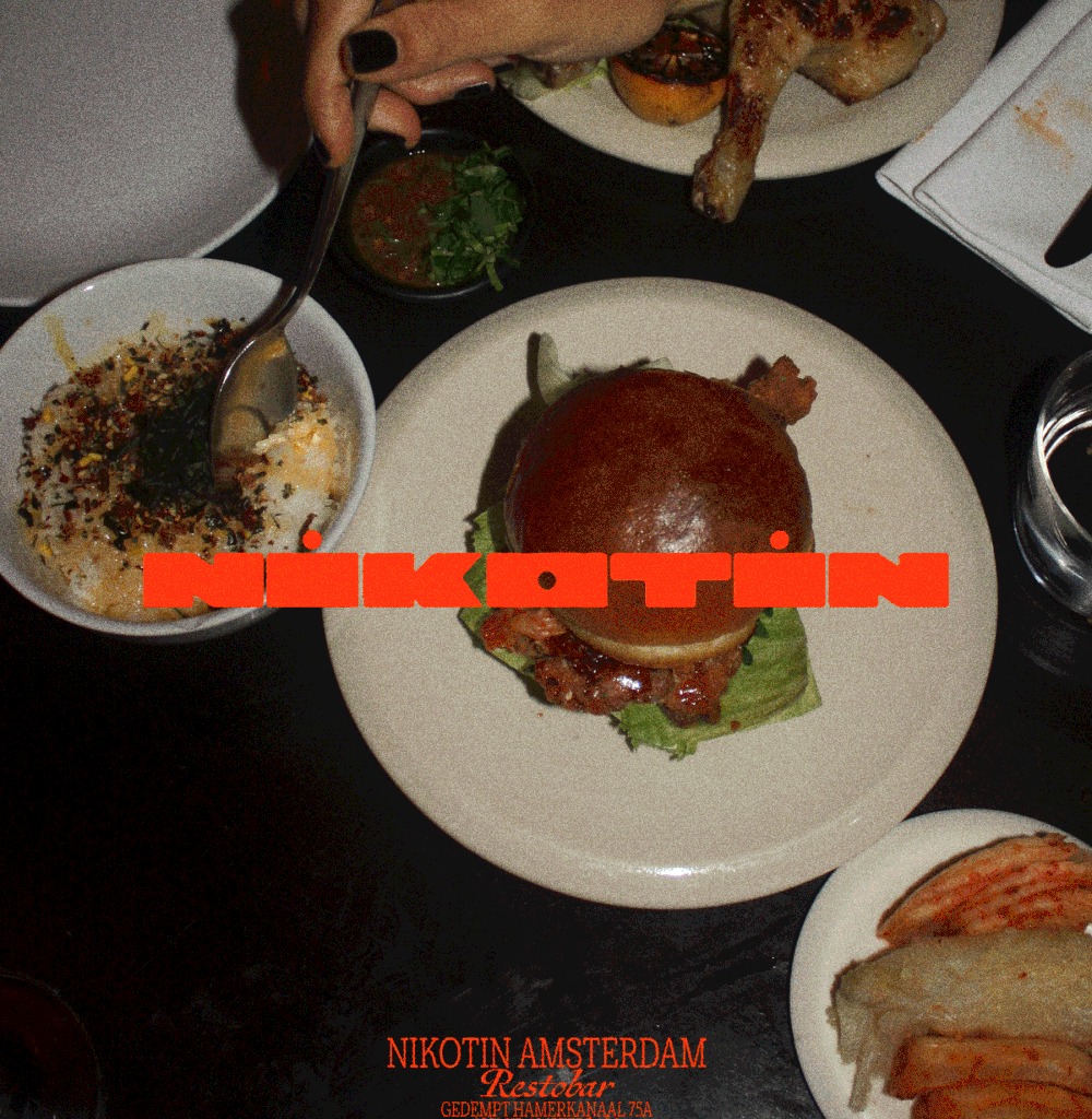
Stripping things right back to a simple horizontal form, Davy landed on an extended custom logo type that took the subtle shape of a cigarette. With its letterforms deliberately wide and rounded, the bold brand mark is also a nod to the kind of space age visuals that the restaurant owners were keen to have in the interiors and beyond from the beginning. “The cigarette influence isn’t the most conventional route for a restaurant to go down,” Davy says, “but I’m really glad we did. When a location has that type of story, it’d be weird not to work around it.”
What surrounds this custom logo mark is a visual world that Davy built for Nikotin out of a far less controlled form of typography: handwriting. Created with a napkin sketch feel, this hand drawn type that covers menus and cards was something Davy drew countless interactions of using India Ink. It’s a looser approach that brings a rougher, unpolished feel to the identity, to reflect the restaurant’s grill based cooking. The analogue look and feel was also something that Davy didn’t want to miss out on: “Dining out is probably one of the least digital things we do now. And I think the visuals surrounding it should reflect that,” the designer ends. “Working with a technique like this means I give away the control, I am by no means a lettering or calligraphy artist, I just had fun and let go and that adds an element of surprise, and a certain uniqueness.”