
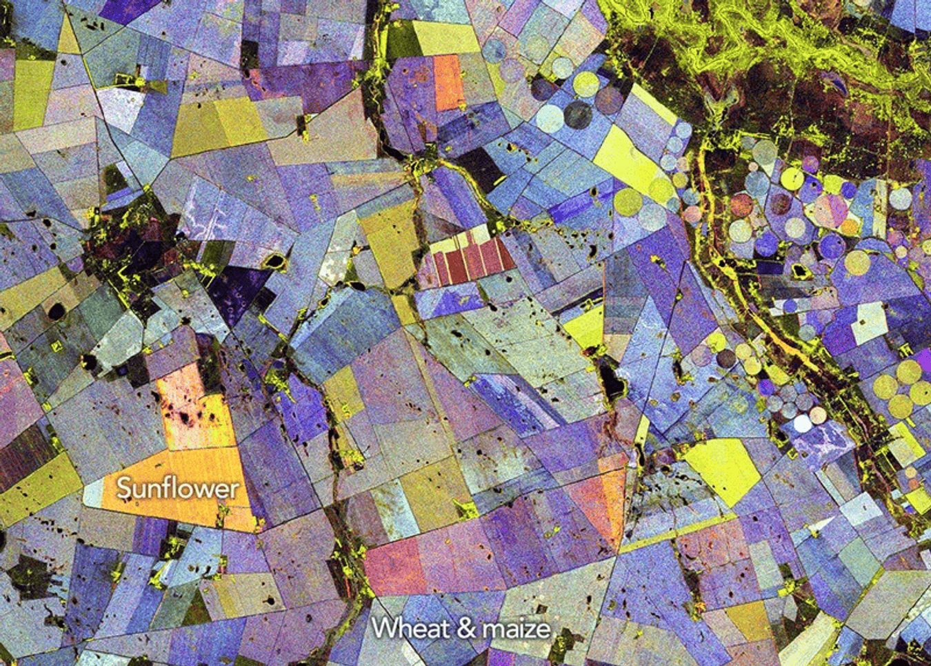
 A false-color composite derived from NISAR data highlights vegetated areas (green), unvegetated surfaces (red), and how rapidly vegetated areas changed (blue) during the 2025-2026 growing season in an agricultural region of South Africa. Image credits: NASA.
NASA just released an image that straight up looks like it belongs in a modern art gallery. Bright reds, greens, blues, and oranges spread across neat circles and rectangles, forming a patchwork that almost feels painted.
But this isn’t abstract art. It’s South Africa’s Maize Triangle, one of the country’s major agricultural regions, seen by radar from space.
The image comes from NISAR, the NASA-ISRO Synthetic Aperture Radar satellite. It shows crop growth and change across a full Southern Hemisphere growing season, from November 2025 to March 2026. NASA published the image as an Earth Observatory Image of the Day on May 29, 2026.
And those strange colors? They come from polarized radar signals. They’re also very useful for farmers.
An Unusual Crop Painting
To understand the image, it helps to start with light.
Light is an electromagnetic wave. As it travels, its electric field can vibrate in different orientations. That orientation is called polarization. You may have run into this before with polarized sunglasses. These lenses reduce glare by blocking light waves that are mostly aligned in one direction. Radar satellites use a related idea, but with microwaves instead of visible light.
These are the same category of waves used in microwave ovens, but the purpose is completely different. In an oven, microwaves make polar molecules such as water jiggle rapidly, and that motion becomes heat. A radar satellite uses microwaves more like a flashlight mixed with an echo sensor. It sends pulses toward Earth and measures the faint signal that bounces back. No one is heating anything up. The satellite is simply watching how the radar signal changes after it hits soil, crops, water, or buildings.
A radar instrument can send out a pulse with its electric field oriented horizontally or vertically. It can then measure whether the returning signal kept that same orientation or came back changed.
×
Thank you! One more thing…
Please check your inbox and confirm your subscription.

That matters because different surfaces twist and scatter radar waves in different ways. A smooth bare field may return much of the signal with its polarization mostly unchanged. A crop canopy usually creates a more complicated signal. Stalks, leaves, seed heads, and soil all scatter the microwaves, often changing the polarization of the returning wave.
In other words, radar doesn’t just see the color of crops. It sees their structure.
Why This Is So Useful
NASA’s image was built from 10 NISAR radar passes over an agricultural area in South Africa’s Free State province, about 110 kilometers north of Bloemfontein. The region lies along the Vet River, where irrigation helps support a mix of circular and rectangular fields (which you can see in the image).
The final image is a false-color composite. Green marks vegetated areas. Red shows unvegetated or sparsely covered surfaces. Blue shows how quickly vegetated areas changed during the season. Most pixels contain a mix of these colors, which is why the final image looks so rich and strange.

A field that grows rapidly and is harvested early, for instance, may appear orange because it combines vegetation and bare-ground signals. NASA notes that sunflowers can show this pattern in the region, although scientists would need ground checks to confirm what is growing in any specific field.

By measuring those changes again and again, NISAR can distinguish a field that stays bare from one that fills with plants, thickens into a canopy, and then is harvested.
“It’s a pretty picture, but there are also important things that it communicates to us,” said Paul Siqueira, a scientist at the University of Massachusetts Amherst, and ecosystems lead of the NISAR science team. “With NISAR, crops like maize and sunflower appear differently than forests because of their size differences and period of growth.”
This kind of image is useful because it gives people a way to watch crops as they grow, not just after they are harvested. A field that greens up late, grows unevenly, or dries down too soon may be showing signs of drought, poor irrigation, pest damage, flooding, or delayed planting. Farmers have local ways of seeing those things, but seen from space, they can reveal patterns across an entire region.
Farmers, governments and scientists all need to know how crops are doing before harvest. Food prices, water planning and drought response can depend on those estimates. Optical satellites have long helped, but clouds, smoke and darkness can get in the way. Radar keeps working.
So, this is not just a pretty picture. It is a crop-monitoring tool, a seasonal record, and a reminder that Earth can look very different when we stop looking only with visible light.