
Leanne Moore uncovers the style secrets behind some of our top restaurants and hotels and reveals how to replicate the looks at your place
It’s not surprising that the directional decor of restaurants and hotels filters down to our homes – the ideas come from the best in the business.
These aesthetic experts make the world a better place through art, design and architecture. They know how to create spaces with the “wow” factor.
Being immersed in rooms designed by these super creatives makes you feel something. Sometimes the spaces feel so good you want to copy them. Here are six design projects from the hospo scene that might inspire your next reno.
Hotel Indigo lobby, Auckland
Australian decorator Simone Haag was part of the team behind Hotel Indigo.
A collaborative project, the architecture and interiors of Hotel Indigo’s lobby are by Melbourne-based Ewert Leaf. James Ingram, of Ingram Advisory, was responsible for developing the concept, design, look and feel for the hotel’s Bistro Saine and the upcoming cocktail bar.
Australian decorator Simone Haag added her distinctive signature to the lobby and bistro.
Simone, what was your role?
Primarily a curator, although styling is always part of the process.
The goal was to create something warm, welcoming and deeply residential in feeling, a place where you genuinely want to spend time. We wanted guests to feel immediately immersed in Auckland’s creative culture.
Instead of a formal hotel environment, we approached the lobby almost like a beautifully collected living room or gallery, where art, objects and furnishings encourage curiosity and discovery.
There is a richness and sophistication to the space, but it’s also relaxed. Guests can arrive after a long journey and immediately feel at ease.
One of the pieces of art in Hotel Indigo’s lobby is Endless Loops #12 by Auckland artist Kathy Barber.
The timber flooring became a very important reference point for the curation. It has such warmth, richness and character. It immediately established the mood of the space.
Because the floor carried so much visual texture and depth, I was drawn to artworks and objects that shared a similar sense of materiality. Ceramics, timber sculpture, woven works and handcrafted pieces all felt very natural within that environment.
What interested me most was creating a collection that felt authentically connected to Auckland and Aotearoa. We worked with local artists and makers whose practices are deeply informed by the landscape, culture and creative identity of New Zealand.
Art was one of the most important elements of the project.
Design tip: When it comes to finding art for your home, trust your intuition.
Naumi Hotel, Wellington
Naumi Hotel, Wellington, came with a “no white” brief for designers. Photo / Samuel Hartnett
Designers: Toni Branso and Liv Patience of Auckland-based studio Material Creative
Toni, what was the overall vibe you were going for?
The Naumi brand has a wild, colourful edge with refinement underneath, and that was the lens for everything.
Eccentric luxe, rich, textural and completely sensory. Cuba St is bohemian at its core, so the hotel needed heart and soul to match its surroundings. We wanted guests to feel like they’d stepped into something unexpected, a refined cacophony of colour that still feels restful and retreat-like.
We played with visual tempo; using harmony and contrast against each other across every surface. Colour-blocking is anchored by a black ceiling trim, teamed with striped carpet, velvet drapes and brass droplet pendants. Each element holds its own but contributes to the whole.
“No white” was our brief. That single constraint pushed us to use colour in entirely new ways. Colour became the architecture of the space.
Colour-blocking was key in Naumi Hotel. Photo / Samuel Hartnett
In the first image, the Broste mirror is from May Time, while the vase and marble sphere are Citta.
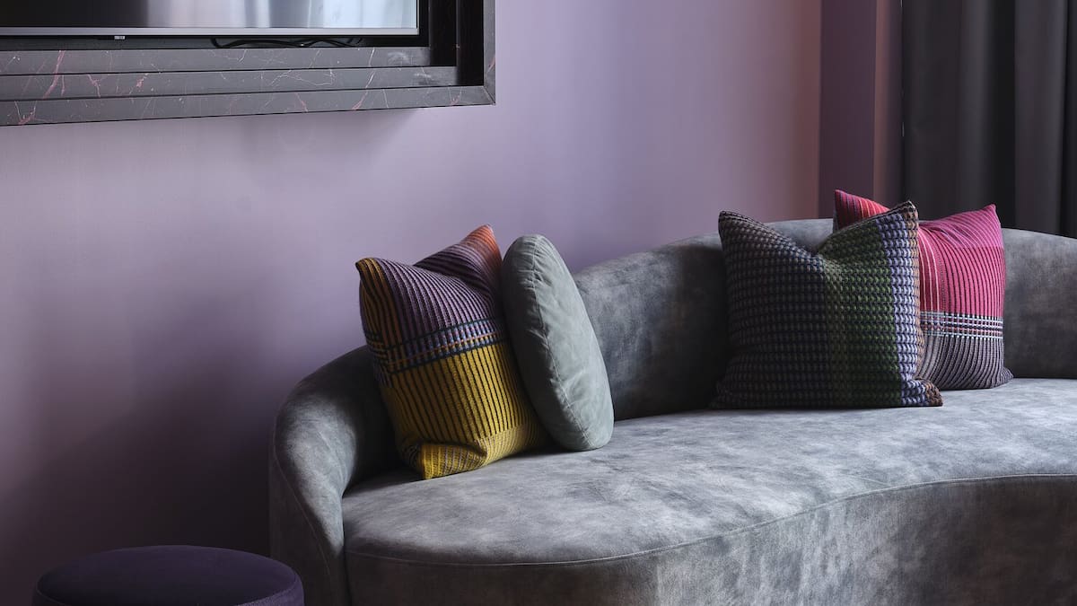
The sofa is custom-made in Lovely fabric in Madder from Warwick and the table is from UFL.
In the space above, the Kina artwork is by Andi Regan.
The custom-made sofa covered in Lovely fabric in Seaglass is from Warwick and the selection of Wallace & Sewell Emmeline cushions come from Bob & Friends.
The carpet is custom designed by Material Creative, made by Dilana.
Design tip: Push yourself to be bold with colour.
Kisa, Wellington
At Kisa, objects were selected to feel worn-in rather than precious. Photo / Jono Parker
Interior designer: Buster Caldwell of the Wonder Group
Kisa is all about Middle Eastern food served with the casual generosity of a New Zealand barbecue. That was the starting point for everything. Cuba St is also one of the most visually hectic streets in the country: colour, character, noise and chaos. We wanted Kisa to be a pocket of respite from that.
We usually begin by asking how a place should make somebody feel. At Kisa the answer was comfort, generosity and escape. Once you have that clear, every decision has a job.
The seating turns inward, to shield from the outside. The lighting creates pools of warmth, allowing the space to remain on the moodier side. The walls carry age, ensuring nothing feels too new or prescribed. The objects are all second-life and sourced, selected to feel worn-in rather than precious.
Clay walls, tobacco-stained timber and mustard corduroy pull people inward at Kisa. Photo / Jono Parker
It’s hard to build a space that doesn’t look new on opening day. We worked hard to create that sense that people had been gathering at Kisa for years.
Colour was a big part of building that world. The palette sits in tobacco, mustard, clay, sand and warm plaster tones: of the earth, deliciously rich and texturally deep.
Around the booths especially, those colours create a small sense of enclosure… almost like little cocoons. The gutsy clay walls, tobacco-stained timber and mustard corduroy pull people inward, closer to the table and each other, while the glass frontage keeps the life of Cuba St moving around you.
The Turkish travertine floor is cut into a hexagonal format and sourced directly from an overseas stone yard. The tiles arrived already a little worn-in and chipped, which felt right. I love materials that get better with use.
The dining chairs are restored 1960s French pieces from The Vitrine, while we custom-designed the tables, banquettes and booths and had them made by Harrows.
We worked with Targetti to develop custom spun aluminium shades.
The artwork is by Emma Kohlmann and was commissioned specifically for the project. The interior is quite controlled materially, so the art gives it some attitude.
Design tip: Colour doesn’t need to be loud. Often the best use of colour is the quiet accumulation of everything in the room working together.
Alla Prossima restaurant in Abstract Hotel, Auckland
Alla Prossima was inspired by New York boutique hotels and modern European interiors.
A collaboration between Nigel McKenna of Templeton Group (property developer), Paul Brown & Associates (architects), and Hayley Brown of The Art Dept (interiors), with some initial input from NOTT Architects.
Hayley, what’s the overall vibe you were going for?
A moody, intimate dining room inspired by New York boutique hotels and modern European interiors. Designed as an underground retreat, the space gives the feeling of a private club, wrapped in rich timber, layered textures and atmospheric lighting. Bespoke furnishings, curated art, craftsmanship and carefully considered materials create an environment that feels both cosmopolitan and deeply personal.
The key is a limited colour palette. We used a rich ochre as an accent colour to lift the room and provide contrast against the dark timber interior. This is balanced with touches of teal blue.
Art was viewed as an essential design element, rather than a finishing touch.
We deliberately kept the ceiling dark to create an intimate atmosphere and to visually lower the ceiling height. This creates a more enveloping dining experience.
Alla Prossima employs a limited colour palette.
What came first, the art or the fabric for the built-in seating?
The art and fabric were considered together. While the tartan-inspired upholstery is more geometric in nature, the artwork lines are softer, less rigid, but echo many of the same colours. This allows two very different patterns to sit comfortably alongside one another, creating harmony through colour. I’m also an artist, so I decided to create the abstract artworks myself.
The engineered oak plank flooring and wood panelling are from Forte. The Lido chair is from Thonet, with seat and backrest upholstered in Lovely velvet in Ochre from Warwick, while the tables are custom-made.
The banquette backrest is upholstered in Dunbar fabric and the banquette seating is in Maestro fabric in Midnight, both from Textilia.
The vintage pendant lights are from The Vitrine.
Design tip: For space-saving banquette seating at your place, try bobsupholsterers.co.nz
The Butcher Baker, Helensville
The Butcher Baker has a farm-to-table concept.
The creative force behind the reimagining of The Butcher Baker’s heritage building is Obel Studio, the interior design practice of Aisha De Beer Smith, partner of chef Reginaldo Richard.
We cook over fire, which is a core aspect of the dining experience. This not only brings depth to our food but connects diners to something fundamental and traditional. It’s also entertaining and brings an amazing atmosphere to the space. It was only natural for the interior design to reflect the same honesty as the food and wine we serve.
We pared the space back to celebrate the building’s inherent character.
Our farm-to-table concept: high-quality produce with a connection to traditional ways of preparing and preserving food. This, along with accumulated ideas gathered from our travels, inspired the design.
The walls provide a warm textural background, which allows other aspects of the design to breathe.
The walls provide a warm textural background, which allows other aspects of the design to breathe. We feel this offers acounterpoint to the drama of an open kitchen and the intensity of the fire.
We applied Resene Spanish White to the brick walls, bringing refinement and sophistication to the space.
The original concrete floor was in poor, uneven condition so we gave it an industrial look that integrates well with other finishes and it’s durable.
The chairs are antique Belgian school chairs sourced from a vintage dealer. The tables are also second-hand.
The upholstery of the built-in seating is by Traditional Upholstery in Waimauku. The fabric for the squab and backrest is Duke in Cavern from Textilia. The cushion upholstery is Mainline Flax in Stockwell, also from Textilia.
I designed the wall lights in collaboration with Hayley Bridgeford Ceramics.
Design tip: With old buildings, work with what you’ve got, rather than against it.
Onslow, Auckland
Onslow was designed around natural materials: warm timber cabinetry, wool and linen textiles. Photo / Simon Wilson
The interior of Onslow restaurant was a collaboration between Knight Associates, restaurateurs Josh and Helen Emett and interior designer Sonja Hawkins of Sonja Hawkins Design.
Sonja, what was the overall vibe you were going for?
We wanted a relatively sophisticated space but not too buttoned up or formal. The goal was for it to feel international, but relaxed and welcoming with a New Zealand flavour.
The shell was done by the developer, so we inherited the wall and floor travertine. This gave it a hotel vibe that I wanted to avoid, so I added layers, such as cook books and antique pieces on the shelves, to soften the space.
Materials were important. We chose all-natural materials: warm timber cabinetry, wool and linen textiles. The banquette seating adds a comfort level, which was enhanced with loose back cushions and scatter cushions. Checked and striped cushions are not what you’d expect in a sophisticated dining room, but bring an elegant informality.
Cushions bring an elegant informality to Onslow.
The photographic artwork featured is by Mark Adams. His work has a wonderful connection to Onslow. It tells the story of Hinemihi, a whare that survived the eruption of Mt Tarawera in 1886. The location of Onslow restaurant (9 Princes St, Auckland) was once The Grand Hotel, opened by the Earl of Onslow in 1889. He later purchased Hinemihi, and had it shipped back to his family estate in England in 1892. Mark created this series after visiting the estate, Clandon House in Surrey. There are plans to return the whare to New Zealand.
The cushion fabric is from Designers’ Collection. Our chairs from Matisse and the lamps are from Cult Design. The ceiling, wall and bar lighting are all from ECC.
Design tip: Art makes life better.
More homes and spaces
Explore stories of creative homes, sustainable living, bold design and personal transformations from today’s most forward-thinking talents.