
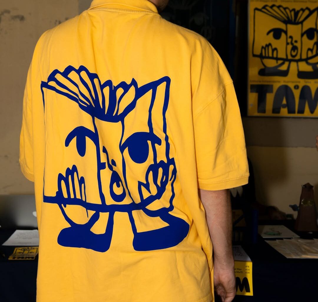
The illustrated characters that shaped the visual imprint of the festival’s first edition also pay homage to this period of history: Livia immersed herself in research into ancient Etruscan symbols: vases, terracotta soldiers, bronze horses in order to shape the fairs illustrated language. “The style was meant to be simple; the lines of the illustrations were drawn with a brush and marker – a single, slightly crooked line that makes each character special,” she shares.
Out of all the iterations of these friendly faces the pair decided to develop one character further to become the festival’s official mascot: the book, which they named zix – “in Etruscan, zix means to write, book, or document,” shares Livia, “zix is therefore the festival’s star, and has become the thread that ties all the activities together.” This cheerful logo covered banners, T-shirts and tote bags with the wonderful inky overspill of screen print across the festival’s applications by Colla (the festival’s lead printer), as well as Risograph printed guides by Todo Modo Dilà, digital printing by Fustelgrafica and letterpress printing by Torchio Letterpress.
To draw the city into this wonderful world of independent print, “our intention was to find a new visual identity that could, in some way, distance Florence from the visual imagery of the Renaissance, which, as wonderful as it is, we felt was too overused and reductive,” shares Livia. Delving further back into Tuscany’s past and arriving at the Etruscans – “a civilisation that unites history, writing, culture, territory, and design” the illustrator says, was the thing that set the festival’s visual attachment to place apart. It also gave the festival its name: “In Etruscan, to create, design or build translates to Tham, and this is the origin of the festival’s name, Tam, as well as the root of its entire visual identity,” Livia ends.