
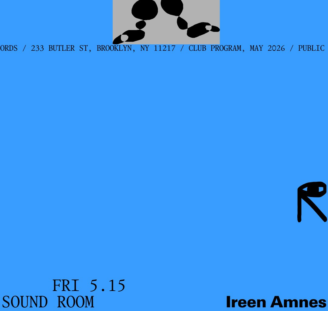
The identity borrows from WiseType, Jacob Wise’s foundry, using it’s Garamono typeface, which captures a kind of timelessness in its serif letterforms, accentuating a mystery in the way its strokes hold weight and details that don’t immediately place it in any one era. “Ritual was a big part of the thinking behind this project overall, and typographically we were looking for that same quality: forms that feel deliberate, almost ceremonial, rather than purely functional,” says Nico. “It was the first typeface the studio thought of. It handled that strangeness, that sense of time, better than anything else.”
The identity features minimal, but highly expressive illustrative elements that look like block prints – although the studio works mostly in digital formats, that doesn’t hinder its penchant for physicality and design roots in poster making and screen printing. “We made a huge number of illustrations and assets, almost like a game with no fixed objective. Once we had a surplus of them, we built out a set that lets the Public Records team play with these illustrations, almost like objects, within the identity system,” says Nico. Nico says the studio “thinks of pixels and colour as materials too”, which adds a richness to the identity’s textures.
Deconstructed figurative illustrations depict the in-between of movement and dance, suggesting they’re both one in the same. This is part of the human mark, an ability to leave ambiguity in design – it’s a major goal for Los Caballos, who had no concrete inspirations in the traditional sense for this project, but more so spiritual inspirations, rooted in Latin America, emotion and most of all: the ways we move and feel in these dark, smoky music venues.