
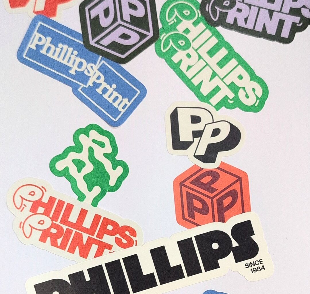
Warm and tactile, the resulting identity is made up of a flexible system with lots of different expressions. A bold but approachable custom-drawn wordmark is accompanied by nine different logos. “That flexibility really speaks to the idea of community – literally a community of logos – and brings a level of play into the identity,” says Laura. It also gives the client freedom to experiment with the identity themselves, whether it’s for company merch, or printed on football kits for their local football team – the Letchworth Garden City Eagles – which Liam played for as a kid. This versatility is completely in line with the company’s spirit of being hands-on in every project and personalised to each client’s needs.
The core deliverable was a new website, so it was important for the branding to translate easily into the digital space while holding onto its essence as a print-based company. “The benefit of having a printer as a client, though, was that Liam was super hands-on,” says Clink. “He was constantly printing flyers, stickers, merch and vinyls and sending me things as he tested them. It meant we could see how the identity behaved in the real world as we developed it, so the process became really collaborative.”