
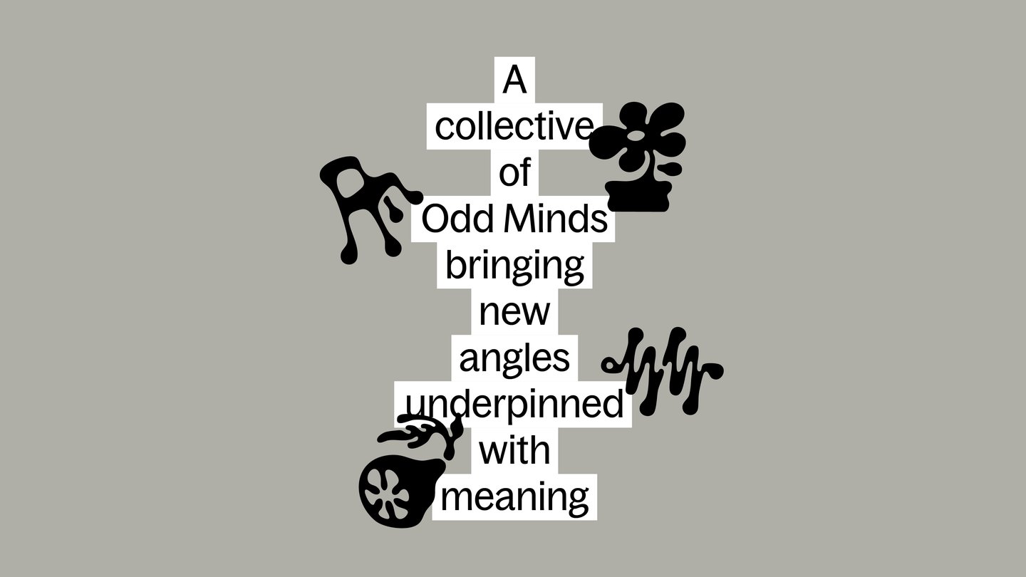
This ethos shines in the studio’s new positioning – Odd Minds. ‘Odd’ represents the agency’s dedication to non-conformity and originality, while ‘Minds’ represents the plurality of the business, and the creative heads that come together to make it what it is. It’s also visualised in a suite of personalised icons. “We asked each person to reflect on the different sides of their personality, their obsessions and fascinations, and distill that down into a singular thing,” says creative director Gary Roberts. “Ideally something metaphorical and surprising, the odder the better.” Once each of the 22-member team had decided on their icon, the illustrator Hugo Bernier realised them in his distinctly buoyant, ethereal style. There’s a duck, a mug of tea, a bowl of ramen, bouncing around the identity, as well as some more abstract icons. A wobbly line, maybe a sound wave? A handful of rocks, teetering in a tower. To summarise, the many facets of the rebrand are, in company partner Jade Annaw’s words: “our collective soul made visible.”
To coincide with the rebrand, Seventeen has also launched a new website that’s consciously pared back and user-centred. “We wanted to create moments of calm and silence, a deliberate contrast to the noise felt through information overload,” says Longbin. When you first reach the landing page you’re met by a centralised tower of colour blocks – or, as Longbin calls them “capsules”. Each capsule when hovered over reveals a project title, and then, when clicked takes you to the project’s case study. “All capsules are then connected by an infinite ‘thread’, a metaphor that carries storytelling weight; it’s a through-line that symbolises something that can be woven, extended, or unspooled over time, perfect for a living archive,” says Longbin. This considered website is the cherry on top of a rebrand that weathers a rapidly changing creativity industry by platforming what matters – the individuality of each person involved in the agency’s everyday.