
From the beginning, typography wasn’t an accessory to Penguin’s brand – it was the brand. The early paperbacks introduced a rigorously consistent format that felt startlingly modern in a landscape dominated by decorative, one-off jackets. But it was Jan Tschichold’s arrival in the 1940s that transformed that foundation into a philosophy.
His now-canonical composition rules and the tri-band system created a typographic rhythm that balanced clarity with personality, offering readers something quietly radical: the idea that good design should remove friction, not just add flourish.
As Charles Nix, creative director at Monotype and a designer who has worked on several Penguin titles, puts it, “Tschichold’s composition rules for Penguin stripped away impediments to understanding. They weren’t just aesthetic – they enabled communication.”
That belief – that typography is fundamentally about human connection – underpins every era of Penguin’s output, from the humanist geometry of Gill Sans to the crisp modernism of Helvetica, to the expressive post-modern shifts that arrived with cultural change in the late 20th Century.
Across letterpress, phototypesetting, offset printing, and now digital reading environments, Penguin has adapted without losing its core typographic values: clarity, consistency, and an unwavering respect for the reader. Even as screens replace paper and algorithms influence discovery, Penguin’s legacy reminds us that design can do more than package content – it can shape culture, set expectations, and make the act of reading itself more generous.
We spoke to Nix about his own personal relationship with Penguin and Tschichold, how the publisher has evolved its visual identity over the decades, and just what made – and makes – it such an iconic brand.
Tell me about your early interest in Penguin and its use of type.
Well, I’m a reader, and I grew up the son of a printer, so I was around type and printing from an early age. When I started studying typography intently at Cooper Union, I used to spend a lot of time in the library – I read as much as I could, including a biography of Jan Tschichold. That book introduced me to the arc of his career, from a young renegade with radical ideas about typography to the mature Tschichold who worked for Penguin and revitalised their system with clear typographic guidelines. Studying those guidelines gave me clues about what I needed to do to improve my typography.
It was the rationality of the rules at Penguin that gave me an abiding respect and love for the Penguin format. The regularity is really appealing: there’s a structure, but within that structure, almost infinite variation. That combination is very compelling to me.
A lot of people love Penguin as a brand without thinking very much about typography, I think.
In the interior designs, especially, there was a real love of the reader. Line lengths, type sizes, the use of n-dashes, spacing, vertical spacing, the distribution of white space, the declination of sizes from heads to subheads to text to footnotes – it was all done in the service of clear communication.
The best typography is deeply concerned with a text’s ability to permeate the mind of the reader. Typography sits there as a kind of gauze between two minds.
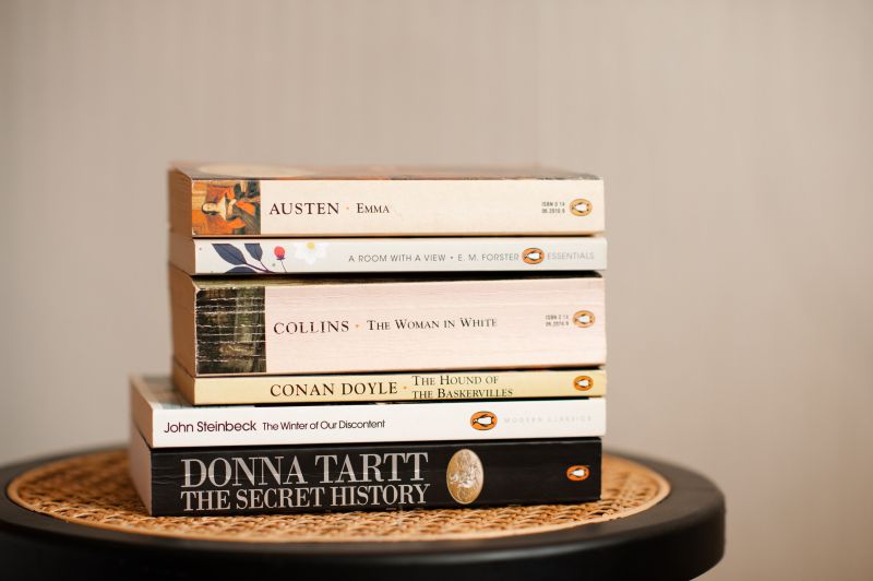
Early Penguin designs with the orange bands at top and bottom, the careful text in the middle, and the precise placement of the penguin were very much in the French publishing mode of a consistent format with real rigour.
But as Penguin evolved, it became a structure for experimentation. It maintained continuity and clarity, while allowing almost complete freedom of variation. In contrast, American publishing tends to treat every book as a brand, and every brand as unique. Those are vast generalisations, of course, but Penguin sits at the fulcrum between those approaches.
Talk to me about the tri-bound system. Why was it revolutionary?
It existed in an early form before Tschichold arrived at Penguin, but he gave it much more rigour and typographic nuance. He switched typefaces, clarified and prescribed the systems that would govern the variety of titles using it.
It was an important moment – a kind of stage setting. The tri-band system is almost like the opening of a play, where the narrator steps out and says, “Going forward, it will be like this”. This is what you’re about to encounter. And then the play unfolds over the next 20 or 30 years – a beautiful sweep that maintains the rhythm of the original but invites vast melody.
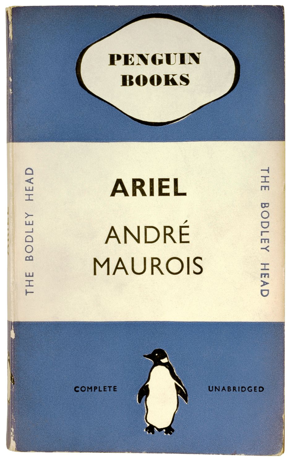
1935 format. Edward Young
Omnific
What have been the most notable shifts in how Penguin has used typography over its 90 years?
You first see the embrace of modernism in jacket design. There’s a movement away from traditional typography – hand lettering, serif typefaces – toward the absolute rule of Gill Sans under Tschichold. Gill Sans is a humanist sans-serif typeface, born of Edward Johnston’s work for the London Underground, with a very clear classical pedigree.
Then there’s the big jump to Helvetica in the late 50s and early 60s – the next major revolution. In between, there’s some use of early Akzidenz Grotesk, but once you reach the Helvetica years, Penguin really melds early modernist ideas of clarity, consistency, and minimalism with the mature international style.
Why do you think Penguin went down that modernist path? It seems very different from what other publishers at the time were doing.
It invites us to guess what people’s minds were like at that time, but post–World War II, the landscape changed dramatically. There was a rapid rise in global literacy: more books in the hands of more people. Literacy, learning, and the idea of what it meant to be a modern human being were all expanding.
The paperback itself was still a nascent thing. There was a real optimism in the mid-century about where we were going collectively as human beings – empowered by technology, championed and represented in design. That, I think, contributes to why the international style resonated.
And what happened after the modernist years? How did Penguin navigate the post-modernist era?
Post-modernism brings much more experimentation. There’s a return to classicism in the late ’80s and early ’90s, but then design breaks open – typographically and stylistically.
It ties to what was happening globally. The optimism of the 50s and early 60s gives way to the realism of global conflicts and new cultural freedoms. Global literacy produces a multiplicity of voices, each with its own flavour of truth.
Design begins to embrace the multiplicities of formats rather than a single format. Designers began grabbing more freely from the typographic treasure chest of history. You see far more typographic variety than in the previous decades.
Omnific
How has Penguin managed to evolve its visual identity while retaining its core values?
Penguin is centred on the transformative quality of literature – the ability of thought to make societal or cultural change. They’ve kept pace with changes in global and local culture while holding onto that core.
And finally, how has the transition from print to digital influenced typographic expression?
From a typographer’s standpoint, it becomes more about orchestration than about playing individual instruments. Many of the specific things we expected from print disappear when the reader can change the point size or even the typeface.
So the relationships you can control – the hierarchy of sizes, the fundamental distribution of space – become paramount. It’s more akin to responsive web design than traditional publishing, but the core idea remains: creating a design that maximises the ability of running text to permeate that space between two minds. Typography must get out of the way.