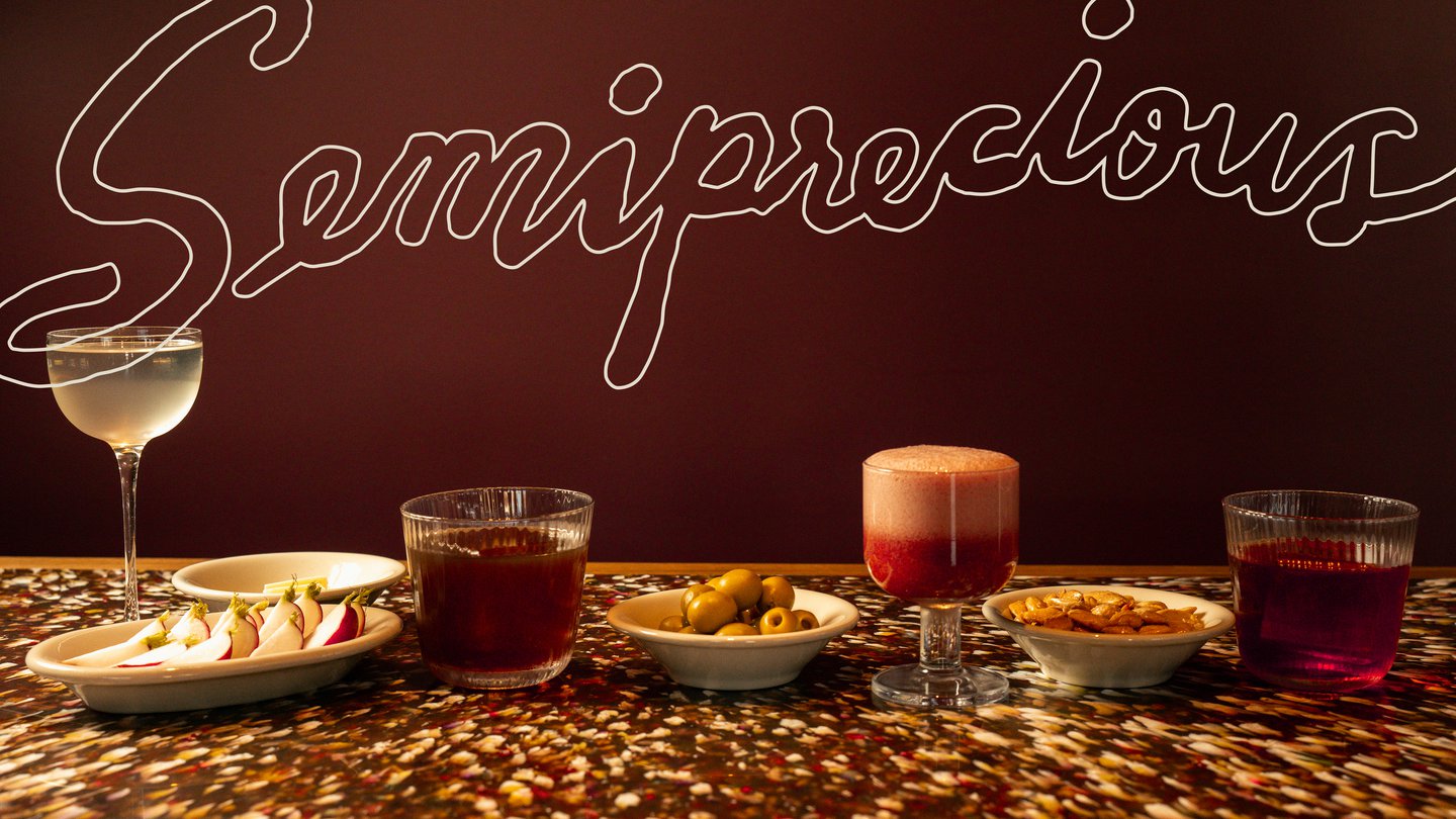
Semiprecious’s visual language is informed by the American western and European drinking culture. Its logo – the silhouette of the mythical pegasus – wouldn’t go amiss on the front of a baseball team’s jersey. Jon says he wanted the design to feel special, without being pretentious, “basically semi-precious”, he says.
The unique situation of co-ownership proved to be a playground for experimentation. Everyone in the Wunder Werkz studio got a shot at illustrating the pegasus mascot (fittingly called Peggy) and these many versions were then combined by the studio’s head illustrator, Maggie, to creating an ethereal amalgamation. “We felt she was a really perfect visual representation of something that was very precious, but also a little silly,” says Jon. This mythological look is accompanied by a bold yet cosy colour pairing of ox blood and cobalt.
The result is warm and inviting, joining a design system populated by a custom script “inspired by mid-century cocktail books like Stork Club and the writings of Corbusier”, says Jon. Le Corbusier’s wooden holiday home, Cabanon, was also a big influence, after Jon became increasingly interested in brutalism and the interaction between tactility and materiality. This combination of visual elements is refreshing in this era of minimalism within the food and drinks space, where menus are replaced by QR codes and interior projects all visually merge towards a bleak monochromatic future.
As drinking culture declines and loneliness is on the rise, Semiprecious’ mission of community is an important tenet of the business; first and foremost, Jon wanted to serve his neighbourhood and it’s community. This vision was then extended to the broader design community and hospitality industry, to create an enjoyable space that conjures new ideas over drinks shared. Jon ends: “For us, it always starts on the human level, with the people you want to go there, how you want them to feel in our spaces, and what you want them to take away.”

