
That’s probably why I suddenly started missing the old Windows Phone interface.
Years later, the Live Tiles design still feels surprisingly unique compared to modern home screens. It wasn’t perfect, but it made phones feel more dynamic and information-focused.
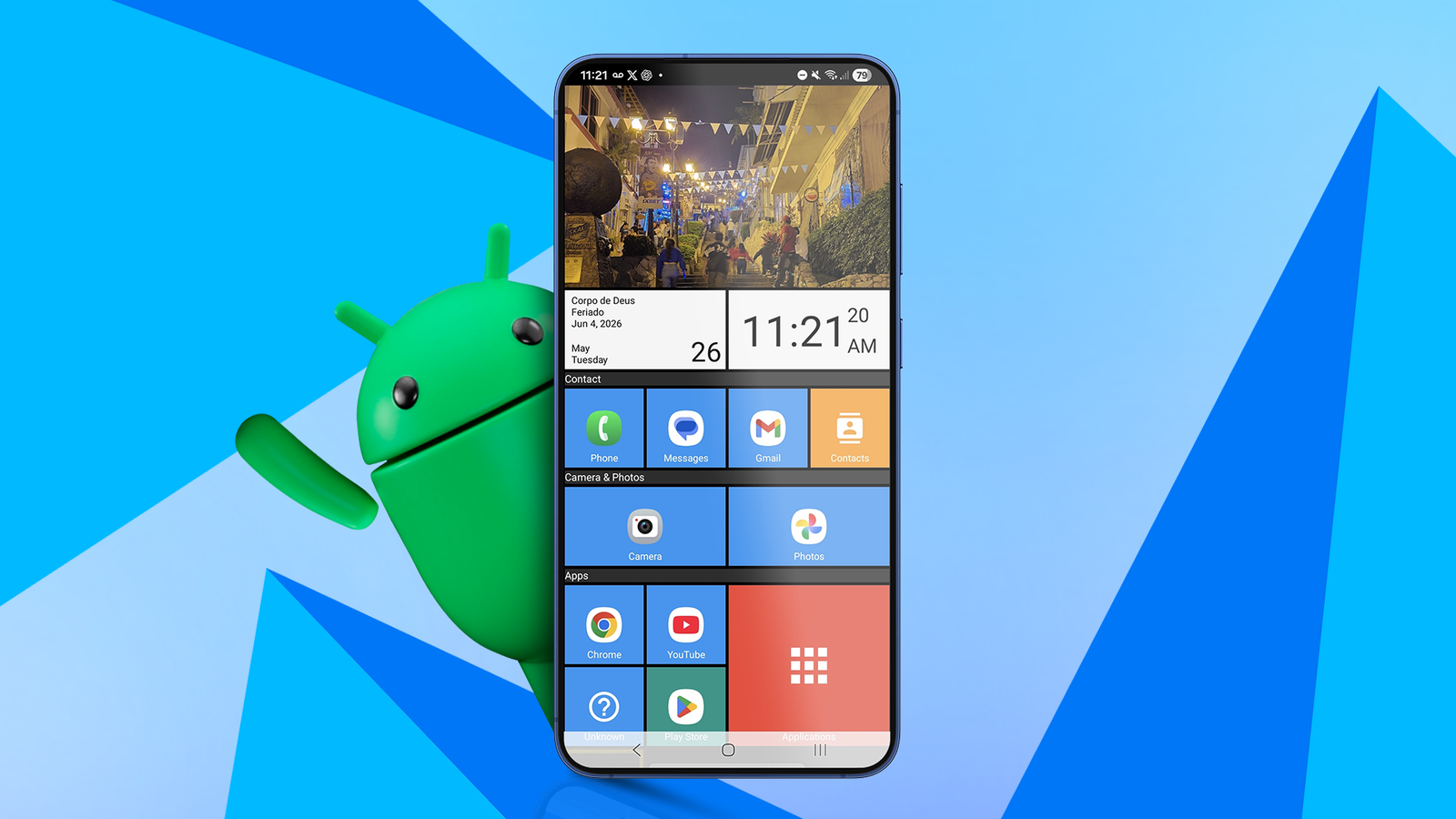
Out of curiosity, I decided to recreate that experience on my phone using Square Home, and I didn’t expect to enjoy it this much.
Related
How I decluttered my Android home screen — one app at a time
Less chaos, more clarity
Why Windows Phone felt different
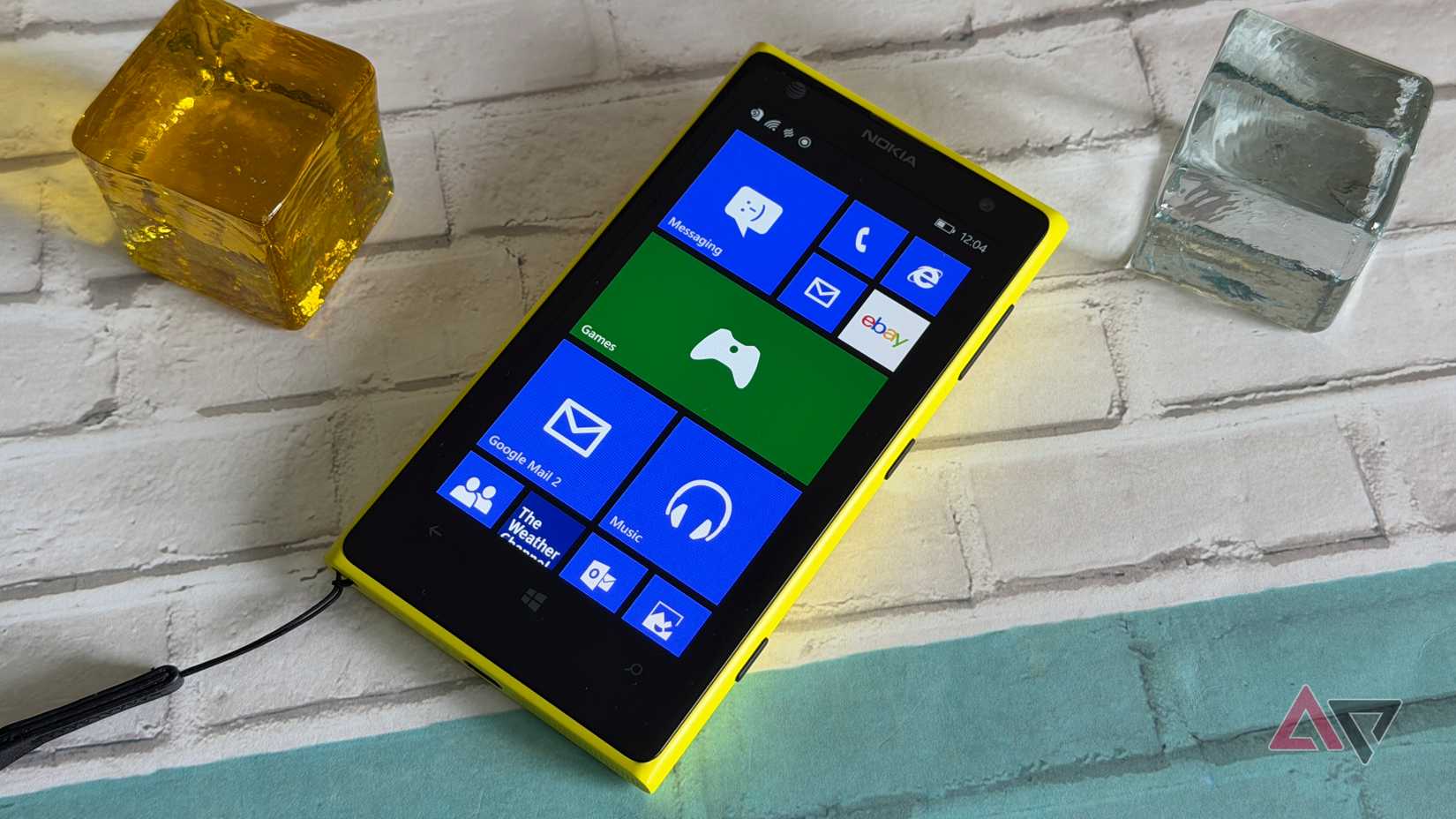
When Microsoft launched Windows Phone, it did not try to mimic iOS or early Android. Instead of icon grids, it gave us Live Tiles: large, rectangular blocks that were not just shortcuts.
It treated the home screen like a live dashboard, with the animated Live Tiles constantly surfacing information.
Messages, weather updates, calendar appointments, photos, emails, music playback, and news could all update in real time without opening individual apps.
The interface was designed based on what Microsoft referred to as its Metro design language. While iOS leaned skeuomorphic and Android felt chaotic with customizable icon packs and widgets everywhere, Windows Phone felt cleaner.
Rebuilding the experience on Android
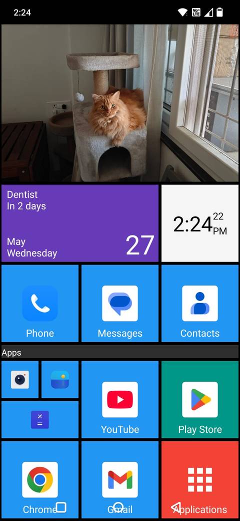
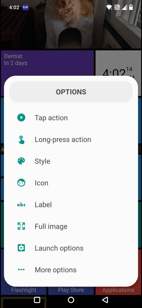
Using Square Home made it surprisingly easy to recreate the old Windows Phone look on Android.
The launcher replaces the traditional app grid with customizable Live Tile-style panels that can display apps, widgets, shortcuts, and information directly on the home screen.
I reorganized my layout around large weather tiles, calendar appointments, music controls, notes, and frequently used apps.
The larger tiles make information easier to glance at quickly, and the vertical scrolling layout feels cleaner than swiping through multiple home screen pages.
I also ended up using widgets more intentionally because they blend naturally into the tile-based design.
After a 14-day free trial, Square Home costs about $2 per year, which feels surprisingly reasonable considering how much customization the launcher offers.
The Live Tiles are customizable
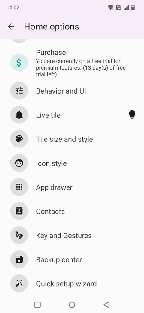
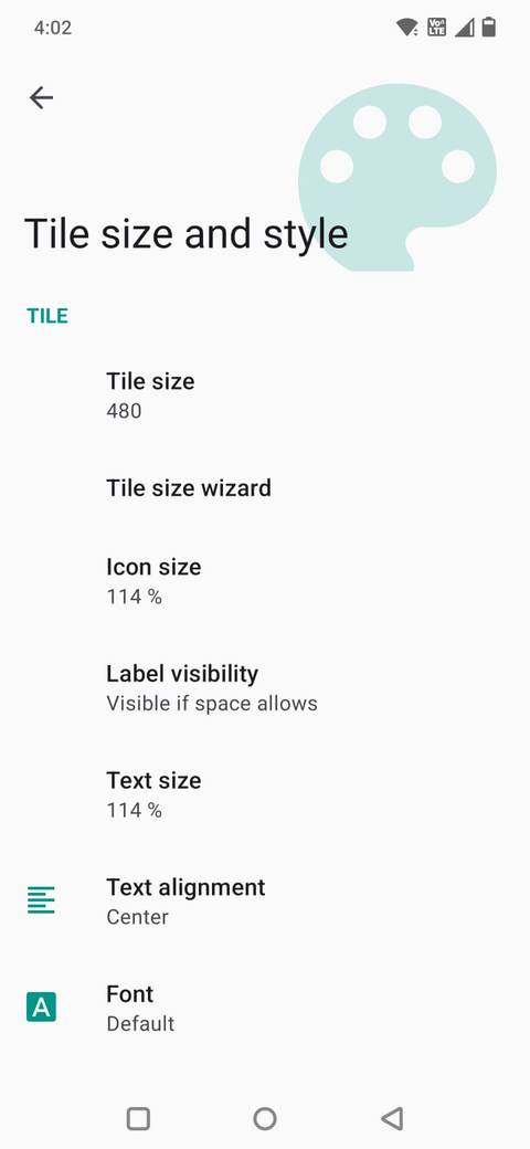
What surprised me most about Square Home is how deep the customization goes when you start exploring the settings.
You’re not limited to simply placing square app icons on the screen. You can tweak almost every part of the layout. You can resize, recolor, or animate the tiles. You also get the option to replace them with custom icons and images.
The launcher also lets you control spacing and layout. I could change tile sizes, adjust margins and spacing between tiles, increase the number of rows, and even customize scrolling behavior to make the interface feel closer to classic Windows Phone.
One feature I ended up using a lot is the ability to customize individual tiles separately. By long-pressing a tile, I can change the icon, apply a different style, add labels, assign long-press actions, or even use custom images.
The Photos tile can rotate through images automatically, which makes the home screen feel much more alive.
Calendar tiles can also surface upcoming appointments and schedule information directly on the home screen, so I can glance at my day without opening the app.
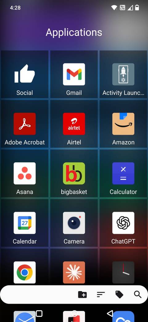
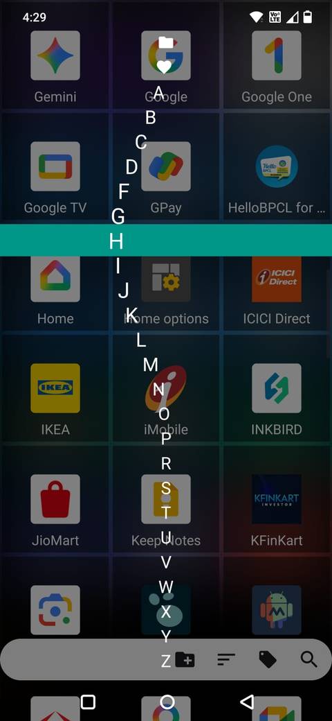
Most Android launchers still rely on multiple horizontal home screen pages filled with widgets and app grids. Square Home immediately felt different because it organizes apps in a long, vertically scrolling workspace.
Instead of swiping endlessly between pages trying to remember where I placed something, I can organize sections naturally as I scroll down.
I grouped productivity apps near the top, media controls and entertainment lower down, and other apps further below.
The larger Live Tiles also make the layout feel less cramped than traditional Android home screens.
Other launchers often feel visually busy when widgets, folders, search bars, and notifications start stacking together.
Square Home’s vertical structure makes everything feel more organized and easier to scan.
Accent colors make a comeback
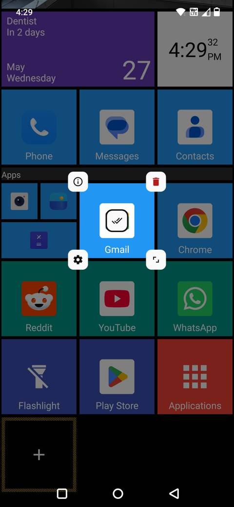
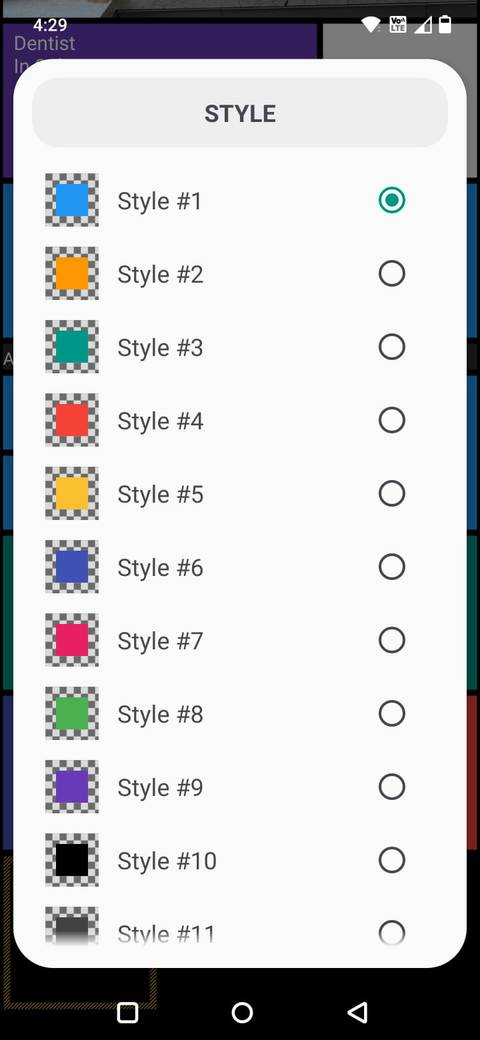
One thing I immediately noticed after switching to Square Home is how much personality accent colors add back to the interface.
While most Android launchers often lean heavily on neutral colors, blurred backgrounds, and monochrome icons, Windows Phone took the opposite approach.
Bright accent colors were a huge part of the identity, and Square Home recreates that surprisingly well.
I started experimenting with bold tile colors again, rather than keeping everything gray or muted, like most modern setups.
Different sections of my home screen now stand out much more clearly at a glance. Music apps, productivity tools, navigation shortcuts, and media tiles all feel visually distinct.
Square Home also lets you customize tile colors individually, adjust transparency, and apply themes across the launcher, so it’s easy to build a setup that either looks very close to classic Windows Phone or something more modernized.
Related
I created a personal command center with Android’s Quick Settings tiles
And now I barely open apps
The experience still feels ahead of its time
I originally recreated the Windows Phone look on Android purely for nostalgia. I expected it to be something fun to experiment with for a few days before switching back to my normal launcher.
Instead, Square Home reminded me why the Windows Phone interface stood out in the first place.
The Live Tiles still feel more dynamic than traditional app grids, the vertical scrolling layout feels surprisingly natural, and the bold accent colors make modern Android home screens look generic.
At this point, I’m not even using it just because it reminds me of Windows Phone. I’m using it because parts of the experience still feel refreshingly different from what other launchers offer today.