
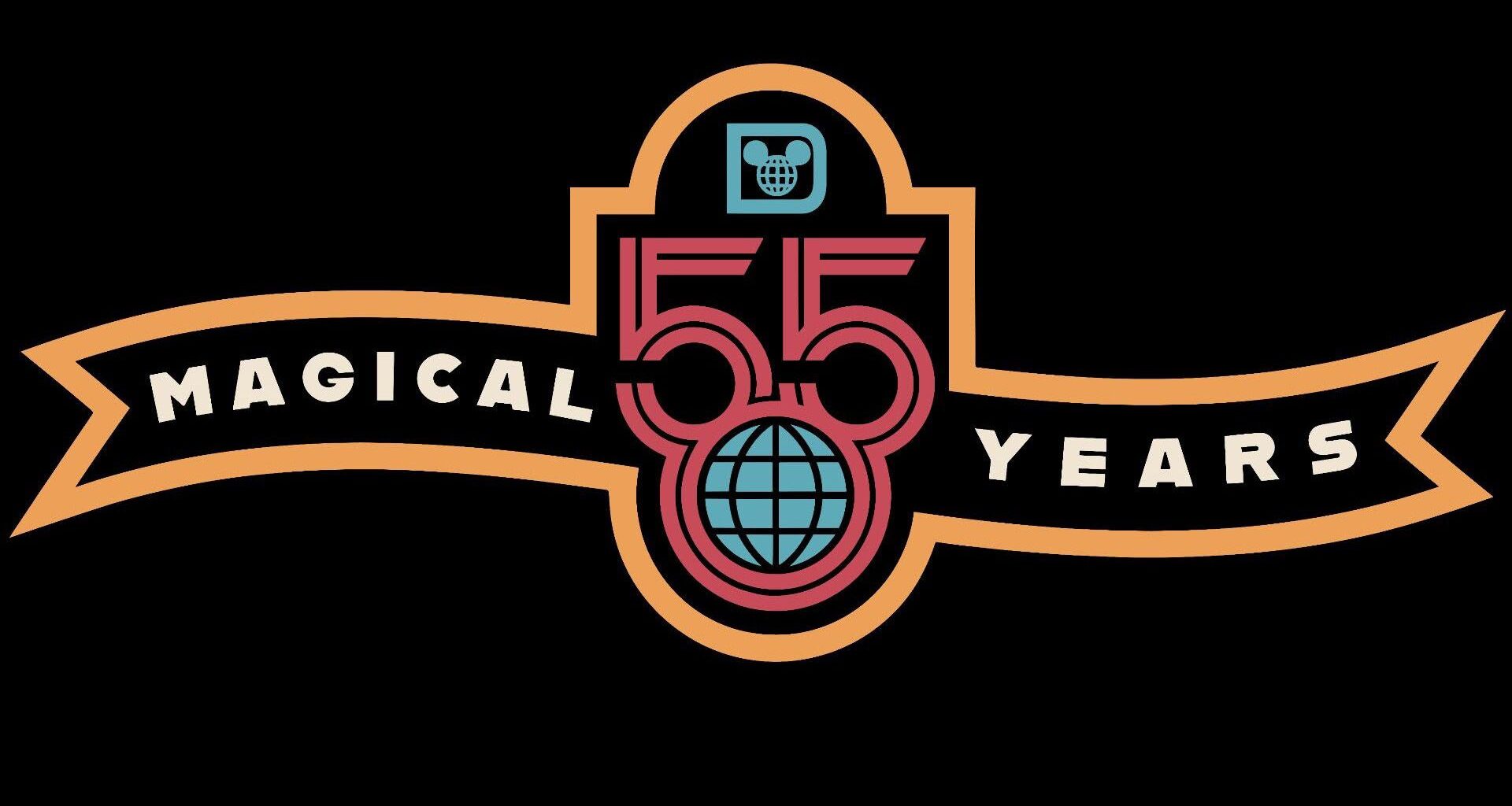
When Disney revealed the logo for its 50th anniversary back in 2019, the response was mixed. It wasn’t clear whether the company had deliberately included what looked like a pair of Mickey Mouse ears in the design – but this time, there can be no mistaking the visual pun.
The ’55’ logo has started appearing on images advertising merch for the Florida destination. And not only is it a delightfully retro reference to the original ‘globe’ icon from the resort’s opening in 1971, but it also features a much more satisfying take on those giant mouse ears.
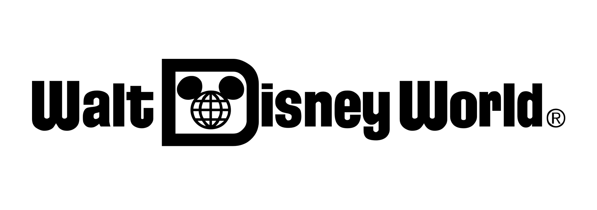
The design harks back to the original 1971 Disney World logo (Image credit: Disney)
Yes, in case it isn’t blindingly obvious, the rounded bottoms of the two ‘5’s sit like ears atop the retro globe. It’s a super simple yet effective design, and it’s already winning over Disney fans.
Latest Videos FromCreative Bloq
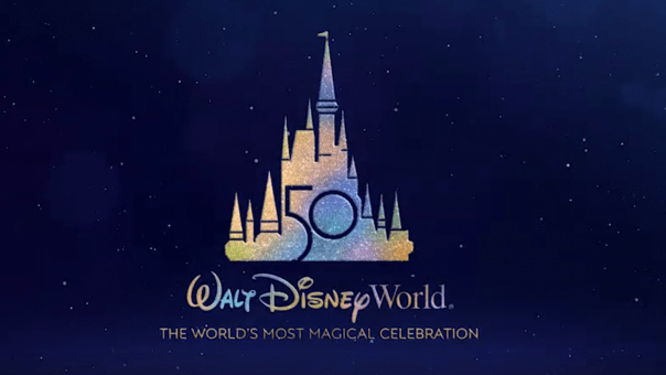
It’s been much more warmly received than the 50th anniversary logo (Image credit: Walt Disney World)
“Massive improvement over the 50th wow,” one X user comments, while another adds, “Absolutely fire logo!’. Another sums up, “How is everything they’ve released about the 55th so far leaps and bounds better than the 50th?”
Walt Disney World’s 55th Anniversary logo is here, celebrating 55 magical years and honoring the resort’s original icon. 🙌 pic.twitter.com/HnHSUMz9B4August 26, 2026
The logo hasn’t been officially announced by Disney, but judging by the early response, it’s set to be a winner.
You may like
Get the Creative Bloq Newsletter