
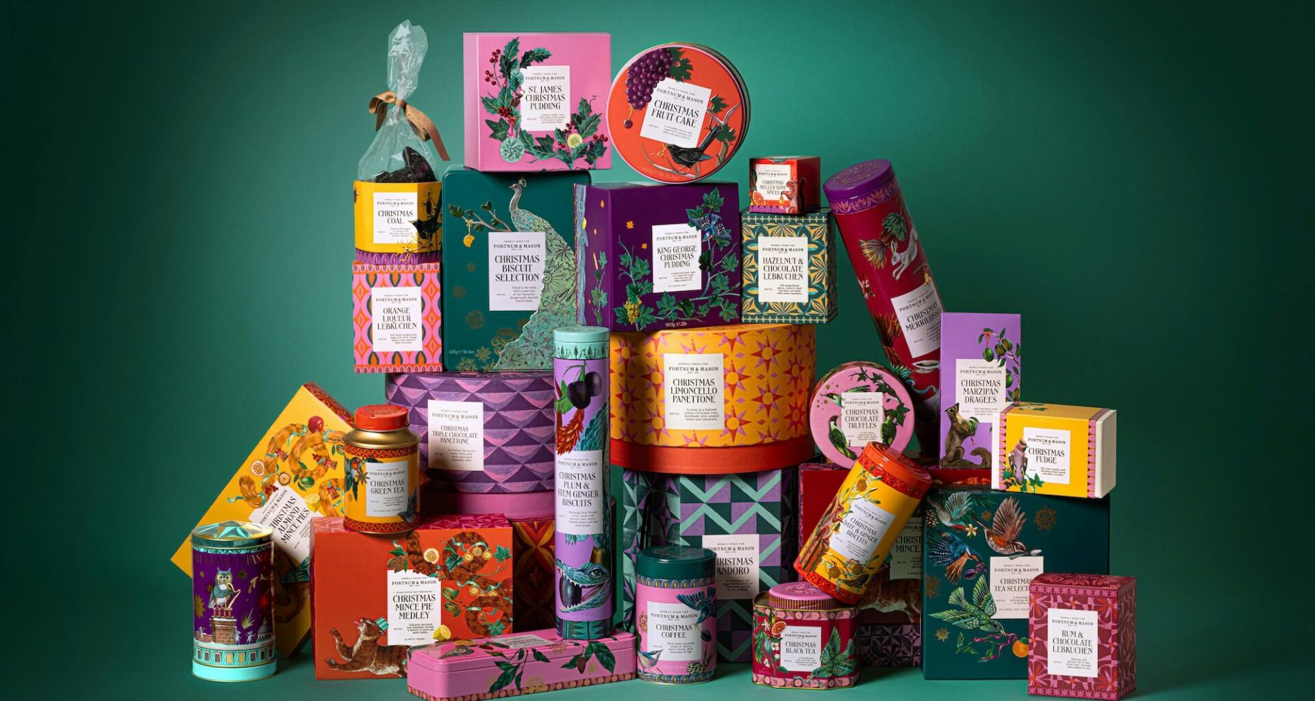
When used with intention and purpose, illustration can enhance a brand. But all too often it is being used only to bring personality to otherwise bland design, says Otherway’s Jono Holt
Without even a history GCSE to my name, my specialist subject is definitely not the past. But having done my research, it’s safe to say cave paintings were some of the very first forms of design and advertising. They formed the start of communication in visual form. Whether that be directions to the nearest water source, drawings of some nearby (presumably dangerous) animals or the instructions to make a better axe. Illustrations have always been useful to people.
Fast forward to now and illustration in communications continues to play a very similar role in our lives. Not much has changed really. It’s just that today we most commonly use it to help people navigate their way through a website, understand a new business model or assemble some Ikea furniture.
The functionality of illustration has always allowed us to simplify the complicated. To visualise something so it’s easier to understand. To show how products work and components fit together. As a result of the tech and DTC boom, we are now very much living with illustrations pretty much 24/7, both on and offline. Whether you’re watching the news, working in Google or paying for something with your Monzo app, they are there. Everywhere. Love them or hate them.
And therein lies the question: do we love them or do we actually hate them? Hate is a strong word, so dislike will do. Either way, let’s take a look at what makes good illustration and what might make, well, less good illustration.
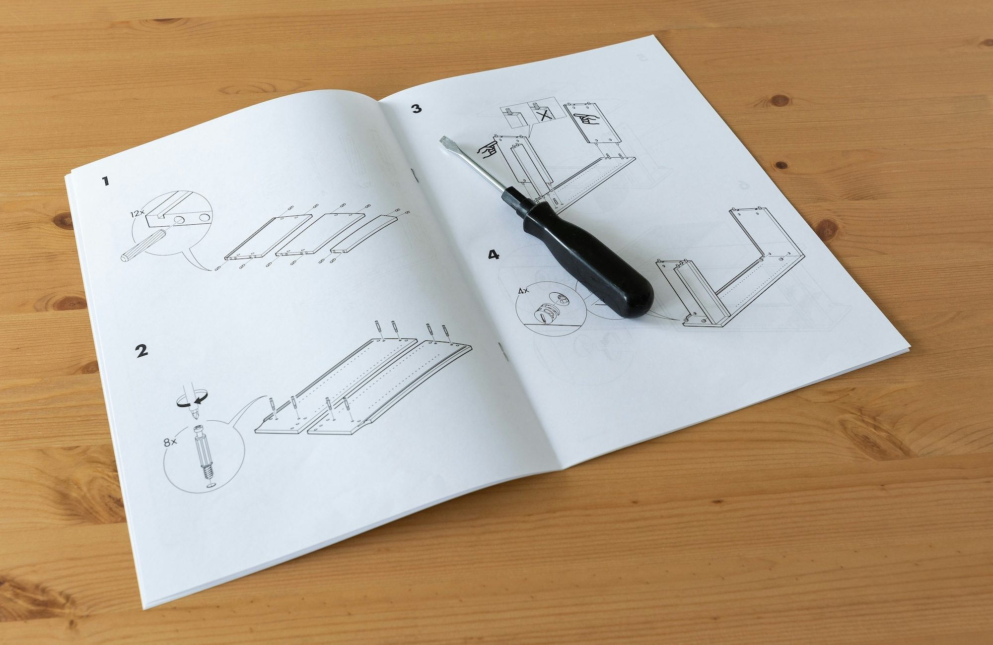 Top: Designs for Fortnum & Mason by Otherway; Above: Ikea instruction illustrations, image courtesy Shutterstock
Sign in